import numpy as np
import pandas as pd
import matplotlib.pyplot as plt
import seaborn as sns
sns.set()
from sklearn.cluster import KMeans
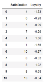
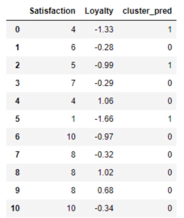
data = pd.read_csv('3.12. Example.csv')
print(data)
代码紧跟上面
# Plot the data
plt.scatter(data['Satisfaction'], data['Loyalty'])
plt.xlabel('Satisfaction')
plt.ylabel('Loyalty')
plt.show()

# Select the features
x = data.copy()
# Clustering
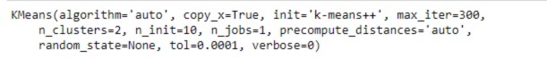
kmeans = KMeans(2)
kmeans.fit(x)
# Clustering results
clusters = x.copy()
clusters['cluster_pred'] = kmeans.fit_predict(x)

plt.scatter(clusters['Satisfaction'], clusters['Loyalty'], c=clusters['cluster_pred'], cmap='rainbow')
plt.xlable('Satisfaction')
plt.ylable('Loyalty')
plt.show()

# Standaridze the variables
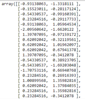
from sklearn import preprocessing
x_scaled = preprocessing.scale(x)
print(x_scaled) # x_scaled contains the standardized 'Satisfaction' and the same values for 'Loyalty'
# Take advantage of the Elbow method
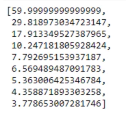
wcss = []
for i in range(1,10):
kmeans = KMeans(i)
kmeans.fit(x_scaled)
wcss.append(kmeans.inertia_)
print(wcss)
plt.plot(range(1,10), wcss)
plt.xlabel('Number of clusters')
plt.ylabel('WCSS')

# Explore clustering solutions and select the number of clusters
kmeans_new = KMeans(2)
kmeans_new.fit(x_scaled)
clusters_new = x.copy()
clusters_new['cluster_pred'] = kmeans_new.fit_predict(x_scaled)
print(clusters_new)
plt.scatter(clusters_new['Satisfaction'], clusters_new['Loyalty'], c=clusters_new['cluster_pred'], cmap='rainbow')
plt.xlabel('Satisfaction')
plt.ylabel('Loyalty')
plt.show()
"""
We often choose to plot using the original values for clearer interpretability. Note: the discrepancy we observe here depends on the range of the axes, too.
"""

# Explore clustering solutions and select the number of clusters
kmeans_new = KMeans(4)
kmeans_new.fit(x_scaled)
clusters_new = x.copy()
clusters_new['cluster_pred'] = kmeans_new.fit_predict(x_scaled)
print(clusters_new)

plt.scatter(clusters_new['Satisfaction'], clusters_new['Loyalty'], c=clusters_new['cluster_pred'], cmap='rainbow')
plt.xlabel('Satisfaction')
plt.ylabel('Loyalty')
plt.show()

-
Types of analysis:
[1] Exploratory
— Get acquainted with the data
— Search for patterns
— Plan
[2] Confirmatory
[3] Explanatory -
There are two types of clustering: Flat and Hierarchical
-
K means is a flat method in the sense that there is no hierarchy but rather we choose the number of clusters and the magic happens the other type is herarchical.
-
There are two types of hierarchical clustering agglomerative (bottom-up) and divisive (Top-Down).
-
With k-means we can simulate this divisive technique and that’s what we did with the elbow method.
-
Agglomerated and divisive clustering should reach similar results but agglomerated is much easier to solve mathematically.
-
Dendrogram: This solution has been produced on the same dataset based on Longitude and Latitude and we have standardized the variables. By the way, standardization did not make a difference in this case.
-
The bigger the distance between two links, the bigger the difference in terms of the features.
-
The pros of the Dendrogram:
[1] Hierarchical clustering shows all the possible linkages between clusters.
[2] We understand the data much, much better
[3] No need to preset the number of clusters (like with k-means)
[4] Many methods to perform hierarchical clustering (Ward method) -
The cons of the Dendrogram:
[1] It is also one of the reasons why hierarchical clustering is far from amazing is scalability.
[2] It is extremely computationally expensive.
[3] The more observations there are the slower it gets.
[4] K means hardly has this issues.
import numpy as np
import pandas as pd
import matplotlib.pyplot as plt
import seaborn as sns
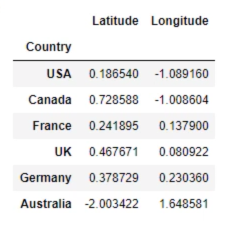
data = pd.read_csv('Country clusters standardized.csv', index_col='Country)
x_scaled = data.copy()
x_scaled = x_scaled.drop(['Language'], axis = 1)
print(x_scaled)
接着上面代码
sns.clustermap(x_scaled, cmap='mako')
