工具:Python
相关资料:
堆栈图是通过将不同的数据集相互垂直绘制而不是相互重叠而生成的。
根据ppt所给数据和图例查找相关资料,画出对应的堆叠图。主要参考自官方文档给出的样例,网址如下:here 。
样例代码:见附件1
实现过程:
详细代码:见附件2
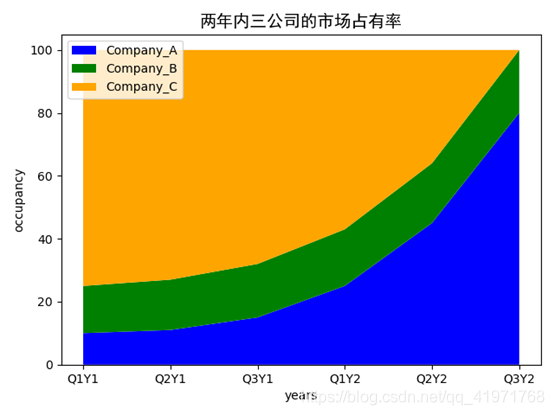
作业1:
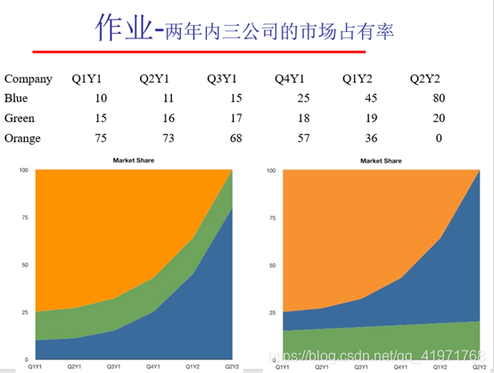
def S_1():
    Years = ['Q1Y1', 'Q2Y1', 'Q3Y1', 'Q1Y2', 'Q2Y2', 'Q3Y2']
    Company_A = [10, 11, 15, 25, 45, 80]
    Company_B = [15, 16, 17, 18, 19, 20]
    Company_C = [75, 73, 68, 57, 36, 0]

    occupancy = [Company_A, Company_B, Company_C]

    labels = ["Company_A", "Company_B", "Company_C"]

    plt.stackplot(Years, occupancy, colors=['blue', 'green', 'orange'], labels=labels)

    plt.xlabel('years')
    plt.ylabel('occupancy')

    plt.title(u'两年内三公司的市场占有率', FontProperties=font)

    plt.legend(loc='upper left')
    plt.show()
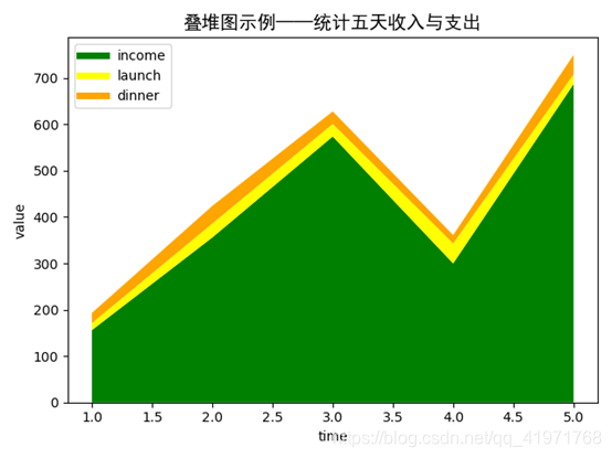
作业2:
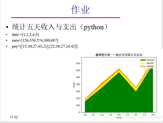
def S_2():
    date = [1, 2, 3, 4, 5]
    earn = [156, 356, 574, 300, 687]
    pay = [[15, 30, 27, 43, 21], [22, 38, 27, 18, 42]]

    plt.stackplot(date, earn, pay, colors=['green', 'yellow', 'orange'])

    plt.xlabel('time')
    plt.ylabel('value')

    plt.plot([], [], color='green', label="income", lineWidth=5)
    plt.plot([], [], color='yellow', label="launch", lineWidth=5)
    plt.plot([], [], color='orange', label="dinner", lineWidth=5)

    plt.title(u'叠堆图示例——统计五天收入与支出', FontProperties=font)

    plt.legend(loc='upper left')
    plt.show()
附件1:
"""
==============
Stackplot Demo
==============

How to create stackplots with Matplotlib.

Stackplots are generated by plotting different datasets vertically on
top of one another rather than overlapping with one another. Below we
show some examples to accomplish this with Matplotlib.
"""
import numpy as np
import matplotlib.pyplot as plt

x = [1, 2, 3, 4, 5]
y1 = [1, 1, 2, 3, 5]
y2 = [0, 4, 2, 6, 8]
y3 = [1, 3, 5, 7, 9]

y = np.vstack([y1, y2, y3])

labels = ["Fibonacci ", "Evens", "Odds"]

fig, ax = plt.subplots()
ax.stackplot(x, y1, y2, y3, labels=labels)
ax.legend(loc='upper left')
plt.show()

fig, ax = plt.subplots()
ax.stackplot(x, y)
plt.show()

###############################################################################
# Here we show an example of making a streamgraph using stackplot


def layers(n, m):
    """
    Return *n* random Gaussian mixtures, each of length *m*.
    """
    def bump(a):
        x = 1 / (.1 + np.random.random())
        y = 2 * np.random.random() - .5
        z = 10 / (.1 + np.random.random())
        for i in range(m):
            w = (i / m - y) * z
            a[i] += x * np.exp(-w * w)
    a = np.zeros((m, n))
    for i in range(n):
        for j in range(5):
            bump(a[:, i])
    return a


d = layers(3, 100)

fig, ax = plt.subplots()
ax.stackplot(range(100), d.T, baseline='wiggle')
plt.show()
附件2:
# -*- coding: utf-8 -*-
# https://matplotlib.org/gallery/lines_bars_and_markers/stackplot_demo.html#sphx-glr-gallery-lines-bars-and-markers-stackplot-demo-py
# Stackplot演示
# 如何使用Matplotlib创建堆栈图。
# 堆栈图是通过将不同的数据集相互垂直垂直绘制而不是相互重叠而生成的。下面我们显示一些使用Matplotlib完成此操作的示例。
# 样例代码路径:样例/stackplot_demo.py
import matplotlib.pyplot as plt
from matplotlib.font_manager import FontProperties

font = FontProperties(fname=r"C:\Windows\Fonts\simhei.ttf", size=14)

def S_1():
    Years = ['Q1Y1', 'Q2Y1', 'Q3Y1', 'Q1Y2', 'Q2Y2', 'Q3Y2']
    Company_A = [10, 11, 15, 25, 45, 80]
    Company_B = [15, 16, 17, 18, 19, 20]
    Company_C = [75, 73, 68, 57, 36, 0]

    occupancy = [Company_A, Company_B, Company_C]

    labels = ["Company_A", "Company_B", "Company_C"]

    plt.stackplot(Years, occupancy, colors=['blue', 'green', 'orange'], labels=labels)

    plt.xlabel('years')
    plt.ylabel('occupancy')

    plt.title(u'两年内三公司的市场占有率', FontProperties=font)

    plt.legend(loc='upper left')
    plt.show()


def S_2():
    date = [1, 2, 3, 4, 5]
    earn = [156, 356, 574, 300, 687]
    pay = [[15, 30, 27, 43, 21], [22, 38, 27, 18, 42]]

    plt.stackplot(date, earn, pay, colors=['green', 'yellow', 'orange'])

    plt.xlabel('time')
    plt.ylabel('value')

    plt.plot([], [], color='green', label="income", lineWidth=5)
    plt.plot([], [], color='yellow', label="launch", lineWidth=5)
    plt.plot([], [], color='orange', label="dinner", lineWidth=5)

    plt.title(u'叠堆图示例——统计五天收入与支出', FontProperties=font)

    plt.legend(loc='upper left')
    plt.show()


if __name__ == "__main__":
    S_1()
    S_2()