%matplotlib inline
import pandas as pd
import numpy as np
数据可视化
Pandas 的数据可视化使用 matplotlib 为基础组件。更基础的信息可参阅 matplotlib 相关内容。本节主要介绍 Pandas 里提供的比 matplotlib 更便捷的数据可视化操作。
线型图
Series 和 DataFrame 都提供了一个 plot 的函数。可以直接画出线形图。
ts = pd.Series(np.random.randn(1000), index=pd.date_range('1/1/2000', periods=1000))
ts = ts.cumsum()
ts.describe()
#describe表示这个series的信息
'''
    count    1000.000000
    mean        3.526470
    std        16.243923
    min       -20.683881
    25%        -9.300320
    50%        -1.758149
    75%        13.224696
    max        42.878495
    dtype: float64
'''

ts.plot();
#绘制出图形

# ts.plot? for more help
ts.plot(title='cumsum', style='r-', ylim=[-30, 30], figsize=(4, 3));
#图形名字,颜色, y取值,图形大小

df = pd.DataFrame(np.random.randn(1000, 4), index=ts.index, columns=list('ABCD'))
df = df.cumsum()
df.describe()
#同上

# df.plot? for more help
df.plot(title='DataFrame cumsum', figsize=(4, 12), subplots=True, sharex=True, sharey=True);
#四列,绘制四条线,分成四个子图,分享x、y轴


df['I'] = np.arange(len(df))
df.plot(x='I', y=['A', 'C'])
#I是1000,绘制AC两条线
柱状图
df = pd.DataFrame(np.random.rand(10, 4), columns=['A', 'B', 'C', 'D'])
df.ix[1].plot(kind='bar')
#绘制柱形图

df.ix[1].plot.bar()
#绘制柱状图

df.plot.bar(stacked=True)
#绘制堆积柱状图

df.plot.barh(stacked=True)
#绘制横向堆积柱状图
直方图
直方图是一种对值频率进行离散化的柱状图。数据点被分到离散的,间隔均匀的区间中,绘制各个区间中数据点的数据。
df = pd.DataFrame({'a': np.random.randn(1000) + 1, 'b': np.random.randn(1000),
                   'c': np.random.randn(1000) - 1}, columns=['a', 'b', 'c'])
df['a'].plot.hist(bins=10)
#绘制a的直方图

df.plot.hist(subplots=True, sharex=True, sharey=True)
#绘制abc的直方图


df.plot.hist(alpha=0.5)
#三个直方图绘制在一张图上,alpha是透明度

df.plot.hist(stacked=True, bins=20, grid=True)
#堆积直方图,条有二十个
密度图
正态分布(高斯分布)就是一种自然界中广泛存在密度图。比如我们的身高,我们的财富,我们的智商都符合高斯分布。
df['a'].plot.kde()
#绘制线型图

df.plot.kde()
#三条线型图

df.mean()
#求平均值

df.std()
#求标准差
带密度估计的规格化直方图
n1 = np.random.normal(0, 1, size=200) # N(0, 1)
n2 = np.random.normal(10, 2, size=200) # N(10, 4)
s = pd.Series(np.concatenate([n1, n2]))
s.describe()
#正态分布
s.plot.hist(bins=100, alpha=0.5, normed=True)
s.plot.kde(style='r-')
#绘制直方图和线型图
散布图
散布图是把所有的点画在同一个坐标轴上的图像。是观察两个一维数据之间关系的有效的手段。
df = pd.DataFrame(np.random.rand(10, 4), columns=['a', 'b', 'c', 'd'])
df.plot.scatter(x='a', y='b');
#绘制散点图

df = pd.DataFrame({'a': np.concatenate([np.random.normal(0, 1, 200), np.random.normal(6, 1, 200)]),
                  'b': np.concatenate([np.random.normal(10, 2, 200), np.random.normal(0, 2, 200)]),
                  'c': np.concatenate([np.random.normal(10, 4, 200), np.random.normal(0, 4, 200)])})
df.describe()

df.plot.scatter(x='a', y='b')
#散点集中于两处(0, 10)(6, 0)
饼图
s = pd.Series(3 * np.random.rand(4), index=['a', 'b', 'c', 'd'], name='series')
#4个随机数×3

s.plot.pie(figsize=(6,6))
#绘制饼图

s.plot.pie(labels=['AA', 'BB', 'CC', 'DD'], colors=['r', 'g', 'b', 'c'],
           autopct='%.2f', fontsize=20, figsize=(6, 6))
#每一块都标记名字,颜色,标记上百分号,字体大小,图的大小

df = pd.DataFrame(3 * np.random.rand(4, 2), index=['a', 'b', 'c', 'd'], columns=['x', 'y'])
df.plot.pie(subplots=True, figsize=(9, 4))
#分成xy两个子图
高级绘图
高级绘图函数在 pandas.tools.plotting 包里。
from pandas.tools.plotting import scatter_matrix
df = pd.DataFrame(np.random.randn(1000, 4), columns=['a', 'b', 'c', 'd'])
scatter_matrix(df, alpha=0.2, figsize=(6, 6), diagonal='kde');
除了自己和自己都是散点图
from pandas.tools.plotting import lag_plot

s = pd.Series(0.1 * np.random.rand(1000) + 0.9 * np.sin(np.linspace(-99 * np.pi, 99 * np.pi, num=1000)))
lag_plot(s);
#lag_plot()用于时间序列的自相关性分析,可以描绘pandas对象series中当前值和滞后值之间的散点图。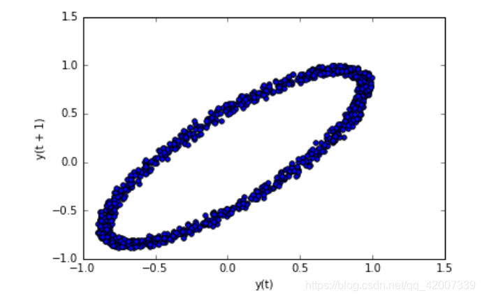
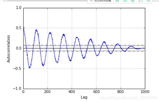
from pandas.tools.plotting import autocorrelation_plot

s = pd.Series(0.7 * np.random.rand(1000) + 0.3 * np.sin(np.linspace(-9 * np.pi, 9 * np.pi, num=1000)))
autocorrelation_plot(s);
#自相关图