pandas.DataFrame.hist
使用函数:
DataFrame.hist(column=None, by=None, grid=True, xlabelsize=None, xrot=None, ylabelsize=None, yrot=None, ax=None, sharex=False, sharey=False, figsize=None, layout=None, bins=10, **kwds)
功能:制作DataFrame的直方图
直方图是数据分布的表示。此函数在DataFrame中的每个系列上调用matplotlib.pyplot.hist(),每列产生一个直方图。
| 参数: |
data : DataFrame
The pandas object holding the data.
pandas对象保存数据。
column : string or sequence
If passed, will be used to limit data to a subset of columns.
如果通过,将用于将数据限制为列的子集。
by : object, optional
If passed, then used to form histograms for separate groups.
如果通过,则用于为不同的组形成直方图。
grid : boolean, default True
Whether to show axis grid lines.
是否显示轴网格线。
xlabelsize : int, default None
If specified changes the x-axis label size.
指定更改x轴标签字符大小。
xrot : float, default None
Rotation of x axis labels. For example, a value of 90 displays the x labels rotated 90 degrees clockwise.
旋转x轴标签。例如,值90表示顺时针旋转90度的x标签。
ylabelsize : int, default None
If specified changes the y-axis label size.
指定更改y轴标签字符大小。
yrot : float, default None
Rotation of y axis labels. For example, a value of 90 displays the y labels rotated 90 degrees clockwise.
y轴标签的旋转。例如,值90表示顺时针旋转90度的y标签。
ax : Matplotlib axes object, default None
The axes to plot the histogram on.
轴绘制直方图。
sharex : boolean, default True if ax is None else False
In case subplots=True, share x axis and set some x axis labels to invisible; defaults to True if ax is None otherwise False if an ax is passed in. Note that passing in both an ax and sharex=True will alter all x axis labels for all subplots in a figure.
如果subplots = True,则共享x轴并将一些x轴标签设置为不可见; 如果ax为None,则默认为True;否则,如果传入ax,则默认为False。请注意,传入ax和sharex = True将改变图中所有子图的所有x轴标签。
sharey : boolean, default False
In case subplots=True, share y axis and set some y axis labels to invisible.
如果subplots = True,则共享y轴并将某些y轴标签设置为不可见。
figsize : tuple
The size in inches of the figure to create. Uses the value in matplotlib.rcParams by default.
要创建的图形的大小(以英寸为单位)。默认情况下使用 matplotlib.rcParams 中的值。如(宽,高)
layout : tuple, optional
Tuple of (rows, columns) for the layout of the histograms.
(行,列)的布局的元组直方图。
bins : integer or sequence, default 10
Number of histogram bins to be used. If an integer is given, bins + 1 bin edges are calculated and returned. If bins is a sequence, gives bin edges, including left edge of first bin and right edge of last bin. In this case, bins is returned unmodified.
要使用的直方图的数量。如果给定一个整数,则计算并返回垃圾箱+1个bin边。如果箱子是一个序列,就会给箱子边缘,包括第一个箱子的左边缘和最后一个箱子的右边缘。在这种情况下,箱子是未被修改的。
**kwds
All other plotting keyword arguments to be passed to matplotlib.pyplot.hist().
要传递给所有其他绘图关键字参数 。matplotlib.pyplot.hist()
|
| Returns: |
axes : matplotlib.AxesSubplot or numpy.ndarray of them |
例子
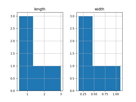
本实施例中绘制直方图基于某些动物的长度和宽度
背景的宽度(bins)
>>> df = pd.DataFrame({
...     'length': [1.5, 0.5, 1.2, 0.9, 3],
...     'width': [0.7, 0.2, 0.15, 0.2, 1.1]
...     }, index= ['pig', 'rabbit', 'duck', 'chicken', 'horse'])
# 显示在3个bins中
>>> hist = df.hist(bins=3)
# 显示在100个bins中
df.hist(grid=False,column="width",bins=100)

绘制直方图默认每一列显示一张图,也就是输入几列就显示几张图。
只显示一张图(显示一列数值的直方图)
df["width"].hist()
或者(指定列)
df.hist(column="width")

定制显示图像大小(figsize=(wide,high))
参数是英寸,注意哦!
df["width"].hist(figsize=(8,4))

去掉网格线
df["width"].hist(grid=False)

排版布局显示直方图(2x2 or 3x3)
注意:layout的值必须大于DataFrame列的数量,如5列不能显示2x2布局。
建议figsize调大,不然下一行图像的标题会和上一行图像的X轴数值重叠。
df1 = pd.DataFrame({
     'length': [1.5, 0.5, 1.2, 0.9, 3],
     'width': [0.7, 0.2, 0.15, 0.2, 1.1],
    'A':[1,2,3,1,2],
    'B':[0.1,0.2,0.3,0.4,0.1],
    'C':[1,2,3,4,5]
     }, index= ['pig', 'rabbit', 'duck', 'chicken', 'horse'])
df1.hist(layout=(3,3),figsize=(8,8))

显示图像色彩浓度(0 < alpha值 < 1)
df.hist(grid=False,column="width",alpha=0.5)

参考:
http://pandas.pydata.org/pandas-docs/stable/generated/pandas.DataFrame.hist.html?highlight=hist#pandas.DataFrame.hist