本文是对《Python数据分析与挖掘实战》实战篇第二章——航空公司客户价值分析上机实验的记录。
实验目的为:
- 了解K-Means算法在客户价值分析实例中的应用。
- 利用Pandas快速实现数据Z-score(标准差)标准化以及用Scikit-Learn的聚类库实现K-Means聚类。
具体实验过程分为三部分:
- LRFMC标准化
- 完成K-Means聚类
- 画出聚类中心特征图
1. LRFMC标准化
利用Pandas程序,读入LRFMC指标文件,代码如下:
import pandas as pd
#标准化处理
zscoredata=pd.read_excel('C:/Users/Administrator/Desktop/xy/chapter7/test/data/zscoredata.xls'.encode('utf-8'))
分别计算各个指标的均值和标准差,使用标准差标准化公式完成LRFMC指标的标准化,并将标准化后的数据进行保存,代码如下:
data_mean=zscoredata.mean(axis=0)
data_std=zscoredata.std(axis=0)
zscoredata_new=(zscoredata-data_mean)/data_std
zscoredata_new.columns=[i+'_Zscore' for i in zscoredata_new.columns]
zscoredata_new.to_excel('C:/Users/Administrator/Desktop/xy/chapter7/test/data/zscoredata_new.xls')
标准差标准化公式由代码中即可看出,此处不另外强调。
至此,数据标准化完成,接下来将利用Python进行聚类分析。
2. 完成K-Means聚类
K-Means聚类是比较常见的聚类方法,网上有很多关于他的资料,比如以下这篇文章:
深入浅出K-Means算法
引用这篇文章中关于K-Means算法的步骤:
1.随机在图中取K个种子点。
2.然后对图中的所有点求到这K个种子点的距离,假如点Pi离种子点Si最近,那么Pi属于Si点群。
3.接下来,我们要移动种子点到属于他的“点群”的中心。
4.然后重复第2)和第3)步,直到,种子点没有移动。
Python中的sklearn包中有可以直接用的K-Means程序,因此,首先需要导入,在导入算法包之前先导入所需数据,由于聚类分析只针对’ZL’,’ZR’,’ZF’,’ZM’,’ZC’这五列数据,因此需要将其截取出来,代码如下:
data=pd.read_excel('C:/Users/Administrator/Desktop/xy/chapter7/test/data/preprocesseddata.xls'.encode('utf-8'))
#截取最后五列数据
data=data[['ZL','ZR','ZF','ZM','ZC']]
from sklearn.cluster import KMeans#导入K均值聚类算法
完成K-Means聚类,并获得聚类中心和类标号。代码如下:
kmodel=KMeans(n_clusters=5,n_jobs=1)
kmodel.fit(data)#训练模型
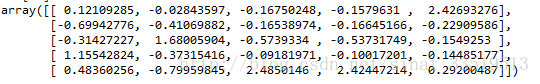
kmodel.cluster_centers_#查看聚类中心
kmodel.labels_#查看样本对应的类别需要注意的是,n_jobs参数指的是并行数,刚开始的时候,因为书上说n_jobs参数一般等于CPU数较好,因此,博主将其设置为2,结果每次一运行电脑就变得巨卡,然后怎么都出不来结果,试了几次之后将其修改为1之后,发现运行就正常了,所以看来还是博主电脑配置太弱了。。。。。。
最后得到聚类中心结果如下:
为了方便查看样本对应的类别,博主将kmodel.labels_转发为DataFrame,然后利用value_counts方法对各个类别对应的客户数进行统计。
代码如下:
from pandas import DataFrame
a=kmodel.labels_
a=DataFrame(a)
a[0].value_counts()
最后得出各类别的统计结果如下图:
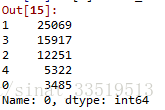
所以最后将各聚类分群的结果统计如下图:

3. 画出客户群特征图(聚类中心特征图)
最后,还需要利用聚类中心店,画出聚类中心特征图,以清晰地观察各聚类分群的特征。
关于雷达图的画法,博主最开始找了matplotlib上的雷达图示例代码,但是示例代码实在是有些复杂,不知如何修改,最后只好找了网上一个稍微简单点的代码,以他为基础,绘制聚类中心的雷达图。
matplotlib雷达图
由于本次实验需要在雷达图中绘制五条,但是上文是只有一条的,参照官网上的示例代码,应该需要用循环代码,但是博主在企图用循环代码的过程中却总是出错,最后没办法,还好只有五条,就先蠢蠢地一条条画了,以后再深入探究matplotlib中雷达图的画法。
代码如下:
'''
matplotlib雷达图
'''
import numpy as np
import matplotlib.pyplot as plt
#标签
labels = np.array(['ZL','ZR','ZF','ZM','ZC'])
#数据个数
dataLenth =5
#数据
data = kmodel.cluster_centers_
#底下是每一条的数据,都需要先转换为np.array才可以
data1=np.array(data[0])
data2=np.array(data[1])
data3=np.array(data[2])
data4=np.array(data[3])
data5=np.array(data[4])
#========自己设置结束============
angles = np.linspace(0, 2*np.pi, dataLenth, endpoint=False)
data1 = np.concatenate((data1, [data1[0]])) # 闭合
data2 = np.concatenate((data2, [data2[0]])) # 闭合
data3 = np.concatenate((data3, [data3[0]])) # 闭合
data4 = np.concatenate((data4, [data4[0]])) # 闭合
data5 = np.concatenate((data5, [data5[0]])) # 闭合
angles = np.concatenate((angles, [angles[0]])) # 闭合
fig = plt.figure()
ax = fig.add_subplot(111, polar=True)# polar参数!!
ax.plot(angles, data1, 'bo-', color='b',linewidth=2)#绘制
ax.fill(angles, data1, facecolor='b', alpha=0.25)#填充
ax.plot(angles, data2, 'bo-', color='r',linewidth=2)
ax.fill(angles, data2, facecolor='r', alpha=0.25)
ax.plot(angles, data3, 'bo-', color='g',linewidth=2)
ax.fill(angles, data3, facecolor='g', alpha=0.25)
ax.plot(angles, data4, 'bo-', color='m',linewidth=2)
ax.fill(angles, data4, facecolor='m', alpha=0.25)
ax.plot(angles, data5, 'bo-', color='y',linewidth=2)
ax.fill(angles, data5, facecolor='y', alpha=0.25)
ax.set_thetagrids(angles * 180/np.pi, labels, fontproperties="SimHei")
ax.set_title("客户群特征分析图", va='bottom', fontproperties="SimHei")
ax.set_rlim(-1,2.5)
ax.grid(True)
labels_group = ('Group 1', 'Group 2', 'Group 3', 'Group 4', 'Group 5')
legend = ax.legend(labels_group, loc=(0.9, .95),
labelspacing=0.1, fontsize='small')
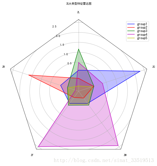
plt.show()最后出来的结果如下图:

可以看出以下特征:
对于Group1来说,ZC比较大,其他都比较小;
对于Group2来说,所有特征值都比较小;
对于Group3来说,ZR比较大,其他都比较小;
对于Group4来说,ZL比较大,其他都比较小;
对于Group5来说,ZF和ZM都非常大,其他相对来说较小。
(后期更新)
博主在后期整理的时候再一次尝试利用matplotlib官网上的雷达图绘制,此次终于成功,其实主要就是改变原数据并去掉最后绘制的一个循环,但不知道为什么之前一直没有成果,在此补上。
代码如下:
#绘制雷达图
##设置字体
from matplotlib.font_manager import FontProperties
from pylab import *
mpl.rcParams['font.sans-serif'] = ['SimHei']
mpl.rcParams['axes.unicode_minus']=False
import numpy as np

import matplotlib.pyplot as plt
from matplotlib.path import Path
from matplotlib.spines import Spine
from matplotlib.projections.polar import PolarAxes
from matplotlib.projections import register_projection


def radar_factory(num_vars, frame='circle'):
    """Create a radar chart with `num_vars` axes.

    This function creates a RadarAxes projection and registers it.

    Parameters
    ----------
    num_vars : int
        Number of variables for radar chart.
    frame : {'circle' | 'polygon'}
        Shape of frame surrounding axes.

    """
    # calculate evenly-spaced axis angles
    theta = np.linspace(0, 2*np.pi, num_vars, endpoint=False)

    def draw_poly_patch(self):
        # rotate theta such that the first axis is at the top
        verts = unit_poly_verts(theta + np.pi / 2)
        return plt.Polygon(verts, closed=True, edgecolor='k')

    def draw_circle_patch(self):
        # unit circle centered on (0.5, 0.5)
        return plt.Circle((0.5, 0.5), 0.5)

    patch_dict = {'polygon': draw_poly_patch, 'circle': draw_circle_patch}
    if frame not in patch_dict:
        raise ValueError('unknown value for `frame`: %s' % frame)

    class RadarAxes(PolarAxes):

        name = 'radar'
        # use 1 line segment to connect specified points
        RESOLUTION = 1
        # define draw_frame method
        draw_patch = patch_dict[frame]

        def __init__(self, *args, **kwargs):
            super(RadarAxes, self).__init__(*args, **kwargs)
            # rotate plot such that the first axis is at the top
            self.set_theta_zero_location('N')

        def fill(self, *args, **kwargs):
            """Override fill so that line is closed by default"""
            closed = kwargs.pop('closed', True)
            return super(RadarAxes, self).fill(closed=closed, *args, **kwargs)

        def plot(self, *args, **kwargs):
            """Override plot so that line is closed by default"""
            lines = super(RadarAxes, self).plot(*args, **kwargs)
            for line in lines:
                self._close_line(line)

        def _close_line(self, line):
            x, y = line.get_data()
            # FIXME: markers at x[0], y[0] get doubled-up
            if x[0] != x[-1]:
                x = np.concatenate((x, [x[0]]))
                y = np.concatenate((y, [y[0]]))
                line.set_data(x, y)

        def set_varlabels(self, labels):
            self.set_thetagrids(np.degrees(theta), labels)

        def _gen_axes_patch(self):
            return self.draw_patch()

        def _gen_axes_spines(self):
            if frame == 'circle':
                return PolarAxes._gen_axes_spines(self)
            # The following is a hack to get the spines (i.e. the axes frame)
            # to draw correctly for a polygon frame.

            # spine_type must be 'left', 'right', 'top', 'bottom', or `circle`.
            spine_type = 'circle'
            verts = unit_poly_verts(theta + np.pi / 2)
            # close off polygon by repeating first vertex
            verts.append(verts[0])
            path = Path(verts)

            spine = Spine(self, spine_type, path)
            spine.set_transform(self.transAxes)
            return {'polar': spine}

    register_projection(RadarAxes)
    return theta


def unit_poly_verts(theta):
    """Return vertices of polygon for subplot axes.

    This polygon is circumscribed by a unit circle centered at (0.5, 0.5)
    """
    x0, y0, r = [0.5] * 3
    verts = [(r*np.cos(t) + x0, r*np.sin(t) + y0) for t in theta]
    return verts


def example_data():
    # The following data is from the Denver Aerosol Sources and Health study.
    # See  doi:10.1016/j.atmosenv.2008.12.017
    #
    # The data are pollution source profile estimates for five modeled
    # pollution sources (e.g., cars, wood-burning, etc) that emit 7-9 chemical
    # species. The radar charts are experimented with here to see if we can
    # nicely visualize how the modeled source profiles change across four
    # scenarios:
    #  1) No gas-phase species present, just seven particulate counts on
    #     Sulfate
    #     Nitrate
    #     Elemental Carbon (EC)
    #     Organic Carbon fraction 1 (OC)
    #     Organic Carbon fraction 2 (OC2)
    #     Organic Carbon fraction 3 (OC3)
    #     Pyrolized Organic Carbon (OP)
    #  2)Inclusion of gas-phase specie carbon monoxide (CO)
    #  3)Inclusion of gas-phase specie ozone (O3).
    #  4)Inclusion of both gas-phase species is present...
    data = [
        ['ZL','ZR','ZF','ZM','ZC'],
        kmodel.cluster_centers_,

    ]#此处修改数据
    return data


if __name__ == '__main__':
    N = 5#此处修改个数
    theta = radar_factory(N, frame='polygon')

    data = example_data()
    spoke_labels = data[0]#这个为特征变量名称
    casedata=data[1]#这个为聚类中心

    fig=plt.figure(figsize=(9,9))
    ax = fig.add_subplot(111,projection='radar')#此处不需要绘制多图,因此修改成一个图
    fig.subplots_adjust(wspace=0.25, hspace=0.20, top=0.85, bottom=0.05)

    colors = ['b', 'r', 'g', 'm', 'y']
    # Plot the four cases from the example data on separate axes
    ax.set_rgrids([0.5, 1, 1.5, 2,2.5])
    ax.set_title( u'五大类型特征雷达图', weight='bold', size='medium', position=(0.5, 1.1),
                     horizontalalignment='center', verticalalignment='center')
    #只使用这一个循环,去掉原本有的大循环
    for d, color in zip(casedata, colors):
        ax.plot(theta, d, color=color)
        ax.fill(theta, d, facecolor=color, alpha=0.25)
        ax.set_varlabels(spoke_labels)

    # add legend relative to top-left plot
    #ax = axes[0, 0]
    labels =['group1','group2','group3','group4','group5']
    legend = ax.legend(labels, loc='best',#loc=(0.9, .95),
                       labelspacing=0.1, fontsize='large')

    #fig.text(0.5, 0.965, u'五大类型特征雷达图',
             #horizontalalignment='center', color='black', weight='bold',
             #size='large')

    plt.show()
最后运行的结果图如下:
不同类别在各特征变量上的数值分布与上面的图差不多,此处不再赘述。
4.总结
本次实验比上一次要稍微简单,但是博主还是在聚类和雷达图这磕了很久,所以,不管代码看着多简单,真正实践起来也许总会出些问题。而且虽然磕磕绊绊地把雷达图画出来了,但显然这种方法真的是比较蠢的,接下来肯定还得继续对matplotlib进行深入学习。
最后,博主在企图用循环来画图的时候,总是出现一个问题,但没有解决,因此记录在这里,希望以后自己可以解决或者看到这篇博文的好心人能帮忙解答一下(如果错误很低级,还请你不要笑–)
循环代码如下:
#colors = ['b', 'r', 'g', 'm', 'y']
#for i in range(5):
    #data=np.array(data[i])
    #data = np.concatenate((data, [data[0]]))
    #color=colors[i]
    #ax.plot(angles, data, 'bo-', color=color,linewidth=2)
    #ax.fill(angles, data, facecolor=color, alpha=0.25)
最后的报错如下:
IndexError: too many indices for array至此,本次上机实验算勉强完成,还有需深入探究的点,留待日后补充完善。(其实也不知道会不会补充呃…….)