import numpy as np
import pandas as pd
import matplotlib.pyplot as plt
from pandas import Series, DataFrame
%matplotlib inline
import seaborn as sns
/Users/bennyrhys/opt/anaconda3/lib/python3.7/importlib/_bootstrap.py:219: RuntimeWarning: numpy.ufunc size changed, may indicate binary incompatibility. Expected 192 from C header, got 216 from PyObject
  return f(*args, **kwds)
/Users/bennyrhys/opt/anaconda3/lib/python3.7/importlib/_bootstrap.py:219: RuntimeWarning: numpy.ufunc size changed, may indicate binary incompatibility. Expected 192 from C header, got 216 from PyObject
  return f(*args, **kwds)
/Users/bennyrhys/opt/anaconda3/lib/python3.7/importlib/_bootstrap.py:219: RuntimeWarning: numpy.ufunc size changed, may indicate binary incompatibility. Expected 192 from C header, got 216 from PyObject
  return f(*args, **kwds)
s1 = Series(np.random.randn(1000))
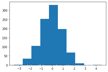
普通画
plt.hist(s1)
(array([  1.,  34., 105., 253., 330., 198.,  68.,  10.,   0.,   1.]),
 array([-3.48152703, -2.68232526, -1.88312349, -1.08392171, -0.28471994,
         0.51448183,  1.31368361,  2.11288538,  2.91208715,  3.71128892,
         4.5104907 ]),
 <a list of 10 Patch objects>)
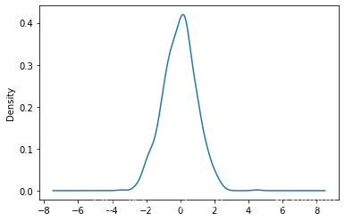
s1.plot(kind='kde')
<matplotlib.axes._subplots.AxesSubplot at 0x1a1e906a90>
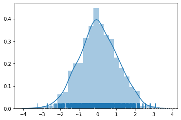
seaborn画
sns.distplot(s1, bins=20, hist=True, kde=True, rug=True)
<matplotlib.axes._subplots.AxesSubplot at 0x1a1faf2410>
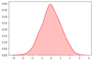
sns.kdeplot(s1, shade=True, color='r')
<matplotlib.axes._subplots.AxesSubplot at 0x1a2258d850>
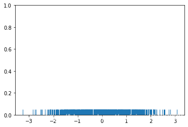
sns.rugplot(s1)
<matplotlib.axes._subplots.AxesSubplot at 0x1a227783d0>
调用plot的方法(以前sns可以调用现在不行了)
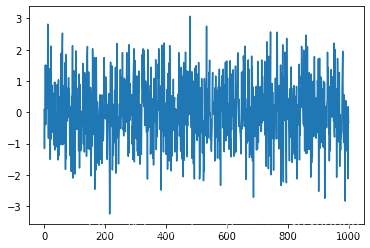
plt.plot(s1)
[<matplotlib.lines.Line2D at 0x1a225d6650>]