找到的资源分享给大家,图片需要自己添加了,这里只有代码,基本的架构是4个CSS样式和一个html,图片需要十四张…
index.html
<!DOCTYPE html>
<html>
<head>
<meta charset="utf-8">
<title>AdMaster</title>
<script src="https://cdn.staticfile.org/jquery/1.12.2/jquery.min.js"></script>
<link rel="stylesheet" type="text/css" href="./css/conponent.css" />
<link rel="stylesheet" type="text/css" href="css/style1.css" media="all and (min-width:800px)"/>
<link rel="stylesheet" type="text/css" href="css/style2.css" media="all and (max-width:799px) and (min-width:668px)"/>
<link rel="stylesheet" type="text/css" href="css/style3.css" media="all and (max-width:667px)"/>
</head>
<body>
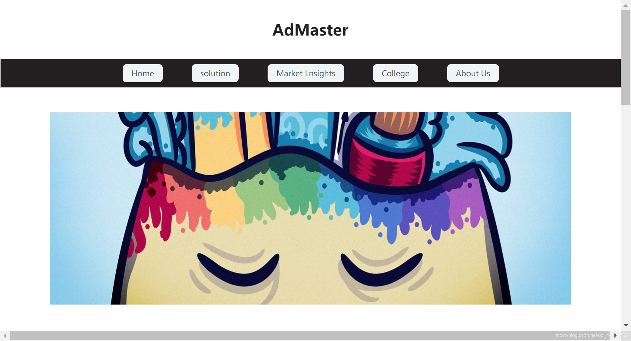
<header>
<h1><a href="#">AdMaster</a></h1>
</header>
<nav>
<img src="./imges/1.png" alt="" id="imgLogo">
<ul><li><a href="#">Home</a></li>
<li><a href="#">solution</a></li>
<li><a href="#">Market Lnsights</a></li>
<li><a href="#">College</a></li>
<li><a href="#">About Us</a></li>
</ul>
</nav>
<section>
<div class="row row1">
<img src="imges/pic01.jpg" >
</div>
<div class="row row2">
<ul>
<li><img src="./imges/2.jpg" alt="">
<h2>Ipsum consequat</h2>
<p>Nisl amet dolor sit ipsum veroeros sed blandit consequat veroeros et magna tempus.</p>
</li>
<li><img src="./imges/3.jpg" alt="">
<h2>Magna etiam dolor</h2>
<p>Provides Servers and network connectivity.</p></li>
<li><img src="./imges/4.jpg" alt="">
<h2>Tempus adipiscing</h2>
<p>Payment gateway to collect veroeros sed blandit consequat money.</p>
</li>
</ul>
<div class="btn">
<a href="#">Get Started</a>
<a href="#">Learn More</a></div>
</div>
<div class="row row3">
<h2>My Portfolio</h2>
<ul>
<li>
<img src="./imges/pic02.jpg" alt="">
<h3>Ipsum feugiat et dolor</h3>
<p>Lorem ipsum dolor sit amet sit veroeros sed amet blandit consequat veroeros lorem blandit
adipiscing et feugiat phasellus tempus dolore ipsum lorem dolore.</p>
<a href="#">Find out more</a>
</li>
<li><img src="./imges/pic03.jpg" alt="">
<h3>Sed etiam lorem nulla</h3>
<p> Start your own cloud hosting business in minutes Simple interface fully equipped with all what you need Compete with Digital Ocean and other cloud giants...</p>
<a href="#">Find out more</a>
</li>
<li><img src="./imges/pic04.jpg" alt="">
<h3>Consequat et tempus</h3>
<p>Sell your cloud management pane new IaaS cloud hosting veroeros cloud management pane sed amet blandit consequat veroeros lorem blandit
SaaS cloud management panel.</p>
<a href="#">Find out more</a>
</li>
<li><img src="./imges/pic05.jpg" alt="">
<h3>Blandit sed adipiscing</h3>
<p>Register a totally free account with all features enabled. or choose one of the available pre-paid packages...</p>
<a href="#">Find out more</a>
</li>
<li><img src="./imges/pic06.jpg" alt="">
<h3>Etiam nisl consequat</h3>
<p>Install Sadeem agent on your servers using our automated installation script, its only one Line which you need to run.</p>
<a href="#">Find out more</a>
</li>
<li><img src="./imges/pic07.jpg" alt="">
<h3>Dolore nisl feugiat</h3>
<p>Create your service offer packages and set the prices of extra bandwidth usage, you can also create coupons to help you ...</p>
<a href="#">Find out more</a>
</li>
</ul>
</div>
</section>
<footer>
<p>Copyright © 2018.Company name All rights reserved.</p>
</footer>
<script type="text/javascript">
$('#imgLogo').click(function() {
$("nav ul").toggle();
})
</script>
</body>
</html>
CSS样式:
conponent.css
*{
	margin: 0;
	padding: 0;
	color: #252122;
}
a{
	text-decoration: none;
}
li{
	list-style: none;
}
header h1{
	text-align: center;
	padding: 40px 0;
}
nav ul{
	margin: 0 auto;
	display: flex;
	border: 1px solid #ccc;
	/* 侧轴对齐方式:居中放置 */
	align-items: center;
	background: #231f20;
	padding: 10px 0;
}
nav ul li a{
	display: inline-block;
	padding: 0 18px;
	height: 38px;
	line-height: 38px;
	border-radius: 8px;
	color: #5d5d5d;
	background: #f0f5f6;
}
nav ul li a:hover{
	background: #d52349;
}
/* 使其图标不显示 */
#imgLogo{
	display: none;
}
.row{
	display: flex;
}
.row1{
	justify-content: center;
	margin: 50px 8%;
}

.row2{
	flex-direction: column;
	margin-bottom: 50px;
}
.row2 ul{
	display: flex;
	justify-content: space-around;
	text-align: center;
	margin: 40px 0;
}

.row2 .btn{
	display: flex;
	justify-content: center;
}

.row2 .btn a{
	width: 200px;
	display: inline-block;
	background: #252122;
	color: #fff;
	text-align: center;
	margin: 0 10px;
	height: 40px;
	line-height: 40px;
	font-weight: bold;
	border-radius:8px;
}
/* 鼠标悬停的时候变色 */
.row2 .btn a:hover{
	background: #d52349;
}
.row3{
	flex-direction: column;
}
.row3 ul li a:hover{
	background: #d52349;
}
.row3 h2{
	text-align: center;
	margin: 20px 0;
}
.row3 ul{
	display: flex;
	justify-content: space-around;
	text-align: center;
}


.row3 ul li h3{
	line-height: 30px;
}
.row3 ul li img{
	width: 100%;
}
.row3 ul li p{
	width: 288px;
	margin: 0 auto;
	text-align: left;
	line-height: 24px;
}
.row3 ul li a{
	display: inline-block;
	background: #252122;
	border-radius: 8px;
	color: #fff;
	line-height: 40px;
	height: 40px;
	padding: 0 20px;
	margin: 20px;
	font-weight: bold;
}
footer{
	height: 120px;
	background: #211d1e;
	color: #fff;
	margin-top: 40px;
	display: flex;
	align-items:center;
	justify-content: center;
	flex-wrap: wrap;
}
footer p{
	color: #fff;
}
/* 当屏幕的宽度大于800px的时候 */
/* @media all and (min-width:800px){
	nav ul{
		width: 100%;
		主轴对齐方式
		justify-content: center;
	}
	nav ul li{
		margin: 0 30px;
	}
} */
/* 当屏幕的宽度在668px~799px之间的时候 */
/* @media all (min-width:668px) and (max-width:799px){
	nav ul{
		width: 100px; */
		/* 主轴对齐方式为平均分配在行里 */
/* 		justify-content: space-around;
	}
} */
/* @media all (max-width:667px) {
	#imgLogo{
		display: block;
		padding-left: 20px;
		cursor: pointer;
	}
	nav ul{
		display: none;
	}
	nav ul li a{
		width: 80%;
		margin: 5px auto;
		background: #f0f5f6;
		text-align: center;
		display: block;
	}
}
 */
style.css
nav ul{
	width: 100%;
	/* 主轴对齐方式 */
	justify-content: center;
}
nav ul li{
	margin: 0 30px;
}

.row1 img{
    width: 100%;
}
.row2 ul li{
	margin-top: 20px;
}
.row2 p{
	width: 320px;
}
.row3 ul{
	flex-wrap: wrap;
	justify-content: space-around;

}
.row3 ul li{
	width: 320px;
	margin-left: 10px;
}
style2.css
nav ul{
		width: 100%;
		/* 主轴对齐方式为平均分配在行里 */
		justify-content: space-around;
	}

.row1 img{
    width: 100%;
	height: 100%;
}
.row2 .btn,.row2 ul{
	flex-wrap: wrap;
	justify-content: flex-start;
}
.row2 ul li{
	width: 30%;
	margin: 10px;
}
.row2 ul li p{
	margin: 0 auto;
}
.row2 btn a{
	margin: 20px auto;
}
.row3 ul{
	flex-wrap: wrap;
	padding: 0 20px;
}
.row3 ul li img{
	width: 100%;
}
.row3 ul li{
	width: 300px;
}
style3.css
	#imgLogo{
		display: block;
		padding-left: 20px;
		cursor: pointer;
	}
	nav ul{
		display: none;
	}
	nav ul li a{
		width: 80%;
		margin: 5px auto;
		background: #f0f5f6;
		text-align: center;
		display: block;
	}
	.row1 img{
	    width: 100%;
		height: 100%;
	}
	.row2 .btn,.row2 ul{
		flex-wrap: wrap;
		justify-content: flex-start;
	}
	.row2 ul li{
		width: 60%;
		margin: 0px auto;
	}
	.row2 .btn a{
		width: 90%;
		margin-top: 20px;
	}
	.row2 p{
		width: 320px;
	}
	.row3 ul{
		flex-wrap: wrap;
	}
	.row3 ul li p{
		width: 300px;
	}
	.row3 ul li img{
		width: 100%;
	}
	.row3 ul li{
		width: 80%;
	}
下面是效果图:
如果有疑问可以发私信给我。
