Introduction to Data Science in Python
1. Getting Started in Python
</> Importing Python modules
In the script editor, use an import statement to import statsmodels.
import statsmodels
Add an as statement to alias statsmodels to sm.
import statsmodels as sm
Add an as statement to alias seaborn to sns.
import seaborn as sns
</> Correcting a broken import
Fix the import of numpy to run without errors.
import NumPy as np

Traceback (most recent call last):
  File "<stdin>", line 2, in <module>
    import NumPy as np
ModuleNotFoundError: No module named 'NumPy'
import numpy as np
What did you need to change to make the import run without errors?
- Whitespace matters in Python, so spaces must be removed
- Python is case-sensitive, so numpy must be all lowercase
- Python is case-sensitive, so IMPORT must be all uppercase
</> Creating a float
Define a variable called bayes_age and set it equal to 4.0.
Display the variable bayes_age.
bayes_age = 4.0
print(bayes_age)
</> Creating strings
Define a variable called favorite_toy whose value is “Mr. Squeaky”.
Define a variable called owner whose value is ‘DataCamp’.
Show the values assigned to these variables.
favorite_toy = "Mr. Squeaky"
owner = 'DataCamp'
print(favorite_toy)
print(owner)
</> Correcting string errors
Correct the mistakes in the code so that it runs without producing syntax errors.
birthday = "2017-07-14'
case_id = 'DATACAMP!123-456?

  File "<stdin>", line 1
    birthday = "2017-07-14'
                          ^
SyntaxError: EOL while scanning string literal
birthday = "2017-07-14"
case_id = 'DATACAMP!123-456?'
</> Valid variable names
Which of the following is not a valid variable name?
- my_dog_bayes
- BAYES42
- 3dogs
- this_is_a_very_long_variable_name_42
</> Load a DataFrame
Use pd.read_csv to load data from a CSV file called ransom.csv. This file represents the frequency of each letter in the ransom note for Bayes.
import pandas as pd
r = pd.read_csv('ransom.csv')
print(r)
</> Correcting a function error
Correct the code so that it runs without syntax errors
plt.plot(x_values y_values)
plt.show()

  File "<stdin>", line 5
    plt.plot(x_values y_values)
                             ^
SyntaxError: invalid syntax
plt.plot(x_values, y_values)
plt.show()
</> Snooping for suspects
Create a variable called plate that represents the observed license plate: the first three letters were FRQ, but the witness couldn’t see the final 4 letters. Use asterisks (*) to represent missing letters.
plate = 'FRQ****'
Call lookup_plate() using the variable plate.
lookup_plate(plate)
Calling lookup_plate() with the license plate FRQ** produced too many results. Luckily, lookup_plate() also accepts a keyword argument: color. Use the color of the car (‘Green’) to get a smaller list.
lookup_plate(plate, color = 'Green')
2. Loading Data in pandas
</> Loading a DataFrame
Import the pandas module under the alias pd.
Load the CSV “credit_records.csv” into a DataFrame called credit_records.
Display the first five rows of credit_records using the .head() method.
import pandas as pd
credit_records = pd.read_csv('credit_records.csv')
print(credit_records.head())
</> Inspecting a DataFrame
Use the .info() method to inspect the DataFrame credit_records
print(credit_records.info())

<script.py> output:
    <class 'pandas.core.frame.DataFrame'>
    RangeIndex: 104 entries, 0 to 103
    Data columns (total 5 columns):
    suspect     104 non-null object
    location    104 non-null object
    date        104 non-null object
    item        104 non-null object
    price       104 non-null float64
    dtypes: float64(1), object(4)
    memory usage: 4.1+ KB
    None
How many rows are in credit_records?
- 103
- 104
- 5
- 64
</> Two methods for selecting columns
Select the column item from credit_records using brackets and string notation.
items = credit_records["item"]
print(items)
Select the column item from credit_records using dot notation.
items = credit_records.item
print(items)
</> Correcting column selection errors
Correct the code so that it runs without errors.
location = credit_records[location]
items = credit_records."item"
print(location)

  File "<stdin>", line 8
    items = credit_records."item"
                                ^
SyntaxError: invalid syntax
location = credit_records["location"]
items = credit_records.item
print(location)
</> More column selection mistakes
Inspect the DataFrame mpr using info().
print(mpr.info())
Correct the mistakes in the code so that it runs without errors.
name = mpr.Dog Name
is_missing = mpr.Missing?
# Display the columns
print(name)
print(is_missing)

  File "<stdin>", line 8
    name = mpr.Dog Name
                      ^
SyntaxError: invalid syntax
name = mpr["Dog Name"]
is_missing = mpr["Missing?"]
print(name)
print(is_missing)
Why did this code generate an error?
name = mpr.Dog Name
- We need to remove the space in Dog Name.
- If a column name has capital letters, then it needs to be in brackets and string notation.
- If a column name contains a space, then it needs to be in brackets and string notation.
</> Logical testing
The variable height_inches represents the height of a suspect. Is height_inches greater than 70 inches?
print(height_inches > 70)
The variable plate1 represents a license plate number of a suspect. Is it equal to FRQ123?
print(plate1 == "FRQ123")
The variable fur_color represents the color of Bayes’ fur. Check that fur_color is not equal to “brown”.
print(fur_color != "brown")
</> Selecting missing puppies
Select the dogs where Age is greater than 2.
greater_than_2 = mpr[mpr.Age > 2]
print(greater_than_2)

  Dog Name             Owner Name       Dog Breed Status  Age
2   Sparky             Dr. Apache   Border Collie  Found    3
3  Theorem  Joseph-Louis Lagrange  French Bulldog  Found    4
5    Benny   Hillary Green-Lerman          Poodle  Found    3
Select the dogs whose Status is equal to Still Missing.
still_missing = mpr[mpr.Status == 'Still Missing']
print(still_missing)

  Dog Name    Owner Name         Dog Breed         Status  Age
0    Bayes      DataCamp  Golden Retriever  Still Missing    1
1  Sigmoid                       Dachshund  Still Missing    2
4      Ned  Tim Oliphant          Shih Tzu  Still Missing    2
Select all dogs whose Dog Breed is not equal to Poodle.
not_poodle = mpr[mpr['Dog Breed'] != 'Poodle']
print(not_poodle)

  Dog Name             Owner Name         Dog Breed         Status  Age
0    Bayes               DataCamp  Golden Retriever  Still Missing    1
1  Sigmoid                                Dachshund  Still Missing    2
2   Sparky             Dr. Apache     Border Collie          Found    3
3  Theorem  Joseph-Louis Lagrange    French Bulldog          Found    4
4      Ned           Tim Oliphant          Shih Tzu  Still Missing    2
</> Narrowing the list of suspects
Select rows of credit_records such that the column location is equal to ‘Pet Paradise’.
purchase = credit_records[credit_records.location == 'Pet Paradise']
print(purchase)

             suspect      location              date          item  price
8   Fred Frequentist  Pet Paradise  January 14, 2018    dog treats   8.75
9   Fred Frequentist  Pet Paradise  January 14, 2018    dog collar  12.25
28      Gertrude Cox  Pet Paradise  January 13, 2018  dog chew toy   5.95
29      Gertrude Cox  Pet Paradise  January 13, 2018    dog treats   8.75
Which suspects purchased pet supplies before the kidnapping?
- Fred Frequentist and Ronald Aylmer Fisher
- Gertrude Cox and Kirstine Smith
- Fred Frequentist and Gertrude Cox
- Ronald Aylmer Fisher and Kirstine Smith
3. Plotting Data with matplotlib
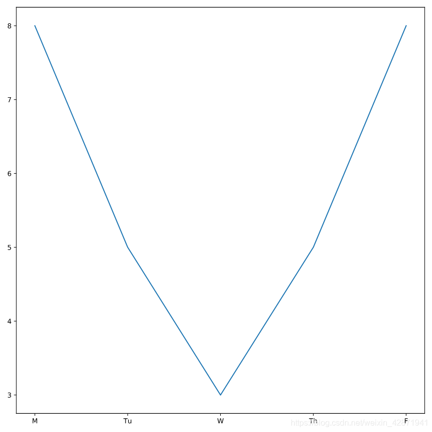
</> Working hard
From matplotlib, import the module pyplot under the alias plt
from matplotlib import pyplot as plt
Plot Officer Deshaun’s hours worked using the columns day_of_week and hours_worked from deshaun.
plt.plot(deshaun.day_of_week, deshaun.hours_worked)
Display the plot.
plt.show()
</> Or hardly working?
Plot Officer Aditya’s time worked with day_of_week on the x-axis and hours_worked on the y-axis.
Plot Officer Mengfei’s time worked with day_of_week on the x-axis and hours_worked on the y-axis.
plt.plot(deshaun.day_of_week, deshaun.hours_worked)
plt.plot(aditya.day_of_week, aditya.hours_worked)
plt.plot(mengfei.day_of_week, mengfei.hours_worked)
# Display all three line plots
plt.show()
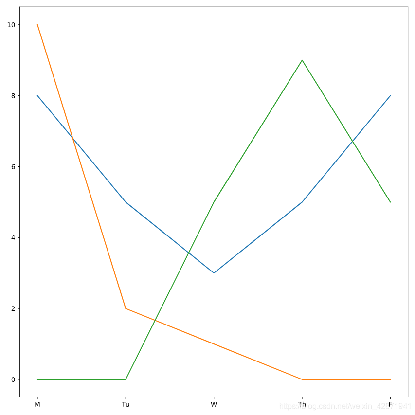
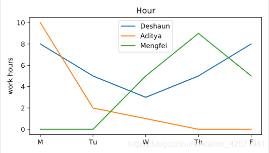
One of the officers was removed from the investigation on Wednesday because of an emergency at a different station house. That office did not return on Thursday or Friday. Which color line represents that officer?
- blue
- green
- orange
</> Adding a legend
Using the keyword label, label Deshaun’s plot as “Deshaun”.
plt.plot(deshaun.day_of_week, deshaun.hours_worked, label='Deshaun')
Add labels to Mengfei’s (“Mengfei”) and Aditya’s (“Aditya”) plots.
plt.plot(aditya.day_of_week, aditya.hours_worked, label='Aditya')
plt.plot(mengfei.day_of_week, mengfei.hours_worked, label='Mengfei')
Nothing is displaying yet! Add a command to make the legend display.
plt.legend()
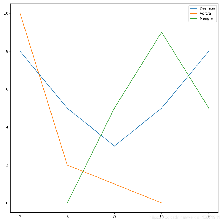
One of the officers did not start working on the case until Wednesday. Which officer?
- Deshaun
- Aditya
- Mengfei
</> Adding labels
Add a descriptive title to the chart.
Add a label for the y-axis.
plt.plot(deshaun.day_of_week, deshaun.hours_worked, label='Deshaun')
plt.plot(aditya.day_of_week, aditya.hours_worked, label='Aditya')
plt.plot(mengfei.day_of_week, mengfei.hours_worked, label='Mengfei')

plt.title('Hour')
plt.ylabel('work hours')
plt.legend()
plt.show()
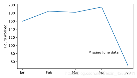
</> Adding floating text
Place the annotation “Missing June data” at the point (2.5, 80)
plt.plot(six_months.month, six_months.hours_worked)
plt.text(2.5, 80, "Missing June data")
plt.show()
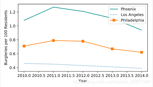
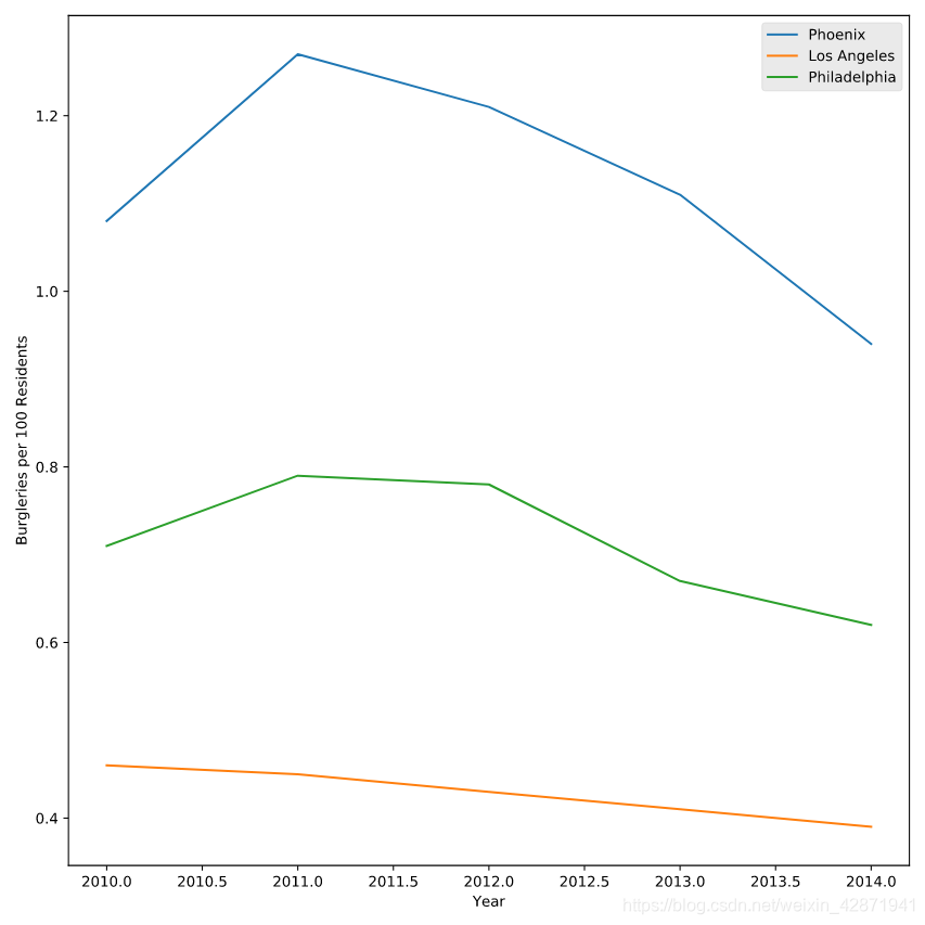
</> Tracking crime statistics
Change the color of Phoenix to “DarkCyan”.
Make the Los Angeles line dotted.
Add square markers to Philadelphia.
plt.plot(data["Year"], data["Phoenix Police Dept"], label="Phoenix", color = 'DarkCyan')
# Make the Los Angeles line dotted
plt.plot(data["Year"], data["Los Angeles Police Dept"], label="Los Angeles", linestyle = ':')
# Add square markers to Philedelphia
plt.plot(data["Year"], data["Philadelphia Police Dept"], label="Philadelphia", marker = 's')
plt.legend()
plt.show()
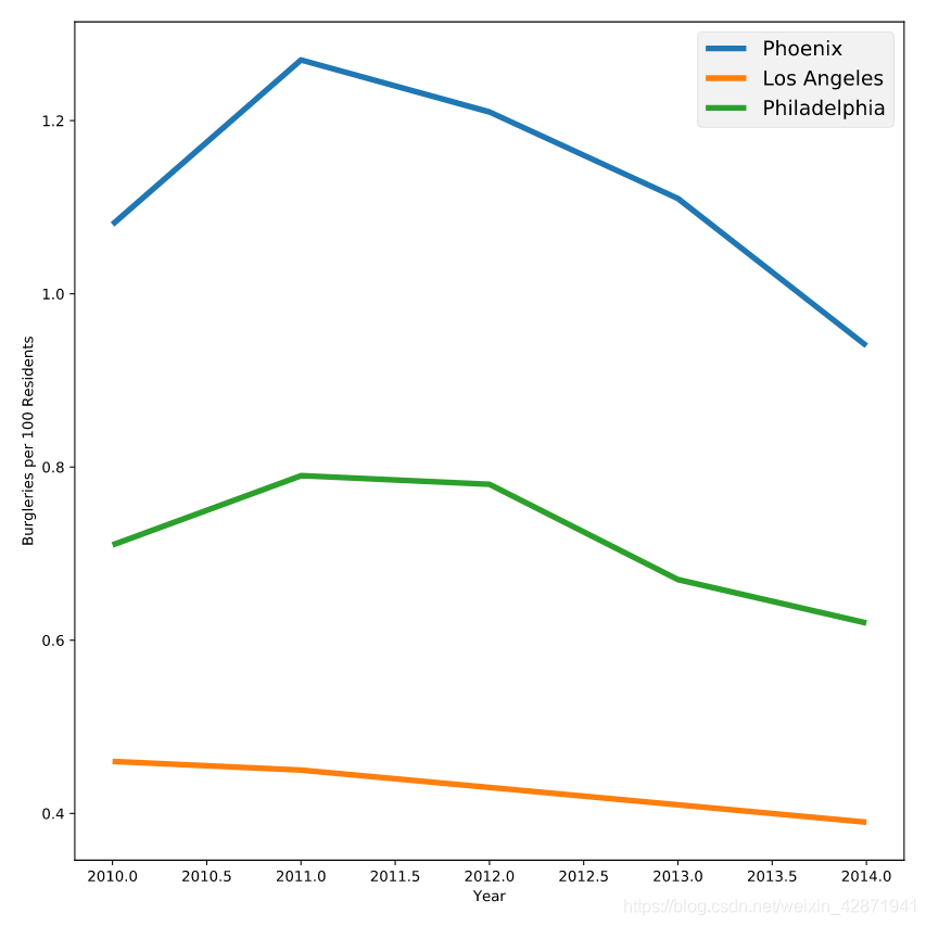
</> Playing with styles
Change the plotting style to “fivethirtyeight”.
# Change the style to fivethirtyeight
plt.style.use('fivethirtyeight')
plt.plot(data["Year"], data["Phoenix Police Dept"], label="Phoenix")
plt.plot(data["Year"], data["Los Angeles Police Dept"], label="Los Angeles")
plt.plot(data["Year"], data["Philadelphia Police Dept"], label="Philadelphia")
plt.legend()
plt.show()
Change the plotting style to “ggplot”.
plt.style.use('ggplot')
plt.plot(data["Year"], data["Phoenix Police Dept"], label="Phoenix")
plt.plot(data["Year"], data["Los Angeles Police Dept"], label="Los Angeles")
plt.plot(data["Year"], data["Philadelphia Police Dept"], label="Philadelphia")
plt.legend()
plt.show()
View all styles by typing print(plt.style.available) in the console
Pick one of those styles and see what it looks like
print(plt.style.available)

<script.py> output:
    ['seaborn-deep', 'fivethirtyeight', 'Solarize_Light2', 'seaborn-bright', 'classic', 'seaborn-colorblind', 'seaborn-paper', 'seaborn-dark-palette', 'fast', 'tableau-colorblind10', 'seaborn', 'seaborn-muted', 'seaborn-ticks', 'grayscale', 'seaborn-pastel', 'seaborn-whitegrid', 'seaborn-darkgrid', 'seaborn-poster', '_classic_test', 'bmh', 'ggplot', 'seaborn-dark', 'seaborn-notebook', 'dark_background', 'seaborn-talk', 'seaborn-white']
plt.style.use('seaborn-colorblind')
plt.plot(data["Year"], data["Phoenix Police Dept"], label="Phoenix")
plt.plot(data["Year"], data["Los Angeles Police Dept"], label="Los Angeles")
plt.plot(data["Year"], data["Philadelphia Police Dept"], label="Philadelphia")
plt.legend()
plt.show()

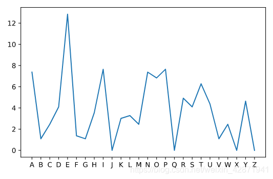
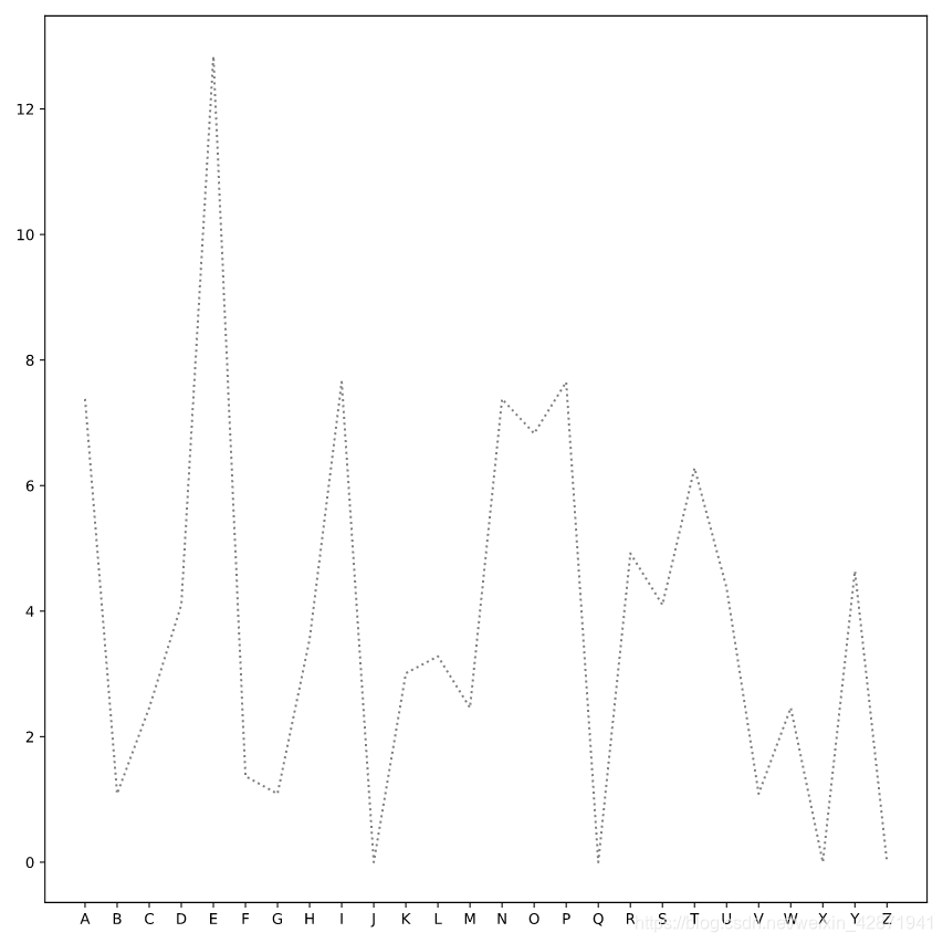
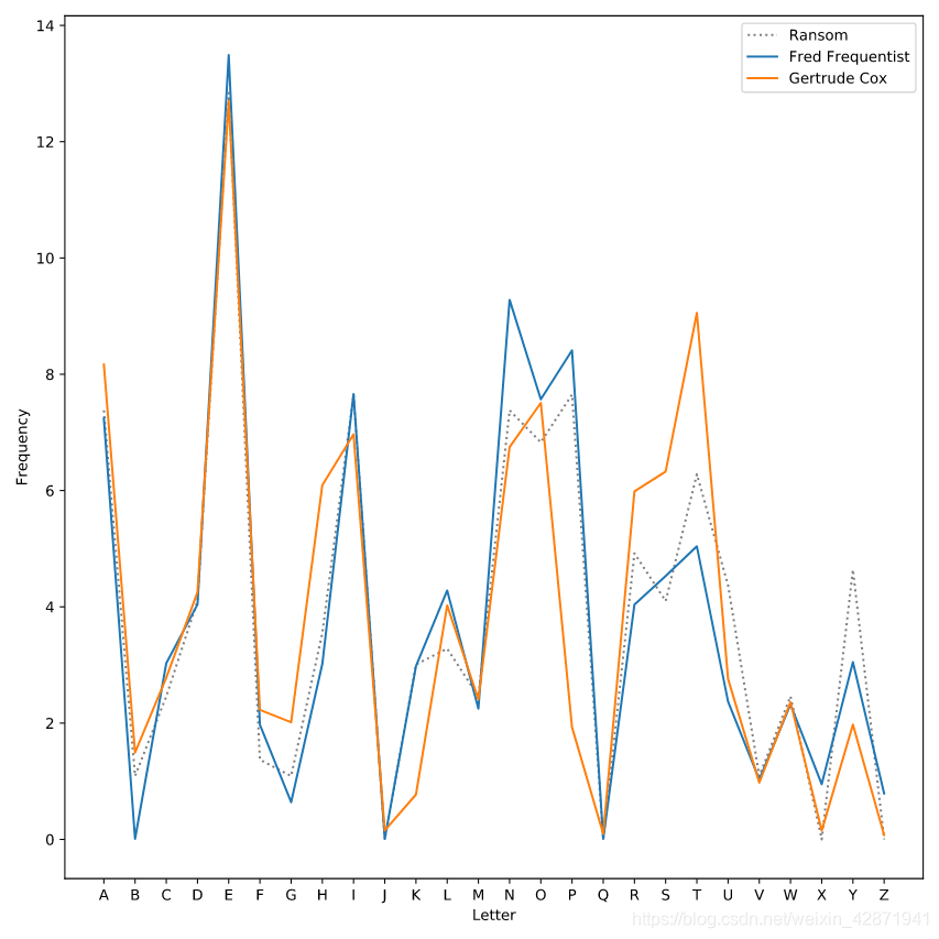
</> Identifying Bayes’ kidnapper
Plot the letter frequencies from the ransom note. The x-values should be ransom.letter. The y-values should be ransom.frequency. The label should be the string ‘Ransom’. The line should be dotted and gray.
plt.plot(ransom.letter, ransom.frequency,
         label="Ransom",
         linestyle=':', color='gray')
plt.show()
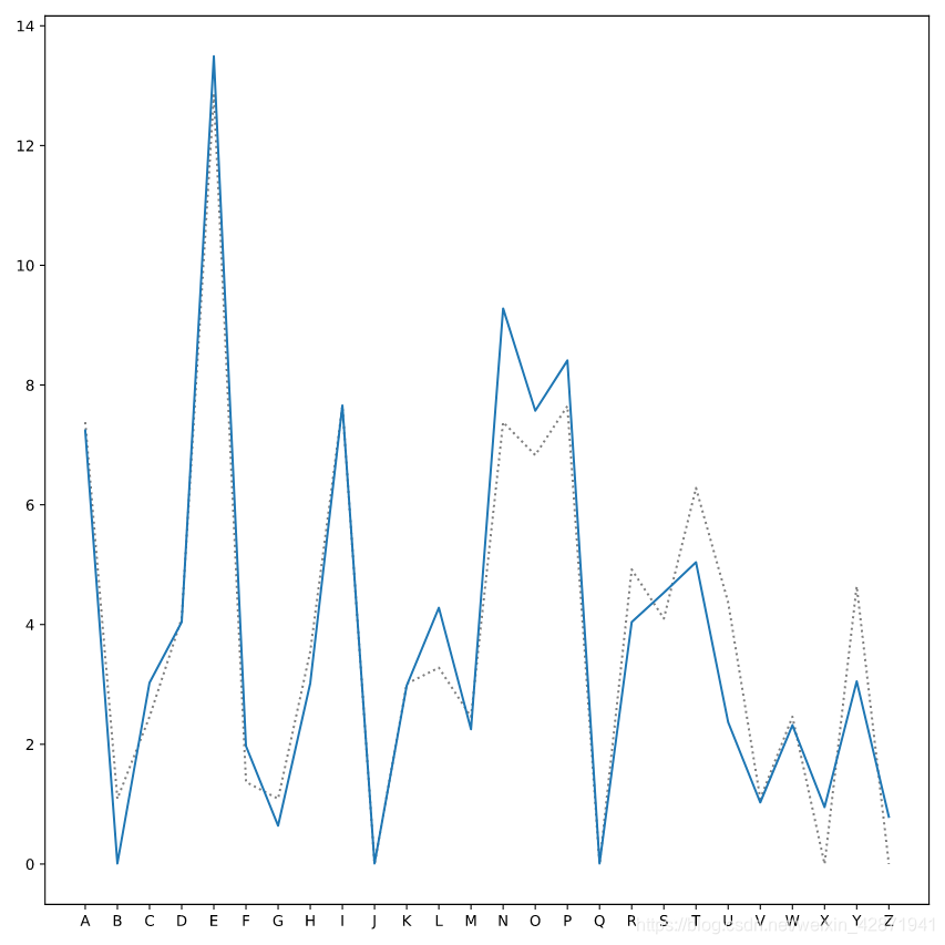
Plot a line for the data in suspect1. Use a keyword argument to label that line ‘Fred Frequentist’).
plt.plot(ransom.letter, ransom.frequency,
         label='Ransom', linestyle=':', color='gray')
# X-values should be suspect1.letter
# Y-values should be suspect1.frequency
# Label should be "Fred Frequentist"
plt.plot(suspect1.letter, suspect1.frequency, label='Fred Frequentist')
plt.show()
Plot a line for the data in suspect2 (labeled ‘Gertrude Cox’).
plt.plot(ransom.letter, ransom.frequency,
         label='Ransom', linestyle=':', color='gray')
plt.plot(suspect1.letter, suspect1.frequency,
         label='Fred Frequentist')
# X-values should be suspect2.letter
# Y-values should be suspect2.frequency
# Label should be "Gertrude Cox"
plt.plot(suspect2.letter, suspect2.frequency, label='Gertrude Cox')
plt.show()
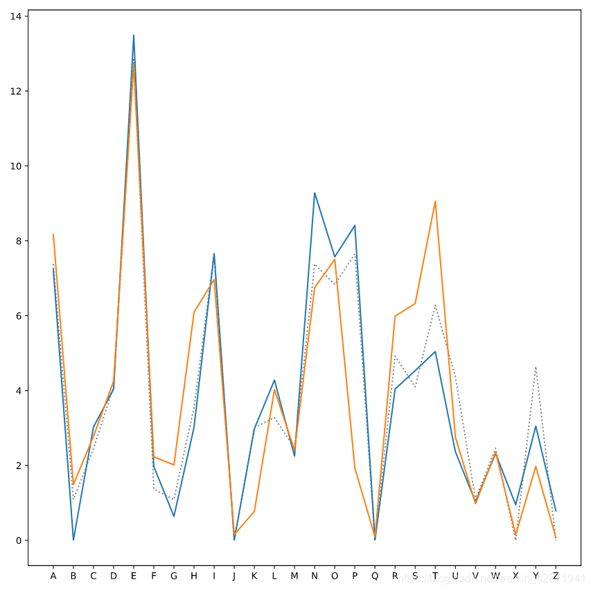
Label the x-axis (Letter) and the y-axis (Frequency), and add a legend.
plt.plot(ransom.letter, ransom.frequency,
         label='Ransom', linestyle=':', color='gray')
plt.plot(suspect1.letter, suspect1.frequency, label='Fred Frequentist')
plt.plot(suspect2.letter, suspect2.frequency, label='Gertrude Cox')
plt.xlabel("Letter")
plt.ylabel("Frequency")
plt.legend()
plt.show()
4. Different Types of Plots
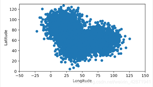
</> Charting cellphone data
Display the first five rows of the DataFrame and determine which columns to plot
Create a scatter plot of the data in cellphone.
# Explore the data
print(cellphone.head())
# Create a scatter plot of the data from the DataFrame cellphone
plt.scatter(cellphone.x, cellphone.y)
plt.ylabel('Latitude')
plt.xlabel('Longitude')
plt.show()

   Unnamed: 0          x          y
0           0  28.136519  39.358650
1           1  44.642131  58.214270
2           2  34.921629  42.039109
3           3  31.034296  38.283153
4           4  36.419871  65.971441
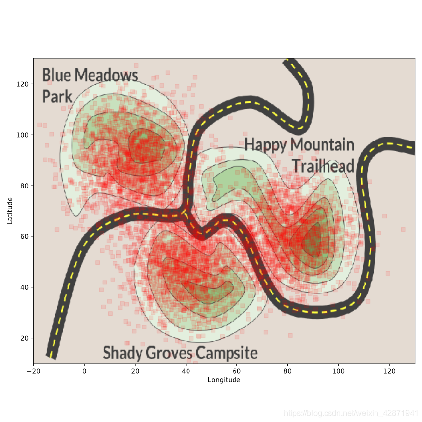
</> Modifying a scatterplot
Change the color of the points to ‘red’.
plt.scatter(cellphone.x, cellphone.y,
           color='red')
plt.ylabel('Latitude')
plt.xlabel('Longitude')
plt.show()
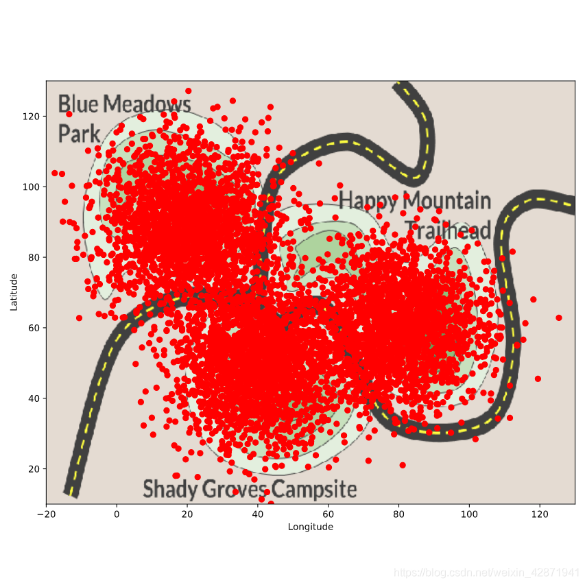
Change the marker shape to square.
# Change the marker shape to square
plt.scatter(cellphone.x, cellphone.y,
           color='red',
           marker='s')
plt.ylabel('Latitude')
plt.xlabel('Longitude')
plt.show()

Change the transparency of the scatterplot to 0.1.
plt.scatter(cellphone.x, cellphone.y,
           color='red',
           marker='s',
           alpha=0.1)
plt.ylabel('Latitude')
plt.xlabel('Longitude')
plt.show()
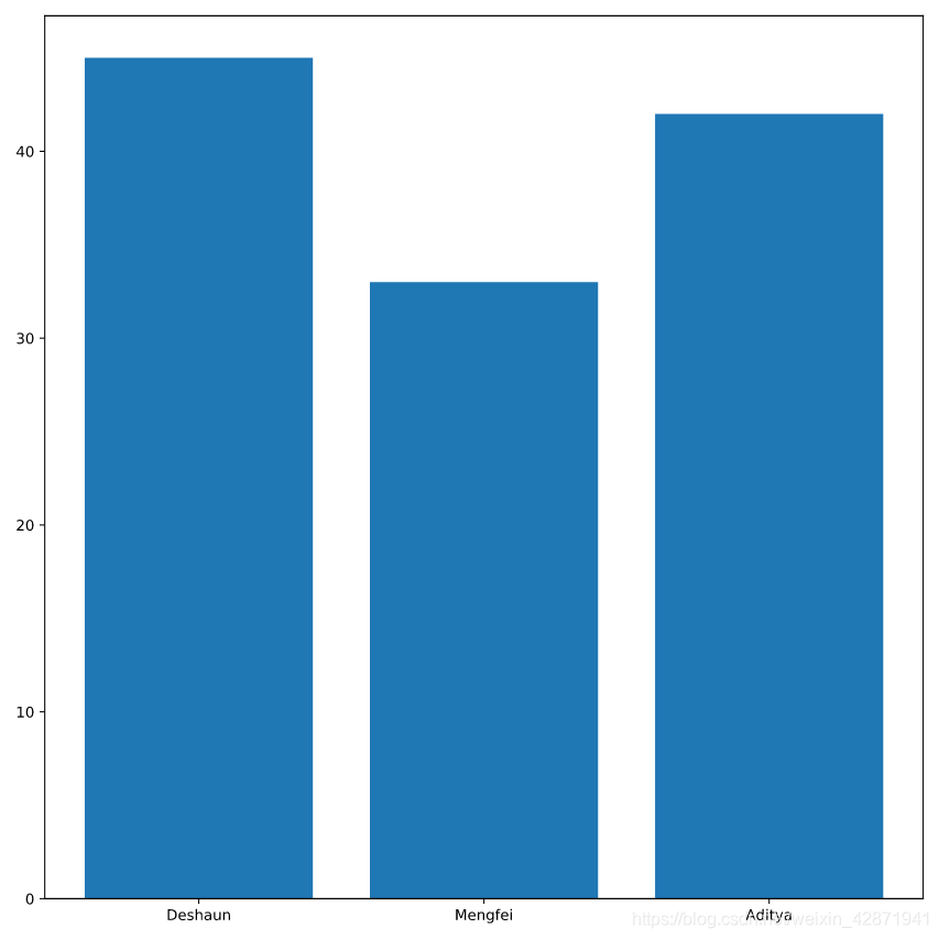
</> Build a simple bar chart
Display the DataFrame hours using a print command.
print(hours)

<script.py> output:
       officer  avg_hours_worked  std_hours_worked
    0  Deshaun                45                 3
    1  Mengfei                33                 9
    2   Aditya                42                 5
Create a bar chart of the column avg_hours_worked for each officer from the DataFrame hours.
plt.bar(hours.officer, hours.avg_hours_worked)
plt.show()
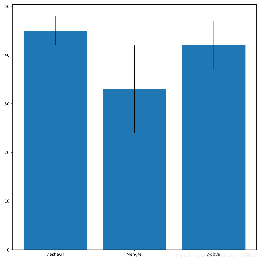
Use the column std_hours_worked (the standard deviation of the hours worked) to add error bars to the bar chart.
plt.bar(hours.officer, hours.avg_hours_worked,
        # Add error bars
        yerr=hours.std_hours_worked)
plt.show()
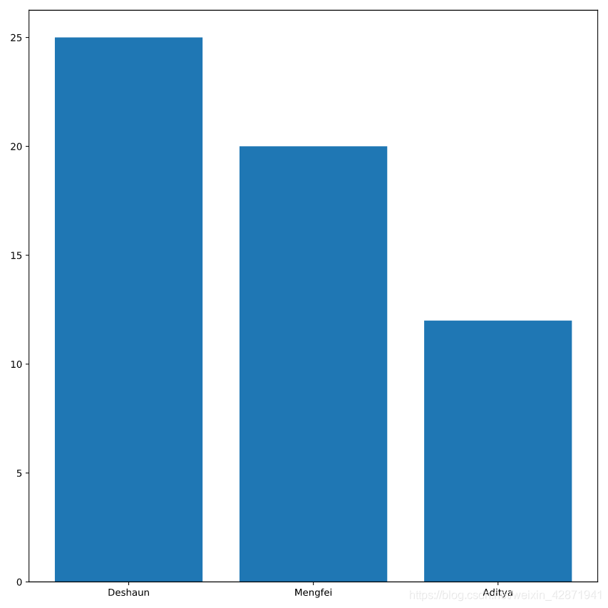
</> Where did the time go?
Create a bar plot of the time each officer spends on desk_work.
Label that bar plot “Desk Work”.
plt.bar(hours.officer, hours.desk_work, label="Desk Work")
plt.show()
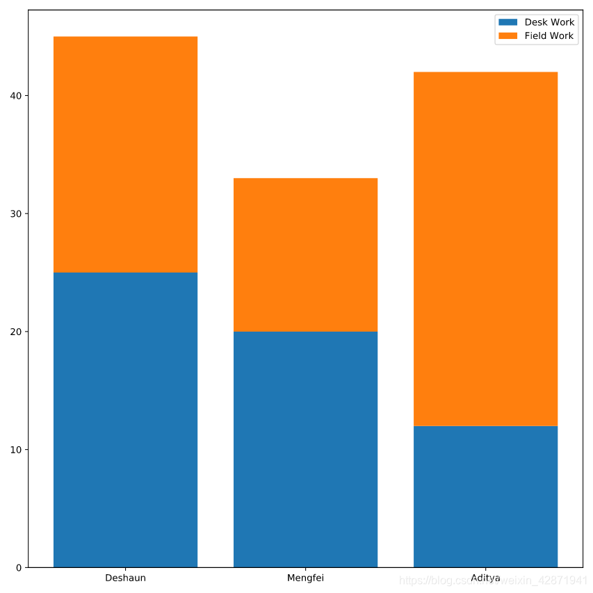
Create a bar plot for field_work whose bottom is the height of desk_work.
Label the field_work bars as “Field Work” and add a legend.
plt.bar(hours.officer, hours.desk_work, label='Desk Work')
plt.bar(hours.officer, hours.field_work, bottom=hours.desk_work, label='Field Work')
plt.legend()
plt.show()
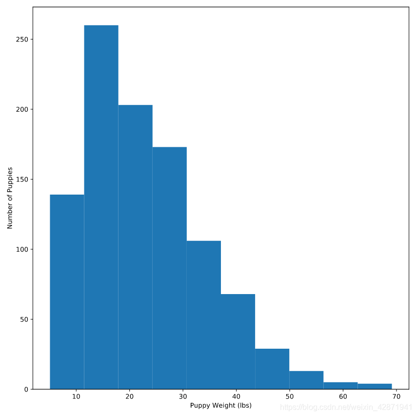
</> Modifying histograms
Create a histogram of the column weight from the DataFrame puppies.
plt.hist(puppies.weight)
plt.xlabel('Puppy Weight (lbs)')
plt.ylabel('Number of Puppies')
plt.show()
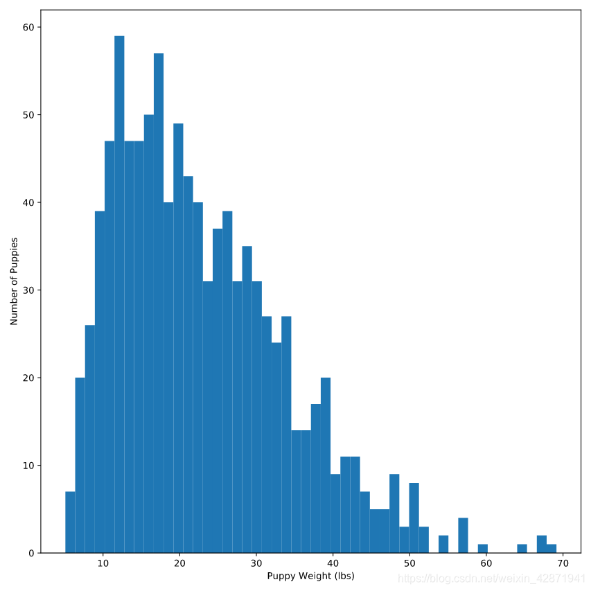
Change the number of bins to 50.
plt.hist(puppies.weight,
        bins=50)
plt.xlabel('Puppy Weight (lbs)')
plt.ylabel('Number of Puppies')
plt.show()
Change the range to start at 5 and end at 35.
plt.hist(puppies.weight,
        range=(5, 35))
plt.xlabel('Puppy Weight (lbs)')
plt.ylabel('Number of Puppies')
plt.show()

</> Heroes with histograms
Create a histogram of gravel.radius.
plt.hist(gravel.radius)
plt.show()

Modify the histogram such that the histogram is divided into 40 bins and the range is from 2 to 8.
plt.hist(gravel.radius, range=(2, 8), bins=40)
plt.show()

Normalize your histogram so that the sum of the bins adds to 1.
plt.hist(gravel.radius,
         bins=40,
         range=(2, 8),
         density=True)
plt.show()

Label the x-axis (Gravel Radius (mm)), the y-axis (Frequency), and the title(Sample from Shoeprint).
plt.hist(gravel.radius,
         bins=40,
         range=(2, 8),
         density=True)
plt.xlabel('Gravel Radius (mm)')
plt.ylabel('Frequency')
plt.title('Sample from Shoeprint')
plt.show()

