本人是一名普普通通的大一学生,上学期的时候学了一段时间HTML,最近看网上有很多送给好朋友生日礼物的程序,便自己引用了一点模板,修改整合做出来一套网页,第一次写博客,写的不是很好,还请各位大佬多多包涵
本人相似作品链接:七夕节的浪漫WEB礼物(修改一下也可以作生日礼物): https://blog.csdn.net/weixin_43341045/article/details/98533156
情人节的浪漫WEB礼物(修改一下也可以作生日礼物)https://blog.csdn.net/weixin_43341045/article/details/104291776
B站上有本作品详细的作品展示效果,本人B站详情请见: https://www.bilibili.com/video/av46100540

更多有趣的HTML礼物详情请看我的B站合集https://www.bilibili.com/video/av84894004
大学生代码学习群交流:871352155(不过还请各位认真填写加群信息)
需要代码的朋友CSDN上面私聊我或者在B站上私聊我(最好是B站,因为很少打开CSDN)
B站关注加三连亦可获得其中一页全代码。蛋糕下载地址https://download.csdn.net/download/weixin_43341045/12243525
前情提要:三个页面都有背景音乐,使用的是audio,为了整个页面的美观是隐藏起来了,每个页面之间都设置了延迟1.5s的跳转(方便展示按钮点击特效)
第一页:登录界面
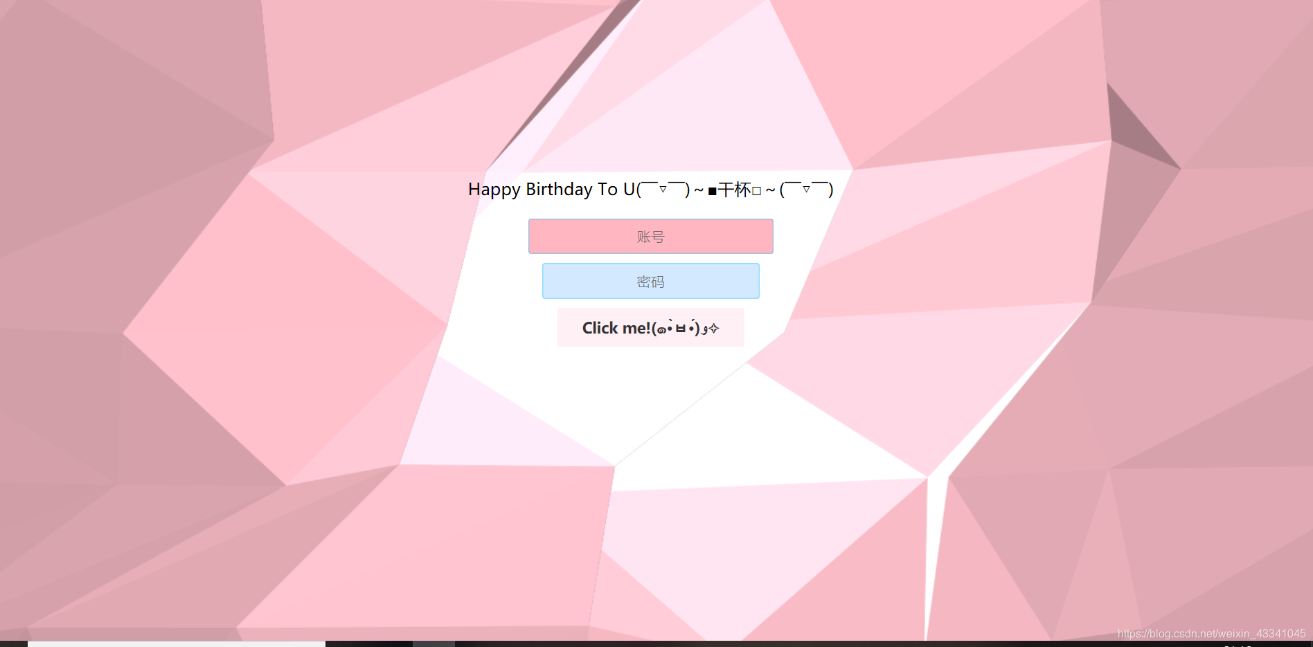
第一页大部分东西都是可以修改的,Eg:密码,账号,和那个登录按钮,本页面是个动态的页面。
<!DOCTYPE html>
<html lang="en">
<meta charset="utf-8">
<head>
<meta name="viewport" content="width=device-width, initial-scale=1.0, maximum-scale=1.0, user-scalable=no" />
<meta http-equiv="content-type" content="text/html;charset=utf-8">
<meta http-equiv="X-UA-Compatible" content="IE=edge,chrome=1">
<title>生日快乐</title>

<link rel="stylesheet" type="text/css" href="Happybirthday/css/style.css">

<script type="text/javascript" src="Happybirthday/js/jquery.min.js"></script>
<script type="text/javascript" src="Happybirthday/js/vector.js"></script>
<script >
	function myfunction()

	{

	var x=document.getElementById("entry_name").value;
	var y=document.getElementById("entry_password").value;
	if(x==""||y=="")
		{alert("You won't forget your name, will you? (~ ̄(OO) ̄)ブ")}
	else  if (x=="ABC"&& y=="123")
		{window.location.href="SecondLucky/LuckyEvertime.html";}
	else {alert("You won't forget your name, will you? (≧∇≦)ノ");}}
		</script>


</head>
<body>
	<audio autoplay="autoplay" loop="loop" preload="auto"

            	src="Happybirthday/弹奏微风.mp3"></audio>

<div id="container">
	<div id="output">
		<div class="containerT">
			<h1>Happy Birthday To U( ̄▽ ̄)~■干杯□~( ̄▽ ̄)</h1>
			<form class="form" id="entry_form">
				<input type="text" placeholder="账号" id="entry_name" >
				<input type="password" placeholder="密码" id="entry_password">


					<button type="button" id="entry_btn" type="button" οnclick="myfunction()">Click me!(๑•̀ㅂ•́)و✧</button>

				<div id="prompt" class="prompt"></div>
			</form>
		</div>
	</div>
</div>


</body>
</html>
第一页css部分
*{margin:0;padding:0;font-size:13px;font-family:microsoft yahei}
html,body{width:100%;height:100%;background:#fff}

#container{width:100%;height:100%;position:fixed;top:0;left:0;z-index:999}
#output{width:100%;height:100%}
.prompt{width:60%;height:30px;margin:5px auto;text-align:center;line-height:30px;font-family:microsoft yahei,Arial,sans-serif;font-size:13px;color:#df0000}
.containerT{width:400px;height:300px;text-align:center;position:absolute;top:50%;left:50%;margin:-150px 0 0 -200px;border-radius:3px}
.containerT h1{font-size:18px;font-family:microsoft yahei,Arial,sans-serif;-webkit-transition-duration:1s;transition-duration:1s;-webkit-transition-timing-function:ease-in-put;transition-timing-function:ease-in-put;font-weight:500}
form{padding:20px 0;position:relative;z-index:2}
form input{-webkit-appearance:none;-moz-appearance:none;appearance:none;outline:0;border:1px solid rgba(0,191,255,.4);background-color:rgba(
30,144,255,.2);width:200px;border-radius:3px;padding:8px 15px;margin:0 auto 10px;display:block;text-align:center;font-size:15px;color:#fff;-webkit-transition-duration:.25s;transition-duration:.25s;font-weight:300}
form input:hover{background-color:rgba(0,191,255,.4)}
form input:focus{background-color:
#FFB6C1;width:230px;color:#333}
form button{-webkit-appearance:none;-moz-appearance:none;appearance:none;outline:0;background-color:
#FFF0F5;border:0;padding:10px 15px;color:#333;border-radius:3px;width:200px;cursor:pointer;font-family:microsoft yahei,Arial,sans-serif;font-size:16px;font-weight:700;-webkit-transition-duration:.25s;transition-duration:.25s}
form button:hover{background-color:#DB7093}
第一页JavaScript
CAV={FRONT:0,BACK:1,DOUBLE:2,SVGNS:"http://www.w3.org/2000/svg"};CAV.Array=typeof Float32Array==="function"?Float32Array:Array;CAV.Utils={isNumber:function(a){return!isNaN(parseFloat(a))&&isFinite(a)}};(function(){for(var a=0,b=["ms","moz","webkit","o"],c=0;c<b.length&&!window.requestAnimationFrame;++c)window.requestAnimationFrame=window[b[c]+"RequestAnimationFrame"],window.cancelAnimationFrame=window[b[c]+"CancelAnimationFrame"]||window[b[c]+"CancelRequestAnimationFrame"];if(!window.requestAnimationFrame)window.requestAnimationFrame=function(b){var c=(new Date).getTime(),f=Math.max(0,16-(c-a)),g=window.setTimeout(function(){b(c+f)},f);a=c+f;return g};if(!window.cancelAnimationFrame)window.cancelAnimationFrame=function(a){clearTimeout(a)}})();Math.PIM2=Math.PI*2;Math.PID2=Math.PI/2;Math.randomInRange=function(a,b){return a+(b-a)*Math.random()};Math.clamp=function(a,b,c){a=Math.max(a,b);return a=Math.min(a,c)};CAV.Vector3={create:function(a,b,c){var d=new CAV.Array(3);this.set(d,a,b,c);return d},clone:function(a){var b=this.create();this.copy(b,a);return b},set:function(a,b,c,d){a[0]=b||0;a[1]=c||0;a[2]=d||0;return this},setX:function(a,b){a[0]=b||0;return this},setY:function(a,b){a[1]=b||0;return this},setZ:function(a,b){a[2]=b||0;return this},copy:function(a,b){a[0]=b[0];a[1]=b[1];a[2]=b[2];return this},add:function(a,b){a[0]+=b[0];a[1]+=b[1];a[2]+=b[2];return this},addVectors:function(a,b,c){a[0]=b[0]+
c[0];a[1]=b[1]+c[1];a[2]=b[2]+c[2];return this},addScalar:function(a,b){a[0]+=b;a[1]+=b;a[2]+=b;return this},subtract:function(a,b){a[0]-=b[0];a[1]-=b[1];a[2]-=b[2];return this},subtractVectors:function(a,b,c){a[0]=b[0]-c[0];a[1]=b[1]-c[1];a[2]=b[2]-c[2];return this},subtractScalar:function(a,b){a[0]-=b;a[1]-=b;a[2]-=b;return this},multiply:function(a,b){a[0]*=b[0];a[1]*=b[1];a[2]*=b[2];return this},multiplyVectors:function(a,b,c){a[0]=b[0]*c[0];a[1]=b[1]*c[1];a[2]=b[2]*c[2];return this},multiplyScalar:function(a,b){a[0]*=b;a[1]*=b;a[2]*=b;return this},divide:function(a,b){a[0]/=b[0];a[1]/=b[1];a[2]/=b[2];return this},divideVectors:function(a,b,c){a[0]=b[0]/c[0];a[1]=b[1]/c[1];a[2]=b[2]/c[2];return this},divideScalar:function(a,b){b!==0?(a[0]/=b,a[1]/=b,a[2]/=b):(a[0]=0,a[1]=0,a[2]=0);return this},cross:function(a,b){var c=a[0],d=a[1],e=a[2];a[0]=d*b[2]-e*b[1];a[1]=e*b[0]-c*b[2];a[2]=c*b[1]-d*b[0];return this},crossVectors:function(a,b,c){a[0]=b[1]*c[2]-b[2]*c[1];a[1]=b[2]*c[0]-b[0]*c[2];a[2]=b[0]*c[1]-b[1]*c[0];return this},min:function(a,b){a[0]<b&&(a[0]=b);a[1]<b&&(a[1]=b);a[2]<b&&(a[2]=b);return this},max:function(a,b){a[0]>b&&(a[0]=b);a[1]>b&&(a[1]=b);a[2]>b&&(a[2]=b);return this},clamp:function(a,b,c){this.min(a,b);this.max(a,c);return this},limit:function(a,b,c){var d=this.length(a);b!==null&&d<b?this.setLength(a,b):c!==null&&d>c&&this.setLength(a,c);return this},dot:function(a,b){return a[0]*b[0]+a[1]*b[1]+a[2]*b[2]},normalise:function(a){return this.divideScalar(a,this.length(a))},negate:function(a){return this.multiplyScalar(a,-1)},distanceSquared:function(a,b){var c=a[0]-b[0],d=a[1]-b[1],e=a[2]-b[2];return c*c+d*d+e*e},distance:function(a,b){return Math.sqrt(this.distanceSquared(a,b))},lengthSquared:function(a){return a[0]*a[0]+a[1]*a[1]+a[2]*a[2]},length:function(a){return Math.sqrt(this.lengthSquared(a))},setLength:function(a,b){var c=this.length(a);c!==0&&b!==c&&this.multiplyScalar(a,b/c);return this}};CAV.Vector4={create:function(a,b,c){var d=new CAV.Array(4);this.set(d,a,b,c);return d},set:function(a,b,c,d,e){a[0]=b||0;a[1]=c||0;a[2]=d||0;a[3]=e||0;return this},setX:function(a,b){a[0]=b||0;return this},setY:function(a,b){a[1]=b||0;return this},setZ:function(a,b){a[2]=b||0;return this},setW:function(a,b){a[3]=b||0;return this},add:function(a,b){a[0]+=b[0];a[1]+=b[1];a[2]+=b[2];a[3]+=b[3];return this},multiplyVectors:function(a,b,c){a[0]=b[0]*c[0];a[1]=b[1]*c[1];a[2]=b[2]*c[2];a[3]=b[3]*c[3];return this},multiplyScalar:function(a,b){a[0]*=b;a[1]*=b;a[2]*=b;a[3]*=b;return this},min:function(a,b){a[0]<b&&(a[0]=b);a[1]<b&&(a[1]=b);a[2]<b&&(a[2]=b);a[3]<b&&(a[3]=b);return this},max:function(a,b){a[0]>b&&(a[0]=b);a[1]>b&&(a[1]=b);a[2]>b&&(a[2]=b);a[3]>b&&(a[3]=b);return this},clamp:function(a,b,c){this.min(a,b);this.max(a,c);return this}};CAV.Color=function(a,b){this.rgba=CAV.Vector4.create();this.hex=a||"#000000";this.opacity=CAV.Utils.isNumber(b)?b:1;this.set(this.hex,this.opacity)};CAV.Color.prototype={set:function(a,b){var a=a.replace("#",""),c=a.length/3;this.rgba[0]=parseInt(a.substring(c*0,c*1),16)/255;this.rgba[1]=parseInt(a.substring(c*1,c*2),16)/255;this.rgba[2]=parseInt(a.substring(c*2,c*3),16)/255;this.rgba[3]=CAV.Utils.isNumber(b)?b:this.rgba[3];return this},hexify:function(a){a=Math.ceil(a*255).toString(16);a.length===1&&(a="0"+a);return a},format:function(){var a=this.hexify(this.rgba[0]),b=this.hexify(this.rgba[1]),c=this.hexify(this.rgba[2]);return this.hex="#"+
a+b+c}};CAV.Object=function(){this.position=CAV.Vector3.create()};CAV.Object.prototype={setPosition:function(a,b,c){CAV.Vector3.set(this.position,a,b,c);return this}};CAV.Light=function(a,b){CAV.Object.call(this);this.ambient=new CAV.Color(a||"#FFFFFF");this.diffuse=new CAV.Color(b||"#FFFFFF");this.ray=CAV.Vector3.create()};CAV.Light.prototype=Object.create(CAV.Object.prototype);CAV.Vertex=function(a,b,c){this.position=CAV.Vector3.create(a,b,c)};CAV.Vertex.prototype={setPosition:function(a,b,c){CAV.Vector3.set(this.position,a,b,c);return this}};CAV.Triangle=function(a,b,c){this.a=a||new CAV.Vertex;this.b=b||new CAV.Vertex;this.c=c||new CAV.Vertex;this.vertices=[this.a,this.b,this.c];this.u=CAV.Vector3.create();this.v=CAV.Vector3.create();this.centroid=CAV.Vector3.create();this.normal=CAV.Vector3.create();this.color=new CAV.Color;this.polygon=document.createElementNS(CAV.SVGNS,"polygon");this.polygon.setAttributeNS(null,"stroke-linejoin","round");this.polygon.setAttributeNS(null,"stroke-miterlimit","1");this.polygon.setAttributeNS(null,"stroke-width","1");this.computeCentroid();this.computeNormal()};CAV.Triangle.prototype={computeCentroid:function(){this.centroid[0]=this.a.position[0]+this.b.position[0]+this.c.position[0];this.centroid[1]=this.a.position[1]+this.b.position[1]+this.c.position[1];this.centroid[2]=this.a.position[2]+this.b.position[2]+this.c.position[2];CAV.Vector3.divideScalar(this.centroid,3);return this},computeNormal:function(){CAV.Vector3.subtractVectors(this.u,this.b.position,this.a.position);CAV.Vector3.subtractVectors(this.v,this.c.position,this.a.position);CAV.Vector3.crossVectors(this.normal,this.u,this.v);CAV.Vector3.normalise(this.normal);return this}};CAV.Geometry=function(){this.vertices=[];this.triangles=[];this.dirty=false};CAV.Geometry.prototype={update:function(){if(this.dirty){var a,b;for(a=this.triangles.length-1;a>=0;a--)b=this.triangles[a],b.computeCentroid(),b.computeNormal();this.dirty=false}return this}};CAV.Plane=function(a,b,c,d){CAV.Geometry.call(this);this.width=a||100;this.height=b||100;this.segments=c||4;this.slices=d||4;this.segmentWidth=this.width/this.segments;this.sliceHeight=this.height/this.slices;var e,f,g,c=[];e=this.width*-0.5;f=this.height*0.5;for(a=0;a<=this.segments;a++){c.push([]);for(b=0;b<=this.slices;b++)d=new CAV.Vertex(e+a*this.segmentWidth,f-b*this.sliceHeight),c[a].push(d),this.vertices.push(d)}for(a=0;a<this.segments;a++)for(b=0;b<this.slices;b++)d=c[a+0][b+0],e=c[a+0][b+
1],f=c[a+1][b+0],g=c[a+1][b+1],t0=new CAV.Triangle(d,e,f),t1=new CAV.Triangle(f,e,g),this.triangles.push(t0,t1)};CAV.Plane.prototype=Object.create(CAV.Geometry.prototype);CAV.Material=function(a,b){this.ambient=new CAV.Color(a||"#444444");this.diffuse=new CAV.Color(b||"#FFFFFF");this.slave=new CAV.Color};CAV.Mesh=function(a,b){CAV.Object.call(this);this.geometry=a||new CAV.Geometry;this.material=b||new CAV.Material;this.side=CAV.FRONT;this.visible=true};CAV.Mesh.prototype=Object.create(CAV.Object.prototype);CAV.Mesh.prototype.update=function(a,b){var c,d,e,f,g;this.geometry.update();if(b)for(c=this.geometry.triangles.length-1;c>=0;c--){d=this.geometry.triangles[c];CAV.Vector4.set(d.color.rgba);for(e=a.length-1;e>=0;e--)f=a[e],CAV.Vector3.subtractVectors(f.ray,f.position,d.centroid),CAV.Vector3.normalise(f.ray),g=CAV.Vector3.dot(d.normal,f.ray),this.side===CAV.FRONT?g=Math.max(g,0):this.side===CAV.BACK?g=Math.abs(Math.min(g,0)):this.side===CAV.DOUBLE&&(g=Math.max(Math.abs(g),0)),CAV.Vector4.multiplyVectors(this.material.slave.rgba,this.material.ambient.rgba,f.ambient.rgba),CAV.Vector4.add(d.color.rgba,this.material.slave.rgba),CAV.Vector4.multiplyVectors(this.material.slave.rgba,this.material.diffuse.rgba,f.diffuse.rgba),CAV.Vector4.multiplyScalar(this.material.slave.rgba,g),CAV.Vector4.add(d.color.rgba,this.material.slave.rgba);CAV.Vector4.clamp(d.color.rgba,0,1)}return this};CAV.Scene=function(){this.meshes=[];this.lights=[]};CAV.Scene.prototype={add:function(a){a instanceof CAV.Mesh&&!~this.meshes.indexOf(a)?this.meshes.push(a):a instanceof CAV.Light&&!~this.lights.indexOf(a)&&this.lights.push(a);return this},remove:function(a){a instanceof CAV.Mesh&&~this.meshes.indexOf(a)?this.meshes.splice(this.meshes.indexOf(a),1):a instanceof CAV.Light&&~this.lights.indexOf(a)&&this.lights.splice(this.lights.indexOf(a),1);return this}};CAV.Renderer=function(){this.halfHeight=this.halfWidth=this.height=this.width=0};CAV.Renderer.prototype={setSize:function(a,b){if(!(this.width===a&&this.height===b))return this.width=a,this.height=b,this.halfWidth=this.width*0.5,this.halfHeight=this.height*0.5,this},clear:function(){return this},render:function(){return this}};CAV.CanvasRenderer=function(){CAV.Renderer.call(this);this.element=document.createElement("canvas");this.element.style.display="block";this.context=this.element.getContext("2d");this.setSize(this.element.width,this.element.height)};CAV.CanvasRenderer.prototype=Object.create(CAV.Renderer.prototype);CAV.CanvasRenderer.prototype.setSize=function(a,b){CAV.Renderer.prototype.setSize.call(this,a,b);this.element.width=a;this.element.height=b;this.context.setTransform(1,0,0,-1,this.halfWidth,this.halfHeight);return this};CAV.CanvasRenderer.prototype.clear=function(){CAV.Renderer.prototype.clear.call(this);this.context.clearRect(-this.halfWidth,-this.halfHeight,this.width,this.height);return this};CAV.CanvasRenderer.prototype.render=function(a){CAV.Renderer.prototype.render.call(this,a);var b,c,d,e,f;this.clear();this.context.lineJoin="round";this.context.lineWidth=1;for(b=a.meshes.length-1;b>=0;b--)if(c=a.meshes[b],c.visible){c.update(a.lights,true);for(d=c.geometry.triangles.length-1;d>=0;d--)e=c.geometry.triangles[d],f=e.color.format(),this.context.beginPath(),this.context.moveTo(e.a.position[0],e.a.position[1]),this.context.lineTo(e.b.position[0],e.b.position[1]),this.context.lineTo(e.c.position[0],e.c.position[1]),this.context.closePath(),this.context.strokeStyle=f,this.context.fillStyle=f,this.context.stroke(),this.context.fill()}return this};function Victor(container,anitOut){if(!!document.createElement("canvas").getContext){var t={width:1.5,height:1.5,depth:10,segments:12,slices:6,xRange:0.8,yRange:0.1,zRange:1,ambient:"#525252",diffuse:"#A5A5A5",speed:0.0002};var G={count:2,xyScalar:1,zOffset:100,ambient:"#FFC0CB",diffuse:"#FFC0CB",speed:0.001,gravity:1200,dampening:0.95,minLimit:10,maxLimit:null,minDistance:20,maxDistance:400,autopilot:false,draw:false,bounds:CAV.Vector3.create(),step:CAV.Vector3.create(Math.randomInRange(0.2,1),Math.randomInRange(0.2,1),Math.randomInRange(0.2,1))};var m="canvas";var E="svg";var x={renderer:m};var i,n=Date.now();var L=CAV.Vector3.create();var k=CAV.Vector3.create();var z=document.getElementById(container||"container");var w=document.getElementById(anitOut||"anitOut");var D,I,h,q,y;var g;var r;function C(){F();p();s();B();v();K(z.offsetWidth,z.offsetHeight);o()}
function F(){g=new CAV.CanvasRenderer();H(x.renderer)}
function H(N){if(D){w.removeChild(D.element)}
switch(N){case m:D=g;break}
D.setSize(z.offsetWidth,z.offsetHeight);w.appendChild(D.element)}
function p(){I=new CAV.Scene()}
function s(){I.remove(h);D.clear();q=new CAV.Plane(t.width*D.width,t.height*D.height,t.segments,t.slices);y=new CAV.Material(t.ambient,t.diffuse);h=new CAV.Mesh(q,y);I.add(h);var N,O;for(N=q.vertices.length-1;N>=0;N--){O=q.vertices[N];O.anchor=CAV.Vector3.clone(O.position);O.step=CAV.Vector3.create(Math.randomInRange(0.2,1),Math.randomInRange(0.2,1),Math.randomInRange(0.2,1));O.time=Math.randomInRange(0,Math.PIM2)}}
function B(){var O,N;for(O=I.lights.length-1;O>=0;O--){N=I.lights[O];I.remove(N)}
D.clear();for(O=0;O<G.count;O++){N=new CAV.Light(G.ambient,G.diffuse);N.ambientHex=N.ambient.format();N.diffuseHex=N.diffuse.format();I.add(N);N.mass=Math.randomInRange(0.5,1);N.velocity=CAV.Vector3.create();N.acceleration=CAV.Vector3.create();N.force=CAV.Vector3.create()}}
function K(O,N){D.setSize(O,N);CAV.Vector3.set(L,D.halfWidth,D.halfHeight);s()}
function o(){i=Date.now()-n;u();M();requestAnimationFrame(o)}
function u(){var Q,P,O,R,T,V,U,S=t.depth/2;CAV.Vector3.copy(G.bounds,L);CAV.Vector3.multiplyScalar(G.bounds,G.xyScalar);CAV.Vector3.setZ(k,G.zOffset);for(R=I.lights.length-1;R>=0;R--){T=I.lights[R];CAV.Vector3.setZ(T.position,G.zOffset);var N=Math.clamp(CAV.Vector3.distanceSquared(T.position,k),G.minDistance,G.maxDistance);var W=G.gravity*T.mass/N;CAV.Vector3.subtractVectors(T.force,k,T.position);CAV.Vector3.normalise(T.force);CAV.Vector3.multiplyScalar(T.force,W);CAV.Vector3.set(T.acceleration);CAV.Vector3.add(T.acceleration,T.force);CAV.Vector3.add(T.velocity,T.acceleration);CAV.Vector3.multiplyScalar(T.velocity,G.dampening);CAV.Vector3.limit(T.velocity,G.minLimit,G.maxLimit);CAV.Vector3.add(T.position,T.velocity)}
for(V=q.vertices.length-1;V>=0;V--){U=q.vertices[V];Q=Math.sin(U.time+U.step[0]*i*t.speed);P=Math.cos(U.time+U.step[1]*i*t.speed);O=Math.sin(U.time+U.step[2]*i*t.speed);CAV.Vector3.set(U.position,t.xRange*q.segmentWidth*Q,t.yRange*q.sliceHeight*P,t.zRange*S*O-S);CAV.Vector3.add(U.position,U.anchor)}
q.dirty=true}
function M(){D.render(I)}
function J(O){var Q,N,S=O;var P=function(T){for(Q=0,l=I.lights.length;Q<l;Q++){N=I.lights[Q];N.ambient.set(T);N.ambientHex=N.ambient.format()}};var R=function(T){for(Q=0,l=I.lights.length;Q<l;Q++){N=I.lights[Q];N.diffuse.set(T);N.diffuseHex=N.diffuse.format()}};return{set:function(){P(S[0]);R(S[1])}}}
function v(){window.addEventListener("resize",j)}
function A(N){CAV.Vector3.set(k,N.x,D.height-N.y);CAV.Vector3.subtract(k,L)}
function j(N){K(z.offsetWidth,z.offsetHeight);M()}
C();}
return J;}
第二页:书信
第二页中间的那几个文字不是用css写出的,而是用PS软件栅格化文字,然后保存为PNG文件,在HTML里面引用得到的,各位可以在这里写下你想对某某(看着办吧,朋友)说的祝福或其他什么的。

第二页HTML
<!DOCTYPE>
<html lang="en">
<head>
<meta http-equiv="Content-Type" content="text/html; charset=utf-8" />
<title>Happy Birthday To U</title>
<meta charset="utf-8">
<meta name="viewport" content="width=device-width, user-scalable=no, minimum-scale=1.0, maximum-scale=1.0">
<style>
body {
background-color: #f40;
margin: 0px;
overflow: hidden;
}
.LoR {
height:800px;
width:800px;
overflow:hidden;
background:url(images/002.png) 0 0 no-repeat;
position:absolute;
top:30%;
left:30%;
margin:-102px auto auto -82px;
z-index:2;
}
</style>
<script type="text/javascript" src="js/three.min.js"></script>
<!--按钮 -->
<style>
body {
font-size: 16px;
font-family: 'Helvetica', 'Arial', sans-serif;
text-align: center;
background-color: #f8faff;
}
.bubbly-button {
font-family: 'Helvetica', 'Arial', sans-serif;
display: inline-block;
font-size: 1em;
padding: 1em 2em;
margin-top: 20px;
margin-bottom: 20px;
-webkit-appearance: none;
appearance: none;
background-color: #ff0081;
color: #fff;
border-radius: 4px;
border: none;
cursor: pointer;
position: relative;
transition: transform ease-in 0.1s, box-shadow ease-in 0.25s;
box-shadow: 0 2px 25px rgba(255, 0, 130, 0.5);
}
.bubbly-button:focus {
outline: 0;
}
.bubbly-button:before, .bubbly-button:after {
position: absolute;
content: '';
display: block;
width: 140%;
height: 100%;
left: -20%;
z-index: -1000;
transition: all ease-in-out 0.5s;
background-repeat: no-repeat;
}
.bubbly-button:before {
display: none;
top: -75%;
background-image: radial-gradient(circle, #ff0081 20%, transparent 20%), radial-gradient(circle, transparent 20%, #ff0081 20%, transparent 30%), radial-gradient(circle, #ff0081 20%, transparent 20%), radial-gradient(circle, #ff0081 20%, transparent 20%), radial-gradient(circle, transparent 10%, #ff0081 15%, transparent 20%), radial-gradient(circle, #ff0081 20%, transparent 20%), radial-gradient(circle, #ff0081 20%, transparent 20%), radial-gradient(circle, #ff0081 20%, transparent 20%), radial-gradient(circle, #ff0081 20%, transparent 20%);
background-size: 10% 10%, 20% 20%, 15% 15%, 20% 20%, 18% 18%, 10% 10%, 15% 15%, 10% 10%, 18% 18%;
}
.bubbly-button:after {
display: none;
bottom: -75%;
background-image: radial-gradient(circle, #ff0081 20%, transparent 20%), radial-gradient(circle, #ff0081 20%, transparent 20%), radial-gradient(circle, transparent 10%, #ff0081 15%, transparent 20%), radial-gradient(circle, #ff0081 20%, transparent 20%), radial-gradient(circle, #ff0081 20%, transparent 20%), radial-gradient(circle, #ff0081 20%, transparent 20%), radial-gradient(circle, #ff0081 20%, transparent 20%);
background-size: 15% 15%, 20% 20%, 18% 18%, 20% 20%, 15% 15%, 10% 10%, 20% 20%;
}
.bubbly-button:active {
transform: scale(0.9);
background-color: #e60074;
box-shadow: 0 2px 25px rgba(255, 0, 130, 0.2);
}
.bubbly-button.animate:before {
display: block;
animation: topBubbles ease-in-out 0.75s forwards;
}
.bubbly-button.animate:after {
display: block;
animation: bottomBubbles ease-in-out 0.75s forwards;
}
</style>
<!-- 按钮点击事件-->
<script type="text/javascript">
function delayURL(url,time){
setTimeout("top.location.href = '" + url + "'",time);
}
</script>
</head>
<body>
<audio autoplay="autoplay" loop="loop" preload="auto"
src="images/Josh Vietti - Because of You.mp3">
</audio> <!--music -->
<a href="#" οnclick="delayURL('../ThirdFelicity/FelicityCake.html',1500)">
<button class="bubbly-button">I want to eat cake!(o゜▽゜)o☆[GO!]</button> </a>
<script>
var animateButton = function(e) {
e.preventDefault;
//reset animation
e.target.classList.remove('animate');
e.target.classList.add('animate');
setTimeout(function(){
e.target.classList.remove('animate');
},700);
};
var classname = document.getElementsByClassName("bubbly-button");
for (var i = 0; i < classname.length; i++) {
classname[i].addEventListener('click', animateButton, false);
}
</script>
<script type="text/javascript">
var container;
var camera, scene, projector, renderer;
var PI2 = Math.PI * 2;
var programFill = function ( context ) {
context.beginPath();
context.arc( 0, 0, 1, 0, PI2, true );
context.closePath();
context.fill();
}
var programStroke = function ( context ) {
context.lineWidth = 0.05;
context.beginPath();
context.arc( 0, 0, 1, 0, PI2, true );
context.closePath();
context.stroke();
}
var mouse = { x: 0, y: 0 }, INTERSECTED;
init();
animate();
function init() {
container = document.createElement( 'div' );
container.id = 'bgc';
container.style.position = 'relative';
container.style.zIndex = '0';
document.body.appendChild( container );
camera = new THREE.PerspectiveCamera( 70, window.innerWidth / window.innerHeight, 1, 10000 );
camera.position.set( 0, 300, 500 );
scene = new THREE.Scene();
for ( var i = 0; i < 100; i ++ ) {
var particle = new THREE.Particle( new THREE.ParticleCanvasMaterial( { color: Math.random() * 0x808080 + 0x808080, program: programStroke } ) );
particle.position.x = Math.random() * 800 - 400;
particle.position.y = Math.random() * 800 - 400;
particle.position.z = Math.random() * 800 - 400;
particle.scale.x = particle.scale.y = Math.random() * 10 + 10;
scene.add( particle );
}
projector = new THREE.Projector();
renderer = new THREE.CanvasRenderer();
renderer.setSize( window.innerWidth, window.innerHeight );
container.appendChild( renderer.domElement );
document.addEventListener( 'mousemove', onDocumentMouseMove, false );
//
window.addEventListener( 'resize', onWindowResize, false );
}
function onWindowResize() {
camera.aspect = window.innerWidth / window.innerHeight;
camera.updateProjectionMatrix();
renderer.setSize( window.innerWidth, window.innerHeight );
}
function onDocumentMouseMove( event ) {
event.preventDefault();
mouse.x = ( event.clientX / window.innerWidth ) * 2 - 1;
mouse.y = - ( event.clientY / window.innerHeight ) * 2 + 1;
}
//
function animate() {
requestAnimationFrame( animate );
render();
}
var radius = 600;
var theta = 0;
function render() {
// rotate camera
theta += 0.2;
camera.position.x = radius * Math.sin( theta * Math.PI / 360 );
camera.position.y = radius * Math.sin( theta * Math.PI / 360 );
camera.position.z = radius * Math.cos( theta * Math.PI / 360 );
camera.lookAt( scene.position );
// find intersections
camera.updateMatrixWorld();
var vector = new THREE.Vector3( mouse.x, mouse.y, 0.5 );
projector.unprojectVector( vector, camera );
var ray = new THREE.Ray( camera.position, vector.subSelf( camera.position ).normalize() );
var intersects = ray.intersectObjects( scene.children );
if ( intersects.length > 0 ) {
if ( INTERSECTED != intersects[ 0 ].object ) {
if ( INTERSECTED ) INTERSECTED.material.program = programStroke;
INTERSECTED = intersects[ 0 ].object;
INTERSECTED.material.program = programFill;
}
} else {
if ( INTERSECTED ) INTERSECTED.material.program = programStroke;
INTERSECTED = null;
}
renderer.render( scene, camera );
}
</script>
<div class="LoR"></div>
<div style="text-align:center;margin:50px 0; font:normal 14px/24px 'MicroSoft YaHei';">
</div>
</body>
</html>JS,没有CSS
window.requestAnimFrame = (function () {
return window.requestAnimationFrame ||
window.webkitRequestAnimationFrame ||
window.mozRequestAnimationFrame ||
window.oRequestAnimationFrame ||
window.msRequestAnimationFrame ||
function (callback) {
window.setTimeout(callback, 1000 / 60);
};
})();
Math.randMinMax = function(min, max, round) {
var val = min + (Math.random() * (max - min));
if( round ) val = Math.round( val );
return val;
};
Math.TO_RAD = Math.PI/180;
Math.getAngle = function( x1, y1, x2, y2 ) {
var dx = x1 - x2,
dy = y1 - y2;
return Math.atan2(dy,dx);
};
Math.getDistance = function( x1, y1, x2, y2 ) {
var xs = x2 - x1,
ys = y2 - y1;
xs *= xs;
ys *= ys;
return Math.sqrt( xs + ys );
};
var FX = {};
(function() {
var canvas = document.getElementById('myCanvas'),
ctx = canvas.getContext('2d'),
lastUpdate = new Date(),
mouseUpdate = new Date(),
lastMouse = [],
width, height;
FX.particles = [];
setFullscreen();
document.getElementById('button').addEventListener('mousedown', buttonEffect);
function buttonEffect() {
var button = document.getElementById('button'),
height = button.offsetHeight,
left = button.offsetLeft,
top = button.offsetTop,
width = button.offsetWidth,
x, y, degree;
for(var i=0;i<40;i=i+1) {
if( Math.random() < 0.5 ) {
y = Math.randMinMax(top, top+height);
if( Math.random() < 0.5 ) {
x = left;
degree = Math.randMinMax(-45,45);
} else {
x = left + width;
degree = Math.randMinMax(135,225);
}
} else {
x = Math.randMinMax(left, left+width);
if( Math.random() < 0.5 ) {
y = top;
degree = Math.randMinMax(45,135);
} else {
y = top + height;
degree = Math.randMinMax(-135, -45);
}
}
createParticle({
x: x,
y: y,
degree: degree,
speed: Math.randMinMax(100, 150),
vs: Math.randMinMax(-4,-1)
});
}
}
window.setTimeout(buttonEffect, 100);
loop();
window.addEventListener('resize', setFullscreen );
function createParticle( args ) {
var options = {
x: width/2,
y: height/2,
color: 'hsla('+ Math.randMinMax(160, 290) +', 100%, 50%, '+(Math.random().toFixed(2))+')',
degree: Math.randMinMax(0, 360),
speed: Math.randMinMax(300, 350),
vd: Math.randMinMax(-90,90),
vs: Math.randMinMax(-8,-5)
};
for (key in args) {
options[key] = args[key];
}
FX.particles.push( options );
}
function loop() {
var thisUpdate = new Date(),
delta = (lastUpdate - thisUpdate) / 1000,
amount = FX.particles.length,
size = 2,
i = 0,
p;
ctx.fillStyle = 'rgba(15,15,15,0.25)';
ctx.fillRect(0,0,width,height);
ctx.globalCompositeStyle = 'lighter';
for(;i<amount;i=i+1) {
p = FX.particles[ i ];
p.degree += (p.vd * delta);
p.speed += (p.vs);// * delta);
if( p.speed < 0 ) continue;
p.x += Math.cos(p.degree * Math.TO_RAD) * (p.speed * delta);
p.y += Math.sin(p.degree * Math.TO_RAD) * (p.speed * delta);
ctx.save();
ctx.translate( p.x, p.y );
ctx.rotate( p.degree * Math.TO_RAD );
ctx.fillStyle = p.color;
ctx.fillRect( -size, -size, size*2, size*2 );
ctx.restore();
}
lastUpdate = thisUpdate;
requestAnimFrame( loop );
}
function setFullscreen() {
width = canvas.width = window.innerWidth;
height = canvas.height = window.innerHeight;
};
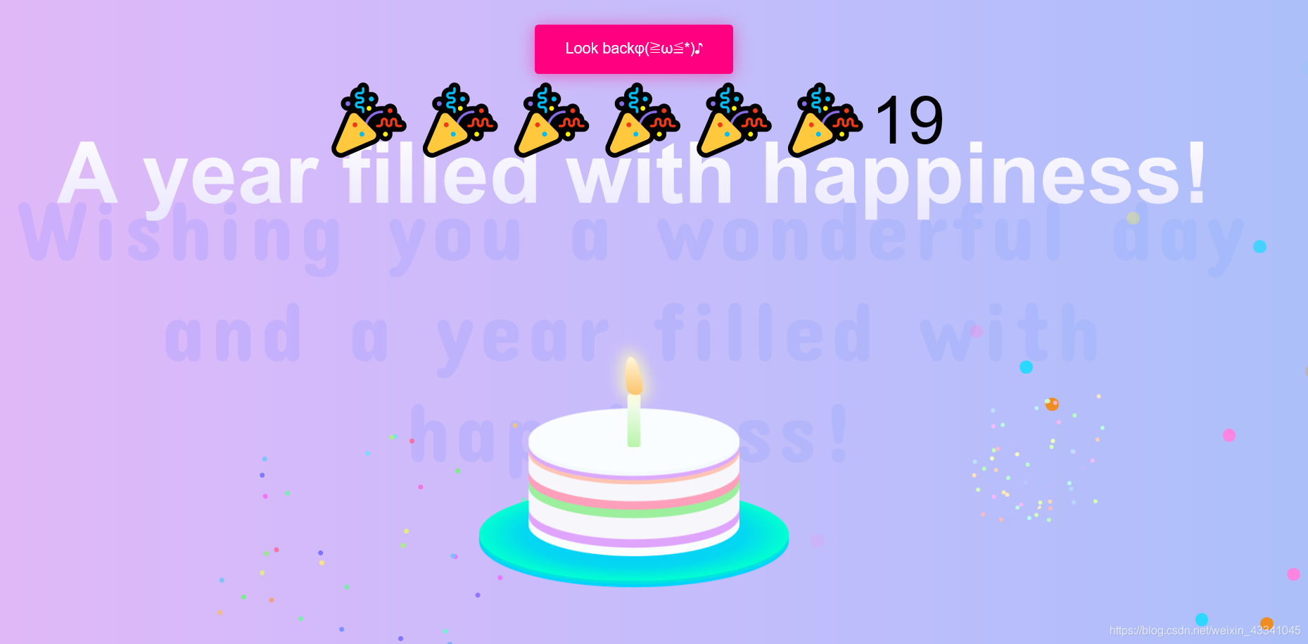
})();第三页:生日蛋糕
过生日岂能没有生日蛋糕?虽然是虚拟的,那也是蛋糕啊,配上背景音乐,气氛必须搞起来啊。
<!DOCTYPE html>
<html lang="en" >
<head>
<meta charset="UTF-8">
<title>lUCKY</title>

<link rel="stylesheet" href="css/style.css">
	<style>
body {
  font-size: 16px;
  font-family: 'Helvetica', 'Arial', sans-serif;
  text-align: center;
  background-color: #f8faff;
}

.bubbly-button {
  font-family: 'Helvetica', 'Arial', sans-serif;
  display: inline-block;
  font-size: 1em;
  padding: 1em 2em;
  margin-top: 20px;
  margin-bottom: 20px;
  -webkit-appearance: none;
  appearance: none;
  background-color: #ff0081;
  color: #fff;
  border-radius: 4px;
  border: none;
  cursor: pointer;
  position: relative;
  transition: transform ease-in 0.1s, box-shadow ease-in 0.25s;
  box-shadow: 0 2px 25px rgba(255, 0, 130, 0.5);
}
.bubbly-button:focus {
  outline: 0;
}
.bubbly-button:before, .bubbly-button:after {
  position: absolute;
  content: '';
  display: block;
  width: 140%;
  height: 100%;
  left: -20%;
  z-index: -1000;
  transition: all ease-in-out 0.5s;
  background-repeat: no-repeat;
}
.bubbly-button:before {
  display: none;
  top: -75%;
  background-image: radial-gradient(circle, #ff0081 20%, transparent 20%), radial-gradient(circle, transparent 20%, #ff0081 20%, transparent 30%), radial-gradient(circle, #ff0081 20%, transparent 20%), radial-gradient(circle, #ff0081 20%, transparent 20%), radial-gradient(circle, transparent 10%, #ff0081 15%, transparent 20%), radial-gradient(circle, #ff0081 20%, transparent 20%), radial-gradient(circle, #ff0081 20%, transparent 20%), radial-gradient(circle, #ff0081 20%, transparent 20%), radial-gradient(circle, #ff0081 20%, transparent 20%);
  background-size: 10% 10%, 20% 20%, 15% 15%, 20% 20%, 18% 18%, 10% 10%, 15% 15%, 10% 10%, 18% 18%;
}
.bubbly-button:after {
  display: none;
  bottom: -75%;
  background-image: radial-gradient(circle, #ff0081 20%, transparent 20%), radial-gradient(circle, #ff0081 20%, transparent 20%), radial-gradient(circle, transparent 10%, #ff0081 15%, transparent 20%), radial-gradient(circle, #ff0081 20%, transparent 20%), radial-gradient(circle, #ff0081 20%, transparent 20%), radial-gradient(circle, #ff0081 20%, transparent 20%), radial-gradient(circle, #ff0081 20%, transparent 20%);
  background-size: 15% 15%, 20% 20%, 18% 18%, 20% 20%, 15% 15%, 10% 10%, 20% 20%;
}
.bubbly-button:active {
  transform: scale(0.9);
  background-color: #e60074;
  box-shadow: 0 2px 25px rgba(255, 0, 130, 0.2);
}
.bubbly-button.animate:before {
  display: block;
  animation: topBubbles ease-in-out 0.75s forwards;
}
.bubbly-button.animate:after {
  display: block;
  animation: bottomBubbles ease-in-out 0.75s forwards;
}


</style>
	<script type="text/javascript">
		function delayURL(url,time){
	 setTimeout("top.location.href = '" + url + "'",time);
	 }
	</script>

</head>
<body>

	<audio autoplay="autoplay" loop="loop" preload="auto"

            	src="images/happybirthday.mp3"></audio>
    <a href="#" οnclick="delayURL('../SecondLucky/LuckyEvertime.html',1500)">
	<button class="bubbly-button">Look backφ(≧ω≦*)♪</button> </a>

<bokeh></bokeh>
<bokeh></bokeh>
<bokeh></bokeh>
<bokeh></bokeh>
<bokeh></bokeh>
<bokeh></bokeh>
<bokeh></bokeh>
<bokeh></bokeh>
<bokeh></bokeh>
<bokeh></bokeh>
<bokeh></bokeh>
<bokeh></bokeh>
<bokeh></bokeh>
<bokeh></bokeh>
<bokeh></bokeh>
<bokeh></bokeh>
<bokeh></bokeh>
<bokeh></bokeh>
<bokeh></bokeh>
<bokeh></bokeh>
<bokeh></bokeh>
<bokeh></bokeh>
<bokeh></bokeh>
<bokeh></bokeh>
<bokeh></bokeh>
<bokeh></bokeh>
<bokeh></bokeh>
<bokeh></bokeh>
<bokeh></bokeh>
<bokeh></bokeh>
<bokeh></bokeh>
<bokeh></bokeh>
<bokeh></bokeh>
<bokeh></bokeh>
<bokeh></bokeh>
<bokeh></bokeh>
<bokeh></bokeh>
<bokeh></bokeh>
<bokeh></bokeh>
<bokeh></bokeh>
<bokeh></bokeh>
<bokeh></bokeh>
<bokeh></bokeh>
<bokeh></bokeh>
<bokeh></bokeh>


<div class="pyro">
<div class="before"></div>
<div class="after"></div>
</div>
<h1>Wishing you a wonderful day and a year filled with happiness!</h1>
<h2>A year filled with happiness!</h2>
<span>??????19</span>
<div class="candle">
<div id="flame" class="lit"></div>
</div>

<div class="cake"></div>
<div class="plate"></div>

<div style="text-align:center;margin:-100px 0; font:normal 14px/24px 'MicroSoft YaHei';">

</div>
</body>
</html>
蛋糕的css
@import url("https://fonts.googleapis.com/css?family=Concert+One|Pacifico");
.mobile {
  position: fixed;
  text-align: center;
  width: 100%;
  top: 50px;
  font-size: 90px;
  display: block;
}

h1, h2, span {
  display: none;
}

@media screen and (min-width: 670px) {
  .mobile {
    display: none;
  }

  h1, h2, span {
    display: block;
  }

  body {
    background: linear-gradient(to right, #e2b8f7, #d4bafa, #c7bcfb, #b9befb, #acbff9);
    cursor: crosshair;
    perspective: 1000px;
    transform-style: preserve-3d;
    font-family: "Pacifico",cursive;
  }
当然了,各位大佬们啊,这代码修改整组也并不是一件容易的事情,最近时间有点紧,所以就只写了一片博客,想要全部源码的各位朋友可以私聊我。祝各位马到成功,爱情天长地久99,谢谢。
