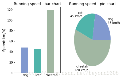
对于常见的数据对比,我们自然想到到的就是使用柱状图和饼状图~~~
import numpy as np
import matplotlib as mpl
import matplotlib.pyplot as pt

mpl.rcParams['axes.titlesize'] = 12 #axes可以理解成轴域或者子图
mpl.rcParams['xtick.labelsize'] = 10
mpl.rcParams['ytick.labelsize'] = 10
mpl.rcParams['axes.labelsize'] = 12
mpl.rcParams['xtick.major.size'] = 0
mpl.rcParams['ytick.major.size'] = 2 #设置y轴的刻度线长度

# 包含了狗,猫和猎豹的最高奔跑速度,还有对应的可视化颜色
speed_map = {
    'dog': (48, '#8199cf'),
    'cat': (45, '#4fb4aa'),
    'cheetah': (120, '#a1b7a2')
}

# 整体图的标题
fig = pt.figure('Bar chart & Pie chart')


# 在整张图上加入一个子图,121的意思是在一个1行2列的子图中的第一张
ax = fig.add_subplot(121)
ax.set_title('Running speed - bar chart')

# 生成x轴每个元素的位置分别为0.5,1.5,2.5
xticks = np.arange(0.5,3.5)

# 定义柱状图每个柱的宽度
bar_width = 0.5

# 动物名称
animals = speed_map.keys()

# 奔跑速度
speeds = [x[0] for x in speed_map.values()]

# 对应颜色
colors = [x[1] for x in speed_map.values()]

# 设置柱状图的属性,前两个参数为横纵轴的具体表示,分别为动物标签的位置和其速度
#后两个参数为条柱的宽度以及其边缘颜色
bars = ax.bar(xticks, speeds, width=bar_width, edgecolor='none')

# 设置y轴的标题
ax.set_ylabel('Speed(km/h)')

# x轴每个标签的具体位置,为了美观对其位置进行了调试
ax.set_xticks(xticks+bar_width/6)

# 设置每个标签的名字
ax.set_xticklabels(animals)

# 设置x轴的范围
ax.set_xlim([bar_width/2-0.5, 3+bar_width/2])

# 设置y轴的范围
ax.set_ylim([0, 125])

# 给每个条形柱分设置特定的颜色
for bar, color in zip(bars, colors):
    bar.set_color(color)

# 将饼状图放置在122
ax = fig.add_subplot(122)
ax.set_title('Running speed - pie chart')

# 生成同时包含名称和速度的标签
labels = ['{}\n{} km/h'.format(animal, speed) for animal, speed in zip(animals, speeds)]

# 绘制饼状图,并指定标签和对应颜色
ax.pie(speeds, labels=labels, colors=colors)

plt.show()
属性比较多,查了不少资料,比较零碎,没有系统讲解的~~~英文版还看不懂,心塞……
为了图的美观度,各种调参,有些原理还不是很清楚,需要好好搞一下~~