LinearProgressIndicator 和 CircularProgressIndicator 也就是进度条 Widget,前一种为线性进度条,后一种为圆形进度条。
一、LinearProgressIndicator
在 Flutter 中 LinearProgressIndicator 可以实现精确进度和模糊进度。比如等待软件安装完成,我们可以使用一个模糊进度条。它继承自 ProgressIndicator。
  const LinearProgressIndicator({
    Key key,
    double value,
    Color backgroundColor,
    Animation<Color> valueColor,
    String semanticsLabel,
    String semanticsValue,
  })
value ---- 表示当前的进度,取值范围为[0,1];如果value为null时则指示器会执行一个循环动画(模糊进度);当value不为null时,指示器为一个具体进度的进度条。
backgroundColor ---- 背景颜色
valueColor ---- 进度条颜色。该值类型是 Animation,这允许我们对进度条的颜色可以指定动画。如果我们不需要对进度条颜色执行动画,想对进度条应用一种固定的颜色,此时可以通过 AlwaysStoppedAnimation 来指定。
semanticsLabel ---- 可用于标识此进度条的目的,以用于屏幕阅读软件。
semanticsValue ---- 属性可用于确定进度指示器,指示已取得多少进度。
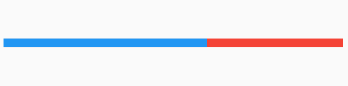
1.1 精确线性进度条
我们设置 value 的值为 0.6。另外加了 SizedBox 限制进度条的宽高。
class _MyHomePageState extends State<MyHomePage> {
  @override
  Widget build(BuildContext context) {
    return Scaffold(
        appBar: AppBar(
          title: Text("Home Page"),
        ),
        body: Column(
          mainAxisAlignment: MainAxisAlignment.center,
          children: <Widget>[
            Row(mainAxisAlignment: MainAxisAlignment.center, children: <Widget>[
              SizedBox(
                width: 400,
                height: 10,
                child: LinearProgressIndicator(
                  value: 0.6,
                  backgroundColor: Colors.red,
                  valueColor: AlwaysStoppedAnimation(Colors.blue),
                ),
              ),
            ])
          ],
        ));
  }
}
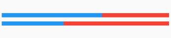
1.2 模糊线性进度条
把 value 设置为 null 就可以实现了。
class _MyHomePageState extends State<MyHomePage> {
  @override
  Widget build(BuildContext context) {
    return Scaffold(
        appBar: AppBar(
          title: Text("Home Page"),
        ),
        body: Column(
          mainAxisAlignment: MainAxisAlignment.center,
          children: <Widget>[
            ......
            Row(mainAxisAlignment: MainAxisAlignment.center, children: <Widget>[
              SizedBox(
                width: 400,
                height: 10,
                child: LinearProgressIndicator(
                  value: null,
                  backgroundColor: Colors.red,
                  valueColor: AlwaysStoppedAnimation(Colors.blue),
                ),
              ),
            ])
          ],
        ));
  }
}
下图中第二个动态进度条就是模糊进度效果。
二、CircularProgressIndicator
和线性进度条类似只多了一个设置进度条粗细的 Field。同样继承自 ProgressIndicator。
  const CircularProgressIndicator({
    Key key,
    double value,
    Color backgroundColor,
    Animation<Color> valueColor,
    this.strokeWidth = 4.0,
    String semanticsLabel,
    String semanticsValue,
  })
下面是使用代码。
class _MyHomePageState extends State<MyHomePage> {
  @override
  Widget build(BuildContext context) {
    return Scaffold(
        appBar: AppBar(
          title: Text("Home Page"),
        ),
        body: Column(
          mainAxisAlignment: MainAxisAlignment.center,
          children: <Widget>[
            ......
            Row(mainAxisAlignment: MainAxisAlignment.center, children: <Widget>[
              SizedBox(
                width: 100,
                height: 100,
                child: CircularProgressIndicator(
                  value: null,
                  backgroundColor: Colors.red,
                  valueColor: AlwaysStoppedAnimation(Colors.blue),
                ),
              ),
            ]),
            SizedBox(
              height: 10,
              child: null,
            ),
            Row(mainAxisAlignment: MainAxisAlignment.center, children: <Widget>[
              SizedBox(
                width: 100,
                height: 50,
                child: CircularProgressIndicator(
                  value: 0.5,
                  backgroundColor: Colors.red,
                  valueColor: AlwaysStoppedAnimation(Colors.blue),
                ),
              ),
            ])
          ],
        ));
  }
}
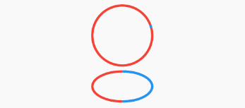
代码中最下面两个进度条就是使用圆形进度条了,我们看到当父 Widget SizedBox 宽高不成比例的时候,画出来的圆形进度条就变成了椭圆。
二、自定义动画进度条
下面我们打造一个进度条,颜色随着时间推移会从黄色变为蓝色,同时进度走到100%。
class _MyHomePageState extends State<MyHomePage>
    with SingleTickerProviderStateMixin {
  AnimationController _animationController;

  @override
  void initState() {
    _animationController =
        new AnimationController(vsync: this, duration: Duration(seconds: 5));
    _animationController.forward();
    _animationController.addListener(() => setState(() => {}));
    super.initState();
  }

  @override
  void dispose() {
    _animationController.dispose();
    super.dispose();
  }

  @override
  Widget build(BuildContext context) {
    return Scaffold(
        appBar: AppBar(
          title: Text("Home Page"),
        ),
        body: Column(
          mainAxisAlignment: MainAxisAlignment.center,
          children: <Widget>[
            ......
            Row(mainAxisAlignment: MainAxisAlignment.center, children: <Widget>[
              SizedBox(
                width: 100,
                height: 100,
                child: CircularProgressIndicator(
                  value: _animationController.value,
                  backgroundColor: Colors.red,
                  valueColor: ColorTween(begin: Colors.yellow, end: Colors.blue)
                      .animate(_animationController),
                  strokeWidth: 10,
                ),
              ),
            ])
          ],
        ));
  }
}

完整 Demo 代码如下:
import 'package:flutter/material.dart';

void main() => runApp(MyApp());

class MyApp extends StatelessWidget {
  // This widget is the root of your application.
  @override
  Widget build(BuildContext context) {
    return MaterialApp(
      title: 'Flutter Demo',
      theme: ThemeData(
        primarySwatch: Colors.blue,
      ),
      home: MyHomePage(),
    );
  }
}

class MyHomePage extends StatefulWidget {
  @override
  _MyHomePageState createState() => _MyHomePageState();
}

class _MyHomePageState extends State<MyHomePage>
    with SingleTickerProviderStateMixin {
  AnimationController _animationController;

  @override
  void initState() {
    _animationController =
        new AnimationController(vsync: this, duration: Duration(seconds: 5));
    _animationController.forward();
    _animationController.addListener(() => setState(() => {}));
    super.initState();
  }

  @override
  void dispose() {
    _animationController.dispose();
    super.dispose();
  }

  @override
  Widget build(BuildContext context) {
    return Scaffold(
        appBar: AppBar(
          title: Text("Home Page"),
        ),
        body: Column(
          mainAxisAlignment: MainAxisAlignment.center,
          children: <Widget>[
            Row(mainAxisAlignment: MainAxisAlignment.center, children: <Widget>[
              SizedBox(
                width: 400,
                height: 10,
                child: LinearProgressIndicator(
                  value: 0.6,
                  backgroundColor: Colors.red,
                  valueColor: AlwaysStoppedAnimation(Colors.blue),
                ),
              ),
            ]),
            SizedBox(
              height: 10,
              child: null,
            ),
            Row(mainAxisAlignment: MainAxisAlignment.center, children: <Widget>[
              SizedBox(
                width: 400,
                height: 10,
                child: LinearProgressIndicator(
                  value: null,
                  backgroundColor: Colors.red,
                  valueColor: AlwaysStoppedAnimation(Colors.blue),
                ),
              ),
            ]),
            SizedBox(
              height: 10,
              child: null,
            ),
            Row(mainAxisAlignment: MainAxisAlignment.center, children: <Widget>[
              SizedBox(
                width: 100,
                height: 100,
                child: CircularProgressIndicator(
                  value: null,
                  backgroundColor: Colors.red,
                  valueColor: AlwaysStoppedAnimation(Colors.blue),
                ),
              ),
            ]),
            SizedBox(
              height: 10,
              child: null,
            ),
            Row(mainAxisAlignment: MainAxisAlignment.center, children: <Widget>[
              SizedBox(
                width: 100,
                height: 50,
                child: CircularProgressIndicator(
                  value: 0.5,
                  backgroundColor: Colors.red,
                  valueColor: AlwaysStoppedAnimation(Colors.blue),
                ),
              ),
            ]),
            SizedBox(
              height: 10,
              child: null,
            ),
            Row(mainAxisAlignment: MainAxisAlignment.center, children: <Widget>[
              SizedBox(
                width: 100,
                height: 100,
                child: CircularProgressIndicator(
                  value: _animationController.value,
                  backgroundColor: Colors.red,
                  valueColor: ColorTween(begin: Colors.yellow, end: Colors.blue)
                      .animate(_animationController),
                  strokeWidth: 10,
                ),
              ),
            ])
          ],
        ));
  }
}
