条形进度条
value:表示当前进度,取值范围为[0,1]。如果value为null则进度条会执行循环动画(模糊进度);如果value不为null,则进度条有具体进度。
valueColor:进度条颜色。可以通过AlwaysStoppedAnimation指定。
backgroundColor:进度条背景颜色。
minHeight:进度条高度。
模糊进度条

const LinearProgressIndicator(
  valueColor: AlwaysStoppedAnimation(Colors.blue),
  backgroundColor: Colors.grey,
)
具体进度条
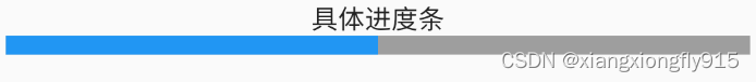
const LinearProgressIndicator(
  value: 0.5,
  minHeight: 10,
  backgroundColor: Colors.grey,
  valueColor: AlwaysStoppedAnimation(Colors.blue),
)
环形进度条
strokeWidth:设置弧线宽度。
其他属性与LinearProgressIndicator基本类似。
模糊进度条

const CircularProgressIndicator(
  valueColor: AlwaysStoppedAnimation(Colors.red),
  backgroundColor: Colors.grey,
)
具体进度条

const CircularProgressIndicator(
  valueColor: AlwaysStoppedAnimation(Colors.red),
  value: 0.5,
  strokeWidth: 4.0,
  backgroundColor: Colors.grey,
)
设置尺寸
LinearProgressIndicator和CircularProgressIndicator没有提供设置尺寸的参数,它们是去父容器的尺寸作为绘制的边界,这时可以借助SizedBox、ConstrainedBox限制指定尺寸。
条形进度条设置尺寸

const SizedBox(
  height: 3,
  width: 100,
  child: LinearProgressIndicator(
    value: 0.5,
    backgroundColor: Colors.grey,
    valueColor: AlwaysStoppedAnimation(Colors.blue),
  ),
)
环形进度条设置尺寸

const SizedBox(
  height: 100,
  width: 100,
  child: CircularProgressIndicator(
    value: 0.5,
    backgroundColor: Colors.grey,
    valueColor: AlwaysStoppedAnimation(Colors.blue),
  ),
)
进度条动画
3秒内进度条颜色由灰色变为蓝色。
import 'package:flutter/material.dart';

class ProgressPage extends StatefulWidget {
    const ProgressPage({Key? key}) : super(key: key);

    @override
    State<StatefulWidget> createState() {
        return _ProgressPageState();
    }
}

class _ProgressPageState extends State<ProgressPage>
    with SingleTickerProviderStateMixin {
    late AnimationController _animationController;

    @override
    void initState() {
        _animationController =
            AnimationController(vsync: this, duration: Duration(seconds: 3));
        _animationController.forward();
        _animationController.addListener(() {
            setState(() {});
        });
        super.initState();
    }

    @override
    void dispose() {
        _animationController.dispose();
        super.dispose();
    }

    @override
    Widget build(BuildContext context) {
        return Scaffold(
            appBar: AppBar(
                title: Text("进度条组件"),
            ),
            body: Padding(
                padding: EdgeInsets.all(10),
                child: Column(
                    children: [
                        Text("3秒由灰色变蓝色动画"),
                        LinearProgressIndicator(
                            backgroundColor: Colors.grey,
                            valueColor: ColorTween(begin: Colors.grey, end: Colors.blue)
                            .animate(_animationController),
                            value: _animationController.value,
                        ),
                    ],
                ),
            ),
        );
    }
}
iOS风格
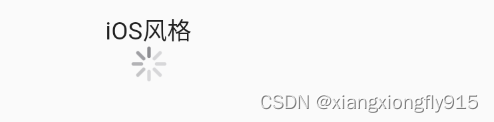
const CupertinoActivityIndicator(
  radius: 10,
  animating: true,
)Flutter框架提供了Material Design风格的线性进度条(LinearProgressIndicator)组件,就是下面的样子,方方正正的,一点也不圆润。

标准的LinearProgressIndicator组件
但是很多APP的设计都按照Material Design风格来玩的,各种各样的都有,我们选择最常见的一种来看一下,下面是“淘宝APP->淘抢购”页面里面的进度条,还是带动画的。

如果直接用线性进度条(LinearProgressIndicator)组件去做,是没办法实现上面的进度条的。正常的话会遇到下面几个问题:
- 没有参数可以设置圆角
- 组件自带的动画效果是无限循环的
- 设置了
value参数就没有动画效果 - 没有参数可以设置高度
- 没有参数可以设置中间的文本组件
但是上面的问题都可以被解决,下面就是具体的解决方案了。
设置圆角
为进度条设置圆角边框的方法就是圆角矩形剪裁(ClipRRect)组件,用圆角矩形剪裁(ClipRRect)组件把线性进度条(LinearProgressIndicator)组件包装起来就可以了。
class _MyHomePageState extends State<MyHomePage> {
  @override
  Widget build(BuildContext context) {
    return Scaffold(
      appBar: AppBar(
        title: Text('Flutter Demo 主页'),
      ),
      // 圆角矩形剪裁(`ClipRRect`)组件,使用圆角矩形剪辑其子项的组件。
      body: ClipRRect(
        // 边界半径(`borderRadius`)属性,圆角的边界半径。
        borderRadius: BorderRadius.all(Radius.circular(10.0)),
        child: LinearProgressIndicator(
          value: 0.6,
          backgroundColor: Color(0xffFFE3E3),
          valueColor: AlwaysStoppedAnimation<Color>(Color(0xffFF4964)),
        ),
      ),
    );
  }
}

设置高度与宽度
为进度条添加高度与宽度限制的方法也不难,就是用大小框(SizedBox)组件包装线性进度条(LinearProgressIndicator)组件。
class _MyHomePageState extends State<MyHomePage> {
  @override
  Widget build(BuildContext context) {
    return Scaffold(
      appBar: AppBar(
        title: Text('Flutter Demo 主页'),
      ),
      body: SizedBox(
        height: 10.0,
        width: 98.0,
        // 圆角矩形剪裁(`ClipRRect`)组件,使用圆角矩形剪辑其子项的组件。
        child: ClipRRect(
          // 边界半径(`borderRadius`)属性,圆角的边界半径。
          borderRadius: BorderRadius.all(Radius.circular(10.0)),
          child: LinearProgressIndicator(
            value: 0.6,
            backgroundColor: Color(0xffFFE3E3),
            valueColor: AlwaysStoppedAnimation<Color>(Color(0xffFF4964)),
          ),
        ),
      ),
    );
  }
}

设置内容文本
为进度条的里面配置描述文本,和上面一样,就是继续包装(PS:Flutter的布局方式真的是过度包装),用堆栈(Stack)组件包装线性进度条(LinearProgressIndicator)组件。
class _MyHomePageState extends State<MyHomePage> {
  @override
  Widget build(BuildContext context) {
    return Scaffold(
      appBar: AppBar(
        title: Text('Flutter Demo 主页'),
      ),
      body: Stack(
        children: <Widget>[
          SizedBox(
            height: 10.0,
            width: 98.0,
            // 圆角矩形剪裁(`ClipRRect`)组件,使用圆角矩形剪辑其子项的组件。
            child: ClipRRect(
              // 边界半径(`borderRadius`)属性,圆角的边界半径。
              borderRadius: BorderRadius.all(Radius.circular(10.0)),
              child: LinearProgressIndicator(
                value: 0.6,
                backgroundColor: Color(0xffFFE3E3),
                valueColor: AlwaysStoppedAnimation<Color>(Color(0xffFF4964)),
              ),
            ),
          ),
          Container(
            height: 10.0,
            width: 98.0,
            padding: EdgeInsets.only(left: 7.0),
            alignment: Alignment.centerLeft,
            child: Text(
              '已抢60%',
              style: TextStyle(
                color: Color(0xffFFFFFF),
                fontSize: 8.0,
              ),
            ),
          ),
        ],
      ),
    );
  }
}

设置动画效果
要为进度条设置动画效果,就不得不提到动画控制器(AnimationController)和补间(Tween)组件,Flutter中的大部分动画效果都可以用它们实现。具体怎么使用它们,请参考下面的代码。
class _MyHomePageState extends State<MyHomePage> with TickerProviderStateMixin {
  /// 当前的进度。
  double currentProgress = 0.6;
  // 动画相关控制器与补间。
  AnimationController animation;
  Tween<double> tween;

  @override
  void initState() {
    // AnimationController({
    //   double value,
    //   Duration duration,
    //   String debugLabel,
    //   double lowerBound: 0.0,
    //   double upperBound: 1.0,
    //   TickerProvider vsync
    // })
    // 创建动画控制器
    animation = AnimationController(
      // 这个动画应该持续的时间长短。
      duration: const Duration(milliseconds: 900),
      vsync: this,
      // void addListener(
      //   VoidCallback listener
      // )
      // 每次动画值更改时调用监听器
      // 可以使用removeListener删除监听器
    )..addListener(() {
        setState(() {});
      });
    // Tween({T begin, T end }):创建tween(补间)
    tween = Tween<double>(
      begin: 0.0,
      end: currentProgress,
    );
    // 开始向前运行这个动画(朝向最后)
    animation.forward();
    super.initState();
  }

  @override
  void dispose() {
    animation.dispose();
    super.dispose();
  }

  @override
  Widget build(BuildContext context) {
    // TODO:构建页面的主要内容。
  }
}
在上面的代码中,我们已经设置好了动画与补间,下面就把线性进度条(LinearProgressIndicator)组件中的value属性值设置成动画控制。
    // TODO:构建页面的主要内容。
    return Scaffold(
      appBar: AppBar(
        title: Text('Flutter Demo 主页'),
      ),
      body: Stack(
        children: <Widget>[
          SizedBox(
            height: 10.0,
            width: 98.0,
            // 圆角矩形剪裁(`ClipRRect`)组件,使用圆角矩形剪辑其子项的组件。
            child: ClipRRect(
              // 边界半径(`borderRadius`)属性,圆角的边界半径。
              borderRadius: BorderRadius.all(Radius.circular(10.0)),
              child: LinearProgressIndicator(
                // Animation<T> animate(
                //   Animation<double> parent
                // )
                // 返回一个由给定动画驱动的新动画,但它承担由该对象确定的值
                value: tween.animate(animation).value,
                backgroundColor: Color(0xffFFE3E3),
                valueColor: AlwaysStoppedAnimation<Color>(Color(0xffFF4964)),
              ),
            ),
          ),
          Container(
            height: 10.0,
            width: 98.0,
            padding: EdgeInsets.only(left: 7.0),
            alignment: Alignment.centerLeft,
            child: Text(
              '已抢${(currentProgress * 100).toInt()}%',
              style: TextStyle(
                color: Color(0xffFFFFFF),
                fontSize: 8.0,
                fontFamily: 'PingFangRegular',
              ),
            ),
          ),
        ],
      ),
    );
这样进度条在构建时就会开始播放前进动画了。