Button作为常用Widget之一,在路由之间跳转等很多场景都有用途。Material 组件库中提供了多种按钮组件如CloseButton、BackButton、IconButton、RaisedButton、FlatButton、OutlineButton、FloatingActionButton、MaterialButton、RawMaterialButton。
一、理清Button之间的关系
这么多button,每一种button都有什么作用,它们之间的继承关系又是怎样?它们之间主要是继承和组合。

二、RawMaterialButton
创建一个基于[Semantics], [Material] 和 [InkWell] Widget 的按钮。
  const RawMaterialButton({
    Key key,
    @required this.onPressed,
    this.onHighlightChanged,
    this.textStyle,
    this.fillColor,
    this.focusColor,
    this.hoverColor,
    this.highlightColor,
    this.splashColor,
    this.elevation = 2.0,
    this.focusElevation = 4.0,
    this.hoverElevation = 4.0,
    this.highlightElevation = 8.0,
    this.disabledElevation = 0.0,
    this.padding = EdgeInsets.zero,
    this.constraints = const BoxConstraints(minWidth: 88.0, minHeight: 36.0),
    this.shape = const RoundedRectangleBorder(),
    this.animationDuration = kThemeChangeDuration,
    this.clipBehavior = Clip.none,
    this.focusNode,
    MaterialTapTargetSize materialTapTargetSize,
    this.child,
  })
onPressed ---- 按钮点击回调
onHighlightChanged ---- 高亮改变回调
textStyle ---- 文本样式,在介绍Text Widget一节中已经详细解释
fillColor ---- 按钮颜色
focusColor ---- 获取焦点颜色
hoverColor ---- 指针悬停在按钮 [Material] 上时的颜色
highlightColor ---- 高亮颜色(按下时)
splashColor ---- 点击按钮时水波纹的颜色
elevation ---- 阴影的范围,值越大阴影范围越大
focusElevation ---- 按钮聚焦时的阴影的范围
hoverElevation ---- 指针悬停在按钮上时阴影的范围
highlightElevation ---- 当按钮被启用并被按下时,按钮的阴影的范围
disabledElevation ---- 禁用按钮时阴影的范围
padding ---- 内边距
constraints ---- 按钮约束
shape ---- 按钮形状
animationDuration ---- 动画持续时长
clipBehavior ---- 裁剪行为
focusNode ---- 按下时用于请求焦点的可选焦点节点
materialTapTargetSize ---- 配置点击目标的最小尺寸
child ---- 子Widget
此类不使用当前的 [Theme] 或 [ButtonTheme] 计算未指定参数的默认值。它旨在用于自定义 Material 按钮,该按钮可以选择包含主题或应用程序特定来源的默认设置。
[RaisedButton] 和 [FlatButton] 根据当前的 [Theme] 和 [ButtonTheme] 配置 [RawMaterialButton]。
import 'package:flutter/material.dart';
void main() => runApp(MyApp());
class MyApp extends StatelessWidget {
// This widget is the root of your application.
@override
Widget build(BuildContext context) {
return MaterialApp(
title: 'Flutter Demo',
theme: ThemeData(
primarySwatch: Colors.blue,
),
home: MyHomePage(),
);
}
}
class MyHomePage extends StatefulWidget {
@override
_MyHomePageState createState() => _MyHomePageState();
}
class _MyHomePageState extends State<MyHomePage> {
@override
Widget build(BuildContext context) {
return Scaffold(
appBar: AppBar(
title: Text("Home Page"),
),
body: Column(
mainAxisAlignment: MainAxisAlignment.center,
children: <Widget>[
Row(mainAxisAlignment: MainAxisAlignment.center, children: <Widget>[
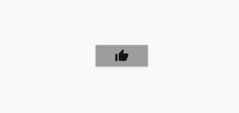
RawMaterialButton(
onPressed: () {
print("tip me.");
},
fillColor: Colors.grey,
splashColor: Colors.blue,
highlightColor: Colors.red,
hoverColor: Colors.green,
child: Icon(Icons.thumb_up),
)
])
],
));
}
}
控制台输出日志:
[{"event":"app.progress","params":{"appId":"cc99bcc7-c069-4177-ae1c-9c9aef189e8c","id":"13","progressId":"hot.reload","message":"Performing hot reload..."}}]Performing hot reload...

[{"event":"app.progress","params":{"appId":"cc99bcc7-c069-4177-ae1c-9c9aef189e8c","id":"14","progressId":null,"message":"Syncing files to device Android SDK built for x86..."}}]Syncing files to device Android SDK built for x86...

Reloaded 0 of 455 libraries in 125ms.
I/flutter ( 2832): tip me.
I/flutter ( 2832): tip me.
三、MaterialButton
一个实用程序类,用于构建依赖于环境 [ButtonTheme] 和 [Theme] 的 Material 按钮。
  const MaterialButton({
    Key key,
    @required this.onPressed,
    this.onHighlightChanged,
    this.textTheme,
    this.textColor,
    this.disabledTextColor,
    this.color,
    this.disabledColor,
    this.focusColor,
    this.hoverColor,
    this.highlightColor,
    this.splashColor,
    this.colorBrightness,
    this.elevation,
    this.focusElevation,
    this.hoverElevation,
    this.highlightElevation,
    this.disabledElevation,
    this.padding,
    this.shape,
    this.clipBehavior = Clip.none,
    this.focusNode,
    this.materialTapTargetSize,
    this.animationDuration,
    this.minWidth,
    this.height,
    this.child,
  })
很多 Field 已经在 RawMaterialButton 中见识过了。
textTheme ---- 定义按钮的基本颜色,以及按钮的最小尺寸,内边距和形状的默认值
textColor ---- 文本颜色
disabledTextColor ---- 禁用后文本颜色
disabledColor ---- 禁用后的颜色
colorBrightness ---- 用于此按钮的主题亮度
minWidth ---- 最小宽度
height ---- 高度
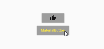
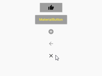
              MaterialButton(
                onPressed: () {
                  print("tip me.");
                },
                color: Colors.grey,
                textColor: Colors.yellow,
                splashColor: Colors.red,
                highlightColor: Colors.green,
                child: Text("MaterialButton"),
              )
四、IconButton
图标按钮,它直接继承自 StatelessWidget。
  const IconButton({
    Key key,
    this.iconSize = 24.0,
    this.padding = const EdgeInsets.all(8.0),
    this.alignment = Alignment.center,
    @required this.icon,
    this.color,
    this.focusColor,
    this.hoverColor,
    this.highlightColor,
    this.splashColor,
    this.disabledColor,
    @required this.onPressed,
    this.focusNode,
    this.tooltip,
  })
iconSize ---- 按钮内图标的大小
tooltip ---- 描述按下按钮时将发生的操作的文本
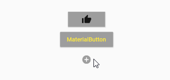
              IconButton(
                icon: Icon(Icons.add_circle),
                onPressed: () {
                  print("tip IconButton");
                },
                color: Colors.grey,
                splashColor: Colors.red,
                highlightColor: Colors.green,
              )
另外CloseButton和BackButton都使用了IconButton。
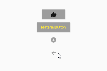
4.1 BackButton
也就是返回按钮,源码非常简单。
material/back_button.dart
class BackButtonIcon extends StatelessWidget {
  /// 创建一个图标,该图标显示当前平台的适当“后退”图标(从 [Theme] 中获得)。
  const BackButtonIcon({ Key key }) : super(key: key);

  /// 返回给定“平台”的相应“后退”图标,这里我们看到有三种平台:android、fuchsia和iOS
  static IconData _getIconData(TargetPlatform platform) {
    switch (platform) {
      case TargetPlatform.android:
      case TargetPlatform.fuchsia:
        return Icons.arrow_back;
      case TargetPlatform.iOS:
        return Icons.arrow_back_ios;
    }
    assert(false);
    return null;
  }

  @override
  Widget build(BuildContext context) => Icon(_getIconData(Theme.of(context).platform));
}

/// material 设计后退按钮。
class BackButton extends StatelessWidget {

  const BackButton({ Key key, this.color }) : super(key: key);

  /// 图标使用的颜色。
  final Color color;

  @override
  Widget build(BuildContext context) {
    assert(debugCheckHasMaterialLocalizations(context));
    return IconButton(
      icon: const BackButtonIcon(),
      color: color,
      tooltip: MaterialLocalizations.of(context).backButtonTooltip,
      onPressed: () {
        Navigator.maybePop(context);
      },
    );
  }
}
BackButton 使用了 BackButtonIcon,另外 onPressed 定义为了 Navigator.maybePop(context),这可实现返回路由的作用。同时也设置了tooltip。
BackButton(
  color: Colors.grey,
)
4.2 CloseButton
关闭按钮,图标换成了 X。无法自定义属性了,下面是它的用法。
CloseButton()
五、RaisedButton
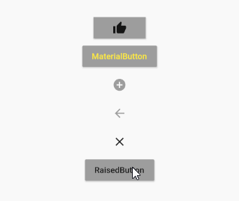
RaisedButton 即"漂浮"按钮,它默认带有阴影和灰色背景。按下后,阴影会变大。
              RaisedButton(
                onPressed: () {
                  print("tip RaisedButton");
                },
                color: Colors.grey,
                splashColor: Colors.red,
                highlightColor: Colors.green,
                child: Text("RaisedButton"),
              )
六、FlatButton
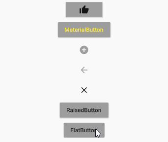
FlatButton即扁平按钮,默认背景透明并不带阴影。按下后,会有背景色。
              FlatButton(
                onPressed: () {
                  print("tip FlatButton");
                },
                color: Colors.grey,
                splashColor: Colors.red,
                highlightColor: Colors.green,
                child: Text("FlatButton"),
              )
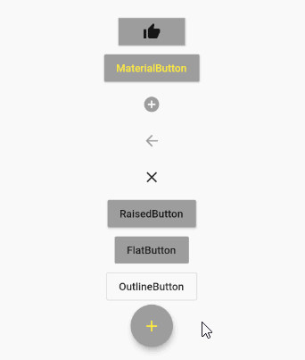
七、OutlineButton
OutlineButton默认有一个边框,不带阴影且背景透明。按下后,边框颜色会变亮、同时出现背景。
              OutlineButton(
                onPressed: () {
                  print("tip OutlineButton");
                },
                color: Colors.grey,
                splashColor: Colors.red,
                highlightColor: Colors.green,
                child: Text("OutlineButton"),
              )

八、FloatingActionButton
material 设计的浮动动作按钮。
  const FloatingActionButton({
    Key key,
    this.child,
    this.tooltip,
    this.foregroundColor,
    this.backgroundColor,
    this.focusColor,
    this.hoverColor,
    this.heroTag = const _DefaultHeroTag(),
    this.elevation,
    this.focusElevation,
    this.hoverElevation,
    this.highlightElevation,
    this.disabledElevation,
    @required this.onPressed,
    this.mini = false,
    this.shape,
    this.clipBehavior = Clip.none,
    this.focusNode,
    this.materialTapTargetSize,
    this.isExtended = false,
  })
foregroundColor ---- 前景色
backgroundColor ---- 背景色
heroTag ---- 它标记以应用于按钮的 [Hero] widget
mini ---- 控制此按钮的大小
isExtended ---- 如果这是一个“扩展的”浮动动作按钮,则为true。通常,[extended] 按钮具有 [StadiumBorder] [shape],并且是使用 [FloatingActionButton.extended] 构造函数创建的。[Scaffold] 通过缩放和旋转过渡来动画化普通浮动操作按钮的外观。
              FloatingActionButton(
                onPressed: () {
                  print("tip FloatingActionButton");
                },
                backgroundColor: Colors.grey,
                foregroundColor: Colors.yellow,
                child: Icon(Icons.add),
              )
最后附上按钮全家的Demo代码。
import 'package:flutter/material.dart';

void main() => runApp(MyApp());

class MyApp extends StatelessWidget {
  // This widget is the root of your application.
  @override
  Widget build(BuildContext context) {
    return MaterialApp(
      title: 'Flutter Demo',
      theme: ThemeData(
        primarySwatch: Colors.blue,
      ),
      home: MyHomePage(),
    );
  }
}

class MyHomePage extends StatefulWidget {
  @override
  _MyHomePageState createState() => _MyHomePageState();
}

class _MyHomePageState extends State<MyHomePage> {
  @override
  Widget build(BuildContext context) {
    return Scaffold(
        appBar: AppBar(
          title: Text("Home Page"),
        ),
        body: Column(
          mainAxisAlignment: MainAxisAlignment.center,
          children: <Widget>[
            Row(mainAxisAlignment: MainAxisAlignment.center, children: <Widget>[
              RawMaterialButton(
                onPressed: () {
                  print("tip me.");
                },
                fillColor: Colors.grey,
                splashColor: Colors.blue,
                highlightColor: Colors.red,
                hoverColor: Colors.green,
                child: Icon(Icons.thumb_up),
              )
            ]),
            Row(mainAxisAlignment: MainAxisAlignment.center, children: <Widget>[
              MaterialButton(
                onPressed: () {
                  print("tip me.");
                },
                color: Colors.grey,
                textColor: Colors.yellow,
                splashColor: Colors.red,
                highlightColor: Colors.green,
                child: Text("MaterialButton"),
              )
            ]),
            Row(mainAxisAlignment: MainAxisAlignment.center, children: <Widget>[
              IconButton(
                icon: Icon(Icons.add_circle),
                onPressed: () {
                  print("tip IconButton");
                },
                color: Colors.grey,
                splashColor: Colors.red,
                highlightColor: Colors.green,
              )
            ]),
            Row(mainAxisAlignment: MainAxisAlignment.center, children: <Widget>[
              BackButton(
                color: Colors.grey,
              )
            ]),
            Row(
                mainAxisAlignment: MainAxisAlignment.center,
                children: <Widget>[CloseButton()]),
            Row(mainAxisAlignment: MainAxisAlignment.center, children: <Widget>[
              RaisedButton(
                onPressed: () {
                  print("tip RaisedButton");
                },
                color: Colors.grey,
                splashColor: Colors.red,
                highlightColor: Colors.green,
                child: Text("RaisedButton"),
              )
            ]),
            Row(mainAxisAlignment: MainAxisAlignment.center, children: <Widget>[
              FlatButton(
                onPressed: () {
                  print("tip FlatButton");
                },
                color: Colors.grey,
                splashColor: Colors.red,
                highlightColor: Colors.green,
                child: Text("FlatButton"),
              )
            ]),
            Row(mainAxisAlignment: MainAxisAlignment.center, children: <Widget>[
              OutlineButton(
                onPressed: () {
                  print("tip OutlineButton");
                },
                color: Colors.grey,
                splashColor: Colors.red,
                highlightColor: Colors.green,
                child: Text("OutlineButton"),
              )
            ]),
            Row(mainAxisAlignment: MainAxisAlignment.center, children: <Widget>[
              FloatingActionButton(
                onPressed: () {
                  print("tip FloatingActionButton");
                },
                backgroundColor: Colors.grey,
                foregroundColor: Colors.yellow,
                child: Icon(Icons.add),
              )
            ])
          ],
        ));
  }
}
