和当年学习Android基础控件一样,Flutter也为我们准备了一些基础Widget,如此就可以开箱即用。下面我们先来研究一下Text Widget,它绝对是开发中高频的存在。
Text Widget用于显示文本,Text 继承自 StatelessWidget,它包含一些控制文本显示样式的属性。
const Text(
    this.data, {
    Key key,
    this.style,
    this.strutStyle,
    this.textAlign,
    this.textDirection,
    this.locale,
    this.softWrap,
    this.overflow,
    this.textScaleFactor,
    this.maxLines,
    this.semanticsLabel,
    this.textWidthBasis,
  })
data ---- 传入Text Widget显示的String,必须不为null。
style ---- 文本样式控制,它是一个TextStyle类型。
strutStyle ---- Strut是一项允许设置最小线高的功能。 效果就像该段落的每一行的开头都包含一个零宽度的空间。
textAlign ---- 如何水平对齐文本,可以选择左对齐、右对齐还是居中等。
textDirection ---- 文字方向,是从左向右,还是从右向左(例如阿拉伯语、希伯来语)。
locale ---- 国际化相关。
softWrap ---- 文本是否应在换行处中断。
overflow ---- 溢出文本应如何处理。
textScaleFactor ---- 代表文本相对于当前字体大小的缩放因子,相对于去设置文本的样式 style 属性的fontSize,它是调整字体大小的一个快捷方式。该属性的默认值可以通过MediaQueryData.textScaleFactor获得,如果没有MediaQuery,那么会默认值将为1.0。
maxLines ---- 最大行数,默认情况下,文本是自动折行的,如果指定此参数,则文本最多不会超过指定的行。
semanticsLabel ---- 语义标签,如果存在,则此Widget的语义将包含此值而不是实际文本。 这将覆盖直接应用于[TextSpan]的任何语义标签。
textWidthBasis ---- 考虑一行或多行文本宽度的不同方法。
enum TextWidthBasis {
  /// 多行文字将占据父级给定的完整宽度。 对于单行文本,将仅使用包含文本所需的最小宽度。
  parent,

  /// 宽度将足以容纳最长的行
  longestLine,
}
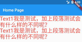
下面是一个简单的文本示例,来看Text如何使用。我们给TextStyle设置了Colors.red,textScaleFactor = 2.0 字体放大两倍。
import 'package:flutter/material.dart';

void main() => runApp(MyApp());

class MyApp extends StatelessWidget {
  // This widget is the root of your application.
  @override
  Widget build(BuildContext context) {
    return MaterialApp(
      title: 'Flutter Demo',
      theme: ThemeData(
        primarySwatch: Colors.blue,
      ),
      home: MyHomePage(),
    );
  }
}

class MyHomePage extends StatefulWidget {
  @override
  _MyHomePageState createState() => _MyHomePageState();
}

class _MyHomePageState extends State<MyHomePage> {
  @override
  Widget build(BuildContext context) {
    return Scaffold(
        appBar: AppBar(
          title: Text("Home Page"),
        ),
        body: Wrap(
          children: <Widget>[
            Text(
              "Text1我是测试,加上段落测试会有什么样的不同呢?\nText1我是测试,加上段落测试会有什么样的不同呢?",
              style: TextStyle(color: Colors.red),
              textScaleFactor: 2.0,
            )
          ],
        ));
  }
}
一、 TextStyle
上面例子是一个简单的用法,很多Field我们没有做控制,下面重点学习TextStyle都能改变Text哪些样式。
const TextStyle({
    this.inherit = true,
    this.color,
    this.backgroundColor,
    this.fontSize,
    this.fontWeight,
    this.fontStyle,
    this.letterSpacing,
    this.wordSpacing,
    this.textBaseline,
    this.height,
    this.locale,
    this.foreground,
    this.background,
    this.shadows,
    this.fontFeatures,
    this.decoration,
    this.decorationColor,
    this.decorationStyle,
    this.decorationThickness,
    this.debugLabel,
    String fontFamily,
    List<String> fontFamilyFallback,
    String package,
  })
inherit ---- 是否使用父 Widget 中的 TextStyle 覆盖当前null值,下面是Text源码中的build函数,我们看到 style.inherit 为 true 的时候会合并 defaultTextStyle。
  @override
  Widget build(BuildContext context) {
    final DefaultTextStyle defaultTextStyle = DefaultTextStyle.of(context);
    TextStyle effectiveTextStyle = style;
    if (style == null || style.inherit)
      effectiveTextStyle = defaultTextStyle.style.merge(style);
    ......
  }
color ---- 字体颜色
backgroundColor ---- 背景颜色
fontSize ---- 字体大小
fontWeight ---- 绘画文字时要使用的字体厚度,Bold、Medium等
fontStyle ---- 字体样式,绘制字母时要使用的字体变体(例如斜体)。
/// 是否倾斜字体中的字形
enum FontStyle {
  /// 使用直立的字形
  normal,
  /// 使用专为倾斜设计的标志符号
  italic,
}
letterSpacing ---- 每个字母之间要增加的空间量(以逻辑像素为单位),可以使用负值使字母更接近。
wordSpacing ---- 在空白的每个序列(即每个单词之间)要添加的空间量(以逻辑像素为单位)。 负值可用于使单词更接近。
textBaseline ---- 用于对齐文本的水平线。
height ---- 该属性用于指定行高,但它并不是一个绝对值,而是一个因子,具体的行高等于 fontSize * height。
locale ---- 国际化相关
foreground ---- 前景Paint
background ---- 背景Paint
shadows ---- 将在文本下方绘制的 [Shadow] 的列表。
fontFeatures ---- 会影响字体选择字形的 [FontFeature] 列表。
decoration ---- 在文字附近绘制的装饰(例如下划线)。
decorationColor ---- 绘制装饰的颜色
decorationStyle ---- 绘制装饰的样式
enum TextDecorationStyle {
  /// 画一条实线
  solid,
  /// 画两条线
  double,
  /// 画一条点画线
  dotted,
  /// 画一条短横线虚线
  dashed,
  /// 画一条波浪线
  wavy
}
decorationThickness ---- 装饰笔触的粗细因子,乘以字体定义的粗细得到最终的装饰笔触粗细。
debugLabel ---- 这种文本样式的可读描述
fontFamily ---- 由于不同平台默认支持的字体集不同,所以在手动指定字体时一定要先在不同平台测试一下。
fontFamilyFallback ---- 可以提供自定义的 [fontFamilyFallback] 列表。 该列表应该是字体家族名称的字符串的有序列表,按尝试顺序排列。[fontFamilyFallback] 中的字体仅在 [fontFamily] 中不存在请求的字形时使用。
package ---- 指定包名,要使用Package中定义的字体,必须提供package参数。
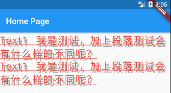
下面我们尝试尽可能多的属性控制,查看字符如何显示。
class _MyHomePageState extends State<MyHomePage> {
  @override
  Widget build(BuildContext context) {
    return Scaffold(
        appBar: AppBar(
          title: Text("Home Page"),
        ),
        body: Wrap(
          children: <Widget>[
            Text(
              "Text1 我是测试,加上段落测试会有什么样的不同呢?\nText1 我是测试,加上段落测试会有什么样的不同呢?",
              style: TextStyle(
                  color: Colors.red,
                  backgroundColor: Colors.blue,
                  fontSize: 18.0,
                  fontWeight: FontWeight.bold,
                  fontStyle: FontStyle.italic,
                  letterSpacing: -1,
                  wordSpacing: 10.0,
                  height: 1.2,
                  decoration:TextDecoration.underline,
                  decorationStyle: TextDecorationStyle.wavy,
                  decorationThickness: 3.0),
              textScaleFactor: 2.0,
            )
          ],
        ));
  }
}

接下来绘制文字阴影试试。
class _MyHomePageState extends State<MyHomePage> {
  @override
  Widget build(BuildContext context) {
    return Scaffold(
        appBar: AppBar(
          title: Text("Home Page"),
        ),
        body: Wrap(
          children: <Widget>[
            Text(
              "Text1 我是测试,加上段落测试会有什么样的不同呢?\nText1 我是测试,加上段落测试会有什么样的不同呢?",
              style: TextStyle(
                color: Colors.red,
                fontSize: 24.0,
                fontWeight: FontWeight.normal,
                fontStyle: FontStyle.normal,
                letterSpacing: 2,
                wordSpacing: 10.0,
                height: 1.2,
                decoration: TextDecoration.underline,
                decorationStyle: TextDecorationStyle.solid,
                shadows: <Shadow>[
                  Shadow(color: Colors.grey, offset: Offset(4, 6))
                ],
              ),
            )
          ],
        ));
  }
}
二、 自定义字体
为了使用自定义的字体,首先要将字体资源引入到工程中,并在pubspec.yaml中声明。
2.1 在pubspec.yaml中声明
接下来我们在工程根目录下创建assets文件夹,并在其内创建fonts文件夹,接下里我从windows–字体,拷贝了一份叶根友刀锋黑草字体(这是我之前安装的字体),添加到pubspec.yaml文件声明中,折腾了半天这个字体没有被加载上来,心灰意冷之际看到其他小伙伴用的是从https://fonts.google.com下载来的字体,我下载了一份Caladea字体,更新pubspec.yaml文件后,重新编译了程序,居然好了。然后再把叶根友刀锋黑草字体使用一把,发现也好了。我想这估计是因为编译系统抽风的原因,因为我当时解包了app并没有发现我之前的字体文件。下面是配置文件。
fonts:
    - family: Caladea
      fonts:
        - asset: assets/fonts/Caladea-Regular.ttf
        - asset: assets/fonts/Caladea-Italic.ttf
          style: italic

    - family: yegenyoudaofengheicao1
      fonts:
        - asset: assets/fonts/yegenyoudaofengheicao1.ttf
style: italic是为了指定具体ttf字体为斜体使用

2.2 使用
接下来看看代码,使用了三组Text对照,第一组使用Caladea字体,第二组使用叶根友刀锋黑草字体,最后一组不指定字体文件。
class _MyHomePageState extends State<MyHomePage> {
  @override
  Widget build(BuildContext context) {
    return Scaffold(
        appBar: AppBar(
          title: Text("Home Page"),
        ),
        body: Wrap(
          children: <Widget>[
            Text(
              "Text1 english word go cat dog hello world. 这里是中文",
              style: TextStyle(
                color: Colors.red,
                fontSize: 24.0,
                fontWeight: FontWeight.normal,
                fontStyle: FontStyle.normal,
                letterSpacing: 2,
                wordSpacing: 10.0,
                height: 1.2,
                fontFamily: 'yegenyoudaofengheicao1',
              ),
            ),
            Text(
              "Text1 english word go cat dog hello world. 这里是中文",
              style: TextStyle(
                color: Colors.red,
                fontSize: 24.0,
                fontWeight: FontWeight.normal,
                fontStyle: FontStyle.italic,
                letterSpacing: 2,
                wordSpacing: 10.0,
                height: 1.2,
                fontFamily: 'Caladea',
              ),
            ),
            Text(
              "Text1 english word go cat dog hello world. 这里是中文",
              style: TextStyle(
                color: Colors.red,
                fontSize: 24.0,
                fontWeight: FontWeight.normal,
                fontStyle: FontStyle.normal,
                letterSpacing: 2,
                wordSpacing: 10.0,
                height: 1.2,
              ),
            )
          ],
        ));
  }
}

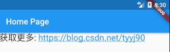
三、TextSpan
如果我们需要对一个Text内容的不同部分按照不同的样式显示,这时就可以使用TextSpan,它代表文本的一个“片段”。这在android开发中和SpannableString类似。
const TextSpan({
    this.text,
    this.children,
    TextStyle style,
    this.recognizer,
    this.semanticsLabel,
  })
以上这些属性在前面基本都见过了,recognizer除外。
recognizer ---- GestureRecognizer类,和手势识别相关,比如识别点击。
class _MyHomePageState extends State<MyHomePage> {
  @override
  Widget build(BuildContext context) {
    return Scaffold(
        appBar: AppBar(
          title: Text("Home Page"),
        ),
        body: Wrap(
          children: <Widget>[
            Text.rich(
              TextSpan(children: [
                TextSpan(text: "获取更多: "),
                TextSpan(
                  text: "https://blog.csdn.net/tyyj90",
                  style: TextStyle(
                      color: Colors.blue,
                      decorationColor: Colors.blue,
                      decorationStyle: TextDecorationStyle.solid,
                      decoration: TextDecoration.underline),
                ),
              ]),
              textScaleFactor: 1.5,
            )
          ],
        ));
  }
}
四、StrutStyle
strut这个词是支柱、支撑物、支撑杆和压杆的意思,单从字面上很难理解这个样式到底在干什么。结合几个例子才能更好的理解。
const StrutStyle({
    String fontFamily,
    List<String> fontFamilyFallback,
    this.fontSize,
    this.height,
    this.leading,
    this.fontWeight,
    this.fontStyle,
    this.forceStrutHeight,
    this.debugLabel,
    String package,
  })
fontFamliy — 计算Strut时使用的字体名称(例如Roboto)。不会从字体绘制字形,并且该字体将仅用于度量。
fontFamilyFallback ---- 当找不到 [fontFamily] 中的字体时将搜索的字体家族名称的有序列表。当所有指定的字体系列用尽时,找不到匹配的内容,将使用默认平台字体。
fontSize ---- 字体大小,the size of the ascent plus descent in logical pixels.
height ---- 高度因子
leading ---- 该自定义leading将以[fontSize]的倍数应用于Strut。
fontWeight ---- 计算Strut时要使用的字体厚度
fontStyle ---- 计算Strut时使用的字体变体(例如,斜体)。
forceStrutHeight ---- 如果为true,则所有行都将以Strut的高度布置。所有行和运行特定的度量将被忽略/覆盖,而仅使用strut度量。此属性保证行间距均匀,但是相邻行中的文本可能会重叠。应谨慎启用此属性,因为它会绕过垂直布局系统的大部分。
debugLabel ---- 这种Strut样式的可读描述。
package ---- 如果在包中定义了字体,则“package”参数必须为非空。结合“fontFamily”参数来设置 [fontFamily] 属性。
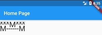
下面的两个例子,来自代码中的注释,体会一下上面Field的含义。
class _MyHomePageState extends State<MyHomePage> {
  @override
  Widget build(BuildContext context) {
    return Scaffold(
        appBar: AppBar(
          title: Text("Home Page"),
        ),
        body: Wrap(
          children: <Widget>[
            Text.rich(
              TextSpan(
                text: '---------         ---------\n',
                style: TextStyle(
                  fontSize: 14,
                  fontFamily: 'Roboto',
                ),
                children: <TextSpan>[
                  TextSpan(
                    text: '^^^M^^^\n',
                    style: TextStyle(
                      fontSize: 30,
                      fontFamily: 'Roboto',
                    ),
                  ),
                  TextSpan(
                    text: 'M------M\n',
                    style: TextStyle(
                      fontSize: 30,
                      fontFamily: 'Roboto',
                    ),
                  ),
                ],
              ),
              strutStyle: StrutStyle(
                fontFamily: 'Roboto',
                fontSize: 14,
                height: 1,
                forceStrutHeight: true,
              ),
            )
          ],
        ));
  }
}
接下里看首字母变成引导字母变大怎么处理。
class _MyHomePageState extends State<MyHomePage> {
  @override
  Widget build(BuildContext context) {
    return Scaffold(
        appBar: AppBar(
          title: Text("Home Page"),
        ),
        body: Wrap(
          children: <Widget>[
            Text.rich(
              TextSpan(
                text: '       he candle flickered\n',
                style: TextStyle(fontSize: 14, fontFamily: 'Serif'),
                children: <TextSpan>[
                  TextSpan(
                    text: 'T',
                    style: TextStyle(fontSize: 37, fontFamily: 'Serif'),
                  ),
                  TextSpan(
                    text: 'in the moonlight as\n',
                    style: TextStyle(fontSize: 14, fontFamily: 'Serif'),
                  ),
                  TextSpan(
                    text: 'Dash the bird fluttered\n',
                    style: TextStyle(fontSize: 14, fontFamily: 'Serif'),
                  ),
                  TextSpan(
                    text: 'off into the distance.',
                    style: TextStyle(fontSize: 14, fontFamily: 'Serif'),
                  ),
                ],
              ),
              strutStyle: StrutStyle(
                fontFamily: 'Serif',
                fontSize: 14,
                forceStrutHeight: true,
              ),
            ),
          ],
        ));
  }
}

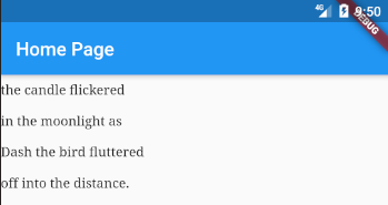
再来观察一下leading的效果。
class _MyHomePageState extends State<MyHomePage> {
  @override
  Widget build(BuildContext context) {
    return Scaffold(
        appBar: AppBar(
          title: Text("Home Page"),
        ),
        body: Wrap(
          children: <Widget>[
            Text.rich(
              TextSpan(
                text: 'the candle flickered\n',
                style: TextStyle(fontSize: 14, fontFamily: 'Serif'),
                children: <TextSpan>[
                  TextSpan(
                    text: 'in the moonlight as\n',
                    style: TextStyle(fontSize: 14, fontFamily: 'Serif'),
                  ),
                  TextSpan(
                    text: 'Dash the bird fluttered\n',
                    style: TextStyle(fontSize: 14, fontFamily: 'Serif'),
                  ),
                  TextSpan(
                    text: 'off into the distance.',
                    style: TextStyle(fontSize: 14, fontFamily: 'Serif'),
                  ),
                ],
              ),
              strutStyle: StrutStyle(
                fontFamily: 'Serif',
                fontSize: 14,
                forceStrutHeight: true,
                leading: 1.0
              ),
            ),
          ],
        ));
  }
}
五、softWrap
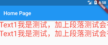
文本是否应在换行处中断。改变bool值softWrap即可,当softWrap为false换行处不中断折行。默认为true。
class _MyHomePageState extends State<MyHomePage> {
  @override
  Widget build(BuildContext context) {
    return Scaffold(
        appBar: AppBar(
          title: Text("Home Page"),
        ),
        body: Wrap(
          children: <Widget>[
            Text(
              "Text1我是测试,加上段落测试会有什么样的不同呢?\nText1我是测试,加上段落测试会有什么样的不同呢?",
              style: TextStyle(color: Colors.red),
              textScaleFactor: 2.0,
              softWrap: false,
            )
          ],
        ));
  }
}
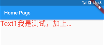
六、overflow
overflow处理溢出文本。
enum TextOverflow {
  /// 裁剪
  clip,
  /// 使溢出的文本淡入透明。
  fade,
  /// 使用省略号表示文本已溢出。
  ellipsis,
  /// 将溢出的文本呈现在其容器之外。
  visible,
}
下面我们先设置overflow为TextOverflow.clip。
class _MyHomePageState extends State<MyHomePage> {
  @override
  Widget build(BuildContext context) {
    return Scaffold(
        appBar: AppBar(
          title: Text("Home Page"),
        ),
        body: Wrap(
          children: <Widget>[
            ConstrainedBox(
              constraints: BoxConstraints(maxWidth: 300, maxHeight: 100),
              child: Text(
                "Text1我是测试,加上段落测试会有什么样的不同呢?\nText1我是测试,加上段落测试会有什么样的不同呢?",
                style: TextStyle(color: Colors.red),
                textScaleFactor: 2.0,
                overflow: TextOverflow.clip,
              ),
            )
          ],
        ));
  }
}
接着修改上面的代码 overflow: TextOverflow.fade。

overflow: TextOverflow.ellipsis。
最后看看设置为visible的效果。

