说来,最近碰到某群友的一个问题:后端没有设置分页,前端怎么做?不知怎的,这让我一下想到了vue中的computed配合JS设置元素个数与page之间的关系。正巧这两天在学习第三方滚动插件:vue-awesome-swiper的使用,故而写一篇文章来总结一下。
创建项目
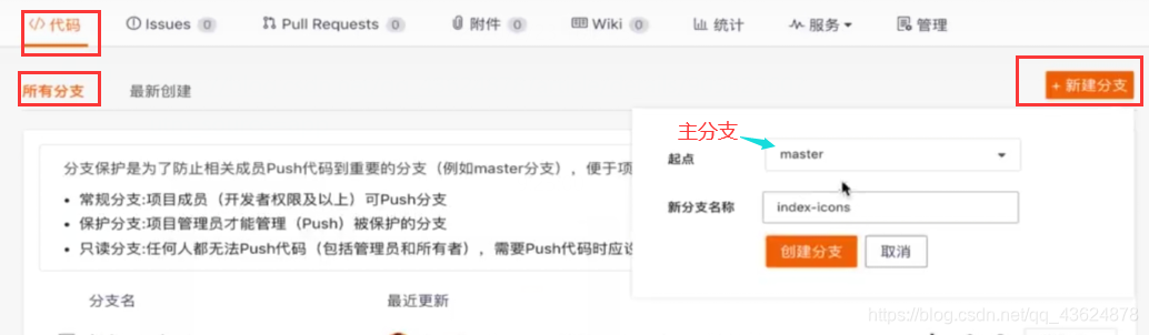
先说,笔者使用的【码云】,在【代码 > 所有分支】处,点击【新建分支】:
然后我们进入创建好的项目文件夹
这里笔者使用的是Linux环境
输入:
git pull

git checkout 项目名(这里就是上面创建的index-icons)
然后进入编辑器,打开components文件夹(我们在这里创建项目所需组件),新建文件Icons.vue:初始时为
<template>

</template>
<script>
	export default {
		name: 'HomeIcons'
	}
</script>
<style lang="stylus" scoped>
</style>
在“页面”组件Home.vue中引入此组件:
//在template中的div中添加:
<home-icons></home-icons>
//在script标签中添加:
import HomeIcons from './components/Icons.vue'
//...
export default {
	//...
	components: {
		HomeIcons
	}
}
现在,让我们正式开始Icons.vue的编写:
template和style的编写
<template>
  <div class="icons">
    <swiper :options="swiperOption">
      <swiper-slide>
        <div
          class="icon"
          v-for="item of list"
          :key="item.id"
        >
          <div class='icon-img'>
            <img class='icon-img-content' :src='item.imgUrl' />
          </div>
          <p class="icon-desc">{{item.desc}}</p>
        </div>
      </swiper-slide>
    </swiper>
  </div>
</template>
<style lang="stylus" scoped>
  @import '~styles/varibles.styl'
  @import '~styles/mixins.styl'
  .icons >>> .swiper-container
    height: 0
    padding-bottom: 50%
  .icons
    margin-top: .1rem
    .icon
      position: relative
      overflow: hidden
      float: left
      width: 25%
      height: 0
      padding-bottom: 25%
      .icon-img
        position: absolute
        top: 0
        left: 0
        right: 0
        bottom: .44rem
        box-sizing: border-box
        padding: .1rem
        .icon-img-content
          display: block
          margin: 0 auto
          height: 100%
      .icon-desc
        position: absolute
        left: 0
        right: 0
        bottom: 0
        height: .44rem
        line-height: .44rem
        text-align: center
        color: $darkTextColor
        ellipsis()
</style>
关于stylus,这是css的一个分支,有关它的下载及在main.js文件里的引入网上一搜一大把,这里笔者就不做介绍了。(因为这里用普通的css亦可)
《CSS世界》中有这么一句话:“当padding用百分比做值时,它表示的其实是div(元素)的宽高比。”
我们接着进行下一步,也是最重要的一步:
script部分的编写
我们在上面template代码中发现了这样一个标签:
<swiper>
	<swiper-slide>
		/**/
	</swiper-slide>
</swiper>
这是笔者引用的一个第三方插件 —— vue-awesome-swiper(GitHub官网)
其引入方式如下:
npm install vue-awesome-swiper@2.6.7 --save
然后在主配置文件main.js中导入:
import VueAwesomeSwiper from 'vue-swesome-swiper'
import 'swiper/dist/css/swiper.css'

Vue.use(VueAwesomeSwiper)
之后按上面方式使用即可!(每一个swiper-slide都为“滚动”的“一页”)
如上面所示,这里的img-src必须是获取后端的数据 —— 所以笔者采用了v-for的形式遍历data中的数据:
// js-data代码
  props: {
    list: Array
  },
  data () {
    return {
      swiperOption: {
        autoplay: false   //自动播放(滚动)选项
      }
    }
  },
目前为止,大部分功能已经完成,但是如果在data中放上模拟数据 会发现一个问题:不能分页! 而且已经超出8个元素之后的元素会被隐藏掉(这里设置“一页”有8个元素存在)。
这不符合我们的初衷——左右滑动;也不能解决摘要中的问题:前端分页。
想到前端分页,就想到了用JS判断元素个数与page之间的关系,于是,就想到了vue中的computed计算属性:
// js-computed代码
  computed: {
    pages () {
      const pages = []
      this.list.forEach((item, index) => {
        const page = Math.floor(index / 8)
        if (!pages[page]) {
          pages[page] = []
        }
        pages[page].push(item)
      })
      return pages   //一定要return出去,要被引用的
    }
  }
然后回到template中,在swiper-slide中添加v-for循环,将v-for中的“数组名”由list改为swiper-slide中for的“循环元素”page!
//template代码修改部分
      <swiper-slide v-for="(page, index) of pages" :key="index">
        <div
          class="icon"
          v-for="item of page"
          :key="item.id"
        >
          <div class='icon-img'>
            <img class='icon-img-content' :src='item.imgUrl' />
          </div>
          <p class="icon-desc">{{item.desc}}</p>
        </div>
      </swiper-slide>
最后,我们要把此分支合并、提交到线上:
git add .
git commit -m 'add icons'
git push
git checkout master
git push
文字部分优化小技巧:
超出指定长度部分变为“…”
要达到这个效果,只需在文字部分加上如下三条CSS样式即可:
overflow: hidden;
white-space: nowrap;
text-overflow:ellipsis;
