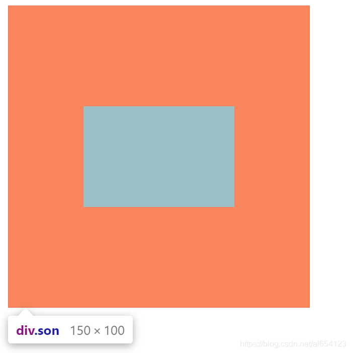
一、用padding实现
1.padding-top = (父盒子的高度 - 子盒子的高度) / 2
2.padding-left = (父盒子的宽度 - 子盒子的宽度) / 2
3.由于padding会撑大盒子,所以父盒子的宽高要减去对应的padding值
<!DOCTYPE html>
<html lang="zh-CN">

<head>
    <meta charset="UTF-8">
    <meta name="viewport" content="width=device-width, initial-scale=1.0">
    <title>盒子居中联系</title>
    <style>
        /* 大盒子300*300,小盒子150*100,怎么使小盒子在大盒子里面居中 */
        .dad {
            /* 300-75=225 */
            width: 225px;
            /* 300-100=200 */
            height: 200px;
            background-color: #f34;
            /* (300-150)/2=75 */
            padding-left: 75px;
            /* (300-100)/2=100 */
            padding-top: 100px;
        }

        .son {
            width: 150px;
            height: 100px;
            background-color: #ee9;

        }
    </style>
</head>

<body>
    <div class="dad">
        <div class="son"></div>
    </div>
</body>

</html>
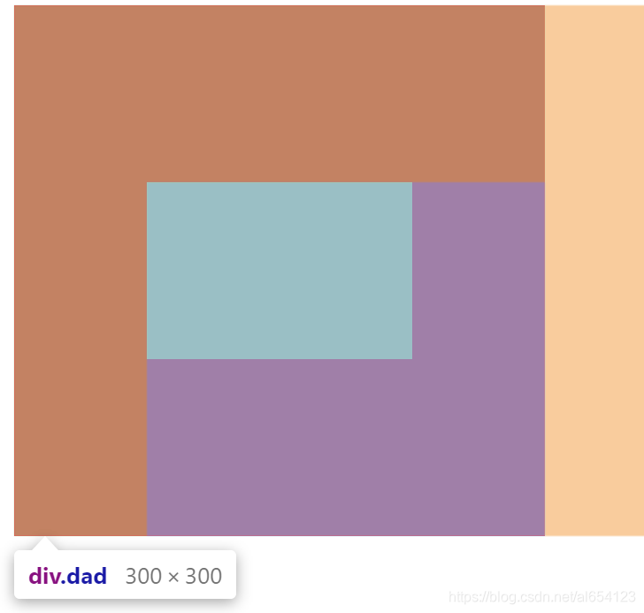
二、用margin实现
1.margin-top = (父盒子的高度 - 子盒子的高度) / 2
2.margin-left = (父盒子的宽度 - 子盒子的宽度) / 2
3.子盒子加margin-top会使父盒子产生塌陷,需要解决塌陷问题
<!DOCTYPE html>
<html lang="zh-CN">

<head>
    <meta charset="UTF-8">
    <meta name="viewport" content="width=device-width, initial-scale=1.0">
    <title>盒子垂直居中</title>
    <style>
        /* 大盒子300*300,小盒子150*100,怎么使小盒子在大盒子里面居中 */
        .dad {
            /* 嵌套的盒子中,子盒子的margin-top会产生塌陷 */
            overflow: hidden;
            width: 300px;
            height: 300px;
            background-color: #f34;
        }

        .son {
            width: 150px;
            height: 100px;
            /* (300-100)/2 */
            margin-top: 100px;
            /* (300-150)/2 */
            margin-left: 75px;
            background-color: #ee9;
        }
    </style>
</head>

<body>
    <div class="dad">
        <div class="son"></div>
    </div>
</body>

</html>
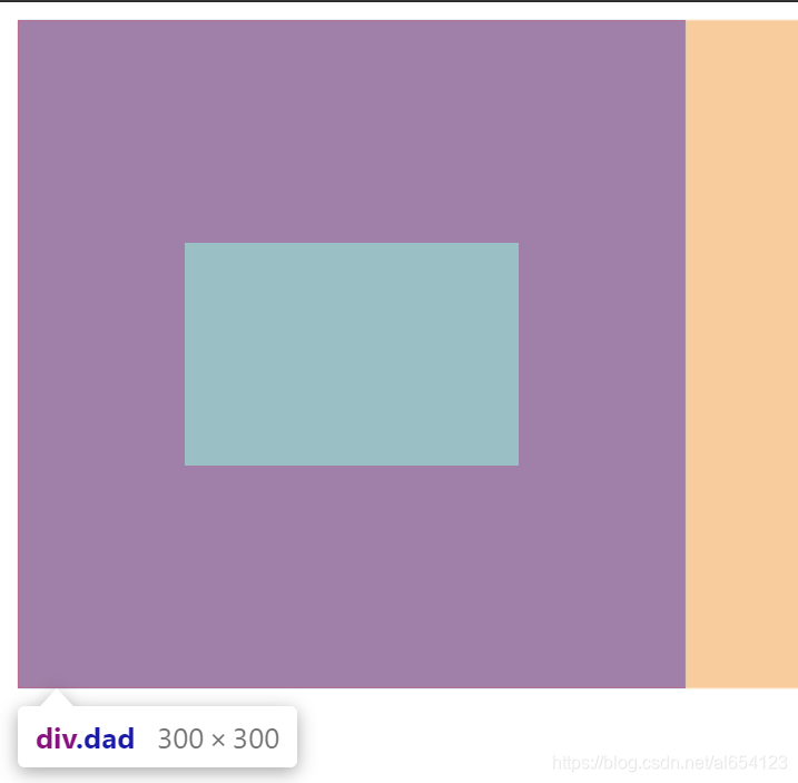
三、text-align+margin
1.先利用text-align:center;时盒子水平居中。
2.由于text-align不能是块级元素水平居中,所以要对子盒子进行类型转换。
3.再利用margin实现垂直居中
<!DOCTYPE html>
<html lang="zh-CN">

<head>
    <meta charset="UTF-8">
    <meta name="viewport" content="width=device-width, initial-scale=1.0">
    <title>盒子垂直居中</title>
    <style>
        /* 大盒子300*300,小盒子150*100,怎么使小盒子在大盒子里面居中 */
        .dad {
            width: 300px;
            height: 300px;
            background-color: #f34;
            /* 让除了块级元素以外的元素水平居中 */
            text-align: center;

        }

        .son {
            /* 转为行内块元素 */
            display: inline-block;
            /* (300-100)/2 */
            margin-top: 100px;
            width: 150px;
            height: 100px;
            background-color: #ee9;
        }
    </style>
</head>

<body>
    <div class="dad">
        <div class="son"></div>
    </div>
</body>

</html>
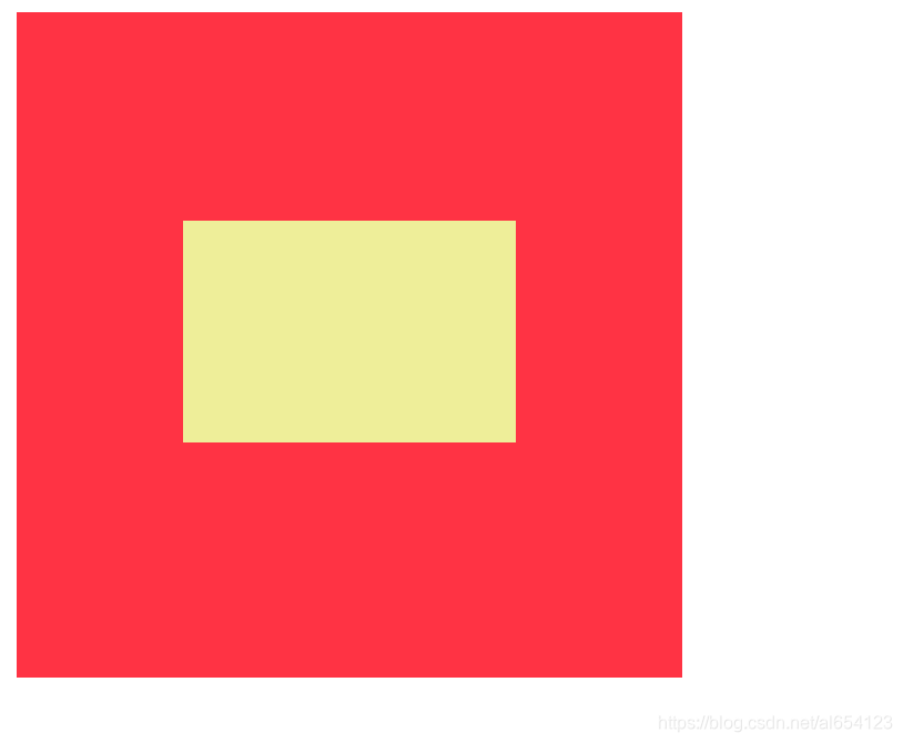
四、利用定位
<!DOCTYPE html>
<html lang="zh-CN">

<head>
    <meta charset="UTF-8">
    <meta name="viewport" content="width=device-width, initial-scale=1.0">
    <title>使用定位+auto</title>
    <style>
        /* 大盒子300*300,小盒子150*100,怎么使小盒子在大盒子里面居中 */
        .dad {
            /* 父相 */
            position: relative;
            width: 300px;
            height: 300px;
            background-color: #f34;
        }

        .son {
            /* 子绝 */
            position: absolute;
            /* 先向下偏移父盒子高度的一半,此时子盒子的上边线垂直居中于父盒子 */
            top: 50%;
            /* 再向上移动自身高度的一半 */
            margin-top: -50px;
            /* 先向右偏移父盒子宽度的一半,此时子盒子的左边线水平居中于父盒子 */
            left: 50%;
            /* 再向右移动自身宽度的一半 */
            margin-left: -75px;
            width: 150px;
            height: 100px;
            background-color: #ee9;
        }
    </style>
</head>

<body>
    <div class="dad">
        <div class="son"></div>
    </div>
</body>

</html>
五、利用定位-auto
1.利用子绝父相定位,再使子盒子上下左右的距离都为0
2.margin:auto;一般情况下只能使盒子水平居中,但当子盒子上下左右距离都为0,此时可实现盒子垂直水平居中的效果。
3.且此时,无论父盒子和子盒子宽高如何改变,子盒子都是垂直居中的。
<!DOCTYPE html>
<html lang="zh-CN">

<head>
    <meta charset="UTF-8">
    <meta name="viewport" content="width=device-width, initial-scale=1.0">
    <title>使用定位+auto</title>
    <style>
        /* 大盒子300*300,小盒子150*100,怎么使小盒子在大盒子里面居中 */
        .dad {
            /* 父相 */
            position: relative;
            width: 300px;
            height: 300px;
            background-color: #f34;
        }

        .son {
            /* 子绝 */
            position: absolute;
            /* 让盒子边偏移上下左右值都为0,再利用margin:auto来实现水平垂直都居中 */
            top: 0;
            bottom: 0;
            left: 0;
            right: 0;
            margin: auto;
            /* 此时,无论盒子大小如何改变,都是水平垂直居中 */
            width: 150px;
            height: 100px;
            background-color: #ee9;
        }
    </style>
</head>

<body>
    <div class="dad">
        <div class="son"></div>
    </div>
</body>

</html>