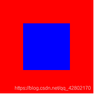
效果如下:
结构代码:
<div class="father">
   		<div class="child"></div>
   </div>
1.方法一:采用弹性盒子
css代码:
.father{
    		width: 200px;
    		height: 200px;
    		background-color: red;
    		display: flex;
    		align-items: center;
    		justify-content: center;
    	}
    	.child{
    		width: 100px;
    		height: 100px;
    		background-color: blue;

    	}
2.方法二:利用父盒子:table-cell+子盒子:inline-block
css代码:
.father{
    		width: 200px;
    		height: 200px;
    		background-color: red;
    		display: table-cell;
    		text-align: center;
    		vertical-align: middle;
    	}
    	.child{
    		width: 100px;
    		height: 100px;
    		background-color: blue;
    		display: inline-block;
    		vertical-align: middle;
    	}
3.方法三:定位+位移
css代码:
.father{
    		width: 200px;
    		height: 200px;
    		background-color: red;
    		position: relative;
    	}
    	.child{
    		width: 100px;
    		height: 100px;
    		background-color: blue;
    		position: absolute;
    		left: 50%;
    		top: 50%;
    		transform: translate(-50%,-50%);
    	}
4.方法四:定位+子盒子左边距、上边距的一半
css代码:
.father{
    		width: 200px;
    		height: 200px;
    		background-color: red;
    		position: relative;
    	}
    	.child{
    		width: 100px;
    		height: 100px;
    		background-color: blue;
    		position: absolute;
    		left: 50%;
    		top: 50%;
    		margin-left: -50px;//为宽度的一半
    		margin-top: -50px;//为高度的一般
    	}
5.方法五: 给子盒子设置定位的上下左右都为0 ,,然后设置margin自动适应
css代码:
.father{
    		width: 200px;
    		height: 200px;
    		background-color: red;
    		position: relative;
    	}
    	.child{
    		width: 100px;
    		height: 100px;
    		background-color: blue;
    		position: absolute;
    		top: 0;
    		right: 0;
    		bottom: 0;
    		left: 0;
    		margin: auto;
    	}
6.方法六:利用calc计算
.father {
        width: 200px;
        height: 200px;
        background-color: red;
        border: 1px solid red;

    }

    .child {
        width: 100px;
        height: 100px;
        background-color: blue;
       margin-top: 50px;
       margin-left: 50px;
    }
7.方法七:父盒子高度或者宽度的一半减去子盒子高度或者宽的的一半
 .father {
        width: 200px;
        height: 200px;
        background-color: red;
        overflow: hidden;

    }

    .child {
        width: 100px;
        height: 100px;
        background-color: blue;
       margin-top: 50px;
       margin-left: 50px;
    }
