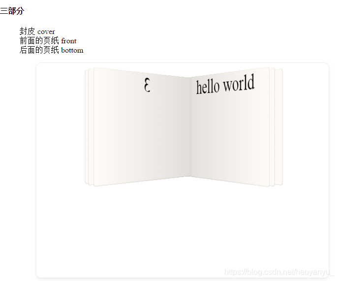
鼠标悬停,书翻开
主要是学习css的perspective透视属性的衍生物
- perspective: none/ 具体数字(父元素)
近大远小
none: 表示没有3D透视
数字取值越大越接近none的效果,取值0时跟none也是一样的效果
transform: perspective(200px)作用于子元素,跟上面父元素效果一样
https://www.jb51.net/css/462429.html - perspective-origin源点角度,传入2个值,表示x轴和y轴(定义在父元素,设置了perspective的元素上)
x: 数字,百分比,left, center, right
y:数字,百分比,top, center, bottom

- HTML代码
<!DOCTYPE html>
<html>
<head>
<meta charset="utf-8" />
<meta name="viewport" content="width=device-width, initial-scale=1">
<title>自己实现的翻书</title>
<link rel="stylesheet" href="./style.css">
</head>
<body>
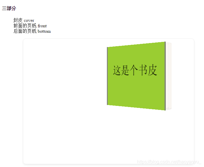
<h4> 三部分 </h4>
<ol>
<li>封皮 cover </li>
<li>前面的页纸 front</li>
<li>后面的页纸 bottom</li>
</ol>
<div class="fanshu">
<div id="book">
<ul class="bottom">
<li></li>
<li></li>
<li>hello world</li>
</ul>
<ul class="front">
<li>1</li>
<li>2</li>
<li>3</li>
</ul>
<ul class="cover"><li>这是个书皮</li></ul>
</div>
</div>
</body>
</html>
- css部分
.fanshu {
	border: 1px solid #eee;
	border-radius: 10px;
	width:80%;
	margin:10px auto;
	min-height: 50vh;
	box-shadow: 0 3px 8px #eee;
}
#book {
	position: relative;
	width: 50%;
	max-width: 250px;
	height: 200px;
	left: 50%;
	top: 30px;
	/* background: red; */
}
#book, ul, li {
	margin: 0;
	padding: 0;
	list-style: none;
}
ul {
	position: absolute;
	top: 0;
	left:0;
	bottom:0;
	width: 100%;
	height: 100%;
	/*-webkit-transform-style: preserve-3d;
	-moz-transform-style: preserve-3d;
	-o-transform-style: preserve-3d;
	transform-style: preserve-3d;*/
	-webkit-perspective: 1000px;
	-moz-perspective: 1000px;
	-o-perspective: 1000px;
	perspective: 1000px;
	-webkit-perspective-origin: 50% 50%;
	-moz-perspective-origin: 50% 50%;
	-o-perspective-origin: 50% 50%;
	perspective-origin:  50% 50%;

	/* background: purple; */
}

#book>ul>li {
	width:100%;
	height: 100%;
	left:0;
	display: list-item;
	text-align: center;
	font-size: 38px;


}
.cover {
	width: 100%;
    height: 100%;
	z-index: 2;
}
.cover>li {
	position: absolute;
	left:0;
	z-index: 1;
	width: 100%;
    height: 100%;
	background: yellowgreen;
	border-left: 4px solid gray;
	border-right: 4px solid gray;
	-webkit-transform-origin:0 100%;
	-moz-transform-origin:0 100%;
	transform-origin:0 100%;
	font-size: 40px;
	padding-top: 60px;
	box-sizing: border-box;
	transform: rotateY(-40deg) translateZ(8px);
	backface-visibility: hidden;
}
#book:hover>ul>li {
	-webkit-transform-origin:0 100%;
	-moz-transform-origin:0 100%;
	transform-origin:0 100%;
}
#book:hover > .cover {
	z-index: 1;

}
#book:hover > .cover>li {
	transform: rotateY(-135deg);
	transition-duration: 1.8s;
}

.front>li, .bottom>li {
	background: #fff;
	position: absolute;
	left: 0;
	top:0;
	transform-origin:0 100%;
	transform: rotateY(-34deg) translateZ(8px);
	border-radius: 0 5px 5px 0;
	background: linear-gradient(to right, #e1ddd8 0%, #fffbf6 100%);
	box-shadow: inset 0px -1px 2px rgba(50, 50, 50, 0.1), inset -1px 0px 1px rgba(150, 150, 150, 0.2);
}
.front {
	/* background: red; */
	z-index: 1;
	transform: rotateY(-34deg) translateZ(8px);
}
.front>li:nth-child(1) {
	transform: rotateY(-28deg);
}
.front>li:nth-child(2) {
	transform: rotateY(-30deg);
}
.front>li:nth-child(3) {
	transform: rotateY(-34deg);
}
/* 翻动时 */
#book:hover > .front>li:nth-child(1) {
	transform: rotateY(-145deg);
	transition-duration: 1.8s;
}
#book:hover > .front>li:nth-child(2) {
	transform: rotateY(-140deg);
	transition-duration: 2.3s;
}
#book:hover > .front>li:nth-child(3) {
	transform: rotateY(-134deg);
	transition-duration: 2.6s;
}

.bottom {
	z-index: 0;
	transform: rotateY(-15deg) translateZ(-8px);
}
.bottom>li:nth-child(1) {
	transform: rotateY(-34deg);
}
.bottom>li:nth-child(2) {
	transform: rotateY(-36deg);
}
.bottom>li:nth-child(3) {
	transform: rotateY(-38deg);
}

#book:hover > .bottom>li:nth-child(1) {
	transform: rotateY(-40deg);
	z-index: 0;
	transition-duration: 1.4s;
}
#book:hover > .bottom>li:nth-child(2) {
	transform: rotateY(-45deg);
	/* z-index: -1; */
	transition-duration: 1.2s;
}
#book:hover > .bottom>li:nth-child(3) {
	transform: rotateY(-48deg);
	/* z-index: -1; */
	transition-duration: 1.1s;
}