阅读目录
一、Matplotlib绘制简单的线图
二、Matplotlib绘制绘制分类变量
三、Matplotlib绘制水平条形图
四、Matplotlib绘制柱形图
五、Matplotlib绘制饼图
一、Matplotlib绘制简单的线图
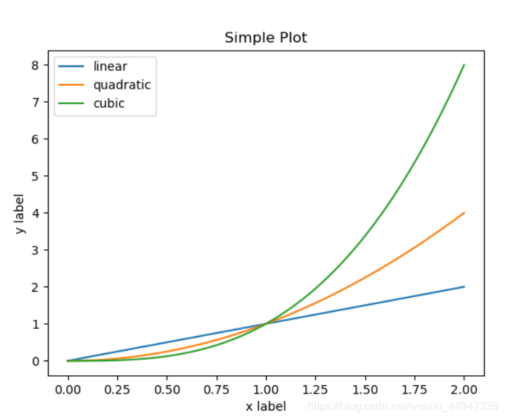
在第一次调用plt.plot创建轴,则后续调用plt.plot在同一坐标添加额外的线,以及 plt.xlabel,plt.ylabel,plt.title和plt.legend设置轴标签和标题和添加的图例
import matplotlib.pyplot as plt
import numpy as np

x = np.linspace(0, 2, 100)	#0到2之间取100个数
plt.plot(x, x, label='linear')	#(x坐标,y坐标,名称标记)
plt.plot(x, x**2, label='quadratic')
plt.plot(x, x**3, label='cubic')
plt.xlabel('x label')
plt.ylabel('y label')
plt.title("Simple Plot")
plt.legend()	# #将plot函数中的label展示出来:展示图例
plt.show()
numpy.linspace(start,stop,num = 50,endpoint = True,retstep =False,dtype = None,axis = 0 ) 返回指定间隔内的均匀间隔的数字。
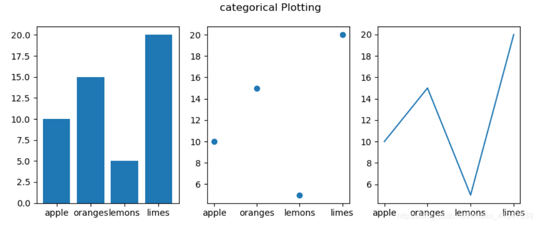
二、Matplotlib绘制绘制分类变量
import matplotlib.pyplot as plt
data = {'apple':10,'oranges':15,'lemons':5,'limes':20}
names = list(data.keys())
values = list(data.values())
#matplotlib.pyplot.subplots 创建一个图和一组子图。
#该实用程序包装器使您可以在一次调用中方便地创建子图的通用布局,包括封闭的图形对象。
fig,axs = plt.subplots(1,3,figsize=(9,3),sharey=False)
#sharey为True时x或y轴将在所有子图中共享,为False时每个子图的x轴或y轴将是独立的
#figsize : 2个元组的浮点数,默认值:rcParams["figure.figsize"] = [6.4, 4.8]
axs[0].bar(names,values)
axs[1].scatter(names,values)
axs[2].plot(names,values)
fig.suptitle('categorical Plotting')

plt.show()
matplotlib.pyplot.subplots 创建一个图和一组子图。
该实用程序包装器使您可以在一次调用中方便地创建子图的通用布局,包括封闭的图形对象。
sharey为True时x或y轴将在所有子图中共享,为False时每个子图的x轴或y轴将是独立的
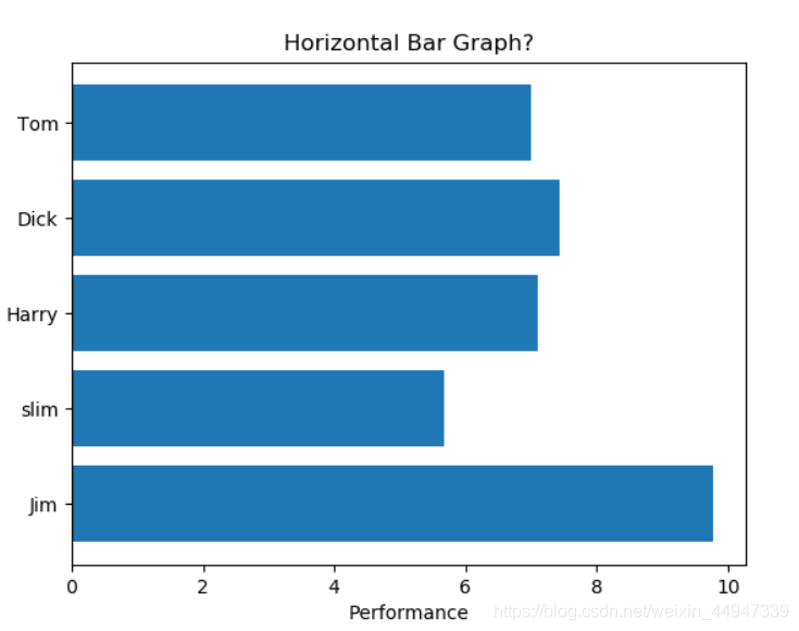
三、Matplotlib绘制水平条形图
import matplotlib.pyplot as plt
import numpy as np
#确定再现性的随机状态
np.random.seed(19680801)
plt.rcdefaults()
fig,ax = plt.subplots()
#示例数据
people = ('Tom','Dick','Harry','slim','Jim')
y_pos = np.arange(len(people))
performance = 10*np.random.rand(len(people))
ax.barh(y_pos,performance,align='center')
ax.set_yticks(y_pos)
ax.set_yticklabels(people)
ax.invert_yaxis()#标签自上而下读取
ax.set_xlabel('Performance')
ax.set_title('Horizontal Bar Graph?')
plt.show()
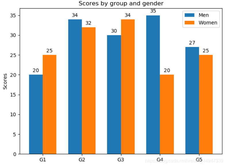
四、Matplotlib绘制柱形图
import matplotlib
import matplotlib.pyplot as plt
import numpy as np

labels = ['G1','G2','G3','G4','G5']
men_means = [20,34,30,35,27]
women_means = [25,32,34,20,25]

x = np.arange(len(labels))#标签位置
width = 0.35
fig,ax = plt.subplots()
rects1 = ax.bar(x-width/2,men_means,width,label='Men')
rects2 = ax.bar(x+width/2,women_means,width,label='Women')
#为标签、标题和自定义x轴刻度标签等添加一些文本。
ax.set_ylabel('Scores')
ax.set_title('Scores by group and gender')
ax.set_xticks(x)
ax.set_xticklabels(labels)
ax.legend()
#在*矩形*中的每一条上附加一个文本标签,显示其高度
def autolabel(rects):
    for rect in rects:
        height = rect.get_height()
        ax.annotate('{}'.format(height),
            xy= (rect.get_x()+rect.get_width()/2,height),
            xytext = (0,3),
            textcoords = "offset points",
            ha = 'center',va = 'bottom')
autolabel(rects1)
autolabel(rects2)
fig.tight_layout()
plt.show()
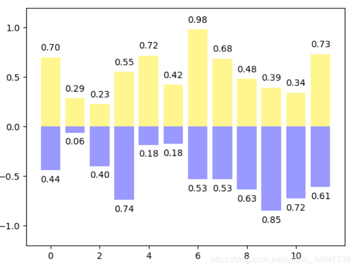
import numpy as np
import matplotlib.pyplot as plt

n = 12;x = np.arange(n)
np.random.seed(123)#随机种子
y1 = np.random.random(n)
y2 = np.random.random(n)
plt.bar(x,y1,facecolor="#FFF68F")
plt.bar(x,-y2,facecolor="#9999ff")

for i,j in zip(x,y1):
    plt.text(i,j+0.05,'%.2f'%j,ha='center',va = 'bottom')#ha是控制水平,va是控制垂直
for i,j in zip(x,y2):
    plt.text(i,-j-0.05,'%.2f'%j,ha='center',va = 'top')
plt.ylim(-1.2,1.2)
plt.show()
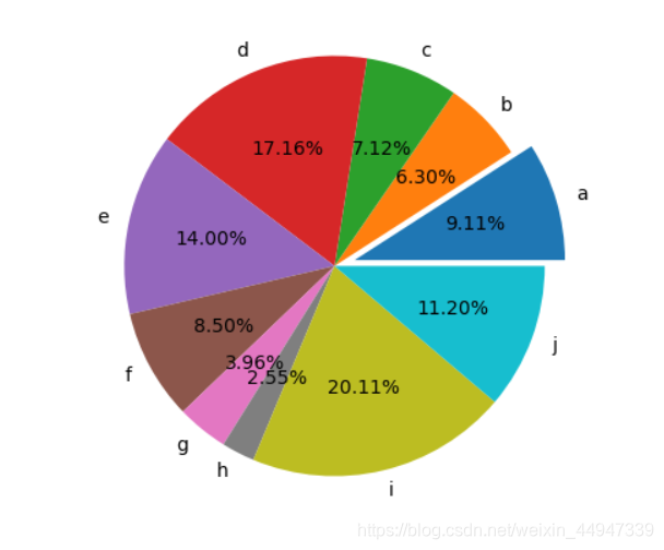
五、Matplotlib绘制饼图
import numpy as np
import matplotlib.pyplot as plt

n = 10
z = np.random.rand(n)
plt.figure(figsize=(5,5))
plt.pie(z,autopct='%.2f%%',explode=[0.1]+[0]*9,labels='abcdefghij',labeldistance=1.1)
#autopct显示数据类型,labels标签设置,labeldistance标签距离
plt.show()
matplotlib官网 学习笔记
