目录
基本操作
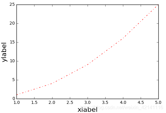
import numpy as np
import matplotlib.pyplot as plt

plt.plot([1,2,3,4,5],[1,4,9,16,25],'-.',color='r')   #横标,纵标,线条样式与颜色
plt.xlabel('xlabel',fontsize = 16)
plt.ylabel('ylabel',fontsize = 16)
图像如下,以及属性值表
子图与标注
标注
import numpy as np
import matplotlib.pyplot as plt

x = np.linspace(-10,10,)
y = np.sin(x)
plt.plot(x,y,linewidth=3,color='b',linestyle=':',marker='o',markerfacecolor='r',markersize=5,alpha=0.4,)  #线宽度,颜色,样式,标记点样式,标记点颜色,标记点规格

line = plt.plot(x,y)
plt.setp(line,linewidth=3,color='b',linestyle=':',marker='o',markerfacecolor='r',markersize=5,alpha=0.4)  #这两句话和之前一句效果相同
plt.text(0,0,'zhangjinlong')       #在某个坐标点加文本
plt.grid(True)                     #加上网格
plt.annotate('thisisaannotate',xy=(-5,0),xytext=(-2,0.3),arrowprops=dict(facecolor='red',shrink=0.05,headlength=10,headwidth=10))   #箭头注释,arrow箭头,xy箭头尖端坐标,xytext文本坐标,
子图
import numpy as np
import matplotlib.pyplot as plt

# 211 表示一会要画的图是2行一列的 最后一个1表示的是子图当中的第1个图
plt.subplot(211)
plt.plot(x,y,color='r')

# 212 表示一会要画的图是2行一列的 最后一个1表示的是子图当中的第2个图
plt.subplot(212)
plt.plot(x,y,color='b')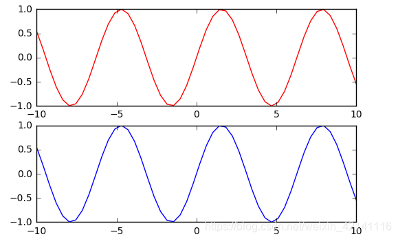
风格
 bmh风格
bmh风格
x = np.linspace(-10,10)
y = np.sin(x)
plt.style.use('bmh')
条形图
np.random.seed(0)
x = np.arange(5)
y = np.random.randint(-5,5,5)
print(y)
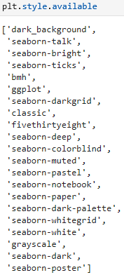
fig,axes = plt.subplots(ncols=2) #两个图,分占两列。如果没有参数则只有一个图。
v_bars = axes[0].bar(x,y,color='red') #条形图按行画
h_bars = axes[1].barh(x,y,color='red') #条形图按列画
axes[0].axhline(0,color='grey',linewidth=2) #画横轴线
axes[1].axvline(0,color='grey',linewidth=2) #画纵轴线
fig,axes = plt.subplots()
v_bars = axes.bar(x,y,color='lightblue')
for bar,height in zip(v_bars,y): #zip() 函数用于将可迭代的对象作为参数,将对象中对应的元素打包成一个个元组,然后返回由这些元组组成的列表。
if height<0:
bar.set(edgecolor='darkred',color='red',linewidth=3) #画一个条形图,对其中值小于0的单独设置风格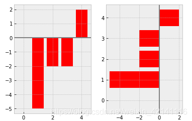
x = np.linspace(0,10,200)
y1 = 2*x+1
y2 = 3*x+1.2
y_mean = 0.5*x*np.cos(2*x)+2.5*x+1.1
fig,ax = plt.subplots()
ax.fill_between(x,y1,y2,color='red')
ax.plot(x,y_mean,color='black')
条形图细节
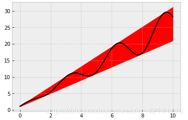
mean_values = [1,2,3]
variance = [0.2,0.4,0.5]
bar_label = ['bar1','bar2','bar3']

x_pos = list(range(len(bar_label)))                  #list将元组转换为列表
plt.bar(x_pos,mean_values,yerr=variance,alpha=0.3)   #绘图,参数分别为横标,纵标,误差帮,透明度
max_y = max(zip(mean_values,variance))    #两个数组传入,返回两个最大值
plt.ylim([0,(max_y[0]+max_y[1])*1.2])     #乘以1.2留白部分
plt.ylabel('variable y')                  #y轴名字
plt.xticks(x_pos,bar_label)               #x轴的位置以及每个位置的标签
plt.show() 
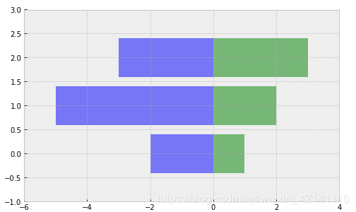
x1 = np.array([1,2,3])
x2 = np.array([2,5,3])
fig = plt.figure(figsize=(8,5)) #图像的长度和宽度
y_pos = np.arange(len(x1))
plt.barh(y_pos,x1,color='g',alpha=0.5)
plt.barh(y_pos,-x2,color='b',alpha=0.5)
plt.xlim(-max(x2)-1,max(x1)+1) #对四方留白的设置
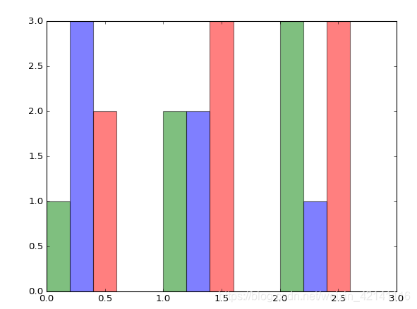
plt.ylim(-1,len(x1))green_data = [1, 2, 3]
blue_data = [3, 2, 1]
red_data = [2, 3, 3]
labels = ['group 1', 'group 2', 'group 3']
pos = list(range(len(green_data)))
width = 0.2
fig, ax = plt.subplots(figsize=(8,6))
#重点关注第一个元素的定位
plt.bar(pos,green_data,width,alpha=0.5,color='g',label=labels[0])
plt.bar([p+width for p in pos],blue_data,width,alpha=0.5,color='b',label=labels[1])
plt.bar([p+width*2 for p in pos],red_data,width,alpha=0.5,color='r',label=labels[2])
条形图外观
import matplotlib.plot as plt

data = range(200, 225, 5)
bar_labels = ['a', 'b', 'c', 'd', 'e']
fig = plt.figure(figsize=(10,8))
y_pos = np.arange(len(data))
plt.yticks(y_pos, bar_labels, fontsize=16)          #给y轴加刻度
bars = plt.barh(y_pos,data,alpha = 0.5,color='g')   #注意这里是barh所以是给y轴标数据
plt.vlines(min(data),-1,len(data)+0.5,linestyle = 'dashed')  #-1代表图形下方的空间,len(data)代表上方
for b,d in zip(bars,data): plt.text(b.get_width()+b.get_width()*0.05,b.get_y()+b.get_height()/2,'{0:.2%}'.format(d/min(data)))
plt.show()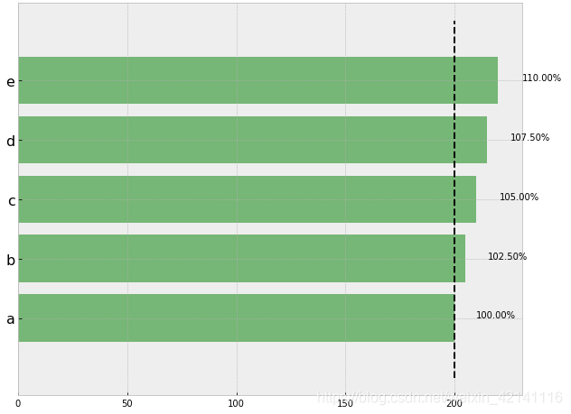
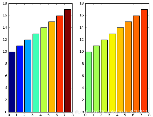
import matplotlib.plot as plt
import matplotlib.colors as col
import matplotlib.cm as cm       #彩色地图


mean_values = range(10,18)
x_pos = range(len(mean_values))

cmap1 = cm.ScalarMappable(col.Normalize(min(mean_values),max(mean_values),cm.hot))
cmap2 = cm.ScalarMappable(col.Normalize(0,20,cm.hot))

plt.subplot(121)
plt.bar(x_pos,mean_values,color = cmap1.to_rgba(mean_values))

plt.subplot(122)
plt.bar(x_pos,mean_values,color = cmap2.to_rgba(mean_values))

plt.show()
patterns = ('-', '+', 'x', '\\', '*', 'o', 'O', '.')
fig = plt.gca()
mean_value = range(1,len(patterns)+1)
x_pos = list(range(len(mean_value)))
bars = plt.bar(x_pos,mean_value,color='white')
for bar,pattern in zip(bars,patterns):
bar.set_hatch(pattern)
plt.show()
