HTML代码如下:
<!DOCTYPE html>
<html>
	<head>
		<meta charset="utf-8">
		<title>bubble</title>
		<link rel="stylesheet" type="text/css" href="css/style.css">
		</script>
	</head>
	<body>
		<div class="bubbels">
			<div class="bubble"></div>
			<div class="bubble"></div>
			<div class="bubble"></div>
			<div class="bubble"></div>
			<div class="bubble"></div>
			<div class="bubble"></div>
			<div class="bubble"></div>
			<div class="bubble"></div>
			<div class="bubble"></div>
			<div class="bubble"></div>
		</div>
	</body>
</html>
CSS代码如下:
body,html
{
	width:100%;
	height:100%;
}
body{
	margin: 0;
	padding: 0;
	background: #9b59b6;
	margin:0;
	padding:0;
	font-weight:500;
	font-family:"Microsoft YaHei","宋体","Segoe UI","Lucida Grande",Helvetica,Arial,sans-serif,FreeSans,Arimo;
}
.bubbels{
	position: absolute;
	width: 100%;
	height: 100%;
	z-index: 0;
	overflow: hidden;
	top:0;
	left: 0;
}
.bubble{
	position: absolute;
	bottom:0;
	width:40px;
	height:40px;
	background: #f1f1f1;
	border-radius:50%;
	opacity: 0.5;
	/*
	opacity 属性设置元素的不透明级别。
	默认值: 1 继承性: no 版本: CSS3
	JavaScript 语法: object.style.opacity=0.5
	*/
	animation: flying 10s infinite ease-in;
}
.bubble:nth-child(1){
width: 40px;
height:40px;
left:10%;
animation-duration:8s;
}
.bubble:nth-child(2){
width: 20px;
height:20px;
left: 20%;
animation-duration: 5s;
animation-delay: 1s;
}
.bubble:nth-child(3){
width:50px;
height:50px;
left:35%;
animation-duration:10s;
animation-delay: 2s;
}
.bubble:nth-child(4){
width: 80px;
height: 80px;
left:50%;
animation-duration: 7s;
animation-delay: 0s;
}
.bubble:nth-child(5){
width:35px;
height:35px;
left:55%;
animation-duration: 6s;
animation-delay: 0s;
}
.bubble:nth-child(6){
width: 45px;
height: 45px;
left: 65%;
animation-duration: 8s;
animation-delay: 0s;
}
.bubble:nth-child(7){
	width: 25px;
	height: 25px;
	left: 75%;
	animation-duration: 7s;
	animation-delay: 2s;
}
.bubble:nth-child(8){
	width: 80px;
	height: 80px;
	left: 80%;
	animation-duration: 6s;
	animation-delay: 1s;
}
.bubble:nth-child(9){
	width:15px;
	height: 15px;
	left: 70%;
	animation-duration: 9s;   /*设置动画持续时间*/
	animation-delay: 0s;
}
.bubble:nth-child(10){
	width: 50px;
	height: 50px;
	left:85%;
	animation-duration: 5s;
	animation-delay: 3s;
}
@keyframes flying{
	0%{
		bottom: -100px;
		transform: translateX(0);
	}
	50%{
		transform: translateX(100px);
	}
	100%{
		bottom: 1080px;
		transform: rotateX(0);
	}
}
#container {
	width:500px;
	height:820px;
	margin:0 auto;
}
div.search {
	padding:10px 0;
}
form {
	position:relative;
	width:300px;
	margin:0 auto;
}
input,button {
	border:none;
	outline:none;
}
input {
	width:100%;
	height:42px;
	padding-left:13px;
}
button {
	height:42px;
	width:42px;
	cursor:pointer;
	position:absolute;
}
/*搜索框6*/

.bar6 input {
	border:2px solid #c5464a;
	border-radius:5px;
	background:transparent;
	top:0;
	right:0;
}
.bar6 button {
	background:#c5464a;
	border-radius:0 5px 5px 0;
	width:60px;
	top:0;
	right:0;
}
.bar6 button:before {
	content:"搜索";
	font-size:13px;
	color:#F9F0DA;
}
/*搜索框7*/

.bar7 form {
	height:42px;
}
.bar7 input {
	width:250px;
	border-radius:42px;
	border:2px solid #324B4E;
	background:#F9F0DA;
	transition:.3s linear;
	float:right;
}
.bar7 input:focus {
	width:300px;
}
.bar7 button {
	background:none;
	top:-2px;
	right:20px;
}
.bar7 button:before {
	content:"Search";
	font-family:FontAwesome;
	color:#324b4e;
}
/*搜索框8*/

.bar8 form {
	height:42px;
}
.bar8 input {
	width:0;
	padding:0 42px 0 15px;
	border-bottom:2px solid transparent;
	background:transparent;
	transition:.3s linear;
	position:absolute;
	top:0;
	right:0;
	z-index:2;
}
.bar8 input:focus {
	width:300px;
	z-index:1;
	border-bottom:2px solid #F9F0DA;
}
.bar8 button {
	background:#683B4D;
	top:0;
	right:0;
}
.bar8 button:before {
	content:"Go";
	font-family:FontAwesome;
	font-size:16px;
	color:#F9F0DA;
}
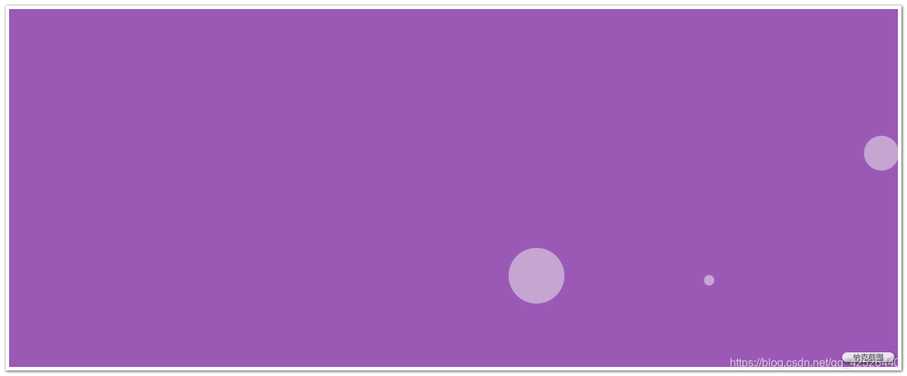
运行截图如下:
有不足之处,望各位大佬多多指正。
