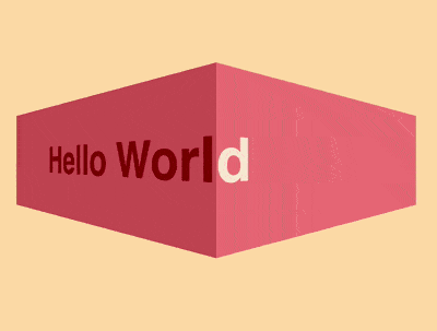
效果预览
按下右侧的“点击预览”按钮在当前页面预览,点击链接全屏预览。
https://codepen.io/zhang-ou/pen/GdrrZq
可交互视频教程
此视频是可以交互的,你可以随时暂停视频,编辑视频中的代码。
请用 chrome, safari, edge 打开观看。
源代码下载
本地下载请从 github 下载。
https://github.com/comehope/front-end-daily-challenges/tree/master/007-3d-text-marquee-effects
代码解读
定义 dom,包含2组重复的文字:
``` <div class="box"> <div class="inner"> <span>Hello World</span> </div> <div class="inner"> <span>Hello World</span> </div> </div> ```居中显示:
html,
body {
    height: 100%;
    display: flex;
    align-items: center;
    justify-content: center;
}
设置容器的尺寸和文字样式:
.box {
    display: flex;
}

.box .inner {
    width: 200px;
    height: 100px;
    line-height: 100px;
    font-size: 32px;
    font-family: sans-serif;
    font-weight: bold;
    white-space: nowrap;
}
配色:
.box .inner:first-child {
    background-color: indianred;
    color: darkred;
}

.box .inner:last-child {
    background-color: lightcoral;
    color: antiquewhite;
}
设置 3d 效果:
.box .inner:first-child {
    transform-origin: left;
    transform: perspective(300px) rotateY(-67.3deg);
}

.box .inner:last-child {
    transform-origin: right;
    transform: perspective(300px) rotateY(67.3deg);
}
定义动画效果:
@keyframes marquee {
    from {
        left: 100%;
    }

    to {
        left: -100%;
    }
}
把动画效果应用到文字上,并隐藏容器外的内容:
.box .inner span {
    position: absolute;
    animation: marquee 5s linear infinite;
}

.box .inner {
    overflow: hidden;
}
让左侧的文字延迟运动,模拟出2组文字连贯运动的效果:
.box .inner:first-child span {
    animation-delay: 2.5s;
    left: -100%;
}
大功告成!
知识点
- transform-origin https://developer.mozilla.org/en-US/docs/Web/CSS/transform-origin
- perspective https://developer.mozilla.org/en-US/docs/Web/CSS/perspective
- rotateY() https://developer.mozilla.org/en-US/docs/Web/CSS/transform-function/rotateY
- animation-delay https://developer.mozilla.org/en-US/docs/Web/CSS/animation-delay