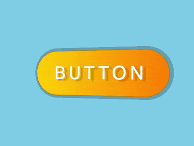
效果预览
按下右侧的“点击预览”按钮在当前页面预览,点击链接全屏预览。
https://codepen.io/zhang-ou/full/MGeRRO
可交互视频教程
此视频是可以交互的,你可以随时暂停视频,编辑视频中的代码。
请用 chrome, safari, edge 打开观看。
源代码下载
本地下载
请从 github 下载。
代码解读
在 dom 中定义一个容器:
<div class="box">BUTTON</div>容器居中显示:
html, body {
    height: 100%;
    display: flex;
    align-items: center;
    justify-content: center;
    background-color: skyblue;
}
设置按钮的 2d 样式,为了便于调整按钮尺寸,使用了变量:
.box {
    background: linear-gradient(to right, gold, darkorange);
    color: white;
    --width: 250px;
    --height: calc(var(--width) / 3);
    width: var(--width);
    height: var(--height);
    text-align: center;
    line-height: var(--height);
    font-size: calc(var(--height) / 2.5);
    font-family: sans-serif;
    letter-spacing: 0.2em;
    border: 1px solid darkgoldenrod;
    border-radius: 2em;
}
设置按钮的 3d 样式:
.box {
    transform: perspective(500px) rotateY(-15deg);
    text-shadow: 6px 3px 2px rgba(0, 0, 0, 0.2);
    box-shadow: 2px 0 0 5px rgba(0, 0, 0, 0.2);
}
定义按钮的鼠标划过动画效果:
.box:hover {
    transform: perspective(500px) rotateY(15deg);
    text-shadow: -6px 3px 2px rgba(0, 0, 0, 0.2);
    box-shadow: -2px 0 0 5px rgba(0, 0, 0, 0.2);
}

.box {
    transition: 0.5s;
}
用伪元素增加光泽:
.box {
    position: relative;
}

.box::before {
    content: '';
    position: absolute;
    width: 100%;
    height: 100%;
    background: linear-gradient(to right, transparent, white, transparent);
    left: 0;
}
定义光泽动画效果:
.box::before {
    left: -100%;
    transition: 0.5s;
}

.box:hover::before {
    left: 100%;
}
最后,隐藏容器之外的内容:
.box {
    overflow: hidden;
}
大功告成!
知识点
- linear-gradient https://developer.mozilla.org/en-US/docs/Web/CSS/linear-gradient
- variables https://developer.mozilla.org/en-US/docs/Web/CSS/Using_CSS_variables
- calc https://developer.mozilla.org/en-US/docs/Web/CSS/calc
- perspective https://developer.mozilla.org/en-US/docs/Web/CSS/perspective
- text-shadow https://developer.mozilla.org/en-US/docs/Web/CSS/text-shadow
- box-shadow https://developer.mozilla.org/en-US/docs/Web/CSS/box-shadow