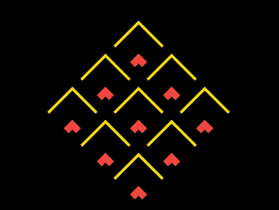
效果预览
在线演示按下右侧的“点击预览”按钮可以在当前页面预览,点击链接可以全屏预览。
https://codepen.io/comehope/pen/MqqqwG
可交互视频
此视频是可以交互的,你可以随时暂停视频,编辑视频中的代码。
请用 chrome, safari, edge 打开观看。
https://scrimba.com/p/pEgDAM/cJBwwHn
源代码下载
本地下载每日前端实战系列的全部源代码请从 github 下载:
https://github.com/comehope/front-end-daily-challenges
代码解读
定义 dom,容器中包含 9 个元素:
<div class="container">
    <span></span>
    <span></span>
    <span></span>
    <span></span>
    <span></span>
    <span></span>
    <span></span>
    <span></span>
    <span></span>
</div>
居中显示:
body {
    margin: 0;
    height: 100vh;
    display: flex;
    align-items: center;
    justify-content: center;
    background-color: black;
}
定义容器尺寸:
.container {
    width: 30em;
    height: 30em;
    font-size: 10px;
}
用 grid 布局把 9 个子元素排列成 3 * 3 的网格状:
.container {
    display: grid;
    grid-template-columns: repeat(3, 1fr);
}
设置容器内子元素的样式,是通过伪元素来设置的:
.container span {
    position: relative;
}

.container span::before,
.container span::after
{
    content: '';
    position: absolute;
    box-sizing: border-box;
    border-style: none solid solid none;
    border-width: 1em;
    border-color: gold;
    width: 100%;
    height: 100%;
}
旋转容器,让它的尖端朝上:
.container {
    transform: rotate(-135deg);
}
增加子元素尺寸由小到大变化的动画:
.container span::before,
.container span::after
{
    animation:
        animate-scale 1.6s linear infinite;
}

@keyframes animate-scale {
    from {
        width: 1%;
        height: 1%;
    }

    to {
        width: 100%;
        height: 100%;
    }
}
增加子元素边框色变化的动画:
.container span::before,
.container span::after
{
    animation:
        animate-border-color 1.6s linear infinite,
        animate-scale 1.6s linear infinite;
}

@keyframes animate-border-color {
    0%, 25% {
        border-color: tomato;
    }

    50%, 75% {
        border-color: gold;
    }

    100% {
        border-color: black;
    }
}
增加子元素边框宽度变化的动画:
.container span::before,
.container span::after
{
    animation:
        animate-border-width 1.6s linear infinite,
        animate-border-color 1.6s linear infinite,
        animate-scale 1.6s linear infinite;
}
最后,让 ::after 伪元素的动画时间慢半拍:
.container span::after {
    animation-delay: -0.8s;
}

@keyframes animate-border-width {
    0%, 100%{
        border-width: 0.1em;
    }

    25% {
        border-width: 1.5em;
    }
}
大功告成!
原文地址:https://segmentfault.com/a/1190000016419507