Android UI之布局(一)
一个丰富的界面有很多的控件,但是控件并不是随意乱放的,而是借助布局在其中来放置控件,布局就是相当于一种可以放置很多控件容器。布局内除了放置控件外,也可以放置布局,通过多层布局的嵌套实现更复杂的界面实现。
在onCreate()回调方法实现中,调用onContentView()方法调用布局文件资源。Android中有这几种布局文件 如FramLayout(帧布局)、LinearLayout(线性布局)、RelativeLayout(相对布局)、TableLayout(表格布局)、AbsoluteLayout(绝对布局)等。下面简单介绍几种常用的布局。
相对布局(RelativeLayout)
RelativeLayout 设置一个视图相对于其他视图的位置,这个布局显得比较随意,可以通过定位的方式让控件出现在布局的任何位置。 因此RelativeLayout 中属性非常多。
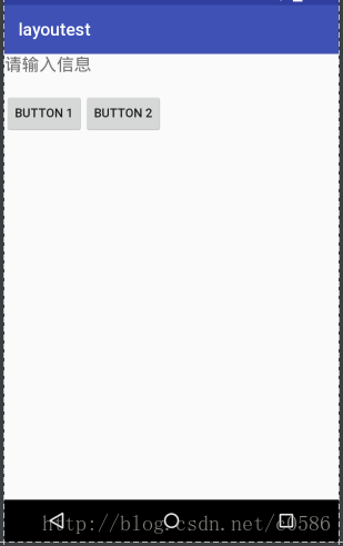
示例代码:
<?xml version="1.0" encoding="utf-8"?>
<RelativeLayout xmlns:android="http://schemas.android.com/apk/res/android"
    android:layout_width="match_parent"
    android:layout_height="match_parent">

    <TextView
        android:id="@+id/tv1"
        android:layout_width="wrap_content"
        android:layout_height="wrap_content"
        android:layout_marginBottom="20dp"
        android:text="请输入信息"
        android:textSize="20sp"/>
    <Button
        android:id="@+id/btn1"
        android:layout_width="wrap_content"
        android:layout_height="wrap_content"
        android:layout_below="@+id/tv1"
        android:layout_alignParentLeft="true"
        android:text="Button 1"

        />
    <Button
        android:id="@+id/btn2"
        android:layout_width="wrap_content"
        android:layout_height="wrap_content"
        android:layout_below="@+id/tv1"
        android:layout_toEndOf="@+id/btn1"
        android:text="Button 2"/>

</RelativeLayout>
控件也可以使用px、in、mm、pt、dp/dip和sp等单位,推荐dp。
相对布局时常用的属性:
    a. 设置控件相对于另一个视图的位置
        i. android: layout_below  在某元素的下方
        ii. android: layout_above  在某元素的上方
        iii. android: layout_toLeftOf  在某元素的左边
        iv. android: layout_toRightOf  在某元素的右边
    b. 设置控件相对于另一个控件的对齐方式
        i. android: layout_alignBaseline 本元素的基线和某元素的基线对齐
        ii. android: layout_alignTop 本元素的上边缘和某元素的上边缘对齐
        iii. android: layout_alignLeft 本元素的左边缘和某元素的左边缘对齐
        iv. android: layout_alignBottom
        v. android: layout_alignRight
    c. 设置控件相对于父控件的对齐方式
        i. android:layout_alignParentBottom 贴紧父元素的下边缘
        ii. android:layout_alignParentLeft 贴紧父元素的左边缘
        iii. android:layout_alignParentRight 贴紧父元素的右边缘
        iv. android:layout_alignParentTop 贴紧父元素的上边缘

    d. 设置控件的方向
        i. android: layout_centerHorizontal 在父元素中水平居中
        ii. android: layout_centerVertical 在父元素中垂直居中
        iii. android: layout_centerInparent 相对于父元素完全居中
    e. 设置控件的留白
        i. android: layout_marginLeft 当前控件左侧的留白
        ii. android: layout_marginRight 当前控件右侧的留白
        iii. android: layout_marginTop 当前控件上方的留白
        iv. android: layout_marginBottom 当前控件下方的留白

android: padding 与 android: layout_margin区别
padding 指该控件内部内容,如文本距离控件该控件的边距。 layout_margin 指该控件距离父控件的边距。
线性布局(LinearLayout)
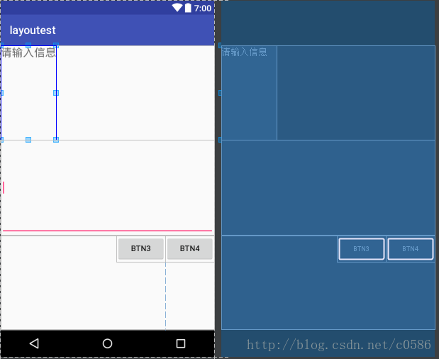
线性布局是Android UI开发中最常用的布局,布局中控件以水平或竖直线性的方向排列,下面上代码
<?xml version="1.0" encoding="utf-8"?>
<LinearLayout xmlns:android="http://schemas.android.com/apk/res/android"
    android:layout_width="match_parent"
    android:layout_height="match_parent"
    android:orientation="vertical">

    <TextView
        android:id="@+id/tv1"
        android:layout_width="wrap_content"
        android:layout_height="0dp"
        android:layout_weight="1"
        android:text="请输入信息"
        android:textSize="20sp" />

    <EditText
        android:id="@+id/edt1"
        android:layout_width="match_parent"
        android:layout_height="0dp"
        android:layout_weight="1"
        android:ems="10"
        android:inputType="textMultiLine">

        <requestFocus />
    </EditText>

    <LinearLayout
        android:layout_width="match_parent"
        android:layout_height="0dp"
        android:layout_weight="1"
        android:gravity="right">

        <Button
            android:id="@+id/btn3"
            android:layout_width="wrap_content"
            android:layout_height="wrap_content"
            android:text="btn3" />

        <Button
            android:id="@+id/btn4"
            android:layout_width="wrap_content"
            android:layout_height="wrap_content"
            android:text="btn4" />
    </LinearLayout>
</LinearLayout>
线性布局中两个重要的属性:
1. android: orientation
设置布局中子视图的显示方式,两个参数horizontal、vertical水平和竖直我们在代码示例中也能看到。父布局和里面嵌套的子布局都有这个属性设置。
2. android: layout_weight
这个是LnearLayout中很奇怪的属性设置,看我们的示例代码,父布局下的同一级子视android:layout_height=”0dp”
android:layout_weight=”1” 其中高度都设置为0dp,使得它们平均三分整个父布局,这个layout_weight默认值为0,其他情况要自己捉摸。
另外还要区分android: gravity 与 android:layout_gravity:
android: gravity用来控制布局中控件对齐的方式,如TextView里文字对齐的方式,常用值有top、bottom、left、right、center等。
android:layout_gravity用于设置控件在父布局中对齐的方式。
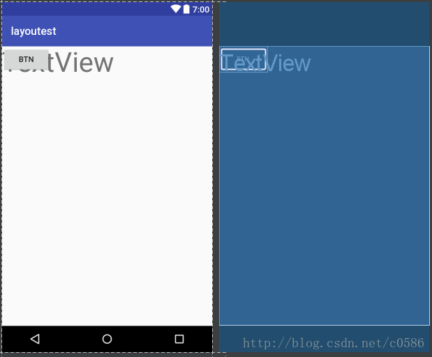
帧布局(FrameLayout)
该布局下所有的控件都会默认摆放在布局的左上角。
代码如下
<?xml version="1.0" encoding="utf-8"?>
<FrameLayout xmlns:android="http://schemas.android.com/apk/res/android"
android:layout_width="match_parent"
android:layout_height="match_parent">
<TextView
android:layout_width="match_parent"
android:layout_height="match_parent"
android:textSize="50dp"
android:text="TextView"/>
<Button
android:layout_width="wrap_content"
android:layout_height="wrap_content"
android:text="btn"/>
</FrameLayout>
布局原则
在Android UI布局过程中,通过遵守一些惯用、有效的布局原则,我们可以制作出高效且复用性高的UI, 如:
尽量多使用RelativeLayout和LinearLayout, 不要使用绝对布局AbsoluteLayout,在布局层次一样的情况下, 建议使用LinearLayout代替RelativeLayout, 因为LinearLayout性能要稍高一点,但往往RelativeLayout可以简单实现LinearLayout嵌套才能实现的布局。
通过include语句将布局复用;
使用ViewStub来加载一些不常用的布局;
使用merge标签减少布局的嵌套层次(减少视图层级,差不多一个意思),来优化UI。
这些原则应该是较为常用,发展到现在可能不止这些原则技巧,还有更好更方便的工具等我们去发现利用,去开发。
