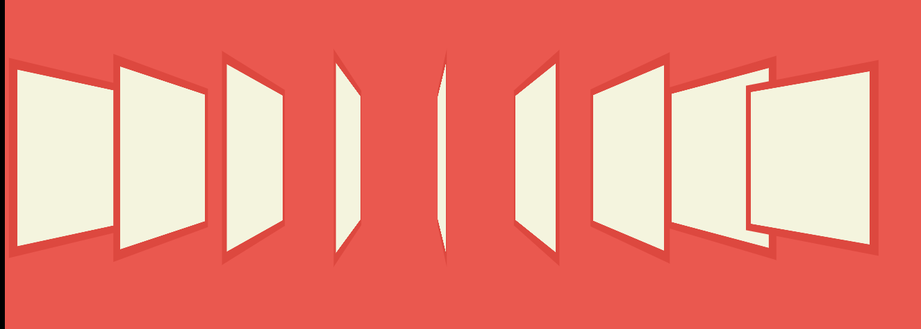
这次多设计几个盒子,来制作3D动画。
    <body>
        <div class="box"></div>
        <div class="box"></div>
        <div class="box"></div>
        <div class="box"></div>
        <div class="box"></div>
        <div class="box"></div>
        <div class="box"></div>
        <div class="box"></div>
        <div class="box"></div>
    </body>
同样,对他们进行CSS样式设计,样式代码很好写,写完效果如下:
            html, body{
            	height:100%;
            }
            body {
                background:#eb584f;
                padding:0;
                position:relative;
            }
            .box{
                background:#f4f4de;
                width:200px;
                height:200px;
                display:inline-block;
                position:absolute;
                left:100px;
                top:200px;
                box-shadow:inset 0 0 0px 10px #dd483f;
            }
接下来,使用TweenMax和jQuery来设计3D动画以及形成的透视效果:设置透视效果为500像素,然后,选取每一个box,对每一个box,设置在接下来的2秒内。移动到距左侧 130*index处,上面距离top不变(top:200),绕Y轴旋转的角度也随盒子的下标增大而增大(rotationY:45+12*index),每个盒子都放大1.2倍(scale:1.2)。
<script src="js/TweenMax.min.js"></script>
<script type="text/javascript" src="jquery-2.1.4.min.js"></script>
<script type="text/javascript">
	$(document).ready(function() {
		CSSPlugin.defaultTransformPerspective = 500;
		$('.box').each(function(index){
			TweenMax.to($(this), 2, {left:index*130, top:200, rotationY:45+12*index, scale:1.2});
		});
	});
</script>
- CSSPlugin.defaultTransformPerspective:全局设置视觉距离
CSSPlugin的中文手册:https://www.tweenmax.com.cn/cssplugin/里面有很多例子,解释的很清楚。
效果如图: