知识点
- text-shadow: h-shadow v-shadow blur color;
text-shadow 属性向文本添加一个或多个阴影。该属性是逗号分隔的阴影列表,每个阴影有两个或三个长度值和一个可选的颜色值进行规定。省略的长度是 0。
| 值 |
描述 |
| h-shadow |
必需。水平阴影的位置。允许负值。 |
| v-shadow |
必需。垂直阴影的位置。允许负值。 |
| blur |
可选。模糊的距离。 |
| color |
可选。阴影的颜色。 |
- h-shadow:阴影的水平偏移量
- v-shadow:阴影的竖直偏移量
- blur :阴影模糊的距离
- color:颜色
- text-shadow可以有多个值
运行效果
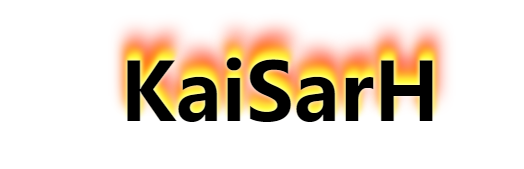
代码
<!DOCTYPE html>
<html lang="en">
<head>
    <meta charset="UTF-8">
    <meta name="viewport" content="width=device-width, initial-scale=1.0">
    <meta http-equiv="X-UA-Compatible" content="ie=edge">
    <title>Document</title>
    <style>
        .fire_text{
            font-size: 80px;
            text-align: center;
            font-family: "微软雅黑";
            font-weight: bold;
            color: #000;
            margin-top: 50px;
            animation: fireText 1s infinite;
        }
        @keyframes fireText {
            0% {
                text-shadow: 0 0 4px white, 0 -5px 4px #ff3, 2px -10px 6px #fd3,
                -2px -15px 11px #f80, 2px -25px 18px #f20;
            }
            25% {
                text-shadow: 0 0 4px white, 2px -7px 6px #ff3, 2px -12px 8px #fd3,
                -3px -20px 11px #f80, 4px -30px 22px #f20;
            }
            50% {
                text-shadow: 0 0 4px white, 2px -10px 8px #ff3, 2px -14px 10px #fd3,
                -4px -25px 11px #f80, 4px -35px 25px #f20;
            }
            75% {
                text-shadow: 0 0 4px white, 2px -7px 6px #ff3, 2px -12px 8px #fd3,
                -3px -20px 11px #f80, 4px -30px 22px #f20;
            }
            100% {
                text-shadow: 0 0 4px white, 0 -5px 4px #ff3, 2px -10px 6px #fd3,
                -2px -15px 11px #f80, 2px -25px 18px #f20;
            }
        }
    </style>
</head>
<body>
<div class="fire_text">
   KaiSarH
</div>
</body>
</html>
