安利一个贼方便的编辑数学公式的工具
对于回归问题,通过
,
等指标可以很好的衡量模型的好坏,但是分类问题则不然,仅仅通过准确率等并不能很好的衡量模型的优劣,比如样本数据处于不均衡状态,99%的数据都为正样本,那么模型就算是对于任何样本都预测为正样本,准确率依然非常高,但是并不能说这个模型是一个好的模型,于是引出了查准率、查全率、
、
和
等概念
accuracy_score 准确率
在样本处于均衡状态下该指标比较有参考意义
代码
from sklearn.metrics import accuracy_score

y = [1, 1, 2, 2, 0, 0]
y_pred = [0, 1, 2, 2, 0, 0]
print(accuracy_score(y, y_pred))
输出
F:\virtualenvs\jlt-detection\Scripts\python.exe F:/python_projects/jlt-detection/test.py
0.8333333333333334

Process finished with exit code 0
precision_score和recall_score 查准率和查全率
混淆矩阵如下:
| 真实值 | 预测值 | |
|---|---|---|
| 正例 | 反例 | |
| 正例 | TP(真正例) | FN(假反例) |
| 反例 | FP(假正例) | TN(真反例) |
两者只是分母不同。查准率的分母为预测为正的样本数,查全率的分母为样本集中实际为正的样本数
一般来讲,查准率越高,查全率越低;反之亦然。原因是:为了提高查准率,预测过程中会偏向于将把握更大的数据预测为正例,从而FP值比较小,查准率更高,相应的FN值变大,查全率变低;为了提高查全率;预测过程中会尽可能把样本预测为正例,此时FN值非常小,查全率变高;相应的FP值变大,查全率变低。
代码
from sklearn.metrics import precision_score, recall_score

y = [1, 1, 1, 0, 0]
y_pred = [0, 1, 1, 0, 0]
print(precision_score(y, y_pred))
print(recall_score(y, y_pred))
输出
F:\virtualenvs\jlt-detection\Scripts\python.exe F:/python_projects/jlt-detection/test.py
1.0
0.6666666666666666

Process finished with exit code 0
f-score
对于数据不均衡的情况可以使用查准率和查全率来作为衡量模型的指标。但是在比较两个模型的时候,
模型的查准率比
高,但是查全率比
低,这个时候就可以使用
,当
时认为查全率更加重要;当
时认为查准率更加重要;当
时,查准率和查全率同等重要。此时
即
,为查准率和查全率的调和平均数。
代码
from sklearn.metrics import precision_score, recall_score, f1_score

y = [1, 1, 1, 0, 0]
y_pred = [0, 1, 1, 0, 0]
p = precision_score(y, y_pred)
r = recall_score(y, y_pred)
print(2 * (p * r) / (p + r))
print(f1_score(y, y_pred))
输出
F:\virtualenvs\jlt-detection\Scripts\python.exe F:/python_projects/jlt-detection/test.py
0.8
0.8

Process finished with exit code 0
roc和auc
,假正率,预测为正但是实际为负的样本数 / 样本中为负的样本数
,真正率,预测为正实际为正的样本数 / 样本中为中为正的样本数,与查全率公式相同
曲线就是以 为横坐标,以 为纵坐标画出的曲线
就是 曲线下的面积,面积越大,代表模型模型越好(对于样本不均衡的数据该结论仍然适用)。
roc曲线绘制过程
| 样本标签 | 1 | 1 | 0 | 0 | 0 | 0 |
|---|---|---|---|---|---|---|
| 预测概率 | 0.9 | 0.7 | 0.8 | 0.6 | 0.5 | 0.4 |
对预测概率进行排序:0.9, 0.8, 0.7,0.6,0.5,0.4
以
为阈值,概率大于或者等于该值预测为正例,此时
以
为阈值,概率大于或者等于该值预测为正例,此时
以
为阈值,概率大于或者等于该值预测为正例,此时
以
为阈值,概率大于或者等于该值预测为正例,此时
以
为阈值,概率大于或者等于该值预测为正例,此时
以
为阈值,概率大于或者等于该值预测为正例,此时
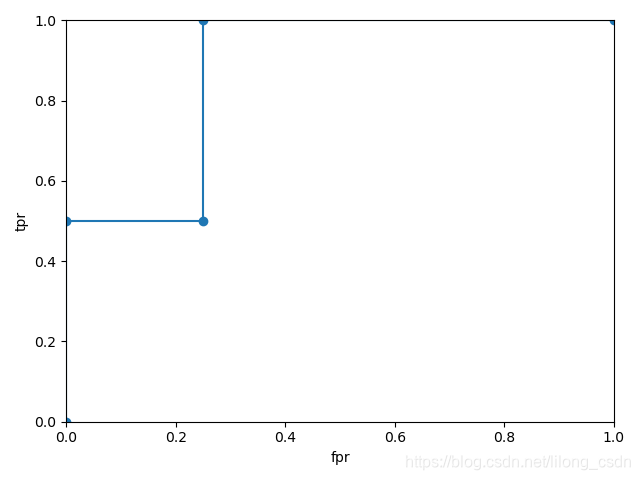
可以看出
的最大值为1,也是就过(0, 1)这个点,此时
为1,
为0,正样本与负样本全部预测正确。
该博客中这么描述AUC的意义:AUC就是从所有正样本中随机选择一个样本,从所有负样本中随机选择一个样本,然后根据你的学习器对两个随机样本进行预测,把正样本预测为正例的概率 ,把负样本预测为正例的概率 , 的概率就等于AUC。根据上边的例子,正例与负例中各选一个,共8种情况,当正例中取到表格中第一列的样本时,无论取哪个阈值,该样本永远被预测为正样本,此时 ,即 永远大于 ;当正例中取第二列的样本数时,只有阈值 时才会被预测为正样本,即 ,负样本中取到第三列的样本数据时,只要 ,该负样本就会被预测为正样本,即 ,此时 ,其他的三个负例样本的情况均是 ,所以总体 的概率为 ,即0.875,可以看出auc的曲线下的面积也是0.875。
代码
from sklearn.metrics import precision_score, recall_score, f1_score, roc_auc_score, roc_curve
import matplotlib.pyplot as plt
y_true = [1, 1, 0, 0, 0, 0]
y_score = [0.9, 0.7, 0.8, 0.6, 0.5, 0.4]
print('roc_score:', roc_auc_score(y_true, y_score))
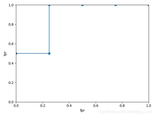
fpr, tpr, thresholds = roc_curve(y_true, y_score)
print('fpr:', fpr)
print('tpr:', tpr)
print('thresholds:', thresholds)
plt.plot(fpr, tpr)
plt.scatter(fpr, tpr)
plt.xlim(0, 1)
plt.ylim(0, 1)
plt.xlabel('fpr')
plt.ylabel('tpr')
plt.show()
输出
F:\virtualenvs\jlt-detection\Scripts\python.exe F:/python_projects/jlt-detection/test.py
roc_score: 0.875
fpr: [0.   0.   0.25 0.25 1.  ]
tpr: [0.  0.5 0.5 1.  1. ]
thresholds: [1.9 0.9 0.8 0.7 0.4]

Process finished with exit code 0
P-R曲线
阈值不同,模型的预测结果也不同,通过设置若干个阈值,可以得到若干组查全率和查准率,P-R曲线是以查全率、查准率为x,y轴所绘制的曲线。
代码
from sklearn.metrics import precision_score, recall_score, f1_score, roc_auc_score, roc_curve, precision_recall_curve
import matplotlib.pyplot as plt

y_true = [1, 1, 0, 0, 0, 0]
y_score = [0.9, 0.7, 0.8, 0.6, 0.5, 0.4]
precision, recall, thresholds = precision_recall_curve(y_true, y_score)
print('precision:', precision)
print('recall:', recall)
print('thresholds:', thresholds)
plt.plot(precision, recall)
plt.scatter(precision, recall)
plt.plot([0, 1], [0, 1], linestyle='--')
plt.xlim(0, 1)
plt.ylim(0, 1)
plt.xlabel('precision')
plt.ylabel('recall')
plt.show()
输出
F:\virtualenvs\jlt-detection\Scripts\python.exe F:/python_projects/jlt-detection/test.py
precision: [0.66666667 0.5        1.         1.        ]
recall: [1.  0.5 0.5 0. ]
thresholds: [0.7 0.8 0.9]

Process finished with exit code 0
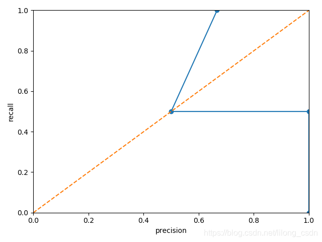
P-R曲线的整体呈下降趋势(前面提到过,一个的增加一般伴随着另一个的减少),该曲线也能从一定程度上反应分类模型的优劣,一种度量方式为计算曲线下面积;另一种度量方式为平衡点(查全率=查准率的点),即BEP。当一个模型的P-R曲线包围住另一个模型的P-R曲线时,前者的性能更好;当平衡点越接近(1,1)这个点时,说明该模型的查全率越高,查准率也越高,模型也越好。
纯手打,有错误的话欢迎大家指出
