原文:How to use Material Desgin with PowerShell
- 1. The Demo Project
- 2. How have all the Library ?
- 3. How to apply the theme In your XAML file ?
- 3. Material Design With PowerShell ?
- 4. Some Objects
When you create WPF application you have two popular Themes Mahapps and Material Design. You can find they own Github project Mahapps and Material Design.
Today we focus on Material Design and how to use with Powershell.
1. The Demo Project
There is a demonstration project to show all the objects, themes, pages, controls that are available in Material Design.
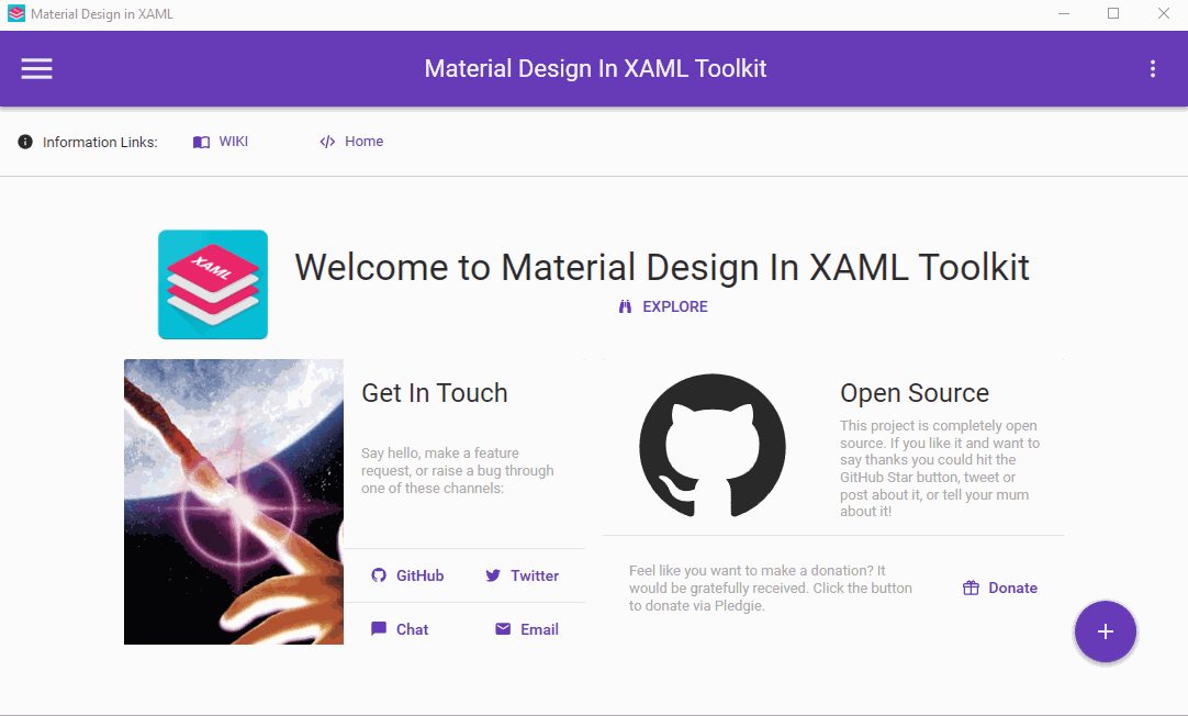
With the demo project you can view the XAML for each objects.
2. How have all the Library ?
- In Visual Studio Community Create an WPF Application and you can manage your nuget package.
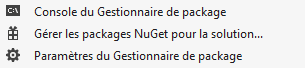
- And we can search Material Design Themes
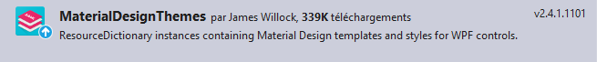
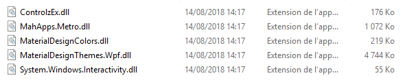
- When done you can retrieve all the library in your source directory.
3. How to apply the theme In your XAML file ?
In your XAML file you can add in specify the namespace. In this example I have Mahapps Windows.
<Controls:MetroWindow
        xmlns="http://schemas.microsoft.com/winfx/2006/xaml/presentation"
        xmlns:Controls="clr-namespace:MahApps.Metro.Controls;assembly=MahApps.Metro"
        xmlns:materialDesign="http://materialdesigninxaml.net/winfx/xaml/themes"
        assembly=MaterialDesignThemes.Wpf"
        xmlns:iconPacks="http://metro.mahapps.com/winfx/xaml/iconpacks"
        xmlns:x="http://schemas.microsoft.com/winfx/2006/xaml"
        Title="Apps_MD_Demo"
	Height="470" Width="620"
        WindowStartupLocation="CenterScreen"
	ResizeMode="NoResize"
        WindowStyle="None"
	BorderThickness="0"
	GlowBrush="{DynamicResource AccentColorBrush}"
        Background="{DynamicResource MaterialDesignPaper}"
        FontFamily="{DynamicResource MaterialDesignFont}"
        TextElement.Foreground="{DynamicResource MaterialDesignBody}"
        TextElement.FontWeight="Regular"
        TextElement.FontSize="13"
        TextOptions.TextFormattingMode="Ideal"
        TextOptions.TextRenderingMode="Auto"
        >
You can add this line xmlns:materialDesign=”http://materialdesigninxaml.net/winfx/xaml/themes” in order to create some Material Design Objects. There is some property for the windows :
- Background=”{DynamicResource MaterialDesignPaper}” we use the DynamicResource with the style MaterialDesignPaper
- FontFamily=”{DynamicResource MaterialDesignFont}” the things but for the FontFamily
- TextElement all these objects refer to the Font, the weight, the size and other option.
But like Mahapps you need to add some in the ResourceDictionary. In this code below I combine in a Mahapps apps with Material Design.
    <Window.Resources>
        <ResourceDictionary>
            <ResourceDictionary.MergedDictionaries>
                <!-- Create Metro Style  -->

                <ResourceDictionary Source="pack://application:,,,/MahApps.Metro;component/Styles/Controls.xaml" />
                <ResourceDictionary Source="pack://application:,,,/MahApps.Metro;component/Styles/Fonts.xaml" />
                <ResourceDictionary Source="pack://application:,,,/MahApps.Metro;component/Styles/Colors.xaml" />
                <ResourceDictionary Source="pack://application:,,,/MahApps.Metro;component/Styles/Accents/Cobalt.xaml"/>
                <ResourceDictionary Source="pack://application:,,,/MahApps.Metro;component/Styles/Accents/BaseLight.xaml" />

				<!-- MaterialDesign Style  -->
                <ResourceDictionary Source="pack://application:,,,/MaterialDesignThemes.Wpf;component/Themes/MaterialDesignTheme.Light.xaml" />
                <ResourceDictionary Source="pack://application:,,,/MaterialDesignThemes.Wpf;component/Themes/MaterialDesignTheme.Defaults.xaml" />
		<ResourceDictionary Source="pack://application:,,,/MaterialDesignColors;component/Themes/Recommended/Primary/MaterialDesignColor.Blue.xaml" />

            </ResourceDictionary.MergedDictionaries>
        </ResourceDictionary>
    </Window.Resources>
In some case if you want to overide themes for object you can add some ResourceDictionary.MergedDictionaries. Here some example for the object : Buttons,Card,Popup,TextBox,Flipper.
<ResourceDictionary Source="pack://application:,,,/MaterialDesignThemes.Wpf;component/Themes/MaterialDesignTheme.Button.xaml" />
<ResourceDictionary Source="pack://application:,,,/MaterialDesignThemes.Wpf;component/Themes/MaterialDesignTheme.Card.xaml" />
<ResourceDictionary Source="pack://application:,,,/MaterialDesignThemes.Wpf;component/Themes/MaterialDesignTheme.PopupBox.xaml"/>
<ResourceDictionary Source="pack://application:,,,/MaterialDesignThemes.Wpf;component/Themes/MaterialDesignTheme.TextBox.xaml" />
<ResourceDictionary Source="pack://application:,,,/MaterialDesignThemes.Wpf;component/Themes/MaterialDesignTheme.Flipper.xaml" />
3. Material Design With PowerShell ?
In Your Powershell script you need to add assembly.
[System.Reflection.Assembly]::LoadWithPartialName('presentationframework') | out-null [System.Reflection.Assembly]::LoadFrom('assembly\MahApps.Metro.dll') | out-null [System.Reflection.Assembly]::LoadFrom('assembly\System.Windows.Interactivity.dll') | out-null [System.Reflection.Assembly]::LoadFrom('assembly\MaterialDesignThemes.Wpf.dll') | out-null [System.Reflection.Assembly]::LoadFrom('assembly\MaterialDesignColors.dll') | out-null4. Some Objects
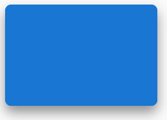
4.1ColorZone
The ColorZone is an object like card and you can use different Mode :
- PrimaryDark
- Standard
- Light
<materialDesign:ColorZone Mode="PrimaryDark" CornerRadius="12" materialDesign:ShadowAssist.ShadowDepth="Depth5" Margin="10" Width="300" Height="200">
</materialDesign:ColorZone>
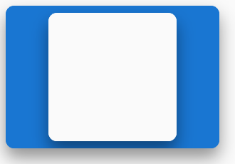
You can nested them :
<materialDesign:ColorZone Mode="PrimaryDark" CornerRadius="12" materialDesign:ShadowAssist.ShadowDepth="Depth5" Margin="10" Width="300" Height="200">
	<materialDesign:ColorZone Mode="Light" CornerRadius="12" materialDesign:ShadowAssist.ShadowDepth="Depth5" Margin="10" Width="180" Height="180">

        </materialDesign:ColorZone>
</materialDesign:ColorZone>
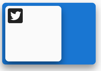
4.2 PackIcon
Like Mahapps Material Design include some Icons Here a example Twitter icon.
	<StackPanel Orientation="Horizontal">
	      <materialDesign:ColorZone Mode="PrimaryDark" CornerRadius="12" materialDesign:ShadowAssist.ShadowDepth="Depth5" Margin="10" Width="300" Height="200">
	        <StackPanel Orientation="Horizontal" Margin="55 0 0 0">
	          <materialDesign:ColorZone Mode="Light" CornerRadius="12" materialDesign:ShadowAssist.ShadowDepth="Depth5" Margin="10" Width="180" Height="180">
            	  <materialDesign:PackIcon Kind="Twitterbox" Height="64" Width="64"/>
                </materialDesign:ColorZone>
           </StackPanel>
      </materialDesign:ColorZone>
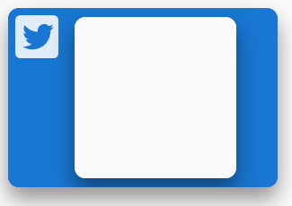
<StackPanel Orientation="Horizontal">
	      <materialDesign:ColorZone Mode="PrimaryDark" CornerRadius="12" materialDesign:ShadowAssist.ShadowDepth="Depth5" Margin="10" Width="300" Height="200">
	        <StackPanel Orientation="Horizontal">
	          <materialDesign:PackIcon Kind="Twitterbox" Height="64" Width="64"/>
	          <materialDesign:ColorZone Mode="Light" CornerRadius="12" materialDesign:ShadowAssist.ShadowDepth="Depth5" Margin="10" Width="180" Height="180">
            </materialDesign:ColorZone>
           </StackPanel>
      </materialDesign:ColorZone>
	</StackPanel>
Written by Jérôme Bezet-Torres @JM2K69.