vue数据可视化v-charts

页面效果
在这里插入图片描述

npm i v-charts echarts -S
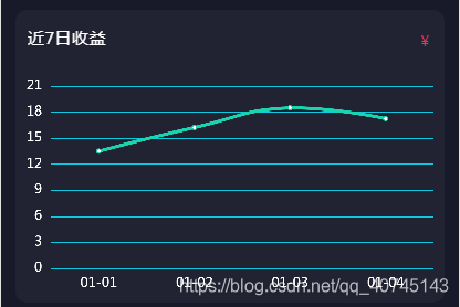
<div class="charts">
	<div class="title">
		<p>近7日收益</p>
		<div><span>{{userInfo.senven_num}}</span></div>
	</div>
	<div class="chart">
		<ve-line width="100%" height="100%" :data="chart.data" :extend="chart.extend"></ve-line>
	</div>
</div>
import Vue from 'vue'
import VeLine from 'v-charts/lib/line.common'
Vue.component(VeLine.name,VeLine)//单独引入某个图
data() {
	return {
        chart: {
            data: {
                columns: ['addtime', 'num'],
                rows: [
                    {
                        addtime:'01-01',
                        num:'13.50'
                    },
                    {
                        addtime:'01-02',
                        num:'16.23'
                    },
                    {
                        addtime:'01-03',
                        num:'18.50'
                    },
                    {
                        addtime:'01-04',
                        num:'17.25'
                    },
                ],
            },
            extend: {
                series: {
                    label: {
                        normal: {
                            show: false, //折线图上的数量显示
                        }
                    },
                    lineStyle: {
                        width: 3,
                    }
                },
                visualMap: {
                    show: false,
                    type: 'continuous',
                    min: 0,
                    symbolSize: 20,
                    max: 120, //
                    color: ["#059EFB", '#14F4C8'] //折线图颜色
                },
                legend: {
                    show: false,
                },
                tooltip: {
                    show: false,
                },
                grid: { //边距
                    show: false,
                    left: 10,
                    top: 20,
                    bottom: 5,
                    right: 10,
                },
                yAxis: { //Y坐标轴刻度标签的相关设置。
                    axisLabel: {
                        color: '#fff', //右侧文字颜色大小
                        fontSize: 12
                    },
                    splitLine: {
                        lineStyle: {
                            color: '#0DCAE1', //横向分割线颜色
                        }
                    }
                },
                xAxis: { //X坐标轴刻度标签的相关设置。
                    axisLabel: {
                        color: '#fff', //底部文字颜色
                        fontSize: 12
                    },
                    axisLine: {
                        show: false
                    },
                    axisTick: {
                        show: false
                    }
                }
            }
        },
    }
},
.charts {
    width: 703px;
    height: 480px;
    background: rgba(33, 35, 50, 1);
    border-radius: 18px;
    margin: 30px auto;
    .title {
        padding: 0 20px;
        height: 90px;
        display: flex;
        align-items: center;
        justify-content: space-between;
        p {
            font-size: 28px;
            color: rgba(255, 255, 255, 1);
        }
        div {
            font-size: 24px;
            color: #FB3254;
            span {
                font-size: 36px;
                color: #FB3254;
            }
        }
    }
    .chart {
        width: 100%;
        height: 380px;
        .ve-line {}
    }
}
发布了76 篇原创文章 · 获赞 144 · 访问量 3040

猜你喜欢

转载自blog.csdn.net/qq_40745143/article/details/103858550