方法
直接调用plot()函数,运行命令时传入向量x和向量y。
plot(mtcars$wt, mtcars$mpg)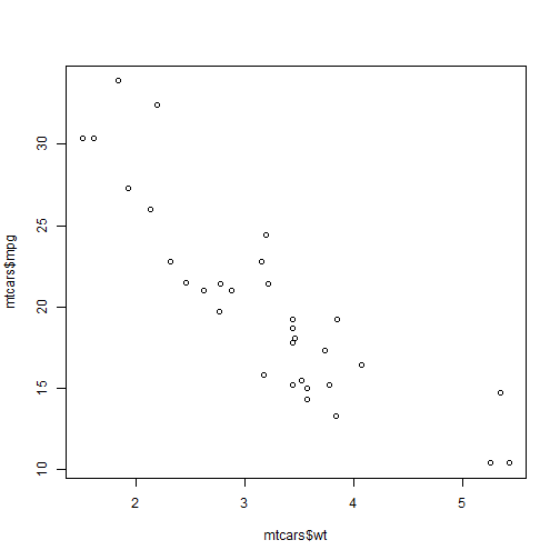
对于ggplot2系统,可以用qplot()函数得到相同的绘图结果:
library(ggplot2)
qplot(mtcars$wt, mtcars$mpg)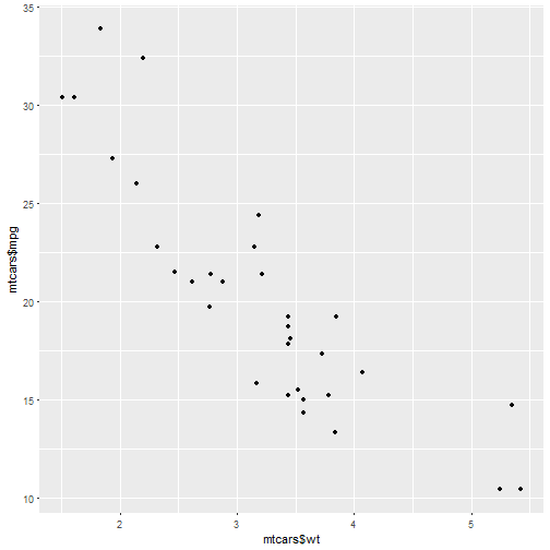
如果两个参数向量包含在一个数据框内,使用下面命令:
qplot(wt, mpg, data=mtcars)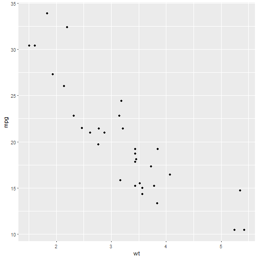
# 这与下面等价
# ggplot(mtcars, aes(x=wt, y=mpg)) + geom_point()
绘制折线图
方法
使用plot()函数绘制时需要传入坐标参量,以及使用参数type="l":
plot(pressure$temperature, pressure$pressure, type="l")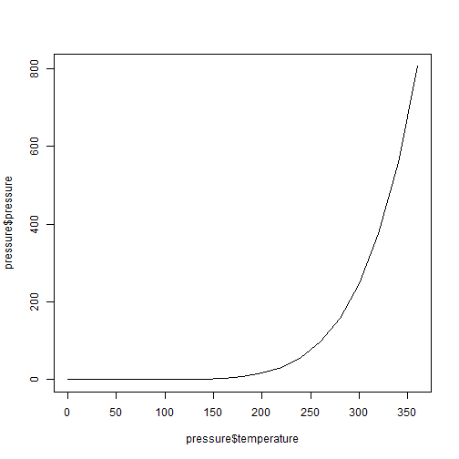
如果想要在此基础之上添加点或者折线,需要通过point()函数与lines()函数实现。
plot(pressure$temperature, pressure$pressure, type="l")
points(pressure$temperature, pressure$pressure)

lines(pressure$temperature, pressure$pressure/2, col="red")
points(pressure$temperature, pressure$pressure/2, col="red")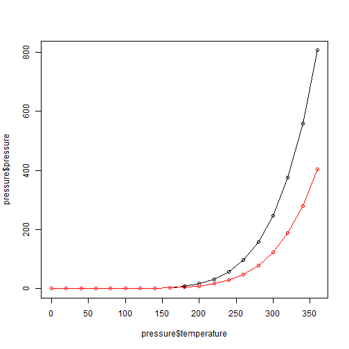
可以使用ggplot包达到类似的效果。
library(ggplot2)
qplot(pressure$temperature, pressure$pressure, geom=c("line", "point"))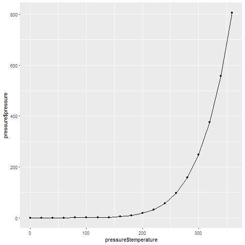
# 或者

ggplot(pressure, aes(x=temperature, y=pressure)) + geom_line() + geom_point()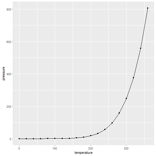
绘制条形图
方法
向barplot()传入两个参数,第一个设定条形的高度,第二个设定对应的标签(可选)。
barplot(BOD$demand, names.arg = BOD$Time)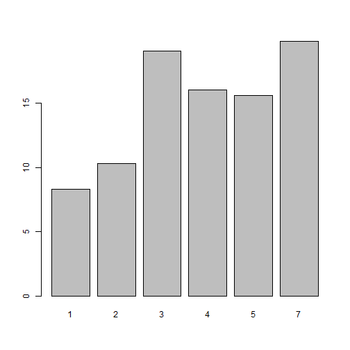
有时候,条形图表示分组中各元素的频数,这跟直方图类似。不过x轴不再是上图看到的连续值,而是离散的。可以使用table()函数计算类别的频数。
barplot(table(mtcars$cyl))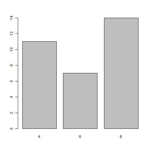
可以使用ggplot2系统函数,注意需要将作为横坐标的变量转化为因子型以及参数设定。
library(ggplot2)

ggplot 大专栏  快速探索数据(BOD, aes(x=factor(Time), y=demand)) + geom_bar(stat="identity")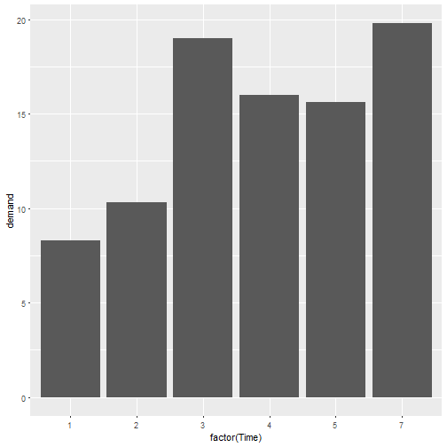
ggplot(mtcars, aes(x=factor(cyl))) + geom_bar()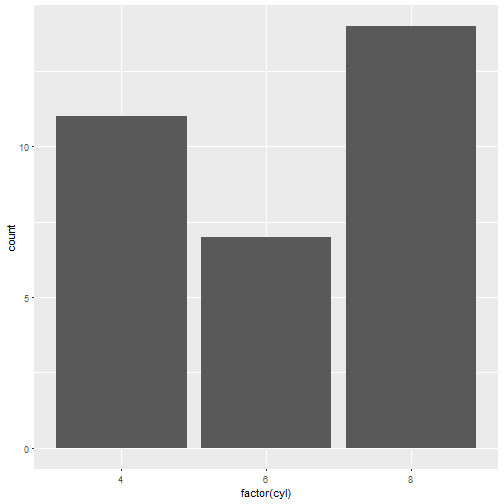
绘制直方图
同样地,我们用两者方法来绘制
hist(mtcars$mpg)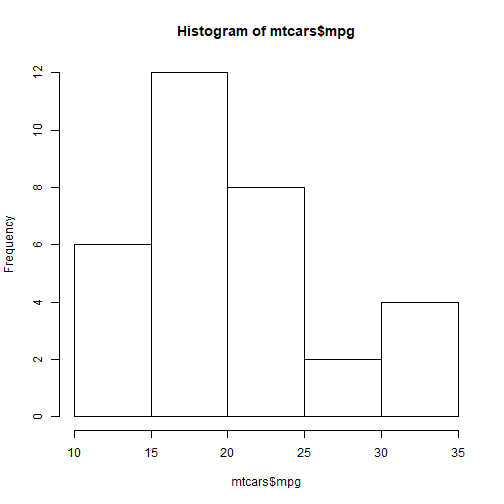
# 通过breaks参数指定大致组距
hist(mtcars$mpg, breaks = 10)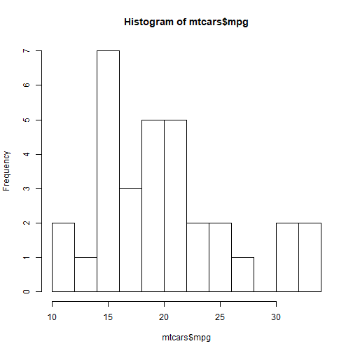
library(ggplot2)
ggplot(mtcars, aes(x=mpg)) + geom_histogram()
## `stat_bin()` using `bins = 30`. Pick better value with `binwidth`.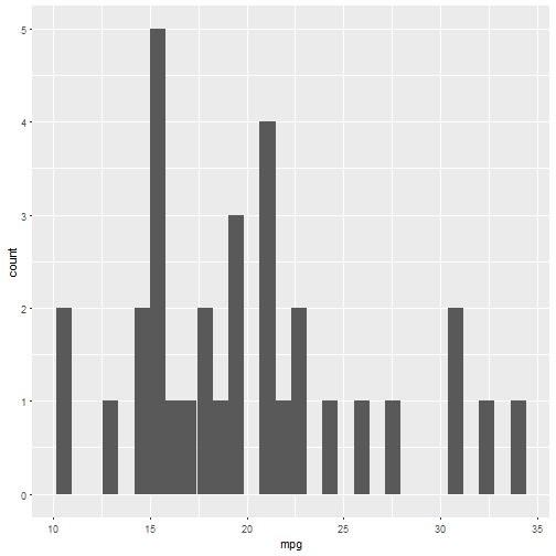
ggplot(mtcars, aes(x=mpg)) + geom_histogram(binwidth = 5)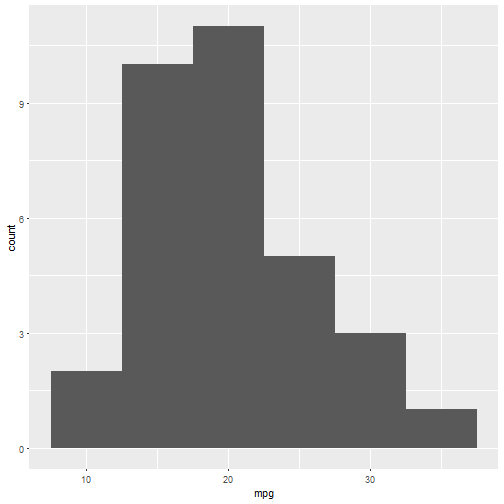
绘制箱线图
使用plot()函数绘制箱线图时向其传递两个向量:x,y。当x为因子型变量时,它会默认绘制箱线图。
plot(ToothGrowth$supp, ToothGrowth$len)
当这两个参数变量包含在同一个数据框,可以使用公式语法。
# 公式语法
boxplot(len ~ supp, data=ToothGrowth)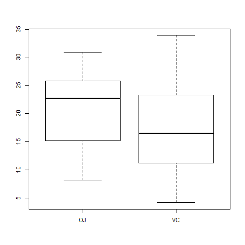
# 在x轴引入两变量交互
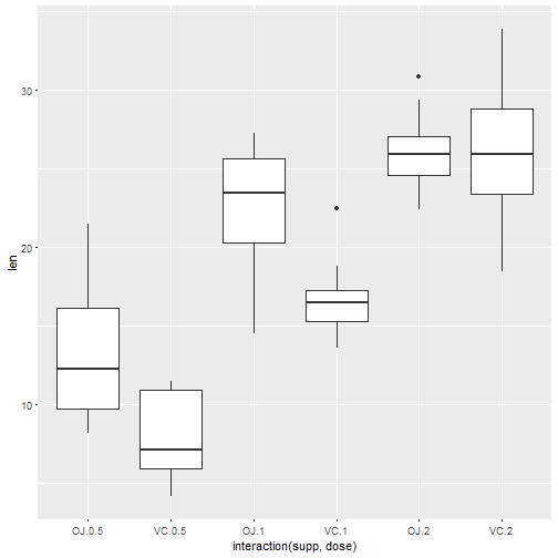
boxplot(len ~ supp + dose, data = ToothGrowth)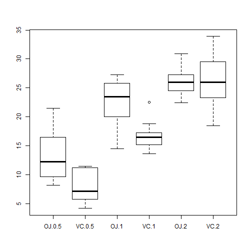
下面使用ggplot2绘制
library(ggplot2)
qplot(ToothGrowth$supp, ToothGrowth$len, geom="boxplot")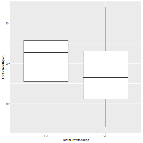
ggplot(ToothGrowth, aes(x=supp, y=len)) + geom_boxplot()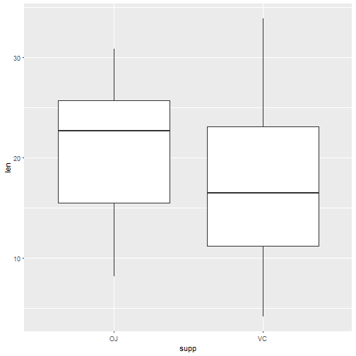
使用interaction()函数将分组变量组合在一起可以绘制基于多分组变量的箱线图。
ggplot(ToothGrowth, aes(x=interaction(supp, dose), y=len)) + geom_boxplot()