版权声明:本文为博主原创文章,遵循 CC 4.0 BY-SA 版权协议,转载请附上原文出处链接和本声明。
(微信小程序可用)
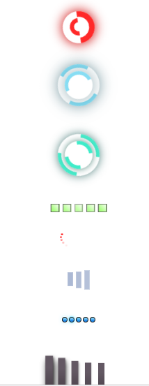
直接上代码
html部分
<view id="ajaxloader1"></view>

<view id="ajaxloader2">
  <view class="outer"></view>
  <view class="inner"></view>
</view>

<view id="ajaxloader3">
  <view class="outer"></view>
  <view class="inner"></view>
</view>

<view id="ajaxbar1">
  <view id="block1" class="barlittle"></view>
  <view id="block2" class="barlittle"></view>
  <view id="block3" class="barlittle"></view>
  <view id="block4" class="barlittle"></view>
  <view id="block5" class="barlittle"></view>
</view>

<view id="ajaxwave1">
  <view id="pointcircle1" class="pointcircle"></view>
  <view id="pointcircle2" class="pointcircle"></view>
  <view id="pointcircle3" class="pointcircle"></view>
  <view id="pointcircle4" class="pointcircle"></view>
  <view id="pointcircle5" class="pointcircle"></view>
</view>

<view id="facebook">
  <view class="bar"></view>
  <view class="bar"></view>
  <view class="bar"></view>
</view>

<view id="loadpulse">
    <view class="segment">
      <view id="layer1" class="ball"></view>
      <view id="layer7" class="pulse"></view>
    </view>
    <view class="segment">
      <view id="layer2" class="ball"></view>
      <view id="layer8" class="pulse"></view>
    </view>
    <view class="segment">
      <view id="layer3" class="ball"></view>
      <view id="layer9" class="pulse"></view>
    </view>
    <view class="segment">
      <view id="layer4" class="ball"></view>
      <view id="layer10" class="pulse"></view>
    </view>
    <view class="segment">
      <view id="layer5" class="ball"></view>
      <view id="layer11" class="pulse"></view>
    </view>
</view>

<view id="shadowloader">
  <span></span>
  <span></span>
  <span></span>
  <span></span>
  <span></span>
</view>
css部分
body {
  background: #161616;
  font: 12px normal Verdana, Arial, Helvetica, sans-serif;
}

#ajaxloader1 {
  width: 30px;
  height: 30px;
  border: 8px solid #fff;
  border-radius: 50%;
  -webkit-box-shadow: 0 0 25px 2px;
  -moz-box-shadow: 0 0 25px 2px;
  box-shadow: 0 0 25px 2px;
  color: #fff;
  border-color: #f00;
  color: #cc0000;
  border-right-color: transparent;
  border-top-color: transparent;
  -webkit-animation: spin-right 1s linear infinite normal;
  -moz-animation: spin-right 1s linear infinite normal;
  -ms-animation: spin-right 1s linear infinite normal;
  animation: spin-right 1s linear infinite normal;
  -webkit-animation-delay: 0;
  -moz-animation-delay: 0;
  -o-animation-delay: 0;
  animation-delay: 0;
  margin: 30px auto 0;
}
#ajaxloader1:after {
  display: block;
  width: 13px;
  height: 13px;
  margin: 3px;
  border: 6px solid #f00;
  content: " ";
  border-radius: 50%;
  border-left-color: transparent;
  border-bottom-color: transparent;
}
#ajaxloader2 {
  margin: 30px auto 0;
}
#ajaxloader2 .outer {
  border: 5px solid rgba(0, 183, 229, 0.9);
  opacity: .9;
  width: 50px;
  height: 50px;
  border-top-color: transparent;
  border-bottom-color: transparent;
  border-radius: 50%;
  -webkit-box-shadow: 0 0 35px rgba(0, 61, 76, 0.9);
  -moz-box-shadow: 0 0 35px rgba(0, 61, 76, 0.9);
  box-shadow: 0 0 35px rgba(0, 61, 76, 0.9);
  -webkit-animation: spin-right 0.5s linear infinite normal;
  -moz-animation: spin-right 0.5s linear infinite normal;
  -ms-animation: spin-right 0.5s linear infinite normal;
  animation: spin-right 0.5s linear infinite normal;
  -webkit-animation-delay: 0;
  -moz-animation-delay: 0;
  -o-animation-delay: 0;
  animation-delay: 0;
  margin: 0 auto;
}
#ajaxloader2 .inner {
  display: block;
  width: 30px;
  height: 30px;
  border: 5px solid rgba(0, 183, 229, 0.9);
  opacity: .9;
  border-radius: 50%;
  border-left-color: transparent;
  border-bottom-color: transparent;
  -webkit-box-shadow: 0 0 35px rgba(0, 61, 76, 0.9);
  -moz-box-shadow: 0 0 35px rgba(0, 61, 76, 0.9);
  box-shadow: 0 0 35px rgba(0, 61, 76, 0.9);
  position: relative;
  top: -50px;
  margin: 0 auto;
  -webkit-animation: spin-left 0.5s linear infinite normal;
  -moz-animation: spin-left 0.5s linear infinite normal;
  -ms-animation: spin-left 0.5s linear infinite normal;
  animation: spin-left 0.5s linear infinite normal;
  -webkit-animation-delay: 0;
  -moz-animation-delay: 0;
  -o-animation-delay: 0;
  animation-delay: 0;
}
#ajaxloader3 {
  margin: 0 auto;
}
#ajaxloader3 .outer {
  border: 5px solid rgba(0, 229, 183, 0.9);
  opacity: .9;
  border-right-color: transparent;
  border-left-color: transparent;
  width: 50px;
  height: 50px;
  margin: 0 auto;
  border-radius: 50%;
  -webkit-box-shadow: 0 0 35px rgba(0, 76, 61, 0.9);
  -moz-box-shadow: 0 0 35px rgba(0, 76, 61, 0.9);
  box-shadow: 0 0 35px rgba(0, 76, 61, 0.9);
  -webkit-animation: spin-pulse 1s linear infinite normal;
  -moz-animation: spin-pulse 1s linear infinite normal;
  -ms-animation: spin-pulse 1s linear infinite normal;
  animation: spin-pulse 1s linear infinite normal;
  -webkit-animation-delay: 0;
  -moz-animation-delay: 0;
  -o-animation-delay: 0;
  animation-delay: 0;
}
#ajaxloader3 .inner {
  border: 5px solid rgba(0, 229, 183, 0.9);
  opacity: .9;
  border-left-color: transparent;
  border-right-color: transparent;
  border-radius: 50%;
  -webkit-box-shadow: 0 0 15px rgba(0, 76, 61, 0.9);
  -moz-box-shadow: 0 0 15px rgba(0, 76, 61, 0.9);
  box-shadow: 0 0 15px rgba(0, 76, 61, 0.9);
  width: 30px;
  height: 30px;
  position: relative;
  top: -50px;
  margin: 0 auto;
  -webkit-animation: spin-right 1s linear infinite normal;
  -moz-animation: spin-right 1s linear infinite normal;
  -ms-animation: spin-right 1s linear infinite normal;
  animation: spin-right 1s linear infinite normal;
  -webkit-animation-delay: 0;
  -moz-animation-delay: 0;
  -o-animation-delay: 0;
  animation-delay: 0;
}
#ajaxbar1 {
  margin: 0 auto;
  overflow: hidden;
  width: 90px;
}
#ajaxbar1 .barlittle {
  background-color: #8aff51;
  filter: progid:DXImageTransform.Microsoft.gradient(startColorstr='@color1', endColorstr='@color2');
  background-image: -webkit-linear-gradient(45deg, #8aff51 25%, #f1ffea);
  background-image: -moz-linear-gradient(45deg, #8aff51 25%, #f1ffea);
  border: 1px solid #111;
  width: 10px;
  height: 10px;
  float: left;
  margin-left: 5px;
  opacity: 0.1;
  -webkit-animation: pulse 1s linear infinite normal;
  -moz-animation: pulse 1s linear infinite normal;
  -ms-animation: pulse 1s linear infinite normal;
  animation: pulse 1s linear infinite normal;
  -webkit-animation-delay: 0;
  -moz-animation-delay: 0;
  -o-animation-delay: 0;
  animation-delay: 0;
}
#ajaxbar1 #block1 {
  -webkit-animation-delay: 0.3s;
  -moz-animation-delay: 0.3s;
  -o-animation-delay: 0.3s;
  animation-delay: 0.3s;
}
#ajaxbar1 #block2 {
  -webkit-animation-delay: 0.2s;
  -moz-animation-delay: 0.2s;
  -o-animation-delay: 0.2s;
  animation-delay: 0.2s;
}
#ajaxbar1 #block3 {
  -webkit-animation-delay: 0.1s;
  -moz-animation-delay: 0.1s;
  -o-animation-delay: 0.1s;
  animation-delay: 0.1s;
}
#ajaxbar1 #block4 {
  -webkit-animation-delay: 0.2s;
  -moz-animation-delay: 0.2s;
  -o-animation-delay: 0.2s;
  animation-delay: 0.2s;
}
#ajaxbar1 #block5 {
  -webkit-animation-delay: 0.3s;
  -moz-animation-delay: 0.3s;
  -o-animation-delay: 0.3s;
  animation-delay: 0.3s;
}
#ajaxwave1 {
  margin: 30px auto 0;
  overflow: hidden;
  height: 50px;
}
#ajaxwave1 .pointcircle {
  background-color: #f00;
  filter: progid:DXImageTransform.Microsoft.gradient(startColorstr='@color1', endColorstr='@color2');
  background-image: -webkit-linear-gradient(90deg, #f00 25%, #ff9999);
  background-image: -moz-linear-gradient(90deg, #f00 25%, #ff9999);
  width: 3px;
  height: 3px;
  border-radius: 50%;
  -webkit-box-shadow: 0 0 5px #cc0000;
  -moz-box-shadow: 0 0 5px #cc0000;
  box-shadow: 0 0 5px #cc0000;
  margin: 0 auto;
  position: relative;
}
#ajaxwave1 #pointcircle1 {
  -webkit-animation: ball-circlex 2s infinite cubic-bezier(0, 0, 0.35, 1) normal;
  -moz-animation: ball-circlex 2s infinite cubic-bezier(0, 0, 0.35, 1) normal;
  -ms-animation: ball-circlex 2s infinite cubic-bezier(0, 0, 0.35, 1) normal;
  animation: ball-circlex 2s infinite cubic-bezier(0, 0, 0.35, 1) normal;
  -webkit-animation-delay: 0;
  -moz-animation-delay: 0;
  -o-animation-delay: 0;
  animation-delay: 0;
}
#ajaxwave1 #pointcircle2 {
  opacity: 0.7;
  top: 1px;
  -webkit-animation: ball-circlex 2s infinite cubic-bezier(0, 0, 0.35, 1) normal;
  -moz-animation: ball-circlex 2s infinite cubic-bezier(0, 0, 0.35, 1) normal;
  -ms-animation: ball-circlex 2s infinite cubic-bezier(0, 0, 0.35, 1) normal;
  animation: ball-circlex 2s infinite cubic-bezier(0, 0, 0.35, 1) normal;
  -webkit-animation-delay: 0.1s;
  -moz-animation-delay: 0.1s;
  -o-animation-delay: 0.1s;
  animation-delay: 0.1s;
}
#ajaxwave1 #pointcircle3 {
  opacity: 0.5;
  top: 2px;
  -webkit-animation: ball-circlex 2s infinite cubic-bezier(0, 0, 0.35, 1) normal;
  -moz-animation: ball-circlex 2s infinite cubic-bezier(0, 0, 0.35, 1) normal;
  -ms-animation: ball-circlex 2s infinite cubic-bezier(0, 0, 0.35, 1) normal;
  animation: ball-circlex 2s infinite cubic-bezier(0, 0, 0.35, 1) normal;
  -webkit-animation-delay: 0.2s;
  -moz-animation-delay: 0.2s;
  -o-animation-delay: 0.2s;
  animation-delay: 0.2s;
}
#ajaxwave1 #pointcircle4 {
  opacity: 0.3;
  top: 3px;
  -webkit-animation: ball-circlex 2s infinite cubic-bezier(0, 0, 0.35, 1) normal;
  -moz-animation: ball-circlex 2s infinite cubic-bezier(0, 0, 0.35, 1) normal;
  -ms-animation: ball-circlex 2s infinite cubic-bezier(0, 0, 0.35, 1) normal;
  animation: ball-circlex 2s infinite cubic-bezier(0, 0, 0.35, 1) normal;
  -webkit-animation-delay: 0.3s;
  -moz-animation-delay: 0.3s;
  -o-animation-delay: 0.3s;
  animation-delay: 0.3s;
}
#ajaxwave1 #pointcircle5 {
  opacity: 0.1;
  top: 4px;
  -webkit-animation: ball-circlex 2s infinite cubic-bezier(0, 0, 0.35, 1) normal;
  -moz-animation: ball-circlex 2s infinite cubic-bezier(0, 0, 0.35, 1) normal;
  -ms-animation: ball-circlex 2s infinite cubic-bezier(0, 0, 0.35, 1) normal;
  animation: ball-circlex 2s infinite cubic-bezier(0, 0, 0.35, 1) normal;
  -webkit-animation-delay: 0.4s;
  -moz-animation-delay: 0.4s;
  -o-animation-delay: 0.4s;
  animation-delay: 0.4s;
}
#facebook {
  width: 32px;
  height: 32px;
  margin: 0 auto;
}
#facebook .bar {
  background: #99aaca;
  border: 1px solid #96a6c9;
  float: left;
  margin: 6px 4px 0 0;
  width: 6px;
  height: 18px;
  -webkit-animation: facebook-pulse 1s linear infinite normal;
  -moz-animation: facebook-pulse 1s linear infinite normal;
  -ms-animation: facebook-pulse 1s linear infinite normal;
  animation: facebook-pulse 1s linear infinite normal;
  -webkit-animation-delay: 0;
  -moz-animation-delay: 0;
  -o-animation-delay: 0;
  animation-delay: 0;
}
#facebook .bar:nth-child(2) {
  -webkit-animation-delay: 0.1s;
  -moz-animation-delay: 0.1s;
  -o-animation-delay: 0.1s;
  animation-delay: 0.1s;
}
#facebook .bar:last-child {
  -webkit-animation-delay: 0.2s;
  -moz-animation-delay: 0.2s;
  -o-animation-delay: 0.2s;
  animation-delay: 0.2s;
  margin-right: 0;
}
#loadpulse {
  width: 48px;
  padding: 8px 5px;
  margin: 30px auto;
  overflow: hidden;
}
#loadpulse .segment {
  float: left;
  position: relative;
  width: 6px;
  height: 6px;
  border: 1px solid #fff;
  border-radius: 50px;
  margin-left: 2px;
  border: 1px solid #111;
  border-right-color: #333;
  border-bottom-color: #333;
  background: #000;
}
#loadpulse .segment:first-child {
  margin-left: 0;
}
#loadpulse .ball {
  background-color: #2187e7;
  filter: progid:DXImageTransform.Microsoft.gradient(startColorstr='@color1', endColorstr='@color2');
  background-image: -webkit-linear-gradient(90deg, #2187e7 25%, #a0eaff);
  background-image: -moz-linear-gradient(90deg, #2187e7 25%, #a0eaff);
  width: 6px;
  height: 6px;
  border-radius: 50px;
  -moz-transform: scale(0);
  -webkit-transform: scale(0);
  -webkit-animation: loadpulse-ball 1s linear forwards normal;
  -moz-animation: loadpulse-ball 1s linear forwards normal;
  -ms-animation: loadpulse-ball 1s linear forwards normal;
  animation: loadpulse-ball 1s linear forwards normal;
  -webkit-animation-delay: 0;
  -moz-animation-delay: 0;
  -o-animation-delay: 0;
  animation-delay: 0;
}
#loadpulse .pulse {
  width: 6px;
  height: 6px;
  border-radius: 30px;
  border: 1px solid #00c6ff;
  -webkit-box-shadow: 0 0 5px #00c6ff;
  -moz-box-shadow: 0 0 5px #00c6ff;
  box-shadow: 0 0 5px #00c6ff;
  position: absolute;
  top: -1px;
  left: -1px;
  -moz-transform: scale(0);
  -webkit-transform: scale(0);
  -webkit-animation: loadpulse-glow 3s infinite ease-out normal;
  -moz-animation: loadpulse-glow 3s infinite ease-out normal;
  -ms-animation: loadpulse-glow 3s infinite ease-out normal;
  animation: loadpulse-glow 3s infinite ease-out normal;
  -webkit-animation-delay: 0;
  -moz-animation-delay: 0;
  -o-animation-delay: 0;
  animation-delay: 0;
}
#loadpulse #layer1 {
  -webkit-animation-delay: 0.5s;
  -moz-animation-delay: 0.5s;
  -o-animation-delay: 0.5s;
  animation-delay: 0.5s;
}
#loadpulse #layer2 {
  -webkit-animation-delay: 1s;
  -moz-animation-delay: 1s;
  -o-animation-delay: 1s;
  animation-delay: 1s;
}
#loadpulse #layer3 {
  -webkit-animation-delay: 1.5s;
  -moz-animation-delay: 1.5s;
  -o-animation-delay: 1.5s;
  animation-delay: 1.5s;
}
#loadpulse #layer4 {
  -webkit-animation-delay: 2s;
  -moz-animation-delay: 2s;
  -o-animation-delay: 2s;
  animation-delay: 2s;
}
#loadpulse #layer5 {
  -webkit-animation-delay: 2.5s;
  -moz-animation-delay: 2.5s;
  -o-animation-delay: 2.5s;
  animation-delay: 2.5s;
}
#loadpulse #layer7 {
  -webkit-animation-delay: 1.5s;
  -moz-animation-delay: 1.5s;
  -o-animation-delay: 1.5s;
  animation-delay: 1.5s;
}
#loadpulse #layer8 {
  -webkit-animation-delay: 2s;
  -moz-animation-delay: 2s;
  -o-animation-delay: 2s;
  animation-delay: 2s;
}
#loadpulse #layer9 {
  -webkit-animation-delay: 2.5s;
  -moz-animation-delay: 2.5s;
  -o-animation-delay: 2.5s;
  animation-delay: 2.5s;
}
#loadpulse #layer10 {
  -webkit-animation-delay: 3s;
  -moz-animation-delay: 3s;
  -o-animation-delay: 3s;
  animation-delay: 3s;
}
#loadpulse #layer11 {
  -webkit-animation-delay: 3.5s;
  -moz-animation-delay: 3.5s;
  -o-animation-delay: 3.5s;
  animation-delay: 3.5s;
}
#shadowloader {
  display: block;
  position: relative;
  overflow: hidden;
  width: 5em;
  margin: 30px auto;
  padding: 20px 10px;
}
#shadowloader span {
  display: block;
  float: left;
  width: 0.5em;
  height: 3em;
  margin: 0 0.5em 0 0;
  background: #635863;
  filter: progid:DXImageTransform.Microsoft.gradient(startColorstr='@color1', endColorstr='@color2');
  background-image: -webkit-linear-gradient(top, #635863 25%, #3d353b);
  background-image: -moz-linear-gradient(top, #635863 25%, #3d353b);
  box-shadow: 1px 1px 1px 0 rgba(0, 0, 0, 0), 1px 1px 1px 0 rgba(0, 0, 0, 0), 1px 1px 1px 0 rgba(0, 0, 0, 0);
  -webkit-animation: pound 0.7s ease-in-out infinite alternate;
  -moz-animation: pound 0.7s ease-in-out infinite alternate;
  -ms-animation: pound 0.7s ease-in-out infinite alternate;
  animation: pound 0.7s ease-in-out infinite alternate;
  -webkit-animation-delay: 0.05s;
  -moz-animation-delay: 0.05s;
  -o-animation-delay: 0.05s;
  animation-delay: 0.05s;
  -webkit-transform-origin: center bottom;
  -moz-transform-origin: center bottom;
  -ms-transform-origin: center bottom;
  transform-origin: center bottom;
}
#shadowloader span:nth-child(2) {
  -webkit-animation-delay: 0.2s;
  -moz-animation-delay: 0.2s;
  -o-animation-delay: 0.2s;
  animation-delay: 0.2s;
}
#shadowloader span:nth-child(3) {
  -webkit-animation-delay: 0.35s;
  -moz-animation-delay: 0.35s;
  -o-animation-delay: 0.35s;
  animation-delay: 0.35s;
}
#shadowloader span:nth-child(4) {
  -webkit-animation-delay: 0.5s;
  -moz-animation-delay: 0.5s;
  -o-animation-delay: 0.5s;
  animation-delay: 0.5s;
}
#shadowloader span:nth-child(5) {
  -webkit-animation-delay: 0.65s;
  -moz-animation-delay: 0.65s;
  -o-animation-delay: 0.65s;
  animation-delay: 0.65s;
}
h1.loadingtext {
  text-align: center;
  text-transform: uppercase;
  font-family: 'Nunito', sans-serif;
  font-size: 4.6875em;
  color: transparent;
  letter-spacing: 0.01em;
}
h1.loadingtext span {
  text-shadow: 0 0 2px rgba(22, 22, 22, 0.9), 0 15px 25px rgba(0, 0, 0, 0.3), 0 -2px 3px rgba(0, 0, 0, 0.1), 0 -5px 10px rgba(22, 22, 22, 0.5), 0 5px 10px rgba(0, 0, 0, 0.3), 0 3px 4px rgba(22, 22, 22, 0.2), 0 0 20px rgba(22, 22, 22, 0.45);
  -webkit-animation: letters 0.85s ease-in-out infinite alternate;
  -moz-animation: letters 0.85s ease-in-out infinite alternate;
  -ms-animation: letters 0.85s ease-in-out infinite alternate;
  animation: letters 0.85s ease-in-out infinite alternate;
  -webkit-animation-delay: 0;
  -moz-animation-delay: 0;
  -o-animation-delay: 0;
  animation-delay: 0;
}
h1.loadingtext span:nth-child(2) {
  -webkit-animation-delay: 0.15s;
  -moz-animation-delay: 0.15s;
  -o-animation-delay: 0.15s;
  animation-delay: 0.15s;
}
h1.loadingtext span:nth-child(3) {
  -webkit-animation-delay: 0.3s;
  -moz-animation-delay: 0.3s;
  -o-animation-delay: 0.3s;
  animation-delay: 0.3s;
}
h1.loadingtext span:nth-child(4) {
  -webkit-animation-delay: 0.45s;
  -moz-animation-delay: 0.45s;
  -o-animation-delay: 0.45s;
  animation-delay: 0.45s;
}
h1.loadingtext span:nth-child(5) {
  -webkit-animation-delay: 0.6s;
  -moz-animation-delay: 0.6s;
  -o-animation-delay: 0.6s;
  animation-delay: 0.6s;
}
h1.loadingtext span:nth-child(6) {
  -webkit-animation-delay: 0.75s;
  -moz-animation-delay: 0.75s;
  -o-animation-delay: 0.75s;
  animation-delay: 0.75s;
}
h1.loadingtext span:nth-child(7) {
  -webkit-animation-delay: 0.9s;
  -moz-animation-delay: 0.9s;
  -o-animation-delay: 0.9s;
  animation-delay: 0.9s;
}
@keyframes spin-right {
  from {
    transform: rotate(0deg);
    opacity: 0.2;
  }
  50% {
    transform: rotate(180deg);
    opacity: 1.0;
  }
  to {
    transform: rotate(360deg);
    opacity: 0.2;
  }
}


@-webkit-keyframes spin-right {
  from {
    -webkit-transform: rotate(0deg);
    opacity: 0.2;
  }
  50% {
    -webkit-transform: rotate(180deg);
    opacity: 1.0;
  }
  to {
    -webkit-transform: rotate(360deg);
    opacity: 0.2;
  }
}
@keyframes spin-left {
  from {
    transform: rotate(0deg);
    opacity: 0.2;
  }
  50% {
    transform: rotate(-180deg);
    opacity: 1.0;
  }
  to {
    transform: rotate(-360deg);
    opacity: 0.2;
  }
}

@-webkit-keyframes spin-left {
  from {
    -webkit-transform: rotate(0deg);
    opacity: 0.2;
  }
  50% {
    -webkit-transform: rotate(-180deg);
    opacity: 1.0;
  }
  to {
    -webkit-transform: rotate(-360deg);
    opacity: 0.2;
  }
}
@keyframes spin-pulse {
  from {
    transform: rotate(160deg);
    opacity: 0;
    box-shadow: 0 0 1px rgba(0, 61, 76, 0.9);
  }
  50% {
    transform: rotate(145deg);
    opacity: 1;
  }
  to {
    transform: rotate(-320deg);
    opacity: 0;
  }
}

@-webkit-keyframes spin-pulse {
  from {
    -webkit-transform: rotate(160deg);
    opacity: 0;
    box-shadow: 0 0 1px rgba(0, 61, 76, 0.9);
  }
  50% {
    -webkit-transform: rotate(145deg);
    opacity: 1;
  }
  to {
    -webkit-transform: rotate(-320deg);
    opacity: 0;
  }
}
@keyframes pulse {
  from {
    transform: scale(1.2);
    opacity: 1;
  }
  to {
    transform: scale(0.7);
    opacity: 0.1;
  }
}

@-webkit-keyframes pulse {
  from {
    -webkit-transform: scale(1.2);
    opacity: 1;
  }
  to {
    -webkit-transform: scale(0.7);
    opacity: 0.1;
  }
}
@keyframes ball-circlex {
  from {
    transform: translateX(0px);
  }
  25% {
    transform: translateX(25px);
    animation-timing-function: ease-in;
  }
  50% {
    transform: translateX(0px);
  }
  75% {
    transform: translateX(-25px);
    animation-timing-function: ease-in;
  }
  to {
    transform: translateX(0px);
  }
}

@-webkit-keyframes ball-circlex {
  from {
    -webkit-transform: translateX(0px);
  }
  25% {
    -webkit-transform: translateX(25px);
    -webkit-animation-timing-function: ease-in;
  }
  50% {
    -webkit-transform: translateX(0px);
  }
  75% {
    -webkit-transform: translateX(-25px);
    -webkit-animation-timing-function: ease-in;
  }
  to {
    -webkit-transform: translateX(0px);
  }
}
@keyframes facebook-pulse {
  10% {
    margin-top: 5px;
    height: 22px;
    border-color: #d1d8e6;
    background-color: #bac5db;
  }
  20% {
    margin-top: 0px;
    height: 32px;
    border-color: #d1d7e2;
    background-color: #bac5db;
  }
  30% {
    margin-top: 1px;
    height: 30px;
    border-color: #d1d8e6;
    background-color: #bac5db;
  }
  40% {
    margin-top: 3px;
    height: 26px;
  }
  50% {
    margin-top: 5px;
    height: 22px;
  }
  60% {
    margin-top: 6px;
    height: 18px;
  }
}

@-webkit-keyframes facebook-pulse {
  10% {
    margin-top: 5px;
    height: 22px;
    border-color: #d1d8e6;
    background-color: #bac5db;
  }
  20% {
    margin-top: 0px;
    height: 32px;
    border-color: #d1d7e2;
    background-color: #bac5db;
  }
  30% {
    margin-top: 1px;
    height: 30px;
    border-color: #d1d8e6;
    background-color: #bac5db;
  }
  40% {
    margin-top: 3px;
    height: 26px;
  }
  50% {
    margin-top: 5px;
    height: 22px;
  }
  60% {
    margin-top: 6px;
    height: 18px;
  }
}
@keyframes loadpulse-ball {
  from {
    transform: scale(0);
  }
  to {
    transform: scale(1);
  }
}

@-webkit-keyframes loadpulse-ball {
  from {
    -webkit-transform: scale(0);
  }
  to {
    -webkit-transform: scale(1);
  }
}
@keyframes loadpulse-glow {
  from {
    transform: scale(0);
    opacity: 0;
  }
  10% {
    transform: scale(1);
    opacity: 0.5;
  }
  50% {
    transform: scale(1.75);
    opacity: 0;
  }
  to {
    transform: scale(0);
    opacity: 0;
  }
}

@-webkit-keyframes loadpulse-glow {
  from {
    -webkit-transform: scale(0);
    opacity: 0;
  }
  10% {
    -webkit-transform: scale(1);
    opacity: 0.5;
  }
  50% {
    -webkit-transform: scale(1.75);
    opacity: 0;
  }
  to {
    -webkit-transform: scale(0);
    opacity: 0;
  }
}
@keyframes pound {
  to {
    transform: scale(1.2);
    box-shadow: 1px 2px 3px 0 rgba(0, 0, 0, 0.65), 2px 6px 12px 0 rgba(0, 0, 0, 0.5), 3px 8px 15px 0 rgba(0, 0, 0, 0.45);
  }
}

@-webkit-keyframes pound {
  to {
    -webkit-transform: scale(1.2);
    box-shadow: 1px 2px 3px 0 rgba(0, 0, 0, 0.65), 2px 6px 12px 0 rgba(0, 0, 0, 0.5), 3px 8px 15px 0 rgba(0, 0, 0, 0.45);
  }
}
@keyframes letters {
  to {
    text-shadow: 0 0 2px rgba(204, 208, 212, 0.2), 0 0 3px rgba(0, 0, 0, 0.02), 0 0 0 rgba(0, 0, 0, 0), 0 0 0 rgba(255, 255, 255, 0), 0 0 0 rgba(0, 0, 0, 0), 0 0 0 rgba(255, 255, 255, 0), 0 0 0 rgba(255, 255, 255, 0);
  }
}

@-webkit-keyframes letters {
  to {
    text-shadow: 0 0 2px rgba(22, 22, 22, 0.2), 0 0 3px rgba(0, 0, 0, 0.02), 0 0 0 rgba(0, 0, 0, 0), 0 0 0 rgba(0, 0, 0, 0), 0 0 0 rgba(0, 0, 0, 0), 0 0 0 rgba(0, 0, 0, 0), 0 0 0 rgba(0, 0, 0, 0);
  }
}