版权声明:本文为博主原创文章,未经博主允许不得转载。 https://blog.csdn.net/u012987546/article/details/79812537
1.css3模拟下雨效果
主要使用到的ccs3的属性:
animation-name //自定义动画的名称
animation-duration //动画的时长
animation-timing-function //动画的时间函数
animation-delay //动画开启前的延迟
animation-iteration-count //循环次数
animation-direction //反向播放
//上面的可以简写成
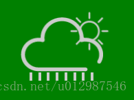
animation: name duration timing-function delay iteration-count direction;执行的效果:

1.编写页面代码:
<div id="box">
     <!-- 云和太阳:图片是在iconfont网站下载的  -->
    <div>
        <img class="sun" src="sun.png" alt="">
        <img class="clond" src="cloud.png" alt="">
    </div>
     <!-- 小雨点 -->
    <div class="rain">
        <span class="drop"></span>
        <span class="drop"></span>
        <span class="drop"></span>
        <span class="drop"></span>
        <span class="drop"></span>
        <span class="drop"></span>
        <span class="drop"></span>
        <span class="drop"></span>
    </div>

</div>
2.添加css样式
    <style>
        #box {
            width: 400px;
            height: 400px;
            background: green;

            position: absolute;
            top: 50%;
            left: 50%;
            margin-left: -200px;
            margin-top: -200px;

        }

        .clond {
            width: 120px;
            height: 80px;

            position: absolute;
            top: 50%;
            left: 50%;
            margin-left: -60px;
            margin-top: -100px;
        }

        .sun {
            width: 60px;
            height: 60px;

            position: absolute;
            top: 30%;
            left: 50%;
            margin-left: 10px;
            margin-top: -30px;

        }

        .rain{
            width: 100px;
            height: 60px;

            position: absolute;
            top: 50%;
            left: 50%;
            margin-left: -47px;
            margin-top: -25px;
        }

        .drop{
            display: inline-block;
            width: 4px;
            height: 12px;
            background: #cccccc;
            margin-right: 4px;
        }
    </style>
效果:
3.让太阳转动
        .sun {
            ...
            ...
            //太阳转动
            animation: sunLoop 10s infinite linear;
        }

        @keyframes sunLoop {
            0%{transform: rotateZ(0deg)}
            100%{transform: rotateZ(360deg)}
        }
4.实现小雨点动画
       .drop{
            ...
            ...
            animation: dropLoop 0.5s infinite linear;
        }

        @keyframes dropLoop {
            //在y轴平移,并且平移到50%和100%的时候改变透明度
            50%{transform: translateY(30px) ; opacity: 0}
            100%{transform: translateY(50px) ; opacity: 0}
        }
5.延迟每个小雨点的开始时间
       .drop:nth-child(1){
            animation-delay:-0.2s;
        }
        .drop:nth-child(3){
            animation-delay:-0.4s;
        }
        .drop:nth-child(5){
            animation-delay:-0.1s;
        }
        .drop:nth-child(7){
            animation-delay:-0.3s;
        }
最后执行的效果: