版权声明:本文为博主原创文章,未经博主允许不得转载。 https://blog.csdn.net/u012987546/article/details/79815318
动画库:loaders.css
github : https://github.com/ConnorAtherton/loaders.css
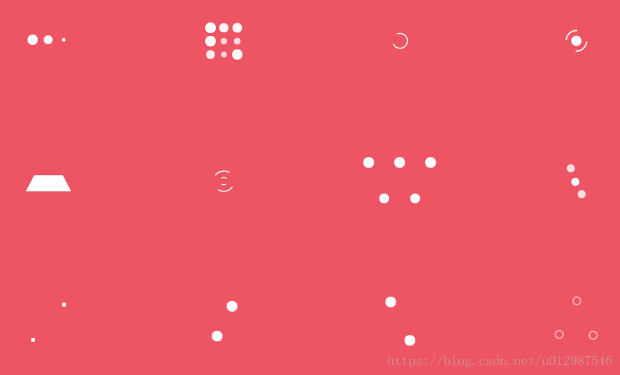
部分效果图:
1.导入动画库
<!DOCTYPE html>
<html lang="en">
<head>
    <meta charset="UTF-8">
    <title>rain</title>
    <!-- 引入动画库 -->
    <link rel="stylesheet" href="css/loaders.css">
    <style>
        #box {
            width: 400px;
            height: 400px;
            background: green;

            position: absolute;
            top: 50%;
            left: 50%;
            margin-left: -200px;
            margin-top: -200px;
            padding: 40px;
        }
    </style>
</head>
<body>

<div id="box">

</div>

</body>
</html>
2.使用loading的样式
<!DOCTYPE html>
<html lang="en">
<head>
<meta charset="UTF-8">
<title>rain</title>
<link rel="stylesheet" href="css/loaders.css">
<style>
#box {
width: 400px;
height: 400px;
background: green;
position: absolute;
top: 50%;
left: 50%;
margin-left: -200px;
margin-top: -200px;
padding: 40px;
}
</style>
</head>
<body>
<div id="box">
<!--第一个动画-->
<div class="loader-inner ball-pulse">
<div></div>
<div></div>
<div></div>
</div>
<br><br>
<!--第二个动画-->
<div class="loader-inner line-spin-fade-loader">
<div></div>
<div></div>
<div></div>
<div></div>
<div></div>
<div></div>
<div></div>
<div></div>
</div>
<br>
<!--第三个动画-->
<div class="loader-inner ball-clip-rotate">
<div></div>
</div>
<br><br>
<!--第四个动画-->
<div class="loader-inner ball-triangle-path">
<div></div>
<div></div>
<div></div>
</div>
</div>
</body>
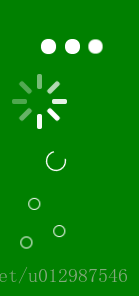
</html>执行的效果: