㈠什么是伪元素?
不同的解释:
⑴伪元素是创造关于文档语言能够指定的文档树之外的抽象。例如文档语言不能提供访问元素内容第一字或者第一行的机制。伪元素允许设计师引用它们,否则这是难以办到的。伪元素还提供样式设计师给在源文档中不存在的内容分配样式(例如::before和:after能够访问产生的内容)。
⑵CSS 在渲染文档的时候,伪元素可以通过 css 给 HTML 添加一个元素(叫标签也行),这个元素在文档树中是找不到的。伪元素被当做 CSS 的样式来进行展现,用法和普通的元素用法是一样的。
⑶伪元素用于创建一些不在文档树中的元素,并为其添加样式。比如说,我们可以通过:before来在一个元素前增加一些文本,并为这些文本添加样式。虽然用户可以看到这些文本,但是这些文本实际上不在文档树中。
⑷CSS伪元素是用来添加一些选择器的特殊效果。
㈡::before 和 ::after的定义
⑴::before 创建一个伪元素,作为已选中元素的第一个子元素,常通过 content 属性来为一个元素添加修饰性的内容。
⑵::after 创建一个伪元素,作为已选中元素的最后一个子元素,常通过 content 属性来为一个元素添加修饰性的内容。
㈢语法
/* CSS3 语法 */
element::before { 样式 }

/* (单冒号)CSS2 */
element:before  { 样式 }
㈣用法
⑴标准写法是双冒号(但考虑兼容性也有人写单冒号)
⑵::before和::after在被选中元素里面、元素现有内容之前(后)插入内容,需要使用content属性指定要插入的内容。content必须有值(空值也行)。
⑶content插入的内容默认是 inline 元素,可以通过display:block改变。
㈤content属性
⑴::before和::after必须配合content属性来使用,content用来定义插入的内容,content必须有值,至少是空。默认情况下,伪类元素的display是默认值inline,可以通过设置display:block来改变其显示。
⑵content取值
①string
使用引号包一段字符串,将会向元素内容中添加字符串。如:a:after{content:""}
示例如下:引号括起来的一段字符串,显示到当前元素的前后:
<!DOCTYPE html>
<html lang="en">
<head>
    <meta charset="UTF-8">
<style type="text/css">
p::before{
          content: "《";
          color: blue;
         }
p::after{
         content: "》";
         color: blue;
        }
</style>
</head>

 <body>
    <p>javascript高级程序设计</p>
</body>
</html>
效果图:

②attr()
通过attr()调用当前元素的属性,比如将图片alt提示文字或者链接的href地址显示出来。
示例:
<!DOCTYPE html>
<html lang="en">
<head>
<meta charset="UTF-8">
<style>
a::after{
content: "(" attr(href) ")";
}
</style>
</head>
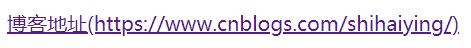
<body>
<a href="https://www.cnblogs.com/shihaiying/">博客地址</a>
</body>
</html>
效果图:
③url()/uri()
用于引用媒体文件。
举例:“百度”前面给出一张图片,后面给出href属性。
<!DOCTYPE html>
<html lang="en">
<head>
    <meta charset="UTF-8">
<style>
a::before{
    content: url("https://www.baidu.com/img/baidu_jgylogo3.gif");
}
a::after{
    content:"("attr(href)")";
}
a{
    text-decoration: none;
}
</style>
</head>
<body>
<a href="http://www.baidu.com">百度</a>
</body>
</html>
效果图:

④counter()
调用计数器,可以不使用列表元素实现序号功能。
配合counter-increment和counter-reset属性使用
示例如下:
<!DOCTYPE html>
<html lang="en">
<head>
<meta charset="UTF-8">
<style>
body {
counter-reset: section;
}
h1 {
counter-reset: subsection;
}
h2 {
counter-reset: subsection;
}
h1:before {
counter-increment: section;
content: counter(section) "、";
}
h2:before {
counter-increment: subsection;
content: counter(section) "." counter(subsection) "、";
}
h3:before {
counter-increment: subsection;
content: counter(section) "." counter(section) "."counter(subsection) "、";
}
</style>
</head>
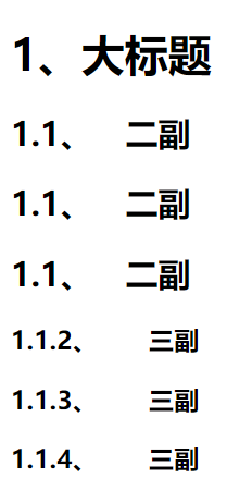
<body>
<h1>大标题</h1>
<h2> 二副</h2>
<h2> 二副</h2>
<h2> 二副</h2>
<h3>  三副</h3>
<h3>  三副</h3>
<h3>  三副</h3>
</body>
</html>
效果图:
⑶content运用
①清除浮动
清除浮动方法有多种,现在最常用的就是下面这种方法,仅需要以下样式即可在元素尾部自动清除浮动
代码如下:
.cf:before,
.cf:after {
    content: " ";
    display: table;
}
.cf:after {
    clear: both;
}
.cf {
    *zoom: 1;
}
②float:居中
我们知道float没有center这个取值,但是可以通过伪类来模拟实现。
这个效果实现很有意思,左右通过::before float各自留出一半图片的位置,再把图片绝对定位上去。
③做出各种图形效果
案例:六芒星
<!DOCTYPE html>
<html lang="en">
<head>
    <meta charset="UTF-8">
    <title>Document</title>
</head>
<style>
           #star-six {
          width: 0;
          height: 0;
          border-left: 50px solid transparent;
          border-right: 50px solid transparent;
          border-bottom: 100px solid red;
          position: relative;
}
       #star-six::after{
          width: 0;
          height: 0;
          border-left: 50px solid transparent;
          border-right: 50px solid transparent;
          border-top: 100px solid red;
          position: absolute;
          content: "";
          top: 30px;
          left: -50px;
}
</style>
<body>
    <div id="star-six"></div>
</body>
</html>
效果图:
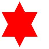
★解释:star-six的div是一个正三角行,#star-six::after是一个倒三角形,通过绝对定位,调整其位置即可实现六角星的效果。
★扩展:CSS绘制图形:https://css-tricks.com/the-shapes-of-css/
④不使用图片创建小图标
举例:比如一个电话
很巧妙的应用一个div左border加圆角当机身,::before和::after配合圆角当听筒。
示例如下:
<!DOCTYPE html>
<html lang="en">
<head>
    <meta charset="UTF-8">
<style type="text/css">
#phone{
    width:50px;
    height:50px;
    border-left:6px solid #EEB422;
    border-radius:20%;
    transform:rotate(-30deg);
    -webkit-transform:rotate(-30deg);
    margin:20px;
    margin-right:0px;
    position:relative;
    display: inline-block;
    top: -5px;
}
 #phone:before{
    width:15px;
    height:15px;
    background:#EEB422;
    border-radius: 20%;
    content: "";
    position: absolute;
    left:-2px;
    top: 1px;
 }
 #phone:after{
    width:15px;
    height:15px;
    background:#EEB422;
    border-radius: 20%;
    content: "";
    position: absolute;
    left:-3px;
    top: 34px;
 }
</style>
</head>
<body>
<div id="wraper">
    <div id="phone"></div>
</div>
</body>
</html>
效果图:

扩展:用伪元素创建了84种小图标:http://nicolasgallagher.com/p...
⑤显示打印网页的URL
<!DOCTYPE html>
<html lang="en">
<head>
    <meta charset="UTF-8">
<style>
@media print {
a[href]:after {

content: " (" attr(href) ") ";
}
}
</style>
</head>
<body>
<a href="http://www.baidu.com">百度</a>
</body>
</html>
效果图:

⑥给blockquote添加引号
经常用到给blockquote 引用段添加巨大的引号作为背景,可以用 ::before 来代替 background 。好处是即可以给背景留下空间,还可以直接使用文字而非图片:
<!DOCTYPE html>
<html lang="en">
<head>
    <meta charset="UTF-8">
<style type="text/css">

blockquote::before {
                    content: open-quote;
                    color: #ddd;
                    z-index: -1;
                    font-size:80px;
}
</style>
</head>
<body>
    <blockquote>引用一个段落,双引号用::before伪元素实现</blockquote>
</body>
</html>
效果图:

⑦超链接特效
举例:配合 CSS定位实现一个鼠标移上去,超链接出现方括号的效果
<!DOCTYPE html>
<html lang="en">
<head>
    <meta charset="UTF-8">
<style type="text/css">
body{

     background-color: #425a6c;
}

a {
   position: relative;
   display: inline-block;
   outline: none;
   color: #fff;
   text-decoration: none;
   font-size: 32px;
   padding: 5px 20px;
}
a:hover::before, a:hover::after {
                                  position: absolute;
                              }
a:hover::before {
                  content: "\5B";
                   left: -10px;
               }
a:hover::after {
                content: "\5D";
                 right: -10px;
               }
</style>
</head>
<body>
    <a href="http://www.baidu.com">鼠标移上去出现方括号</a>
</body>
</html>
效果图:

⑷content的值什么时候加引号,什么时候不加?
①动态的(会变的值)不加引号。
②媒体不加引号。
③固定的值、字符串需要加引号。
㈥:before详细解释
⑴如同对伪元素的名称一样,:before 是用来给指定的元素的内容前面插入新的内容
⑵示例:
.before:before{
                      content:'you before';
                      color:red;
               }

<div class="before"> me</div>
⑶在这里我们给伪元素 :before 添加了属性 content,并赋值为 you before。效果如下:
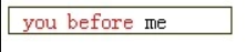
⑷//在指定元素的内容 me 前添加了新内容 you before
⑸这里通过伪元素 :before 添加的新内容区域默认的 display 属性值为 inline,那么我们可不可以修改新内容区域的属性,答案是肯定的。
⑹你可以像修改其他元素一样修改它的样式,我们来将它的 display 属性值来改为 block。
.before:before{
                     content:'you before';
                     display:block;
                     color:red;
                   }

<div class="before"> me</div>
⑺现在我们再来看下效果:

⑻//由伪元素 :before 生成新内容区域果然变为了块元素
㈦具体示例
<html>
<head>
<meta charset="utf-8" />

<title>css伪元素:before和:after</title>

<style type="text/css">

a.button {
background-color: #F0F0F0 ;
border: 1px solid #CCCCCC ;
border-radius: 4px 4px 4px 4px ;
color: #333333 ;
display: block ;
font-size: 30px ;
padding: 6px 30px 4px 58px ;
position: relative ;
text-decoration: none ;
width: 100px ;
}

a.button:before {
background-color: #FF0066 ;
border-radius: 3px 3px 3px 3px ;
color: #FFFFFF ;
content: "NEW" ;
font-family: sans-serif ;
font-size: 15px ;
left: 9px ;
line-height: 15px ;
margin-top: -10px ;
padding: 3px 3px 2px 3px ;
position: absolute ;
text-align: center ;
top: 50% ;
}

a.button:after {
background-color: #FFFFFF ;
border: 1px solid #DADADA ;
border-radius: 22px 22px 22px 22px ;
color: #333333 ;
content: "\00BB" ;
display: none ;
font-size: 30px ;
height: 28px ;
line-height: 26px ;
margin-top: -14px ;
position: absolute ;
right: 6px ;
text-align: center ;
text-indent: 1px ;
top: 50% ;
width: 28px ;
}

a.button:hover:after {
display: block ;
}

</style>
</head>
<body>

<h1>
css伪元素:before和:after
</h1>

<a href="#" class="button">
Button
</a>

</body>
</html>
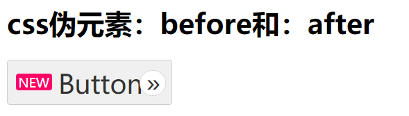
★代码介绍:
⑴根据html标记,只有一个带有文本“button”的按钮。但是,当呈现页面时,可以看到“new”标记:
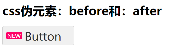
⑵ 这个“new”标记是由:before伪元素提供的。但是,我们的css还有一个:after伪元素,初始显示为“none”;这个伪元素设置为仅显示在:hover:
参考:https://segmentfault.com/a/1190000000474414
https://segmentfault.com/a/1190000016236943#articleHeader5
https://www.bennadel.com/blog/2445-using-css-pseudo-elements-before-and-after.htm