::after和::before使用方法
1. 在元素内容前后加上指定内容
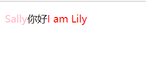
p::before{
   content: 'Sally';
   color: pink;
}
p::after{
   content: 'I am Lily';
   color: red;
}

<p>你好</p>
示例效果:
2. ::after 清除浮动
这里不详细介绍了,我的另一篇文章理解CSS浮动float 有介绍 https://blog.csdn.net/qq_43553067/article/details/88741490
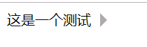
3. :before和:after 用来写小三角形
<div class="demo">这是一个测试</div>

.demo:after{
          content: '';
          display: inline-block;
          width: 0;
          height: 0;
          border: 8px solid transparent;
          border-left: 8px solid #AFABAB;
          position: relative;
          top: 2px;
          left: 10px;
}
效果展示:
4.用:after和:before 写一个对话框
<div class="left">
    <p>吃了吗</p>
  </div>
  <div class="right">
    <p>吃过了,吃了红烧排骨和酸菜鱼</p>
</div>

.left,.right{
        min-height: 40px;
        display: table;
        position: relative;
        text-align: center;
        border-radius: 7px;
        background-color: #9EEA6A;
      }
      .right {
        top:  60px;
        left: 60px;
      }
      /*使内容垂直居中*/
      .right>p,.left>p{
        display: table-cell;
        vertical-align: middle;
        padding: 0 10px;
      }
      /*用伪类写出三角形*/
      .left::after,.right::before{
        content: '';
        width: 0;
        height: 0;
        border: 8px solid transparent;
        position: absolute;
        top: 11px;
      }
      .left::after{
        border-right: 8px solid #9EEA6A;
        left: -15px;
      }
      .right::before{
        border-left: 8px solid #9EEA6A;
        left: 243px;
}
效果如图所示:

也可以加个边框让她美观一些哦~
设计代码如下
不知道为什么粘贴代码总是卡壳…那就放图片把 放重点部分嘻嘻 记得.left,.right也要加上border样式哦~~
