常见的页面布局有
1、左右宽度固定,中间自适应;
2、上下高度固定,中间自适应;
3、左宽度固定,右自适应;
4、上高度固定,下自适应,
下边是我看过网上的视频后写出来的三栏布局-左右宽高固定,中间自适应;
  1 <!DOCTYPE html><!-- html 5 -->
  2 <html>
  3 <head>
  4     <title>左中右三栏布局</title>
  5     <style type="text/css">
  6         html * {
  7             padding: 0;
  8             margin: 0;
  9         }
 10         .layout{
 11             width: 100%;
 12             margin-top: 15px;
 13         }
 14         .layout .three_columns > div{
 15             min-height: 150px;
 16             text-align: center;
 17         }
 18         .layout .three_columns > div.center > p{
 19             margin-top: 15px;
 20         }
 21     </style>
 22 </head>
 23 <body>
 24     <!-- 第一种三栏布局:float方式 -->
 25     <section class="layout float">
 26         <style type="text/css">
 27             .layout.float .left{
 28                 float: left;
 29                 width: 300px;
 30                 background: #90D9F7;
 31             }
 32             .layout.float .right{
 33                 float: right;
 34                 width: 300px;
 35                 background: #F5DE25;
 36             }
 37             .layout.float .center{
 38                 background: pink;
 39             }
 40         </style>
 41         <article class="three_columns">
 42             <div class="left"></div>
 43             <div class="right"></div>
 44             <div class="center">
 45                 <h1>三栏布局float布局</h1>
 46                 <p>优点:兼容性比较好
 47                    缺点:脱离文档流,清除浮动,处理与周边元素布局
 48                 </p>
 49                 <p>去掉高度后,内容会超出容器</p>
 50             </div>
 51         </article>
 52     </section>
 53
 54     <!-- 第二种三栏布局:position方式 -->
 55     <section class="layout position">
 56         <style type="text/css">
 57             .layout.position .left{
 58                 position: absolute;
 59                 left: 0;
 60                 width: 300px;
 61                 background: #90D9F7;
 62             }
 63             .layout.position .center{
 64                 position: absolute;
 65                 left: 300px;
 66                 right: 300px;
 67                 background: pink;
 68             }
 69             .layout.position .right{
 70                 position: absolute;
 71                 right: 0;
 72                 width: 300px;
 73                 background: #F5DE25;
 74             }
 75         </style>
 76         <srticle class="three_columns">
 77             <div class="left"></div>
 78             <div class="center">
 79                 <h1>三栏布局position布局</h1>
 80                 <p>优点:快速布局
 81                    缺点:脱离文档流,可使用性差
 82                 </p>
 83                 <p>去掉高度后,内容会超出容器</p>
 84             </div>
 85             <div class="right"></div>
 86         </srticle>
 87     </section>
 88
 89     <!-- 第三种三栏布局:flex方式 -->
 90     <section class="layout flexbox">
 91         <style type="text/css">
 92             .layout.flexbox{
 93                 margin-top: 180px;
 94             }
 95             .layout.flexbox .three_columns{
 96                 display: flex;
 97             }
 98             .layout.flexbox .left{
 99                 width:300px;
100                 background: #90D9F7;
101             }
102             .layout.flexbox .center{
103                 flex: 1;
104                 background: pink;
105             }
106             .layout.flexbox .right{
107                 width: 300px;
108                 background: #F5DE25;
109             }
110         </style>
111         <article class="three_columns">
112             <div class="left"></div>
113             <div class="center">
114                 <h1>三栏布局flex布局</h1>
115                 <p>解决上两种方案的缺陷,最好用的布局
116                 </p>
117                 <p>去掉高度后,容器会被内容撑开,还可以使用</p>
118             </div>
119             <div class="right"></div>
120         </article>
121     </section>
122
123     <!-- 第四种三栏布局:table -->
124     <section class="layout table">
125         <style type="text/css">
126             .layout.table .three_columns{
127                 display: table;
128                 width: 100%;
129                 height: 150px;
130             }
131             .layout.table .three_columns>div{
132                 display: table-cell;
133             }
134             .layout.table .left{
135                 width: 300px;
136                 background: #90D9F7;
137             }
138             .layout.table .center{
139                 background: pink;
140             }
141             .layout.table .right{
142                 width: 300px;
143                 background: #F5DE25;
144             }
145         </style>
146         <article class="three_columns">
147             <div class="left"></div>
148             <div class="center">
149                 <h1>三栏布局table布局</h1>
150                 <p>
151                     优点:兼容性是最好的
152                     缺点:不好控制、当其中一个高度变,其他的高度也会变
153                 </p>
154                 <p>去掉高度后,容器会被内容撑开,还可以使用</p>
155             </div>
156             <div class="right"></div>
157         </article>
158     </section>
159
160     <!-- 第五种三栏布局:grid -->
161     <section class="layout grid">
162         <style type="text/css">
163             .layout.grid .three_columns{
164                 width: 100%;
165                 display: grid;
166                 grid-template-rows: 150px;
167                 grid-template-columns: 300px auto 300px;
168             }
169             .layout.grid .left{
170                 background: #90D9F7;
171             }
172             .layout.grid .center{
173                 background: pink;
174             }
175             .layout.grid .right{
176                 background: #F5DE25;
177             }
178         </style>
179         <article class="three_columns">
180             <div class="left"></div>
181             <div class="center">
182                 <h1>三栏布局grid布局</h1>
183                 <p>
184                     优点:兼容性是最好的
185                     缺点:不好控制、当其中一个高度变,其他的高度也会变
186                 </p>
187                 <p>去掉高度后,内容会超出容器</p>
188             </div>
189             <div class="right"></div>
190         </article>
191     </section>
192 </body>
193 </html>
下图是我的代码的运行结果:
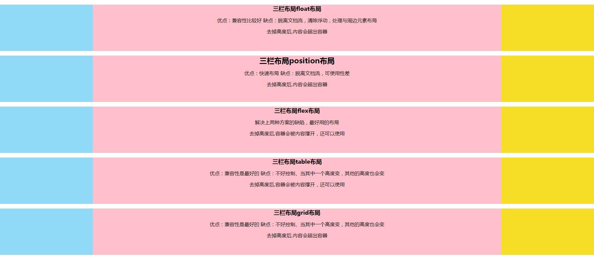
我在上边总结了一下每种布局的优缺点,以及去掉高度后哪种布局还可以使用,如果各位有觉得不对的地方,欢迎大家帮我纠正!