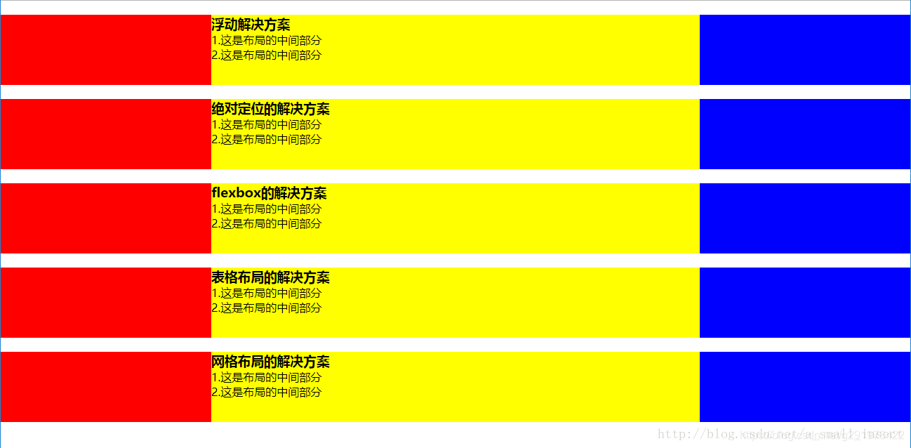
前端常问的面试题,题目:假设高度一定,请写出三栏布局,左右宽度300px,中间自适应。
下面提供这道题的五种解决方案:
首先要写好整个页面的布局(初始化等)
    <style>
        html * {
            padding: 0;
            margin: 0;
        }

        .layout {
            margin-top: 20px;
        }

        .layout article div {
            min-height: 100px;
        }
    </style>
1.浮动的解决方案
<!-- 浮动布局解决方案 -->
    <section class="layout float">
        <style>
            .layout.float .left {
                float: left;
                width: 300px;
                background: red;
            }

            .layout.float .right {
                float: right;
                width: 300px;
                background: blue;
            }

            .layout.float .center {
                background: yellow;
            }
        </style>
        <article class="left-center-right">
            <div class="left"></div>
            <div class="right"></div>
            <div class="center">
                <h1>浮动解决方案</h1>
                <p>1.这是布局的中间部分</p>
                <p>2.这是布局的中间部分</p>
            </div>
        </article>
    </section>
2.绝对定位的解决方案
<!-- 绝对定位的解决方案 -->
    <section class="layout absolute">
        <style>
            .layout.absolute .left-center-right>div {
                position: absolute;
            }

            .layout.absolute .left {
                left: 0;
                width: 300px;
                background: red;
            }

            .layout.absolute .center {
                left: 300px;
                right: 300px;
                background: yellow;
            }

            .layout.absolute .right {
                right: 0;
                width: 300px;
                background: blue;
            }
        </style>
        <article class="left-center-right">
            <div class="left"></div>
            <div class="center">
                <h1>绝对定位的解决方案</h1>
                <p>1.这是布局的中间部分</p>
                <p>2.这是布局的中间部分</p>
            </div>
            <div class="right"></div>
        </article>
    </section>
3.flexbox的解决方案
<!-- flexbox解决方案 -->
    <section class="layout flexbox">
        <style>
            .layout.flexbox {
                margin-top: 140px;
            }

            .layout.flexbox .left-center-right {
                display: flex;
            }

            .layout.flexbox .left {
                width: 300px;
                background: red;
            }

            .layout.flexbox .center {
                flex: 1;
                background: yellow;
            }

            .layout.flexbox .right {
                width: 300px;
                background: blue;
            }
        </style>
        <article class="left-center-right">
            <div class="left"></div>
            <div class="center">
                <h1>flexbox的解决方案</h1>
                <p>1.这是布局的中间部分</p>
                <p>2.这是布局的中间部分</p>
            </div>
            <div class="right"></div>
        </article>
    </section>
4.表格布局的解决方案
<!-- 表格布局的解决方案 -->
    <section class="layout table">
        <style>
            .layout.table .left-center-right {
                width: 100%;
                display: table;
                height: 100px;
            }

            .layout.table .left-center-right>div {
                display: table-cell;
            }

            .layout.table .left {
                width: 300px;
                background: red;
            }

            .layout.table .center {
                background: yellow;
            }

            .layout.table .right {
                width: 300px;
                background: blue;
            }
        </style>
        <article class="left-center-right">
            <div class="left"></div>
            <div class="center">
                <h1>表格布局的解决方案</h1>
                <p>1.这是布局的中间部分</p>
                <p>2.这是布局的中间部分</p>
            </div>
            <div class="right"></div>
        </article>
    </section>
5.网格布局的解决方案
<!-- 网格布局的解决方案     -->
    <section class="layout grid">
        <style>
            .layout.grid .left-center-right {
                display: grid;
                width: 100%;
                grid-template-rows: 100px;
                grid-template-columns: 300px auto 300px;
            }

            .layout.grid .left {
                background: red;
            }

            .layout.grid .center {
                background: yellow;
            }

            .layout.grid .right {
                background: blue;
            }
        </style>
        <article class="left-center-right">
            <div class="left"></div>
            <div class="center">
                <h1>网格布局的解决方案</h1>
                <p>1.这是布局的中间部分</p>
                <p>2.这是布局的中间部分</p>
            </div>
            <div class="right"></div>
        </article>
    </section>
最终的效果图: