CSS介绍:
CSS能够使页面具有美观一致的效果,并且能够让内容与格式分离,利于扩展
所以,CSS解决了下面两个问题:
1. 将HTML页面的内容与校区分离;
2. 提高web开发的工作效率。
CSS是指层叠式样式表(Cascading Style Sheets),样式定义如何显示HTML元素,样式通常又会存在于样式表中;也就是说,把HTML元素的样式都统一收集起来写在一个地方或一个CSS文件里
CSS的优势:
1. 内容与表现分离;
2. 页面的表现统一,容易修改;
3. 丰富的样式,使页面布局更加灵活;
4. 减少网页的代码量,增加网页浏览器速度,节省网络带宽;

5. 运用独立页面的CSS,有利于网页被搜索引擎收录。
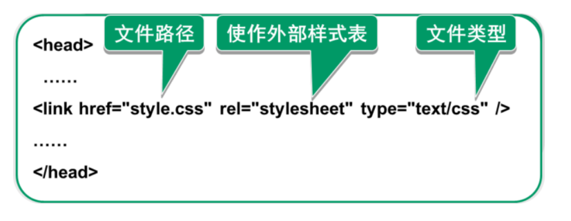
使用CSS的方法:通常把样式规则的内容都保存在CSS文件中,此时该文件被称为外部样式表(stylesheet),然后在HTML文件中通过 link 标签引用该CSS该文件即可。
CSS基础语法
CSS语法可以分为两部分: 1. 选择器 ; 2. 声明。 声明由属性的值组成,多个声明之间用分号分隔

CSS的引入方式:
1. 内联样式
2. 行内样式表(在HTML标签中插入;不推荐这种方式,不利于扩展)
3. 外部样式表: a. 链接式(link标签); b.导入式
示例代码如下:
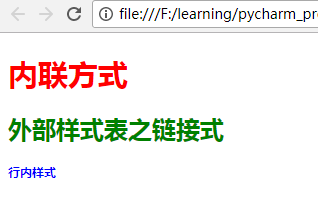
<!DOCTYPE html>
<html lang="en">
<head>
    <meta charset="utf-8">
    <title>CSS的引入方式</title>
    <!-- 内嵌(内联)方式 style -->
    <style type="text/css">
        h1{
            font-size:30px;
            color:red;
        }
    </style>

    <!-- 外部样式之链接式:link -->
    <link rel="stylesheet" type="text/css" href="./css导入方法.css">
</head>
<body>
    <div>
        <h1>内联方式</h1>

        <h2>外部样式表之链接式</h2>

        <!-- 行内样式 -->
        <h3 style="font-size:10px;color:blue">行内样式</h2>
    </div>
</body>
</html>
上述代码中,链接式的CSS文件中代码如下:
h2{
    font-size:20;
    color:green;
}

/*在css文件中设置选择器和声明*/
浏览器中的效果如下:
外联样式表之导入式(了解性知识点):@import url()
<style type="text/css">
    import url("./css导入方法.css")
</style>
链接式与导入式的区别:
1. <link />标签属于XHTML,@import是属性css2.1;
2. 使用<link />链接的CSS文件先加载到网页当中,再进行编译显示;
3. 使用@import导入的CSS 文件,两把CSS文件加载到网页中;
4. @import是属于CSS2.1特有的,对于不兼容CSS2.1的浏览器来说就是无效的
基本选择器:
选择器的定义及作用:在一个页面中会有很多的元素,不同的元素可能会有不同的样式,某些元素又需要设置相同的样式,选择器就是用来从HTML中查找特定元素的,找到元素之后就可以为它们设置样式了。选择器为样式规则指定了一个作用范围。
基础选择器包括:
- 标签选择器
- 类选择器
- ID选择器
- 通用选择器
如下代码:
<!DOCTYPE html>
<html lang="en">
<head>
    <meta charset="utf-8">
    <title>基础选择器</title>
    <style type="text/css">
        /* *号是通配符;能够匹配所有的元素标签 */
        *{
            padding: 0;
            margin:0;
            color: #CD00CD;
        }

        /*元素(标签)选择器*/
        h1{
            color: #8B1C62;

        }

        /*id选择器*/
        /*父元素的高度通常不做设置(让子元素自动填充)*/
        /* 通过*搜索id */
        /* margin:0 auto; 作用:让内容在浏览器中间显示 */
        #container{
            width: 968px;
            background-color:#4B0082;
            margin: 0 auto;
        }

        /* 类(class)选择器 (前面加“ . ”) */
        .content{
            width: 500px;
            background: #00EE00;
        }

        /*标签选择器*/
        img{
            width: 96px;
        }

        /*ul>li  表示子代选择器(直属的下一级);高级选择器*/
        /*设置ul中li的显示样式*/
        ul>li{
            color: #0000EE;
        }

        /*ul a  表示后代选择器,所有后代(所有的下级)都会被设置*/
        ul a{
            color: #FF7F00;
        }
    </style>
</head>

<body>
    <!-- 上+中+下 布局 -->
    <div id="container">
        <div class="header">
            <!-- 一个页面中只能有一个h1 -->
            <h1>路飞学城</h1>
        </div>

        <div class="content">
            <h2>CONTENT</h2>
            <img src="./python2.png">
        </div>

        <div class="header">
            <p>
                <ul>
                    <li>1 <a href="">哈哈哈</a></li>
                    <li>2</li>
                    <li>3</li>
                </ul>
            </p>
        </div>
    </div>
</body>
</html>
高级选择器:
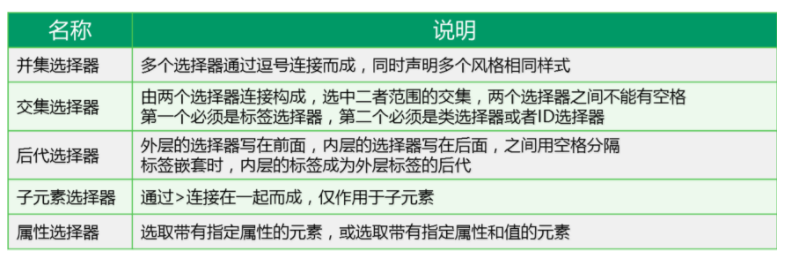
并集选择器、交集选择器、毗邻选择器、兄弟选择器 代码如下:
<!DOCTYPE html>
<html lang="en">
<head>
    <meta charset="utf-8">
    <title>高级选择器</title>
    <style type="text/css">
        /*群组(并集)选择器*/
        /*border 表示给每个盒子设置边框,solid表示这实线*/
        /* 先通过“ . ”取到该选择器 */
        .title,.content,.footer{
            width: 968px;
            /*height:300px;*/
            margin: 0 auto;
            background-color: #FF6A6A;
            border:1px solid blue;
        }

        /*交集选择器*/
        p.p1{
            color:green;
        }

        /* 取id用# */
        p#title1{
            font-size:100px;
        }
        /*浏览器是从上到下解析;如果 p#title1中也有color,会覆盖p.p1中的color */

        /*毗邻选择器*/
        /*用“+”号*/
        /*找到所有紧挨在h3后面的【第一个】p标签,设置字体颜色为#551A8B。*/
        /*毗邻指的是紧邻的下【一个】*/
        h3+p{
            color:#551A8B;
        }

        /*兄弟选择器*/
        /*用“~”波浪线符号*/
        /*找到所有h3标签后面所有同级的p标签,设置字体颜色为红色。*/
        h3~p{
            color:#00EE00;
        }


    </style>
</head>
<body>
    <div class="title">
        <p class="p1" id="title1">我是标题</p>
    </div>
    <div class="content">
        <h3>我是3级标题</h3>
        <a href="">哈哈</a>
        <!-- 下面的<p>标签早跟上面的<h3>标签不是毗邻关系,但是是兄弟关系 -->
        <p>我是段落</p>
        <h3>我是3级标题</h3>
        <p>我是段落</p>
        <h3>我是3级标题</h3>
        <p>我是段落</p>
        <!-- 下面的2个<p>标签早跟上面的<h3>标签不是毗邻关系,但是是兄弟关系 -->
        <p>我是段落</p>
        <p>我是段落</p>

    </div>
    <div class="footer"></div>
</body>
</html>
属性选择器:除了HTML元素的id属性和class属性外,还可以根据HTML元素的特定属性选择元素
<!DOCTYPE html>
<html lang="en">
<head>
    <meta charset="utf-8">
    <title>属性选择器</title>
    <style type="text/css">
        /*属性选择器*/
        /*根据属性查找,找到所有属性为title的选择器*/
        [title]{
            color:#CD00CD;
        }

        /*找到所有的class=baidu的选择器*/
        [class="baidu"]{
            color:#CD3700;
        }

        /*找到所有class是以btn开头的选择器*/
        [class^="btn"]{
            font-size:30px;
            color:#8B6914;
        }
        /*找到所有class是以btn结尾的选择器*/
        [class$="xia"]{
            font-size:20px;
            color: #8B1A1A;
        }
    </style>
</head>
<body>
    <div class="footer">
        <a href="" class="baidu">百度</a>
        <a href="" class="btn-default">百度button</a>
        <a href="" class="baiduyixia">百度一下</a>
        <p title="title1">段落标题</p>
    </div>
</body>
</html>

<!--
选择器总结:
基础选择器:
    1. 标签选择器: div
    2. 类选择器: .div1
    3. id选择器: #box
    4. 通配符选择器: *

高级选择器:
    1. 并集选择器:用“,”隔开
    2. 交集选择器:选择器之间不能有空格,第一个必须是标签选择器,第二个是类选择器或ID选择器
    3. 后代选择器:选择器之间用空格
    4. 子代选择器:选择器之间用>
    5. 毗邻选择器:+
    6. 兄弟选择器: ~
    7. 属性选择器:[class],[class="xxx"][class^="xx"][class$="x"]
 -->

 <!--
CSS样式的优先级:
行内样式表>内联样式(内部样式表)>外部样式表(链接式)
ID选择器>类选择器>标签选择器
  -->
选择器优先级示例:
<!DOCTYPE html>
<html lang="en">
<head>
    <meta charset="utf-8">
    <title>选择器优先级</title>
    <style type="text/css">
        div{
            color:red;
        }

        .box{
            color:blue;
        }

        #div1{
            color: orange;
        }

    </style>
</head>
<body>
    <!-- 优先级:id>类>标签 -->
    <div class="box" id="div1">TEST</div>
</body>
</html>

<!--
浏览器效果:TEST字体颜色为 orange
 -->
伪类选择器:
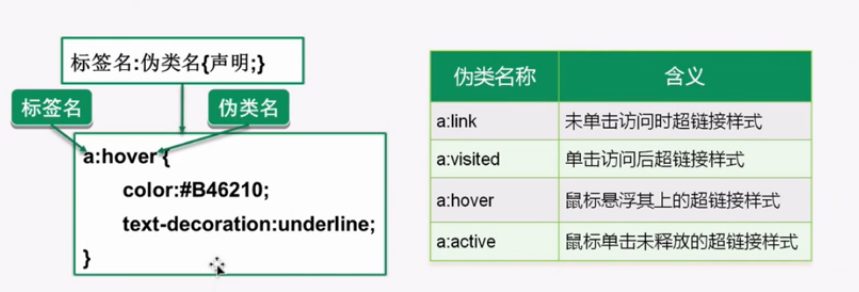
伪类选择器和伪元素选择器的代码如下:
<!DOCTYPE html>
<html lang="en">
<head>
    <meta charset="utf-8">
    <title>伪类选择器</title>
    <style type="text/css">
        /*伪类选择器*/
        a:link{
            color:blue;
        }
        a:visited{
            color: yellow;
        }
        a:hover{
            font-size:30px;
            color:orange;
        }
        a:active{
            color:red;
        }

        /*input输入框获取焦点时的样式:当在输入框中输入的时候,输入框会变成 1px+实线 的状态*/
        input:focus{
            border:1px solid;
        }

        /*伪元素选择器*/
        /*让<p>标签中的内容的第一个字符变成30px*/
        p:first-letter{
            font-size:30px;
        }

        /*给<p>标签中的内容前面添加“哈哈”,添加的“哈哈”颜色为red*/
        p:before{
            content:"哈哈";
            color:red;
        }

        /*给<p>标签中的内容的结尾添加“666”,颜色为blue*/
        p:after{
            content:"666";
            color:blue;
        }
    </style>
</head>
<body>
    <div>
        <ul>
            <li><a href="#">百度一下</a></li>
            <li><a href="#">hao123</a></li>
            <li><a href="#">博客</a></li>
        </ul>
        <form>
            <input type="text" name="">
        </form>
        <p>来呀!快活呀!</p>
    </div>
</body>
</html>
样式处理包括:文本、字段、背景、链接、图片、列表、表格、轮廓等
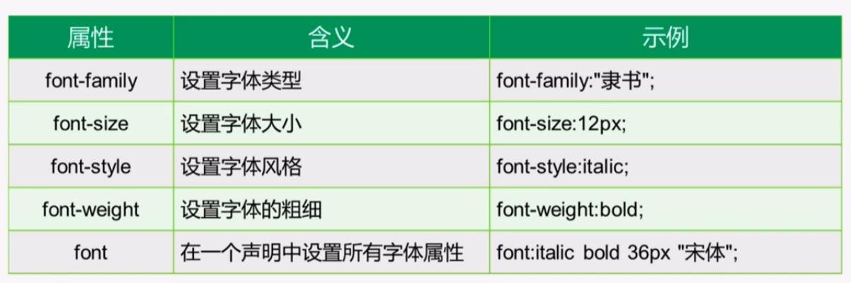
<!DOCTYPE html>
<html lang="en">
<head>
    <meta charset="utf-8">
    <title>字体样式</title>
    <style type="text/css">
        p{
            /*设置字体大小*/
            font-size:30px;
            /*设置成斜体;斜体有两种:oblique和italic,推荐使用oblique*/
            /*默认的是normal*/
            font-style:oblique;
            /*设置字体的粗细*/
            /*字体粗细有:normal,bold,bolder,lighter,<integer>*/
            font-weight:bold;
            /*设置字体类型(需要你的电脑上下载了相应的字体类型)*/
            font-family: "隶书";
            /*字体颜色*/
            color:red;
        }
    </style>
</head>
<body>
    <!-- 默认字体大小是 16px=1em -->
    <p>我们这里放一个段落</p>
</body>
</html>
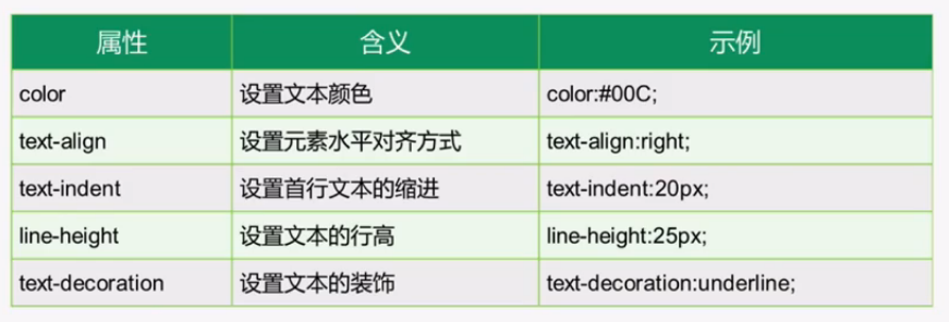
文本样式:
代码如下:
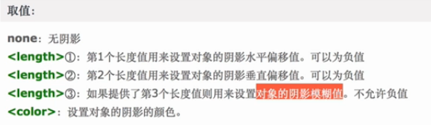
<!DOCTYPE html>
<html lang="en">
<head>
    <meta charset="utf-8">
    <title>样式处理之文本</title>
    <style type="text/css">
        .box1{
            width:500px;
            height: 200px;
            background-color:red;

            /*设置字体颜色*/
            color:blue;
            /*为字体设置下划线;text-decoration 默认值为none*/
            text-decoration:underline;
            /*
            overline是上划线;
            line-through 表示删除线
            */

            /*设置鼠标的游标属性;pointer是变成小手*/
            cursor:pointer;

            /*设置文本首行的缩进*/
            text-indent:30px;

            /*设置文本的水平对齐方式*/
            text-align: center;
            /*
            left:左对齐(默认值);
            right:右对齐;
            center:居中对齐;
            justify:两端对齐;
            */

            /*设置文本的阴影*/
            text-shadow: 2px 2px 0.5px #fff
            /*
            水平方向:右正左负
            垂直方向:下正上负
            阴影模糊值: 0~1
            */

            /*行高*/
            /*当行高=盒子的高度时,会实现文本的垂直居中*/
            line-height:200px;
            line-height: 200px;
        }
    </style>
</head>
<body>
    <div class="box1">天空飘过五个字</div>
    <a href="">天空飘过五个字</a>
</body>
</html>
cursor属性表:

text-shadow取值表:
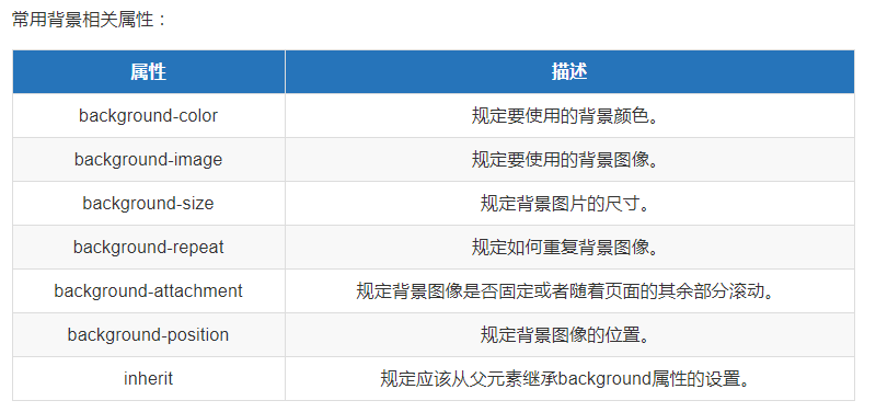
背景属性:background
示例代码如下:
<!DOCTYPE html>
<html lang="en">
<head>
    <meta charset="utf-8">
    <title>背景样式</title>
    <style type="text/css">
        #img{
            width: 1000px;
            height: 1000px;

            /*设置背景颜色*/
            background-color: yellowgreen;

            /*设置背景图像*/
            background-image:url(./go.jpg);

            /*背景图片取消重复*/
            background-repeat: no-repeat;
            /*
            repeat:默认值;背景图像将在垂直方向和水平方向重复;
            repeat-x:背景图像将在水平方向重复;
            repeat-y:背景图像将在垂直方向重复;
            no-repeat:背景图像将仅显示一次。
            */

            /*调整背景图像的位置*/
            background-position: 20px 50px;
            /*第一个参数指水平方向上往左移20px,第二个参数指垂直方向上向下移50px;可取负数*/

            /*
            设置背景图片可简写如下(官方推荐这种写法):
            background:url(./go.jpg) no-repeat 20px 50px;
            */

    </style>
</head>
<body>
    <div id="img"></div>
</body>
</html>

<!-- 展示图片有两种方法:1. img标签; 2. background-img -->
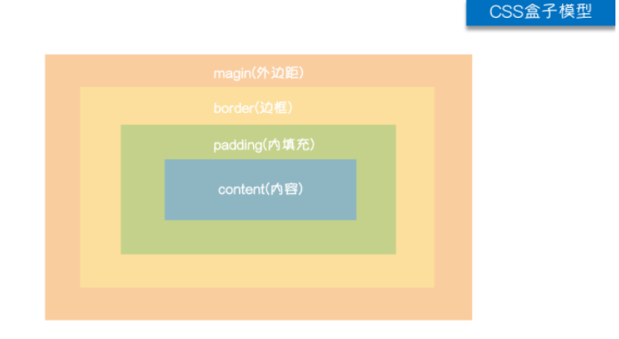
CSS盒模型
HTML文档中的每个元素(看到的内容)都被描绘成矩形盒子,这些矩形盒子通过一个模型来描述其占用空间,这个模型称为盒子模型。盒子模型通过4个边界来描述:外边距(margin)、边距(边框,border)、内边距(内填充,padding)、内容元素(content)
盒模型---边框(border)
border包括:
1. 边框样式(border-style)
2. 边框颜色(border-color)
3. 边框粗细(border-width)
<!DOCTYPE html>
<html lang="en">
<head>
    <meta charset="utf-8">
    <title>盒模型之border</title>
    <style type="text/css">
        .wrapper{
            width: 200px;
            height: 200px;
            background-color: #000;

            border-top-width: 5px;
            border-left-width: 5px;
            border-right-width: 5px;
            border-bottom-width: 5px;

            /*border-top-color: red;*/
            border-color: red;

            border-top-style: solid;
            border-left-style: dashed;
            border-right-style: dotted;
            border-bottom-style: double;

            /*也可以写成下面的形式*/
            border:10px solid yellow;

            /*统一设置样式*/
            /*四个值:上 右 下 左;顺时针顺序*/
            border-style: dotted dashed double solid;
            /*
            三个值:上、左右、下
            两个值:上下、左右
            一个值:四个方向
            */
        }
    </style>
</head>
<body>
    <div class="wrapper">

    </div>
</body>
</html>
盒子模型---margin
margin(外边距):控制元素与元素之间的距离
1. margin的四个方向
2. margin会改变实际大小,背景色不会渲染到margin区域,margin区域会以空白显示,但是其也属于盒子的一部分
3. margin是添自身的,如果想改变哪个区域的位置,就给谁添加margin
示例代码如下:
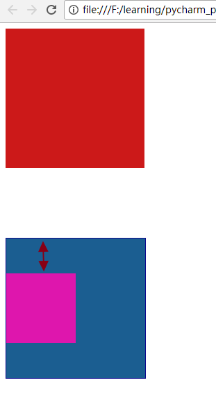
<!DOCTYPE html>
<html lang="en">
<head>
    <meta charset="utf-8">
    <title>盒子模型之margin</title>
    <style type="text/css">
        .box1{
            width: 200px;
            height: 200px;
            background-color: RGB(204,25,25);

            /*margin-top: 20px;*/

            /*margin用法和border相同*/
            /*margin:20px 40px;*/

            /*margin:0 auto; 作用:使盒子元素水平居中*/
            /*margin:0 auto;*/

            margin-bottom: 50px;

        }

        .box2{
            width: 200px;
            height: 200px;
            background-color: #1B5E91;

            margin-top: 100px;
            border:1px solid #0C098D;


        }
        /*当两个垂直外边距相遇时,会形成一个外边距,称为“外边距合并”(以大的外边距值为准)(水平方向不会有这种情况);相邻两个元素或者嵌套元素都会有“外边距合并”的效应*/
        /*注意:父子级盒子 嵌套 设置外边距 会形成外边距合并,影响页面布局;
        解决办法:给父元素添加border*/

        .child{
            width: 100px;
            height: 100px;
            background-color: #DE16AD;

            margin-top: 50px;
        }
        /*box2和child是父子级关系,也会形成“外边距合并”,以它们中较大的为准*/
        /*解决方法:为父级区域添加border;如果不给父级区域添加border,父子区域的上边距会重合在一起*/
    </style>
</head>
<body>
    <div class="box1"></div>
    <div class="box2">
        <div class="child">

        </div>
    </div>
</body>
</html>
浏览器效果:第一个是“嵌套区域的外边距合并”,第二个是“嵌套落区域外边距合并的解决”

盒子模型---padding
示例代码如下:
<!DOCTYPE html>
<html lang="en">
<head>
    <meta charset="utf-8">
    <title>盒子模型之padding</title>
    <style type="text/css">
        .box1{
            width: 300px;
            height: 200px;
            background-color: red;

            /*padding不能填充颜色*/
            /*padding-left: 20px; */
            padding: 20px 30px;

        }
    </style>
</head>
<body>
    <!-- 内边距(内填充,padding):内容区域到边框的距离
         内边距会扩大元素所在的区域(填充的区域是白白增加的)

         注意:为元素设置内边距只能影响自己,不会影响其他的元素
    -->
    <div class="box1">五笔输入法</div>

</body>
</html>
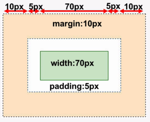
盒子模型尺寸计算方法:
display的用法:

示例代码如下:
<!DOCTYPE html>
<html lang="en">
<head>
    <meta charset="utf-8">
    <title>display属性</title>
    <style type="text/css">
        div{
            width: 100px;
            height: 100px;
            background-color: red;

            /*控制元素 隐藏;不占浏览器的位置*/
            /*display: none;*/

            /*控制元素的隐藏也可以用  visibility:hiddenp;  但是它占浏览器的位置*/
            /*visibility: hidden;*/

            /*设置成行内块元素*/
            /*display: inline-block;*/

            /*设置成行内元素;不能设置宽高,宽高根据内容来填充*/
            display: inline;

            /*用途:例如,将导航栏中的<li>设置成行内或行内块元素*/
        }

        a{
            display: block;
            width: 300px;
            height: 300px;
            background-color: yellow;
        }

        img{
            /*行内块元素(inline-block)通常用于转化为block,因为即使把inline-block转化成inline,它还是能设置宽高(如 <img>)*/
            display: block;
            width: 100px;
            height: 100px;

        }
    </style>
</head>
<body>
    <div>123</div>
    <div>456</div>
    <a href="#">百度一下</a>
    <img src="./go.jpg" alt="go">

</body>
</html>
浮动:float
浮动产生的效果
示例代码如下:
<!DOCTYPE html>
<html lang="en">
<head>
    <meta charset="utf-8">
    <title>浮动属性float</title>
    <style type="text/css">
        .wrapper div{
            width: 200px;
            height: 200px;
            background-color: red;
            border:1px solid black;

            /*
            float:left;  左浮动:浏览器左侧为起始,从左往右依次排列
            float:right;  右浮动:浏览器右侧为起始,从右往左依次排列
            float:none;   默认值;按原来的样式展示
            */
            float:left;
        }
    </style>

</head>
<body>
    <div class="wrapper">
        <!-- 文档流:可见元素在文档中的显示位置 -->
        <!-- 浮动产生的效果:浮动可以使元素按指定位置排列,直到遇到父元素的边界或另一个元素的边界 -->
        <div>1</div>
        <div>2</div>
        <div>3</div>
    </div>


</body>
</html>
浮动的特性:
示例代码:
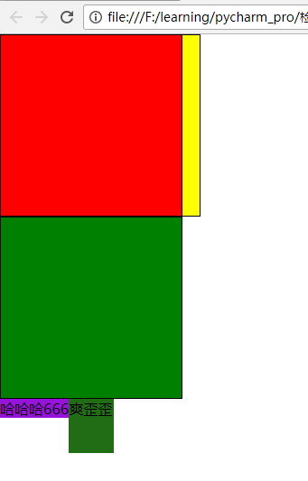
<!DOCTYPE html>
<html lang="en">
<head>
    <meta charset="utf-8">
    <title>浮动的特性</title>
    <style type="text/css">
        *{
            padding: 0;
            margin: 0;
        }

        .wrapper div{
            width: 200px;
            height: 200px;
            border:1px solid black;
        }

        .box1{
            background-color: red;
            float:left;
        }
        .box2{
            background-color: yellow;
            margin-left: 20px;
        }
        .box3{
            background-color: green;
        }

        .container{
            /*width: 300px;
            height: 300px;*/
            background-color: #9614D9;
            float:left;
        }
        span{
            float: left;
            background-color: #216D15;

            /*此时可以设置宽高*/
            width: 50px;
            height: 60px;
        }
    </style>
</head>
<body>
    <!-- 文档流:可见元素在文档中的排列位置

        浮动的效果:
        1. 浮动可以使元素脱离文档流,从而不占相对位置;
        2. 浮动会使元素提升层级
        3. 浮动可以使块元素在一行排列,不设置宽高时,可以使元素适内容
        4. 浮动可以使行内元素支持设置宽高

     -->

     <!-- 导航大多是用浮动做的 -->
    <div class="wrapper">
        <div class="box1"></div>
        <div class="box2"></div>
        <div class="box3"></div>
    </div>

    <div class="container">哈哈哈</div>
    <div class="container">666</div>
    <span>爽歪歪</span>

</body>
</html>
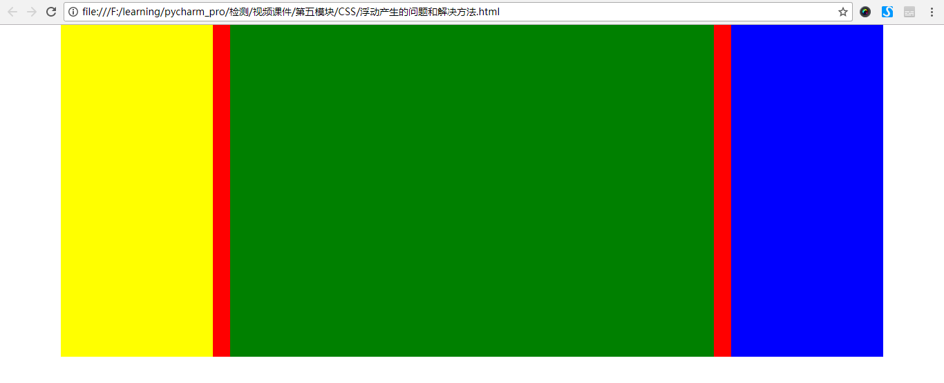
浏览器上显示效果:
浮动问题和解决方案:
<!DOCTYPE html>
<html lang="en">
<head>
    <meta charset="utf-8">
    <title>浮动产生的问题和解决方法</title>
    <style type="text/css">
        *{
            padding: 0;
            margin: 0;
        }

        .wrap{
            width: 1190px;
            /*页面布局的时候,父级盒子的高度通常不要设置,直接由子元素来填充*/
            /*height: 500px;*/
            background-color: red;
            margin: 0 auto;

            /*子盒子超出部分隐藏起来*/
            overflow: hidden;

        }
        .wrap div{
            float: left;
        }

        .wrap1{
            width: 220px;
            height: 480px;
            background-color: yellow;
            /*float: left;*/
        }
        .wrap2{
            width: 700px;
            height: 480px;
            background-color: green;
            margin-left: 25px;
            /*float: left;*/
        }
        .wrap3{
            width: 220px;
            height: 480px;
            background-color: blue;
            margin-left: 25px;
            /*float: left;*/
        }

        /*clear:both; 表示 在左右两侧不允许浮动元素*/
        /*#clearfix{
            /*先把它的float设置成none,再 clear:both;
            float: none;
            clear: both;
        }*/

        /*官方推荐解决方法如下:*/
        .wrap:after{
            visibility: hidden;
            clear: both;
            display: block;
            content: ".";
            height: 0
        }
    </style>
</head>
<body>
    <!--
    浮动产生的问题:
    1. 父元素一设置高度时,子元素设置了浮动,则子元素不会撑开父元素的高度,因为子元素不占位置

    解决办法:
    1. 给父盒子设置固定高度,但是这种方法不灵活,因为可能会影响下面元素的布局;
    2. 给浮动元素最后一个加一个空的块级元素,且该元素不浮动,并且设置 clear:both; 这种方法的缺点:结构冗余;
    3. 给父盒子后面加一个空的块级元素(官方推荐):.wrap:after{
            visibility: hidden;
            clear: both;
            display: block;
            content: ".";
            height: 0
        }
    4. 给父元素添加: overflow:hidden; (推荐使用)
    附:解决浮动问题时,3和4都写上
     -->
    <div class="wrap">
        <div class="wrap1"></div>
        <div class="wrap2"></div>
        <div class="wrap3"></div>
        <div id="clearfix"></div>
    </div>

</body>
</html>
3和4扩展盒子高度的区别:

浏览器效果如下:
overflow属性值:

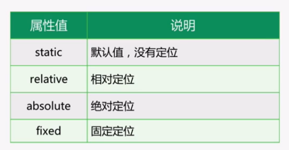
定位处理:position
大的盒子的定位用margin,大盒子里面的小盒子定位用position
属性值:
定位处理之relative:
<!DOCTYPE html>
<html lang="en">
<head>
    <meta charset="utf-8">
    <title>position定位之relative</title>
    <style type="text/css">
        *{
            padding: 0;
            margin: 0;
        }
        div{
            width: 200px;
            height: 200px;
        }
        .box1{
            background-color: red;

            /*设置了 position:relative;  之后,还需要对 top,left,right或bottom进行设置,不设置偏移量时对元素没有任何影响*/
            position: relative;
            top: 20px;
            left: 30px;

        }
        .box2{
            background-color: yellow;
        }
        .box3{
            background-color: green;
        }
    </style>
</head>
<body>
    <!--
    相对定位:相对自身原来位置进行偏移(偏移设置:top;left;right;bottom)
    1. 不设置偏移量的时候,对元素没有任何影响;
    2. 可以提升层级关系
     -->
    <div class="box1"></div>
    <div class="box2"></div>
    <div class="box3"></div>

</body>
</html>
定位处理之绝对定位和固定定位:
<!DOCTYPE html>
<html lang="en">
<head>
    <meta charset="utf-8">
    <title>position定位之absolute</title>
    <style type="text/css">
        *{
            padding: 0;
            margin: 0;
        }
        div{
            width: 200px;
            height: 200px;
        }
        .box1{
            background-color: red;
            position: relative;
            top: 100px;
            left: 30px;
        }
        .box2{
            background-color: yellow;
            position: absolute;
            top: 150px;

        }
        .box3{
            background-color: green;
            position: absolute;
            left: 150px;
            top: 10px;

        }

        .father{
            width: 300px;
            height: 300px;
            background-color: #B3A8A8;
            margin-left: 300px;
            margin-top: 100px;
            position: relative;
        }
        .child{
            width: 100px;
            height: 100px;
            background-color: #9F2FAC;
            position: absolute;
            top:20px;
            left: 20px;
        }

        .aside_logo{
            width: 100px;
            height: 100px;
            background-color: blue;

            /*固定定位:即使页面滑动,也一直保持不动,可用于制作小广告*/
            position: fixed;
            bottom: 20px;
            right: 20px;
        }
    </style>
</head>
<body>
    <!--
    绝对定位:absolute;
    在没有设置父级元素定位(position)时,以浏览器的左上角为基准;
    在有父级的情况下,父级设置相对定位,子级设置绝对定位,则子盒子是以父盒子为基准进行定位(“父相子绝”,很常见)

    1. 提升层级关系
    2. 脱离文档流
     -->
    <div class="box1"></div>
    <div class="box2"></div>
    <div class="box3"></div>

    <div class="father">
        <div class="child"></div>
    </div>

    <div class="aside_logo"></div>
    <ul>
        <li>1</li>
        <li>2</li>
        <li>3</li>
        <li>4</li>
        <li>5</li>
        <li>6</li>
        <li>7</li>
        <li>8</li>
        <li>9</li>
        <li>10</li>
        <li>11</li>
        <li>12</li>
        <li>13</li>
        <li>14</li>
        <li>15</li>
        <li>16</li>
    </ul>
</body>
</html>
堆叠z-index
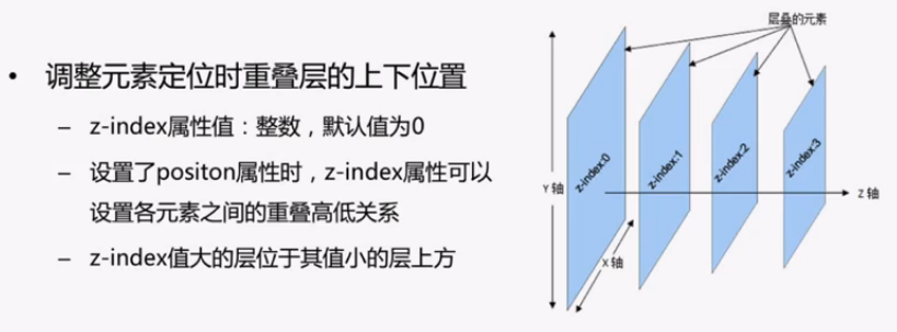
<!DOCTYPE html>
<html lang="en">
<head>
    <meta charset="utf-8">
    <title>堆叠z-index</title>
    <style type="text/css">
        div{
            width: 100px;
            height: 100px;
            position: absolute;
        }
        .box1{
            background-color: red;
            left: 20px;
            z-index: 1;
        }
        .box2{
            background-color: yellow;
            top: 20px;
            z-index: 2;

            /*设置圆角或者圆*/

            border-radius: 20px 0 0 0;
            /*设置圆*/
            /*border-radius: 50%;*/
        }
        .box3{
            background-color: green;
        }
    </style>
</head>
<body>
    <div class="box1"></div>
    <div class="box2"></div>
    <div class="box3"></div>
</body>
</html>
常见的网页布局:
- 上下结构
- 上中下结构
- 上左右下结构:1-2-1结构
- 上左中右下结构:1-3-1结构