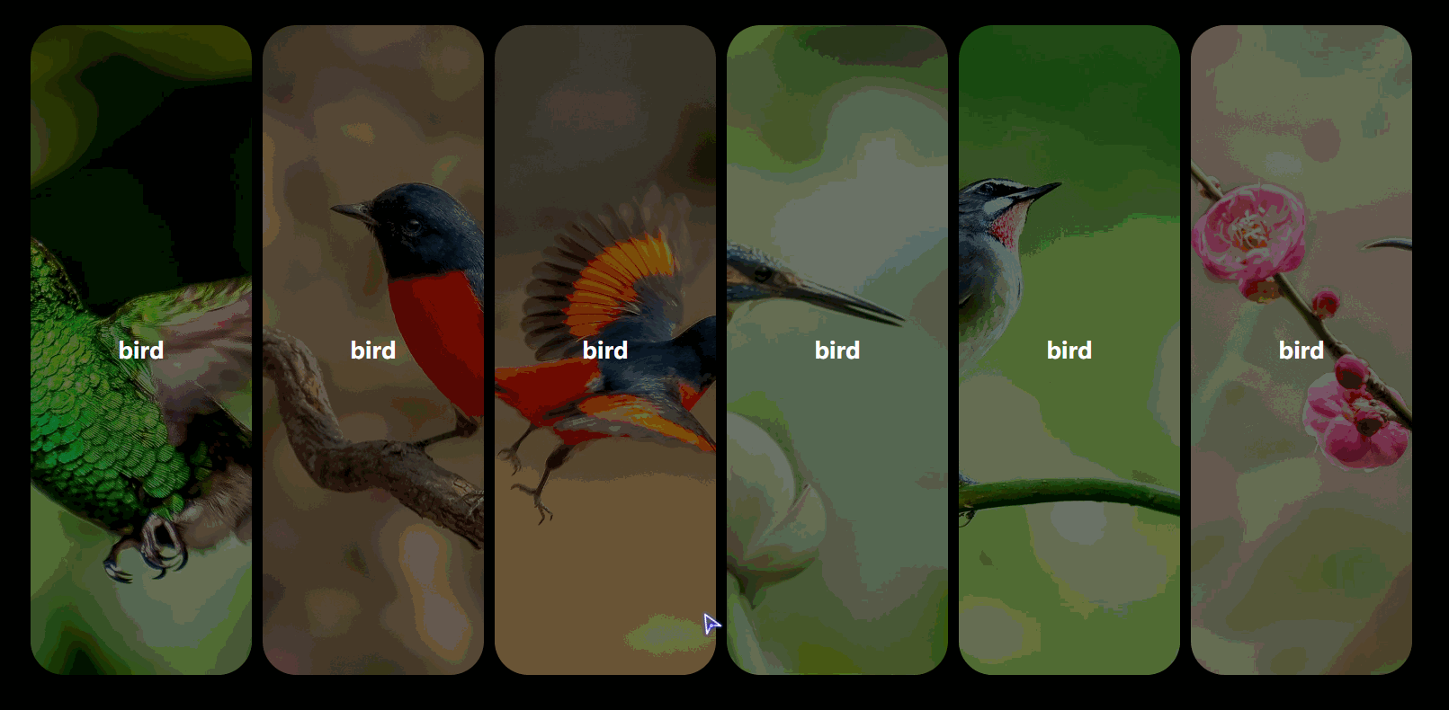
效果如下:
其实实现起来很简单,就是控制 宽 高的变化,然后给他加上transition 过度而已。觉得代码没什么难的地方,就不打注释了,如果哪里有不懂的话,可以直接评论呢。
直接上源码
html代码:
<!DOCTYPE html>
<html lang="en">

<head>
    <meta charset="UTF-8">
    <meta name="viewport" content="width=device-width, initial-scale=1.0">
    <meta http-equiv="X-UA-Compatible" content="ie=edge">
    <title>Document</title>
    <link rel="stylesheet" href="./css/index.css">
</head>

<body>
    <div class="wra">
        <ul class="content">
            <li class="items">
                <div class="inner">
                    <h2>bird</h2>
                    <div class="bg">
                        <div class="close"></div>
                    </div>
                </div>
            </li>
            <li class="items">
                <div class="inner">
                    <h2>bird</h2>
                    <div class="bg">
                        <div class="close"></div>
                    </div>
                </div>
            </li>
            <li class="items">
                <div class="inner">
                    <h2>bird</h2>
                    <div class="bg">
                        <div class="close"></div>
                    </div>
                </div>
            </li>
            <li class="items">
                <div class="inner">
                    <h2>bird</h2>
                    <div class="bg">
                        <div class="close"></div>
                    </div>
                </div>
            </li>
            <li class="items">
                <div class="inner">
                    <h2>bird</h2>
                    <div class="bg">
                        <div class="close"></div>
                    </div>
                </div>
            </li>
            <li class="items">
                <div class="inner">
                    <h2>bird</h2>
                    <div class="bg">
                        <div class="close"></div>
                    </div>
                </div>
            </li>
        </ul>
    </div>
    <script src="./js/jquery.js"></script>
    <script src="./js/index.js"></script>
</body>

</html>
css代码:
*{
    padding: 0;
    margin: 0;
    list-style: none;
    box-sizing: border-box;
}

:root,body,.wra{
    width: 100%;
    height: 100%;
}
.wra{
    background-color: black;
    display: flex;
    justify-content: center;
    align-items: center;
}

.wra .content{
    width: 80%;
    height: 80%;
    display: flex;
    justify-content: space-between;
    align-items: center;
    overflow: hidden;
}

.wra .content .items{
    position: relative;
    height: 100%;
    width: 16%;
    border-radius: 30px;
    transition: height .5s linear, width .7s .5s linear;
}
.wra .content .items:hover .inner .bg{
    opacity: 1;
}
.wra .content .items:hover h2{
    font-size: 30px;
}
.wra .content .items h2{
    position: absolute;
    left: 50%;
    top: 50%;
    transform: translate(-50%, -50%);
    color: #fff;
    font-size: 20px;
    z-index: 1;
    transition: font-size .3s , opacity .3s;
}
.wra.wra-active .content .items h2{
    opacity: 0;
}
.wra .content .items .inner{
    width: 100%;
    height: 100%;
    transition: transform .5s ;
}
.wra .content .items .inner .bg{
    width: 100%;
    height: 100%;
    background-size: cover;
    background-position: center center;
    border-radius: 30px;
    opacity: .5;
    transition: opacity .3s;
}
.wra .content .items:nth-of-type(1) .inner .bg{
    background-image: url('../img/1.jpg');
}
.wra .content .items:nth-of-type(2) .inner .bg{
    background-image: url('../img/2.jpg');
}
.wra .content .items:nth-of-type(3) .inner .bg{
    background-image: url('../img/3.jpg');
}
.wra .content .items:nth-of-type(4) .inner .bg{
    background-image: url('../img/4.jpg');
}
.wra .content .items:nth-of-type(5) .inner .bg{
    background-image: url('../img/5.jpg');
}
.wra .content .items:nth-of-type(6) .inner .bg{
    background-image: url('../img/6.jpg');
}

.wra .content .items.active{
    width: 100%;
}
.wra .content .items.active .inner .bg{
    opacity: 1;
}
.wra.wra-active .content .items:not(.active){
    width: 0%;
    height: 0%;
}

.wra .content .items .inner{
    transform: translateY(101%);
}

.wra.init .content .items .inner{
    transform: translateY(0%);
}

.wra.init .content .items:nth-of-type(2) .inner{
    transition-delay: .2s;
}
.wra.init .content .items:nth-of-type(3) .inner{
    transition-delay: .3s;
}
.wra.init .content .items:nth-of-type(4) .inner{
    transition-delay: .4s;
}
.wra.init .content .items:nth-of-type(5) .inner{
    transition-delay: .5s;
}
.wra.init .content .items:nth-of-type(6) .inner{
    transition-delay: .6s;
}
.wra .content .items .inner .bg .close{
    opacity: 0;
    transform: rotateZ(0deg);
}
.wra .content .items.active .inner .bg .close{
    position: absolute;
    right: 30px;
    top: 30px;
    width: 30px;
    height: 30px;
    opacity: 1;
    transform: rotateZ(360deg);
}
.wra .content .items.active .inner .bg .close{
    transition: opacity .3s linear 1s, transform .5s linear 1s;
}
.wra .content .items.active .inner .bg .close::after,.wra .content .items.active .inner .bg .close::before{
    position: absolute;
    content: "";
    width: 30px;
    height: 4px;
    background-color: #fff;
    top: calc(50% - 2px);
}
.wra .content .items.active .inner .bg .close::after{
    transform: rotateZ(45deg);
}
.wra .content .items.active .inner .bg .close::before{
    transform: rotateZ(-45deg);
}
jquery代码:
setTimeout(function(){
    $('.wra').addClass('init');
},400)
$('.items').on('click', function(){
    $(this).addClass('active');
    $('.wra').addClass('wra-active');
})
$('.close').on('click', function(e){
    e.stopPropagation();
    $('.items').removeClass('active');
    $('.wra').removeClass('wra-active');
})