伸缩布局
传统的三等份
flex-direction 调整主轴方向
flex-direction: row 默认 水平从左到右
flex-direction: row-reverse;
flex-direction: column;
flex-direction: column-reverse;
justify-content 调整主轴对齐
justify-content: flex-start;
默认值 表示让子元素从父容器的开头开始排序
justify-content: flex-end;
表示让子元素从父容器的后面开始排序但盒子顺序不变
justify-content: center;
表示让子元素在父容器中间显示
justify-content: space-between;
左右盒子贴近父盒子 中间的均分空白间距
justify-content: space-around;
相当于给每个盒子添加左右margin
align-items 调整侧轴对齐(垂直对齐) 对一行的情况排列
align-items: stretch; /*默认 子元素高度会拉伸适应父容器(子元素没有设置高度前提下)*/
align-items: center; /*垂直居中*/
align-items: flex-start;/*上对齐*/
align-items: flex-end;/*下对齐*/
flex-wrap 控制是否换行
flex-wrap: nowrap; 默认值 项目不拆行不拆列 收缩显示 一行内显示
flex-wrap: wrap; 项目必要时候拆行或拆列
flex-wrap: wrap-reverse; 项目必要时候拆行或拆列,但是相反的顺序
flex-flow flex-direction和flex-wrap的简写
flex-flow:flex-direction flex-wrap
排列方向 换不换行
order 控制子元素的排列顺序
order值越小越排在前面 值可以为负数 默认值为0
align-content
必须父元素设置 display: flex flex-direction: row
flex-wrap: wrap
其值可以设置 stretch center flex-start
flex-end space-between space-around
06伸缩布局的排列方式.html
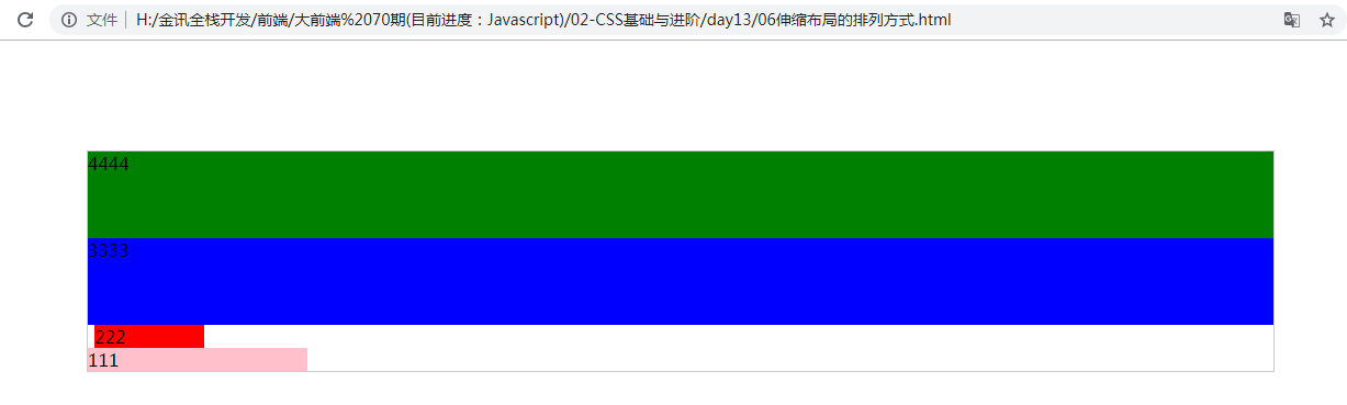
<!DOCTYPE html>
<html lang="en">
<head>
    <meta charset="UTF-8">
    <title>Document</title>
    <style type="text/css">
       section {
             width: 80%;
             height: 200px;
             margin: 100px auto;
             border: 1px solid #ccc;
             /*父盒子添加flex*/
             display: flex; /*伸缩布局模式 这个盒子具有弹性*/
             min-width: 500px;
             flex-direction: row-reverse;
             flex-direction: column-reverse;
       }

       section div{

       }

       div:nth-child(1) {
             background-color: pink;
             width: 200px;
       }

       div:nth-child(2) {
             background-color: red;
             width: 100px;
             margin: 0 6px;
       }

       div:nth-child(3) {
             background-color: blue;
             flex: 1;
       }

       div:nth-child(4) {
             background-color: green;
             flex: 1;
       }
    </style>
</head>
<body>
    <section>
        <div>111</div>
        <div>222</div>
        <div>3333</div>
        <div>4444</div>
    </section>
</body>
</html>
07justify-content属性.html
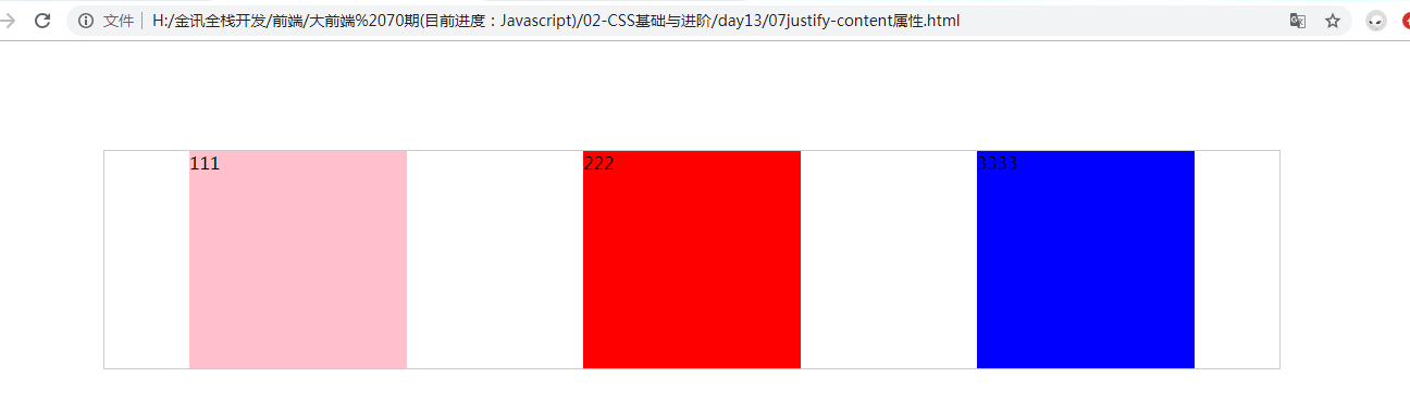
<!DOCTYPE html>
<html lang="en">
<head>
    <meta charset="UTF-8">
    <title>Document</title>
    <style type="text/css">
       section {
             width: 80%;
             height: 200px;
             margin: 100px auto;
             border: 1px solid #ccc;
             /*父盒子添加flex*/
             display: flex; /*伸缩布局模式 这个盒子具有弹性*/
             min-width: 500px;
             justify-content: flex-start;
             justify-content: flex-end;
             justify-content: center;
             justify-content: space-between;
             justify-content: space-around;
       }

       section div{
           width: 200px;
       }

       div:nth-child(1) {
             background-color: pink;
       }

       div:nth-child(2) {
             background-color: red;
             margin: 0 6px;
       }

       div:nth-child(3) {
             background-color: blue;

       }


    </style>
</head>
<body>
    <section>
        <div>111</div>
        <div>222</div>
        <div>3333</div>
    </section>
</body>
</html>
08align-items属性详解.html
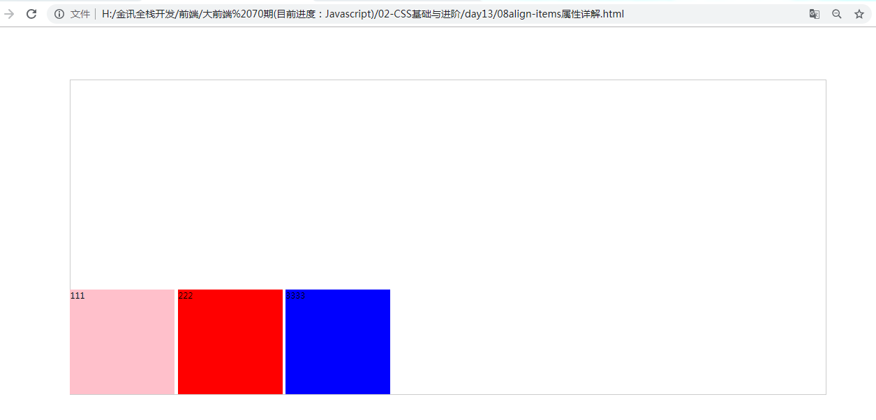
<!DOCTYPE html>
<html lang="en">
<head>
    <meta charset="UTF-8">
    <title>Document</title>
    <style type="text/css">
       section {
             width: 80%;
             height: 600px;
             margin: 100px auto;
             border: 1px solid #ccc;
             /*父盒子添加flex*/
             display: flex; /*伸缩布局模式 这个盒子具有弹性*/
             min-width: 500px;
             align-items: stretch; /*默认 子元素高度会拉伸适应父容器(子元素没有设置高度前提下)*/
             align-items: center; /*垂直居中*/
             align-items: flex-start;/*上对齐*/
             align-items: flex-end;/*下对齐*/
       }

       section div{
           width: 200px;
           height: 200px;
       }

       div:nth-child(1) {
             background-color: pink;
       }

       div:nth-child(2) {
             background-color: red;
             margin: 0 6px;
       }

       div:nth-child(3) {
             background-color: blue;

       }


    </style>
</head>
<body>
    <section>
        <div>111</div>
        <div>222</div>
        <div>3333</div>
    </section>
</body>
</html>
09flex-wrap属性.html
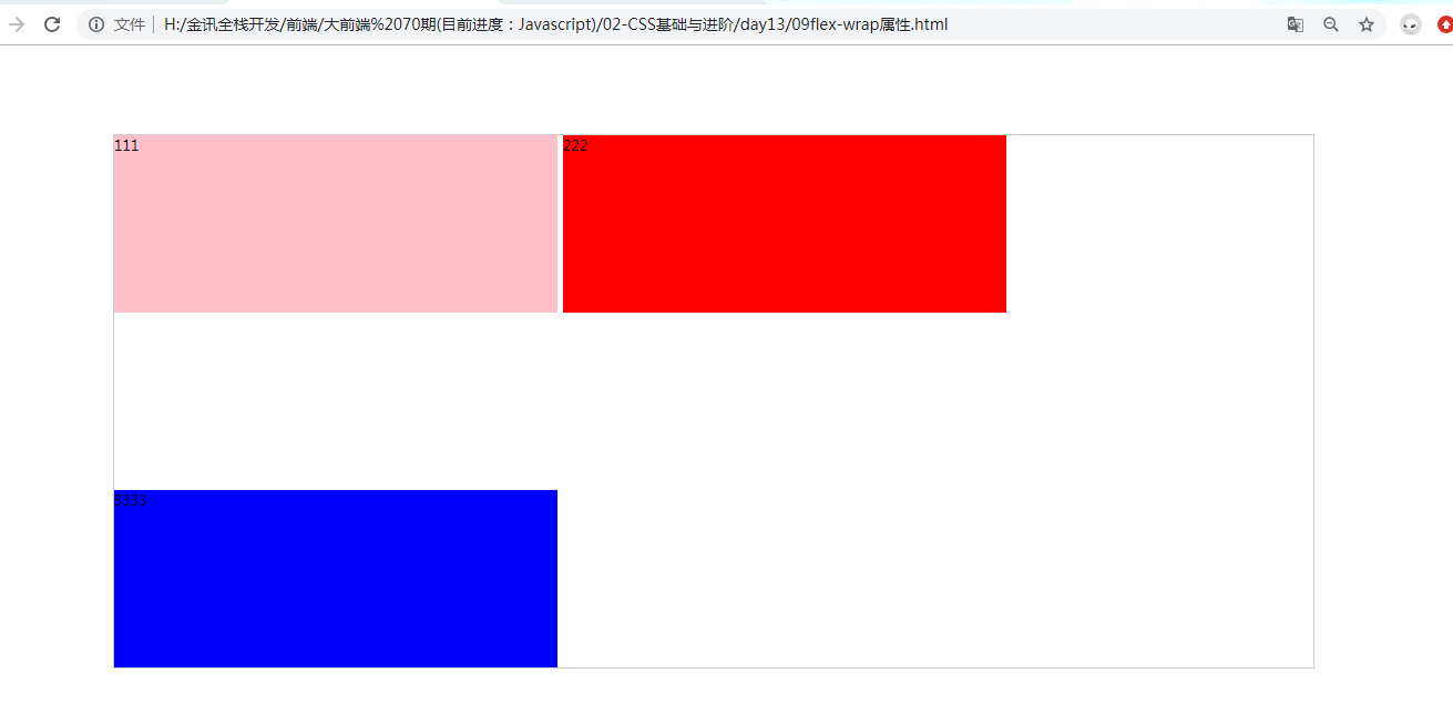
<!DOCTYPE html>
<html lang="en">
<head>
    <meta charset="UTF-8">
    <title>Document</title>
    <style type="text/css">
       section {
             width: 80%;
             height: 600px;
             margin: 100px auto;
             border: 1px solid #ccc;
             /*父盒子添加flex*/
             display: flex; /*伸缩布局模式 这个盒子具有弹性*/
             min-width: 500px;
             flex-wrap: nowrap;
             flex-wrap: wrap-reverse;
             flex-wrap: wrap;
             align-content: space-between;
       }

       section div{
           width: 500px;
           height: 200px;
       }

       div:nth-child(1) {
             background-color: pink;
       }

       div:nth-child(2) {
             background-color: red;
             margin: 0 6px;
       }

       div:nth-child(3) {
             background-color: blue;

       }


    </style>
</head>
<body>
    <section>
        <div>111</div>
        <div>222</div>
        <div>3333</div>
    </section>
</body>
</html>