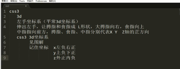
01rotateX.html
<!DOCTYPE html>
<html lang="en">
<head>
    <meta charset="UTF-8">
    <title>Document</title>
    <style type="text/css">
        body {
            /* 视距  眼睛到屏幕的距离 视距越大效果越不明显 越小透视效果越明显*/
            perspective: 200px;
        }
        img {
            display: block;
            margin: 100px auto;
            transition: all 5s;
        }

        img:hover {
            transform: rotateX(360deg);
        }
    </style>
</head>
<body>
    <img src="x.jpg" alt="">
</body>
</html>
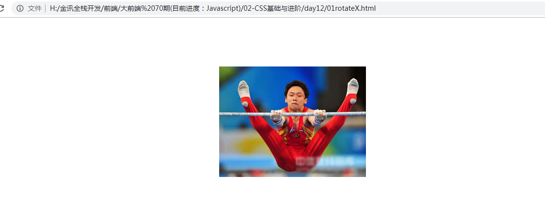
02rotateY.html
<!DOCTYPE html>
<html lang="en">
<head>
    <meta charset="UTF-8">
    <title>Document</title>
    <style type="text/css">
         body {
            /* 视距  眼睛到屏幕的距离 视距越大效果越不明显 越小透视效果越明显*/
            perspective: 500px;
        }
        img {
            display: block;
            margin: 100px auto;
            transition: all 4s;
        }

        img:hover {
            transform: rotateY(360deg);
        }
    </style>
</head>
<body>
    <img src="y.png" width="300" alt="">
</body>
</html>
03rotateZ.html

<!DOCTYPE html>
<html lang="en">
<head>
    <meta charset="UTF-8">
    <title>Document</title>
    <style type="text/css">
        body {
            /* 视距  眼睛到屏幕的距离 视距越大效果越不明显 越小透视效果越明显*/
            perspective: 500px;
        }
        img {
            display: block;
            margin: 100px auto;
            transition: all 1s;
        }

        img:hover {
            transform: rotateZ(360deg);
        }
    </style>
</head>
<body>
    <img src="y.png"  width="300" alt="">
</body>
</html>

04-3D移动.html
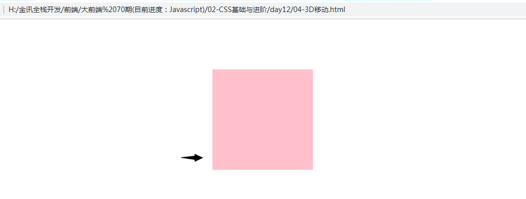
<!DOCTYPE html>
<html lang="en">
<head>
    <meta charset="UTF-8">
    <title>Document</title>
    <style type="text/css">
       body {
             perspective: 500px;
       }
       div {
              width: 200px;
              height: 200px;
              background-color: pink;
              margin: 100px auto;
              transition: all 1s;
       }

       div:hover {
              transform: translateX(100px);
       }
    </style>
</head>
<body>
    <div></div>
</body>
</html>
05-3D移动.html
<!DOCTYPE html>
<html lang="en">
<head>
    <meta charset="UTF-8">
    <title>Document</title>
    <style type="text/css">
       body {
             perspective: 500px;
       }
       div {
              width: 200px;
              height: 200px;
              background-color: pink;
              margin: 100px auto;
              transition: all 1s;
       }

       div:hover {
               /* x y 轴既可以用px也可以用% z轴只能用px*/
              transform: translate3d(50%,50%,200px);
       }

       h1 {
              transform: translate3d(0,100px,0);
              transition: all 1s;
       }

       h1:hover {
              transform: translate3d(0,0,0);
       }
    </style>
</head>
<body>
    <h1>每一个今天胜似无数个昨天</h1>
    <div></div>
</body>
</html>