目录
关于文字和图片的水平垂直居中,在前端界绝对算是一个老生常谈的问题了,尤其是垂直居中,什么千奇百怪的解法都能想的出来。下面我就总结一些比较常用的方法:
一、文本的水平垂直居中:
1、水平居中:
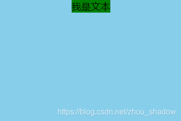
text-align:center
 <style>
        #father{
            width:300px;
            height:200px;
            text-align:center;
            background-color:skyblue;

        }
        #son{
            background-color:green;
        }
    </style>
<body>
	<div id="father">
	    <span id="son">我是文本</span>
	</div>
</body>
结果:
2、垂直居中:
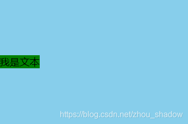
(1)、单行文本
只要height值等于line-height值就
 <style>
    #father{
          width:300px;
          height:200px;
          background-color:skyblue;
          line-height:200px;
      }
      #son{
          background-color:green;
      }
    </style>
<body>
	<div id="father">
	    <span id="son">我是文本</span>
	</div>
</body>
结果:
将子元素换成块级元素。
<style>
    #father{
          width:300px;
          height:200px;
          background-color:skyblue;
          line-height:200px;
      }
      #son{
          background-color:green;
      }
</style>
<body>
	<div id="father">
	    <div id="son">我是文本</div>
	</div>
</body>
结果:
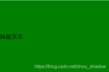
ps:height === line-height 无法使替换元素,如<img>、<input>、<areatext>、<select>…垂直居中,必须有<a>、<span>…类似行内标签配合才能使垂直居中生效! (下面的图片垂直居中解法5 会用到这个特性)
(2)、多行文本
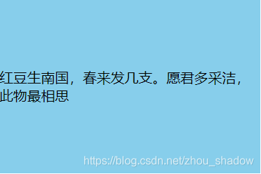
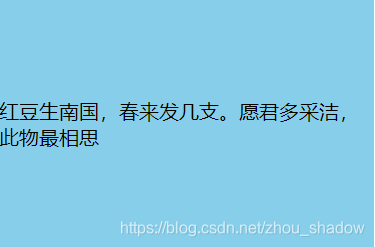
情况1:高度固定
关键属性:display:tabel-cell; vertical-align:middle;
<style>
 div{
     height:200px;
     width:300px;
     vertical-align:middle;
     display:table-cell;
     word-break:break-all;
     background:skyblue;
     }
</style>
<body>
<div id="father">
    红豆生南国,春来发几支。愿君多采洁,此物最相思
</div>
</body>
结果:
情况2:父级高度固定,嵌套行内元素
关键属性:父级:diaplay:tabel; 子集:display:tabel-cell; vertical-align:middle;
 <style>
        div{
            height:200px;
            width:300px;
            display:table;
            word-break:break-all;
            background:skyblue;
        }
        span{
            display:table-cell;
            vertical-align:middle;
        }
</style>
<body>
<div>
<span>
   红豆生南国,春来发几支。愿君多采洁,此物最相思
</span>
</div>
</body>
结果:
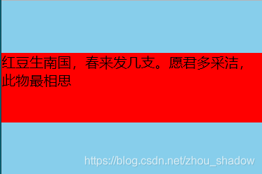
情况3:父级高度固定,嵌套块级元素且该元素高确定
关键属性:定位 + margin-top:负值;
 <style type="text/css">
        *{
            margin:0;
            padding:0;
        }

        div{
            height:200px;
            width:300px;
            position:relative;
            word-break:break-all;
            background:skyblue;
        }

        p{
            position:absolute;
            top:50%;
            left:0;
            height:80px;
            margin-top:-40px;
            background:red;
        }
    </style>
<body>
<div>
    <p>
        红豆生南国,春来发几支。愿君多采洁,此物最相思
    </p>
</div>
</body>
结果:
情况4:父级高度固定,嵌套块级元素且该元素高不确定
关键属性:定位 + transform:translateY(-50%);
  <style>
        *{
            margin:0;
            padding:0;
        }

        /*不加的话会被p或其他标签默认样式影响*/
        div{
            height:200px;
            width:300px;
            position:relative;
            word-break:break-all;
            background:skyblue;
        }

        /*个人建议,被包裹的块标签就不要height,用内容将高度撑开就好*/
        p{
            position:absolute;
            top:50%;
            left:0;
            transform:translateY(-50%);
        }
    </style>
<body>
<div>
    <p>
        红豆生南国,春来发几支。愿君多采撷,此物最相思
    </p>
</div>
</body>
结果:

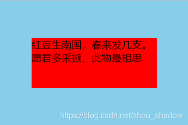
情况5:父子均 定宽 定高 (水平垂直居中)
关键属性:定位 + margin:auto;
 <style>
        *{
            margin:0;
            padding:0;
        }

        div{
            height:200px;
            width:300px;
            position:relative;
            word-break:break-all;
            background:skyblue;
        }

        p{
            position:absolute;
            top:0;
            bottom:0;
            right:0;
            left:0;
            margin:auto;
            height:80px;
            width:200px;
            background:red;
        }
    </style>
<body>
<div>
    <p>
        红豆生南国,春来发几支。愿君多采撷,此物最相思
    </p>
</div>
</body>
结果:
二、图片的水平垂直居中:
1、水平居中:
(1)、给img设display:inline-block;然后父级text-align:center;
 <style>
        div{
            width:300px;
            height:200px;
            text-align:center;
            background-color:skyblue;
         }
        img{
            /*可以不添加text-align*/
            text-align:center;
            display:inline-block;
            width:100px;
            height:100px;
        }
</style>
<body>
<div>
  <img src="1.jpg"/>
</div>
</body>
结果:

(2)、给img设display:block; 同时设margin: 0 auto;
 <style>
        div{
            width:300px;
            height:200px;
            text-align:center;
            background-color:skyblue;
         }

        img{
            /*display:block可以不加*/
            display:block;
            margin:0 auto;
            text-align:center;
            display:inline-block;
            width:100px;
            height:100px;
        }
    </style>
<body>
<div>
  <img src="1.jpg"/>
</div>
</body>
结果:
2、垂直居中水平居中:
解法1:img父级display:table-cell; vertical:middle; height:xxx; (推荐)
 <style>
        div{
            display: table-cell;
            width:300px;
            height:200px;
            vertical-align: middle;
            /*text-align:去掉则垂直不水平*/
            text-align:center;
            background:skyblue; /*table-cell 可以使替换元素垂直居中,强大!*/
        }
        img{
            width:100px;
            height:100px;
        }
    </style><body>
<div>
  <img src="1.jpg"/>
</div>
</body>
结果:

解法2:定位 + transform: translate(-50%,-50%);
 <style>
        div{
            position:relative;
            width:300px;
            height:200px;
            text-align:center;
            background:skyblue;
        }
        img{
            position:absolute;
            top:50%;left:50%;
            transform:translate(-50%,-50%);
            width:100px;
            height:100px;
        }
    </style>
<body>
<div>
  <img src="1.jpg"/>
</div>
</body>
结果:

另:当已知图片大小时也可以把translate换成margin负值,这里不推荐使用。
解法3:定位 + margin:auto;
<style>
div{
	position:relative;
	width:400px;
	height:300px;
	text-align:center;
	background:#999;
}
img{
	position:absolute;
	top:0;bottom:0;
	left:0;right:0;
	margin:auto;
}
</style>
<div>
<img src="1.jpg" />
</div>
</body
结果:

解法4:父级display:table; + 包裹img的元素()设为display:table-cell;
 <style>
        div{
            display:table;
            width:300px;
            height:200px;
            text-align:center;
            background:skyblue;
        }
        span{
            display:table-cell;
            vertical-align:middle;
        }
        img{
            width:100px;
            height:100px;
        }
    </style>
<body>
<div>
    <span>
        <img src="1.jpg"/>
    </span>
</div>
</body>
结果

解法5:父级line-height == height + <img>vertical-align:middle (推荐)
 <style>
        img{
            border:0;
        }
        div{
            width:300px;
            height:200px;
            line-height:200px;
            background:skyblue;
            text-align:center;
        }
        img{
            width:100px;
            height:100px;
            vertical-align:middle;
        }
    </style>
<body>
<div>
     <img src="1.jpg"/>
</div>
</body>
结果:
解法6:background实现
复制代码
<style>
   div{
         width:300px;
         height:200px;
         background:skyblue url(1.jpg) no-repeat center center;
         background-size:100px 100px;
     }
</style>
<body>
<div>
</div>
</body>
结果:

介于pc端对flex布局的兼容有限,暂且不谈。 若发现错误之处,欢迎拍砖指正,真心感谢!><
转自辛月