注:无论是display:table方式还是display:inline-block方式,想要实现子元素水平或垂直或水平垂直都居中,一定不要忘记给父元素设置font-size:0消除默认间隙,不然会有误差。
1.图片或背景图与文字的对齐
给图片和文字的父容器设置font-size:0,然后单独给文字设置字体大小,因为inline-block元素会产生水平和垂直方向的默认间隙,可以通过给父容器设置font-size:0消除默认间隙,然后将图片容器设置为inline-block元素,如果是插入图片img本身就是inline-block元素就不用设了,然后设置图片容器的垂直对齐方式为vertical-align: top。
<style>
* {
    margin: 0;
    padding: 0;
}
//方法一,inline-block
.title {
    font-size: 0;
    margin: 10px;
}
.brand {
    display: inline-block;
    vertical-align: top;
    width: 30px;
    height: 18px;
    background: url("images/[email protected]") no-repeat;
    background-size: cover;
}
.name {
    margin-left: 6px;
    font-size: 16px;
    line-height: 18px;
}
.title2 {
    font-size: 0;
    margin: 10px;
}
.brand2 {
    vertical-align: top;
    width: 30px;
    height: 18px;
}
.name2 {
    margin-left: 6px;
    font-size: 16px;
    line-height: 18px;
}
//方法二,浮动
.title3 {
    overflow: hidden;
    margin: 10px;
}
.brand3 {
    float: left;
    width: 30px;
    height: 18px;
}
.name3 {
    float: left;
    margin-left: 6px;
    font-size: 16px;
    line-height: 18px;
}
</style>
<body>
<div class="title">
    <span class="brand"></span>
    <span class="name">粥品香坊</span>
</div>
<div class="title2">
    <img class="brand2" src="images/[email protected]" alt="品牌">
    <span class="name2">粥品香坊</span>
</div>
<div class="title3">
    <img class="brand3" src="images/[email protected]" alt="品牌">
    <span class="name3">粥品香坊</span>
</div>
</body>
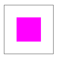
2.元素水平垂直均居中(宽高已知)
<style>
    *{
        margin: 0;
        padding: 0;
    }
    .parent {
        position: relative;
        width: 100px;
        height: 100px;
        border: 1px solid #666;
    }
    .child {
        position: relative;
        left: 50%;
        top: 50%;
        margin-left: -25px;
        margin-top: -25px;
        width: 50px;
        height: 50px;
        background: #f0f;
    }
</style>
<body>
    <div class="parent">
        <div class="child"></div>
    </div>
</body>
3.元素水平垂直均居中(宽高未知,图片)

父容器设置text-align: center,line-height:容器高,font-size:0;img标签设置vertical-align: middle.注意这种情况是img标签外直接就是最外层的父容器,没有间接包裹一层,下面一种情况是img标签和父容器中间还有一层,这种要用display: table来实现了,而且千万不能忘了父容器要设置font-size:0,不然会有间隙误差,下面一种table方式也是如此 。
<style>
    * {
        margin: 0;
        padding: 0;
    }
    .parent {
        text-align: center;
        width: 100px;
        height: 100px;
        line-height: 100px;
        border: 1px solid #666;
        font-size: 0;
    }
    img {
        vertical-align: middle;
    }
</style>
<body>
    <div class="parent">
        <img src="images/[email protected]" alt="品牌">
    </div>
</body>
4.元素水平垂直居中(宽高未知,通用,diaplay:table)

父元素设置display:table,text-align:center,font-size:0;子元素设置display:table-cell,vertical-align:middle,这种方式也可以实现多行文本垂直居中。该方式IE低版本无效,IE低版本下父元素设置line-height属性,子元素设置display:inline-block即可 。
<style>
    *{
        margin: 0;
        padding: 0;
    }
    .parent {
        display: table;
        text-align: center;
        width: 100px;
        height: 100px;
        border: 1px solid #666;
        font-size: 0;
    }
    .child {
        display: table-cell;
        vertical-align: middle;
    }
</style>
<body>
    <div class="parent">
        <div class="child">
            <img src="images/[email protected]" alt="品牌">
        </div>
    </div>
</body>
5.元素水平垂直居中(宽高未知,css3)

<style>
    * {
        margin: 0;
        padding: 0;
    }
    .parent {
        position: relative;
        width: 100px;
        height: 100px;
        border: 1px solid #666;
        margin: 20px;
        font-size: 0;
    }
    .child {
        position: absolute;
        top: 50%;
        left: 50%;
        margin: auto;
        -webkit-transform: translate(-50%,-50%);
        -ms-transform: translate(-50%,-50%);
        -moz-transform: translate(-50%,-50%);
        -o-transform: translate(-50%,-50%);
        transform: translate(-50%, -50%);
    }
</style>
<body>
    <div class="parent">
        <div class="child">
            <img src="images/[email protected]" alt="">
        </div>
    </div>
</body>