元素水平垂直居中的场景很常见,常用的方法如下:
(以下方法在chorme测试可行)
一、文本垂直居中
<div class="test">这是一段文字</div>
.test {


	width: 200px;
	height: 200px;
	background: orange;
	text-align: center; /* 水平居中 */
	line-height: 200px; /* 垂直居中 */
}
效果图:

二、元素水平垂直居中
为了方便展示,以下示例的父元素均设置了宽高,但实际我们的场景中,很多父元素是不确定宽高的。(具体场景具体分析了)
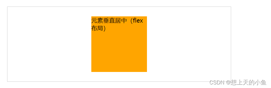
1、弹性布局flex
弹性布局,这个是我最常用的方式,大部分的场景都能满足。
<div class="wrapper">
	<div class="test">元素垂直居中(flex布局)</div>
</div>
.wrapper {


	width: 600px;
	height: 200px;
	border: 1px solid #ccc;
	display: flex;
	justify-content: center;
	align-items: center;
}
.test {


	width: 150px;
	height: 150px;
	background: orange;
}
效果图:
下面几种方法的效果图都是一样的,就不一一放图了。
2、position定位+margin(auto属性)
如果父元素宽高是确定的,水平居中只需要margin:0 auto即可。
这里结合定位,四个方向的偏移量都设置为0,要实现水平垂直居中,只需将margin设置为auto即可。
.wrapper {


	width: 600px;
	height: 200px;
	border: 1px solid #ccc;
	position: relative;
}
.test {


	width: 150px;
	height: 150px;
	background: orange;
	position: absolute;
	top: 0;
	bottom: 0;
	left: 0;
	right: 0;
	margin: auto;
}
3、position定位+margin
此方法也用了position定位+margin,与第二种方式不同的是,这里设置的是margin-top、margin-left偏移量。
这个应该都能理解吧?left设置的是50%,表明在中间的点,如果需要居中,水平方向上需要往左挪动1/2,即150*1/2=75。top也是同理。
.wrapper {


	width: 600px;
	height: 200px;
	border: 1px solid #ccc;
	position: relative;
}
.test {


	width: 150px;
	height: 150px;
	background: orange;
	position: absolute;
	left:50%;
  	top:50%;
	margin-top: -75px;
	margin-left: -75px;
}
4、position定位
此方法纯靠定位,与第三种方式不同的是,偏移量直接在left赋值的时候就计算出来了,无需再设置margin进行调整。
.wrapper {


	width: 600px;
	height: 200px;
	border: 1px solid #ccc;
	position: relative;
}
.test {


	width: 150px;
	height: 150px;
	background: orange;
	position: absolute;
	left:calc((100% - 150px)/2); /* 如width已知,100%可替换成width */
  	top:calc((100% - 150px)/2); /* 如height已知,100%可替换成height */
}
5、position定位+transform
transform属性允许你旋转,缩放,倾斜或平移给定元素。
该方法我们用到的是平移。可以和第三种方式对比着看,这里的translate实现的就是margin-left和margin-top。
.wrapper {


	width: 600px;
	height: 200px;
	border: 1px solid #ccc;
	position: relative;
}
.test {


	width: 150px;
	height: 150px;
	background: orange;
	position: absolute;
	left:50%;
  	top:50%;
	transform: translate(-50%, -50%);
}
6、表格table-cell
该方法需要注意的一点就是:vertical-align: middle
vertical-align用来指定行内元素(inline)或表格单元格(table-cell)元素的垂直对齐方式。
所以,这里给test设置了display为inline-block,不然垂直居中是不生效的哦!
.wrapper {


	width: 600px;
	height: 200px;
	border: 1px solid #ccc;
	display: table-cell;
	vertical-align: middle;
	text-align: center;
}
.test {


	width: 150px;
	height: 150px;
	background: orange;
	display: inline-block;
}
如果还有其他方式需要补充的,欢迎评论区留言哦!