微信小程序本来封装有底部导航栏,但对于想自定义样式和方法的开发者来说,这并不是很好。
参考链接:https://github.com/ljybill/miniprogram-utils/tree/master/custom-tabbar
首先创建一个底部导航栏组件,名为:navBar
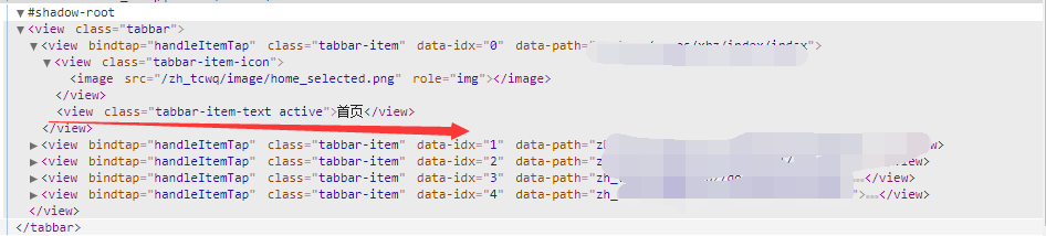
<view class='tabbar'>
  <view wx:if='{{_auth >= item.auth}}' class='tabbar-item' wx:for='{{tabbarList}}' wx:key='{{item.pagePath}}' bindtap='handleItemTap' data-path='{{item.pagePath}}' data-idx='{{index}}'>
    <view class='tabbar-item-icon'>
      <image src='{{activeIdx === index ? item.selectedIconPath : item.iconPath}}'></image>
    </view>
    <view class='tabbar-item-text {{activeIdx === index ? "active" : ""}}'>{{item.text}}</view>
  </view>
</view>
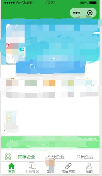
导航栏样式,分为5个按钮,中间为圆形凸起
.tabbar {
  position: fixed;
  bottom: 0;
  left: 0;
  right: 0;
  height: 100rpx;
  border-top: 0.5px solid #d5d5d5;
  display: flex;
  font-size: 0;
  background: #fff;
}
.tabbar-item {
  flex: 1;
  text-align: center;
  overflow: hidden;
  box-sizing: border-box;
  padding: 8rpx 10rpx 0;
  color: #333333;
}

.tabbar-item:nth-child(3){
  position: relative;
  bottom: 50rpx;
  height:150rpx;
  flex: 0.7;
}

.tabbar-item:nth-child(3) .tabbar-item-icon{
  height: 100rpx;
  background: #fff;
  border-radius: 50%;
  border-top: solid 1px gray;
}

.tabbar-item:nth-child(3) .tabbar-item-icon image{
  width: 100rpx;
  height: 106rpx;
  padding-top: 6rpx;
}

.tabbar-item:nth-child(3) .tabbar-item-text{
  line-height: 0;
  font-size: 28rpx;
  margin-top: 8px;
  color: #808080;
}

.tabbar-item-icon {
  margin-bottom: 6rpx;
  height: 56rpx;
}

.tabbar-item-icon image {
  width: 56rpx;
  height: 56rpx;
}

.tabbar-item-text {
  font-size: 28rpx;
  line-height: 20rpx;
  color: #808080;
}
.active {
  color: #23ac38;
}
接下来在app.json中配置导航跳转,由于关于项目,路径自己写
"tabBar": {
    "color": "white",
    "borderStyle": "white",
    "backgroundColor": "white",
    "list": [
      {
        "pagePath": "跳转路径",
        "text": "首页",
        "iconPath": "zh_tcwq/image/home.png",
        "selectedIconPath": "zh_tcwq/image/home_selected.png",
        "auth": 0
      },
      {
        "pagePath": "跳转路径",
        "text": "行业社区",
        "iconPath": "zh_tcwq/image/community.png",
        "selectedIconPath": "zh_tcwq/image/community_selected.png",
        "auth": 0
      },
      {
        "pagePath": "跳转路径",
        "text": "发现",
        "iconPath": "zh_tcwq/image/xbz_logo.png",
        "selectedIconPath": "zh_tcwq/image/close.png",
        "auth": 0
      },
      {
        "pagePath": "跳转路径",
        "text": "项目对接",
        "iconPath": "zh_tcwq/image/docking.png",
        "selectedIconPath": "zh_tcwq/image/docking_selected.png",
        "auth": 0
      },
      {
        "pagePath": "跳转路径",
        "text": "我的",
        "iconPath": "zh_tcwq/image/mine.png",
        "selectedIconPath": "zh_tcwq/image/mine_selected.png",
        "auth": 0
      }
    ]
  }
然后在app.js文件中把app.json配置的导航栏隐藏
onLaunch: function() {
    // 隐藏原生的tabbar
    wx.hideTabBar()
  },
由于要自定义导航栏,所以要自己创建一个导航配置文件
在项目目录下创建一个config文件夹,创建一个router.js的文件
module.exports = [
  {
    "pagePath": "跳转路径",
    "text": "首页",
    "iconPath": "/zh_tcwq/image/home.png",
    "selectedIconPath": "/zh_tcwq/image/home_selected.png",
    "auth": 0
  },
  {
    "pagePath": "跳转路径",
    "text": "行业社区",
    "iconPath": "/zh_tcwq/image/community.png",
    "selectedIconPath": "/zh_tcwq/image/community_selected.png",
    "auth": 0
  },
  {
    "pagePath": "跳转路径",
    "text": "发现",
    "iconPath": "/zh_tcwq/image/xbz_logo.png",
    "selectedIconPath": "/zh_tcwq/image/close.png",
    "auth": 0
  },
  {
    "pagePath": "跳转路径",
    "text": "项目对接",
    "iconPath": "/zh_tcwq/image/docking.png",
    "selectedIconPath": "/zh_tcwq/image/docking_selected.png",
    "auth": 0
  },
  {
    "pagePath": "跳转路径",
    "text": "我的",
    "iconPath": "/zh_tcwq/image/mine.png",
    "selectedIconPath": "/zh_tcwq/image/mine_selected.png",
    "auth": 0
  }
]
接下来在导航栏组件中配置该导航按钮参数
// zh_tcwq/pubcoms/navbar/navbar.js
import tabbarList from "../../../zh_tcwq/config/router.js"
Component({
/**
* 组件的属性列表
*/
properties: {
activeIdx: {
type: Number,
value: 0
},
auth: {
type: Number,
value: 0,
observer: 'onAuthChanged'
}
},
/**
* 组件的初始数据
*/
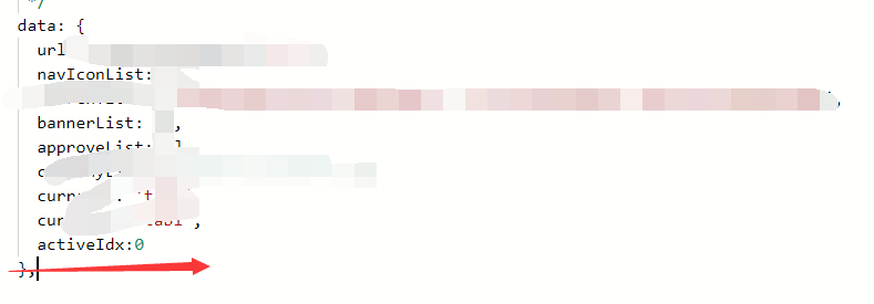
data: {
tabbarList: tabbarList,
_auth: 0
},
/**
* 组件的方法列表
*/
methods: {
handleItemTap(e) {
const {
idx,
path
} = e.currentTarget.dataset
if (idx === this.data.activeIdx) {
this.trigger('refresh')
return
}
wx.switchTab({
url: `/${path}`,
})
},
onAuthChanged(newVal) {
wx.setStorageSync('__com-tabbar-auth', newVal)
this.setData({
_auth: newVal
})
},
trigger(eventName, value = {}, info) {
if (!eventName) {
throw new TypeError('没有自定义事件名')
}
this.triggerEvent(eventName, value)
console.log(`发送 ${eventName} 事件,携带的值为 ${typeof value === 'object' ? JSON.stringify(value) : value} ${info ? ' --- ' + info : ''}`)
}
},
ready() { },
/** 权限显示 */
pageLifetimes: {
show: function () {
console.log('show')
this.setData({
_auth: wx.getStorageSync('__com-tabbar-auth')
})
}
}
})
关于原作者点击跳转后无法动态激活底部样式的问题,我利用了一个小小的机智,通过组件间的参数传递,判断该参数是否和页面传递的参数一致,一致就显示为active状态
例如:在index页面下引用该组件:
先在json中配置组件:
{
  "usingComponents": {
    "tabbar":"../../../pubcoms/navbar/navbar"
  }
}
在wxml文件中引用
<!-- 底部导航栏--start -->

<tabbar activeIdx="{{activeIdx}}"></tabbar>
<!-- 底部导航栏--end -->
利用activeIdx来传入导航栏组件中,在index.js中声明该参数,因为我的index为第一页,所有我赋值的量为0(数组显示的规则是0,1,2,3,4,五个菜单)
每个引用该组件的页面都配置一下activeIdx,这样在每次加载的时候组件会判断两个参数是否一致,如果一致,就添加active样式。
不知道将的够不够清除,如果有问题的同学可以回复提问。
效果图如下,中间是一个圆形凸起的大logo