微信小程序自定义头部导航栏
虽然小程序自带的顶部导航栏比较好用,但是扩展性比较差。在实际开发中我们经常需要针对导航栏进行一些功能性操作。比如点击返回按钮返回到固定的页面,设置其他背景颜色字体颜色以及增加一些按钮等等。下面我们一起来看看导航栏的定制;
先看下demo的效果:
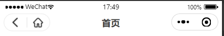
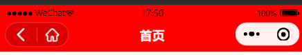
最终要实现的效果:
- 在tabbar页面不显示左侧按钮;
- 分享出去的页面进入后不显示左侧返回按钮;
- 点击返回按钮可以自行设置返回层级;
- 字体颜色,背景颜色的设置;
- 左侧按钮的深浅样式切换;
使用自定义组件定义导航栏
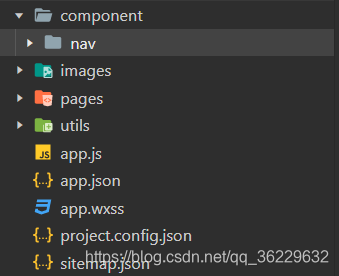
在小程序跟目录下建立component / nav文件夹用来放我们的导航栏组件
首先在app.js中获取机型信息
onLaunch() {


    wx.getSystemInfo({


      success: (res) => {


        this.globalData.windowWidth = res.windowWidth
        this.globalData.statusBarHeight = res.statusBarHeight
        this.globalData.navBarHeight = 44 + res.statusBarHeight
      }
    })
    this.globalData.capsule = wx.getMenuButtonBoundingClientRect() //获取胶囊宽高及位置
  },
  globalData: {


    capsule:null,
  }
在nav组件中编写组件
wxml:
<view class="nav-box">
	<view wx:if="{

     { seat }}" class="seat-box" style="height:{

       {

        44 + statusBarHeight}}px;"></view>
	<view class='nav-wrap' style="background-color:{

       {

       backgroundColor}};">
		<view style="height:{

       {

       statusBarHeight}}px;"></view>
		<view class='content'>
			<view class="title" style="line-height:44px;color:{

       {

       titleColor}};">{

   {navTitle}}</view>
			<view wx:if="{

     {isShow}}" class="capsule-box {

     {isWhite? 'isWhite':'isblack'}} {

     {!isBack?'noBack':''}}"
				style='height:{

       {

       capsule.height}}px;position: absolute; top:{

       {

       capsule.top-statusBarHeight}}px; left:{

       {

       left}}px;'>
				<block wx:if="{

     {isBack}}">
					<view class="capsult-item">
						<image class='back' bindtap='back'
						src="{

     {isWhite ? '/images/ic_nav_back_white.png':'/images/ic_nav_back_blac.png'}}"
						mode="aspectFit" lazy-load="false" data-num="{

     {pageNum}}" binderror="" bindload="">
					</image>
					</view>
					<view class="{

     {isWhite? 'lineWhite':'lineblack'}}" hover-class="none" hover-stop-propagation="false"></view>
		  	</block>
				<view class="capsult-item">
					<image class='home' bindtap="toIndex"
					src="{

     {isWhite ? '/images/ic_nav_home_white.png':'/images/ic_nav_home_black.png'}}"
					mode="aspectFit" lazy-load="false" binderror="" bindload="">
				</image>
				</view>
			</view>
		</view>
	</view>
</view>
wxss
.nav-wrap {


  position: fixed;
  top: 0;
  left: 0;
  width: 750rpx;
  z-index: 99999;
}

.content {


  position: relative;
  width: 100%;
  height: 44px;
}

.back {


  width: 44rpx;
  height: 44rpx;
}

.home {


  width: 44rpx;
  height: 44rpx;
}

.lineblack {


  height: 36rpx;
  background: #B0B0B0;
  width: 1rpx;
  position: absolute;
  top: 50%;
  left: 50%;
  transform: translate(-50%, -50%);
  opacity: 0.5;
}

.lineWhite {


  height: 36rpx;
  background: rgba(255, 255, 255, .7);
  width: 1rpx;
  position: absolute;
  top: 50%;
  left: 50%;
  transform: translate(-50%, -50%);
  opacity: 0.5;
}

.title {


  text-align: center;
  font-weight: 900;
  font-size: 32rpx;
}

.letBtnBox {


  width: 100px;
  display: flex;
  align-items: center;
}

.capsule-box {


  width: 85px;
  border-radius: 88rpx;
  background: #FFFFFF;
  overflow: hidden;
  display: flex;
  justify-content: space-between;
}

.isWhite {


  border: 1rpx solid rgba(255, 255, 255, .25);
  background: rgba(0, 0, 0, .15);
}

.isblack {


  border: 1rpx solid rgba(0, 0, 0, .1);
  background: rgba(255, 255, 255, .6);
}

.opacity {


  background: rgba(0, 0, 0, .1);
}

.capsult-item {


  display: flex;
  width: 50%;
  align-items: center;
  justify-content: center;
}
.noBack{


  width: 32px;
}
.noBack .capsult-item{


  width: 100%;
}
js
const app = getApp()
Component({


  options: {


    multipleSlots: true
  },
  properties: {


    isWhite: {

     //默认不是白色自定义返回
      type: Boolean,
      value: false
    },
    // 背景颜色
    backgroundColor: {


      type: String,
      value: 'rgba(0,0,0,0)'
    },
    // 标题颜色
    titleColor: {


      type: String,
      value: 'rgba(0,0,0,1)'
    },
    // 边框颜色
    borderColor: {


      type: String,
      value: 'rgba(0,0,0,1)'
    },
    // 标题
    navTitle: {


      type: String,
      value: ''
    },
    // 状态栏区域位置
    seat: {


      type: Boolean,
      value: true
    },
    // 是否显示左侧按钮
    isShow: {


      type: Boolean,
      value: true
    },
    // 是否显示左侧返回按钮
    isBack:{


      type:Boolean,
      value:true
    },
    // 返回层级 默认为1
    pageNum: {


      type: Number,
      value: 1
    }
  },
  data: {


    capsule: {

    }
  },
  lifetimes:{


      //判断是否有上一级页面,如果有显示返回按钮(isBack参数)否则不显示
    attached: function() {


        this.setData({


          isBack:getCurrentPages().length === 1?false:true
        })
    }
  },
  ready() {


      //获取机型状态栏信息
    const {


      statusBarHeight,
      navBarHeight
    } = app.globalData
    console.log(app.globalData)
    this.setData({


      statusBarHeight,
      navBarHeight,
      left: app.globalData.windowWidth - app.globalData.capsule.right, //胶囊据右边距离
      capsule: app.globalData.capsule
    })
  },
  methods: {


      //返回层级 默认为1
    back(e) {


      wx.navigateBack({


        delta: e.currentTarget.dataset.num
      })
    },
      //跳转到首页
    toIndex() {


      wx.switchTab({


        url: '/pages/index/index'
      })
    }
  }
})
json
{
  "component": true
}
页面中引用
在需要使用自定义导航栏的页面设置
{


  "usingComponents": {


    "navbar":"/component/nav/nav"
  },
  "navigationStyle":"custom"
}
wxml中引入组件
<navbar isShow="{

     {isShow}}" navTitle="{

     {navTitle}}" backgroundColor="{

     {backgroundColor}}" isWhite="{

     {isWhite}}" pageNum="1" titleColor="{

     {titleColor}}"></navbar>
js文件配置
data:{


    isShow:true,//是否显示左侧按钮
    backgroundColor:'red',//背景颜色
    navTitle:'首页',//标题
    isWhite:true,//是否白色胶囊
    titleColor:'#fff',//字体颜色
}
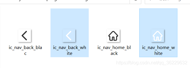
images静态资源我项目中是使用的这四个图标。尺寸为44*44px; 如果你的项目中UI提供的图标尺寸不是这个,一定要对应去修改图标的nav.wxss中图片的尺寸大小!!!!
四个图标(可下载,白色的也在只不过看不清):


图标预览图:
通过以上的代码就可以实现针对自定义导航栏的封装以及引用,实现自定义导航栏。有疑问可以留言探讨!