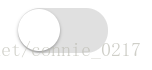
效果图如下:

很简单的HTML结构
<!-- 仿ios的switch开关 -->
    <label for=""><input type="checkbox" name="" id="" class="a-switch"></label>
CSS部分:
主要用到了:
点击label会触发点击所包含的input控件,利用处理label的样式来实现
<style>
        .a-switch{
            width: 60px;
            height: 30px;
            border-radius: 20px;
            -webkit-appearance: none;
            user-select: none;
            outline: none;
            background-color: #e0e0e0;
            box-shadow: #c2c2c2 0 0 0 0 inset;
            position: relative;
            transition:0.4s;
        }
        .a-switch:before{
            content: '';
            width: 28px;
            height: 28px;
            border-radius: 100%;
            background-color: #fff;
            box-shadow: 0 1px 3px rgba(0, 0, 0, 0.4);
            position: absolute;
            left:0;
            top:1px;
            transition:0.3s;
        }
        .a-switch:checked{
            border-color: #81d480;
            box-shadow: #83e482 0 0 0 14px inset;
            background-color: #81d480;
        }
        .a-switch:checked:before{
            left:32px;
        }
  </style>