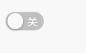
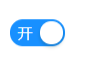
自定义常用input表单元素的第三篇,自定义一个Switch开关,表面上看是和input没关系,其实这里采用的是checkbox的checked值的切换。同样,采用css伪类和“+”css选择器为思路,下面是预览图:
下面先放HTML代码,看下DOM结构:
<input type="checkbox" id="my_switch" class="my_switch">
<label for="my_switch"></label>
DOM结构没什么特别的,就是一个常用的checkbox复选框的结构,唯一不同的是label标签没有内容。下面再看下CSS代码:


.my_switch {
    display: none;
}

.my_switch+label {
    display: inline-block;
    box-sizing: border-box;
    height: 22px;
    min-width: 44px;
    line-height: 20px;
    vertical-align: middle;
    border-radius: 100px;
    border: 1px solid transparent;
    background-color: rgba(0, 0, 0, 0.25);
    cursor: pointer;
    -webkit-transition: all 0.36s;
    transition: all 0.36s;
    position: relative;
}

.my_switch:checked+label {
    background-color: #1890ff;
}

.my_switch+label::before {
    content: "";
    display: block;
    width: 18px;
    height: 18px;
    position: absolute;
    left: 1px;
    top: 1px;
    border-radius: 18px;
    background-color: #fff;
    cursor: pointer;
    transition: all 0.36s cubic-bezier(0.78, 0.14, 0.15, 0.86);
    -webkit-transition: all 0.36s cubic-bezier(0.78, 0.14, 0.15, 0.86);
    -webkit-box-shadow: 0 2px 4px 0 rgba(0, 35, 11, 0.2);
    box-shadow: 0 2px 4px 0 rgba(0, 35, 11, 0.2);
}

.my_switch:checked+label::before {
    left: 23px;
    transition: all 0.36s cubic-bezier(0.78, 0.14, 0.15, 0.86);
    -webkit-transition: all 0.36s cubic-bezier(0.78, 0.14, 0.15, 0.86);
}

.my_switch+label::after {
    content: "关";
    position: absolute;
    top: 1px;
    left: 24px;
    font-size: 12px;
    color: #fff
}

.my_switch:checked+label::after {
    content: "开";
    left: 5px;
}
主要思路:switch开关有三部分组成,第一部分就是整个开关背景(椭圆部分)这部分可以用label定义样式。第二部分为左右切换的小按钮,可以用label伪类表示。第三部分为显示的开关文字,同样也可以用伪类表示。最终根据checkbox复选框的checked值就可以切换开或关了。赶快去试试吧。