Ripple Effect / Touch Feedback / 触摸反馈动画
1. 简介
材料设计中的触摸反馈在用户和UI元素交互的点提供瞬时视觉确认。例如,当按钮被触摸时显示一个水波纹效果。 这是 Android 5.0 默认的触摸反馈动画。水波纹动画通过新的 RippleDrawable 类实现。水波纹效果可以配置在 View 边界的末端或超出 View 的边界。例如,下面的图片序列说明了在一个按钮上触摸时的水波纹效果动画:
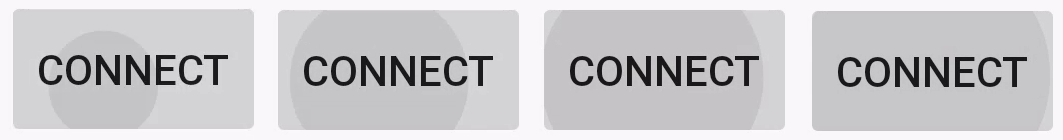
刚开始在按钮上触摸时会出现左边第一张图片所示,剩下的图片说明了水波纹效果是怎样扩散到按钮边界的。 当水波纹动画完成,View 恢复到初始状态。默认的水波纹动画不超过一秒,但可以自定义动画的长度。
注意水波纹效果只会在 Android 5.0 及以上显示,之前的版本会高亮显示。
2. 使用系统自带的两个 Ripple 波纹效果
//有边界?android:attr/selectableItemBackground//无边界 (要求API21以上)?android:attr/selectableItemBackgroundBorderless 使用时只需要把上面这两个值作为 View 的 android:background="" 或 android:foreground="" 即可(如果已经有背景, 可以设置到前景属性中)。同时如果想要效果显示出来要保证 View 是可点击的(比如控件本身可点击、或者给控件设置点击事件、 或给控件设置 android:clickable="true")。
这里的颜色是系统默认的,可以在 theme 里更改默认的波纹颜色
<style name="AppTheme" parent="Theme.AppCompat.Light.NoActionBar"> <!-- API 21 theme customizations can go here. --> <item name="android:colorControlHighlight">#ff0000</item></style>代码设置
如果想通过代码设置 Touch Feedback 效果,方式如下:
int[] attrs = new int[]{R.attr.selectableItemBackground};TypedArray typedArray = getActivity().obtainStyledAttributes(attrs);int backgroundResource = typedArray.getResourceId(0, 0);mView.setBackgroundResource(backgroundResource);
3. 自定义 Ripple
3.1 无边界
ripple 说是触摸反馈动画,其实它就是一个 Drawable,所以定义时需要放到 drawable 文件夹下:
<?xml version="1.0" encoding="utf-8"?><ripple xmlns:android="http://schemas.android.com/apk/res/android" android:color="#4285f4"></ripple>- 上面中 ripple 属性中 color 代表的是波纹的颜色。
- ripple 中还有一个属性为 radius (波纹大小),则触摸显示的波纹为设置的固定大小,不会为手指触摸点开始显示。
- 边界的颜色如果没有透明度,为纯色的话,会遮盖其它无边界的波纹。
3.2 有边界
<?xml version="1.0" encoding="utf-8"?>
<ripple xmlns:android="http://schemas.android.com/apk/res/android"
android:color="#4285f4"><!--波纹点击颜色-->
<!-- 添加边界 -->
<item android:drawable="@color/blue"/>
</ripple>
- 上面的 item 是为了设置一个边界,其实它的作用就是为 View 绘制一个默认的背景。并且如果有更复杂的 需求,可以直接在
<item><shape/></item>中绘制一个 shape 。
3.3Button的触摸反馈
Button 在 v21 以上默认情况下是自带有 ripple 效果和点击Z轴抬高的阴影效果(会在视图状态动画中详解)的。
但是如果你给 Button 设置了背景图,上面自带的默认点击效果都会失去。这时如果想保持点击效果有下面几种方式:
1把 Button 的背景设置放到 Theme 中更改
<style name="AutoButton" parent="AppTheme"> <item name="buttonStyle">@style/Widget.AppCompat.Button</item> <item name="colorButtonNormal">?attr/colorAccent</item></style>然后把这个 theme 设置给 Button,其中 clolorButtonNormal 就是默认状态下的背景(无需再设置 background )。这样就会保持按钮默认的点击效果。
2 给 Button 设置普通背景的同时,设置 Ripple 效果给 Foreground 前景属性
自定义 Ripple
一种形式就是通过上面 3-2 中介绍的自定义 ripple。
如果想设置不同状态的可以通过下面的形式:
<?xml version="1.0" encoding="utf-8"?><ripple xmlns:android="http://schemas.android.com/apk/res/android" android:color="#FF0000" > <item> <selector> <item android:drawable="@drawable/icon_bg1" android:state_pressed="true"> </item> <item android:drawable="@drawable/icon_bg2" android:state_pressed="false"> </item> </selector> </item></ripple>也就相当于把 Ripple 和 Shape 结合在一起。
另外需要注意的是,在自定义 <ripple/>时,我们一般把它放到 drawable-v21 文件夹下, 在 drawable 文件夹下放置兼容低版本的普通 Drawable 文件,如 <shape/>或者 <selector/>。
揭露动画
1. 概述
在 Android 5.0 及更高的版本中,加入了一种全新的视觉动画效果,就是揭露动画。揭露动画在系统中很常见,就是类似波纹的效果, 从某一个点向四周展开或者从四周向某一点聚合起来,可以用在 Activity 里面的 View 动画效果, 也可以使用在 Activity 跳转过渡动画中。
2. 使用
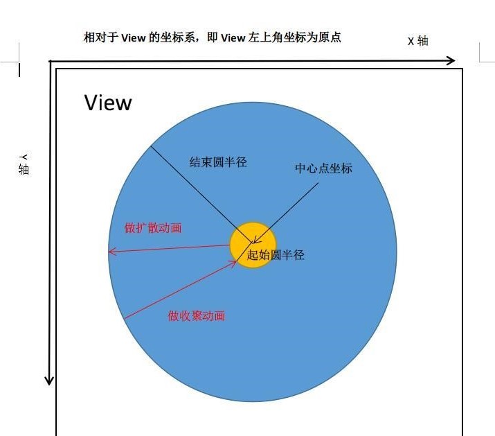
使用揭露动画非常简单,Android Sdk 中已经帮我们提供了一个工具类 ViewAnimationUtils 来创建揭露动画。ViewAnimationUtils 里面只有一个静态方法 createCircularReveal(View view, int centerX, int centerY, float startRadius, float endRadius), 返回一个 Animator 动画对象。
public final class ViewAnimationUtils { private ViewAnimationUtils() {} /** * ...... * @param view The View will be clipped to the animating circle. * @param centerX The x coordinate of the center of the animating circle, relative to * <code>view</code>. * @param centerY The y coordinate of the center of the animating circle, relative to * <code>view</code>. * @param startRadius The starting radius of the animating circle. * @param endRadius The ending radius of the animating circle. */ public static Animator createCircularReveal(View view, int centerX, int centerY, float startRadius, float endRadius) { return new RevealAnimator(view, centerX, centerY, startRadius, endRadius); }}ViewAnimationUtils.createCircularReveal()方法能够为裁剪区域添加动画以揭露或隐藏视图。我们主要使用 createCircularReveal 方法, 该方法有四个参数:
- 第一个参数是执行揭露动画的 View 视图
- 第二个参数是相对于视图 View 的坐标系,动画圆的中心的x坐标
- 第三个参数是相对于视图 View 的坐标系,动画圆的中心的y坐标
- 第四个参数是动画圆的起始半径,第五个参数动画圆的结束半径。
如下图所示:
揭露动画有两种效果,一种是显示一组UI元素,另一种是隐藏一组UI元素:
- 以中心点为轴点,当开始半径小于结束半径时,从开始半径处向外扩大到结束半径处显示View
- 以中心点为轴点,当开始半径大于结束半径时,从开始半径处向内缩小到结束半径处隐藏View
注意:揭露动画对象只能使用一次,不能被重新使用,也就是说每次使用揭露动画都要调用 ViewAnimationUtils.createCircularReveal() 返回一个揭露动画对象使用,同时一旦开始了动画就不能暂停或重新开始。揭露动画是一种异步动画,可以自动运行在 UI 线程上。 当揭露动画结束后,如果设置了 Animator.AnimatorListener 监听器,那么监听器的 onAnimationEnd(Animator) 方法会被调用, 但可能会被延迟调用,这取决于线程的响应能力。
通过这个分析图,其实应该就很容易理解了,我们要做的所有事情就是确定 ViewAnimationUtils.createCircularReveal() 这 个方法的四个参数。
这里查看具体的代码:
@Override
public void onClick(View view) {
boolean isVeggie = ((ColorDrawable) view.getBackground()) != null && ((ColorDrawable) view.getBackground()).getColor() == green;
//平方根方法
int finalRadius = (int) Math.hypot(view.getWidth() / 2, view.getHeight() / 2);
if (isVeggie) {
text1.setText(baconTitle);
text2.setText(baconText);
view.setBackgroundColor(white);
} else {
//.createCircularReveal(要进行操作的视图,中心点x和y来执行动画,开始半径,结束半径)。
Animator anim = ViewAnimationUtils.createCircularReveal(view, (int) view.getWidth() / 2, (int) view.getHeight() / 2,
0, finalRadius);
text1.setText(veggieTitle);
text2.setText(veggieText);
view.setBackgroundColor(green);
anim.start();
}
}